This is Alex, he’s blind — Accessibility context cards
Providing our product teams with a list of accessibility considerations before they begin designing
Someone in our design team shared this brilliant article on the concept of ‘Performance cards’ written by Spotify.
At Spotify, they use context and action cards to encourage their teams to empathise with users in different situations from themselves. For example, someone with a limited data plan is likely to use Spotify in different ways to someone with unlimited data.
The article got me thinking that something similar could be used to solve a problem we have in our product design teams.
The problem
I’ve been focussing my time on shifting accessibility left and a lot of that time has been spent introducing the design team to the basics of accessibility. One problem we were having was that often designers would leave accessibility to the end, until the final design was ready for review. By this time, designers are emotionally invested in the design and any re-work needed from an accessibility review, took longer to complete than if it had been considered from the start.
The proposed solution
The Spotify context cards were designed for teams to look at in workshops before any design had begun. I also own the brilliant Alphabet of Accessibility Deck which “describes 26 real people who need us to design and develop accessible websites. Some you’ll recognize as disabled, and some may come as a surprise”.
I stole and merged both of these great ideas to create a set of bios and things to consider when designing for them. The cards were created in Figma, to make them easy for our design team to access.
This is Alex, he’s blind

Here’s an example card from the deck. They are by no means an exhaustive list, but instead have been designed to get our teams to consider the basics before any work has been done. There will still be accessibility reviews, but hopefully less will need to go back into design if these basics have been considered first.
Design considerations for people who are blind
If you’re new to considering accessibility in your designs, I hope these examples highlighted in the context cards will help you to understand a little bit more about what you can do to help.
All content must be present in text or have Alt text
For people who use screen readers, text is especially important. Everything that conveys meaning in your designs should include text or have a text alternative so a screen reader can access it.

The example above shows that you should include text where possible, making both the icon and the text clickable as part of the link. As an alternative, if it is impossible to include text, you should annotate your design to include what the text alternative for the button or link should be. This way a screen reader will announce the label of the icon button when it gets focus.

Another thing to keep in mind when designing is what imagery doesn’t need to be accessed via the screen reader. For example, if you’re using an icon for search and you also have a text label of “Search”, to avoid a screen reader announcing “Search, Search” you should give the icon an empty alt tag so it is ignored by assistive technology. This is something you should annotate when you hand over your designs.

Finally on alt text, remember to annotate the alt text for any imagery that conveys meaning in your designs. Try to communicate what the image is saying by being on the page.
Here’s a great article from GOV.UK on writing effective alt text.
Information must not be conveyed by visual attributes alone
In most cases, assistive technology won’t convey visual attributes like colour, size or font-weight. This means you shouldn’t rely on visual attributes alone to convey meaning.

In the design above, the text field on the left turns red to convey an error has occurred. This relies only on colour, which something like a screen reader wouldn’t announce (I’m aware an input can be coded to convey errors in other ways, but this is for explanatory purposes only).
The example on the right, includes the addition of an x icon next to the field label and a clear text explanation of what the error is, so it doesn’t only rely on colour.
Headings should be used to break your designs into clear sections
Some people using screen readers will navigate a new page via only the headings. This is to get a sense of the entire page before looking for a section that interests them to explore it further. This saves a lot of time navigating through every item to find what they’re looking for.
This makes it really important that your headings clearly describe the section they entitle.
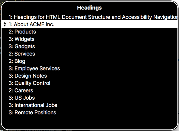
Navigating by heading alone, usually means exploring a list of headings out of context from the rest of the design. This makes it really important that your headings make sense on their own. Think of them as a content page for a book. Each heading should let the reader know what they are likely to find if they explore that section.
All functionality must work when using only the keyboard
It is important to think about how someone using only a keyboard would interact with your product. People who are blind tend not to use a mouse and instead opt for keyboard. People using a screen reader are also almost certainly using it with a keyboard.
This means it is important to think about the logical reading and tab order of your product. It should be very obvious what the next element to receive focus will be. It’s generally a good idea in left to right reading countries to follow top to bottom and left to right reading patterns.
Use common design patterns
Everyone likes things to feel familiar. There’s a comfort in familiar, which tends to show that things in your product will work as the user expects them to. For this reason, it is always important to stick to convention where possible. Don’t use common design elements for things in which they aren’t intended to be used.
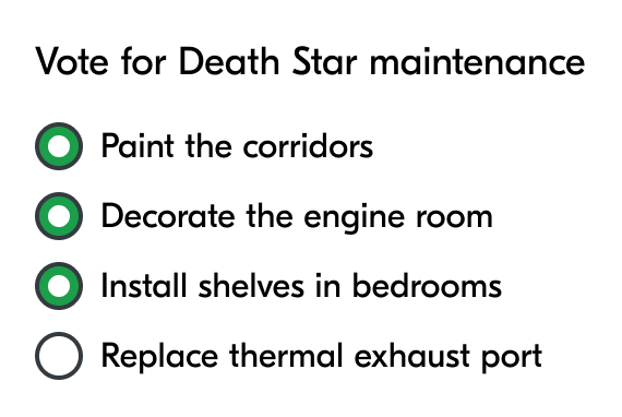
In this rudimentary example above, the design uses radio buttons for an option that accepts multiple choice. Radio buttons were designed to only accept single choice answers. Checkboxes were designed for multiple choice.
Following convention is especially important when it comes to accessibility because standard HTML elements tend to work well with most assistive technology. When creating a new convention or incorrectly using a design pattern it requires a lot of effort to make the design work for things like screen readers.
Users must receive feedback after actions, via their screen reader
When you’re designing your products it is important to think about the entire flow. What happens after a form is submitted? If someone deletes an item how do they know it has been deleted?
Feedback is important for everyone, but it is especially important to consider how people using a screen reader receive that feedback. If they don’t receive that feedback they may never know anything has occurred.

When designing feedback, it is important to remember that some people take longer to achieve tasks than others. That means it is generally a good idea to leave feedback on display until a user decides to dismiss it.
It is also important to think about where to place the feedback. You should place the feedback close to the item that initiated it, so it is easy to find and flows logically.
All features should be available via a click
Screen readers tend to make certain gestures impossible. On top of that, as mentioned earlier, most people who are blind will navigate via their keyboard so any gestures that require a mouse, like drag and drop, are impossible.
When designing a feature to use gestures, it is important to always provide an alternative method to perform the same action using only a keyboard.

In the example above, users can upload a document by either dragging and dropping their document into the designated area. Alternatively, they can select the ‘Upload document’ button to select their file from their device.
Videos require audio descriptions
If your designs incorporate video, at the very least, you must ensure the team creating the video provides a transcript. A transcript is a text version of the content in the video and can be used to describe the action.
It is even better to provide an audio-described version of the video so people who can’t see it still understand what is going on. Here’s an excellent video describing what audio description is.
What’s next for the cards?
The cards have been created as a reusable component in our product teams Figma library. Everyone has been encouraged to place them on any boards created for workshops and in their Figma file before they begin design work.
So far, 12 cards have been created covering different types of persona but they are by no means exhaustive. I’m going to look to add more cards and add more details to the existing cards over time.
Your feedback
Do you think these cards are something you would find useful? Do you have any suggestions for how they could be improved or added to?
I’d be really keen to hear your thoughts.

