The Why: Revealing untapped UI potential in Blue Bottle Coffee’s website
Recently, I came across a thought-provoking LinkedIn post by Joe Natoli, a UX consultant. He highlighted a critical problem surrounding the “Daily UI Challenges”, noting that designers doing this challenge are focused solely on the visual aesthetics. They share images without providing any text or explanation, overlooking the most important parts — the STORY, the PURPOSE, and the WHY behind their designs.
As I took on the Daily UI Challenge, Joe’s insights resonated with me, shedding light on why I was struggling with each challenge. Originally, my goal was to focus on improving my UI skills, but with each challenge, I found myself questioning every design choice. I shifted my perspective, delving into the “why”, and exploring the meaning behind each decision I made. After all, it’s not just about designing something visually pleasing — it’s about articulating the reasons behind every design choice.
Here are some highlights from my Daily UI Challenge. I redesigned Blue Bottle’s website, revealing untapped opportunities that have been missed.
404 Error Page
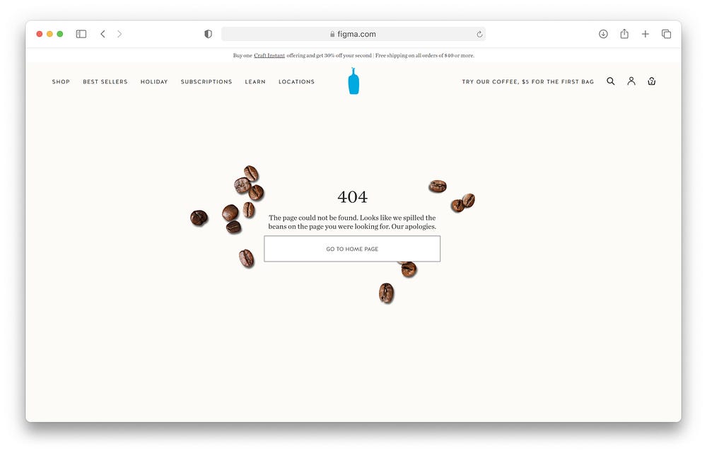
The 404 error page is often neglected, so it’s not a surprise that Blue Bottle missed out on this opportunity. Designing this page is crucial, because when users land here, it disrupts their flow, leading to frustration. Once the flow is interrupted, users may lose interest in the site.
Problem:
- While the current page effectively communicates that an error has occurred, there’s a lack of guidance on how users can recover from this situation. This oversight may lead to user drop-offs.
- Missed opportunity with branding.
Solution:
- In a clear and empathetic tone, I crafted messaging that apologizes for the error while adding a playful element to it. The message not only addresses the issue, but also provides a solution to guide users back to the home page. Additionally, I made sure to include the navigation bar. For users, who may prefer not to return to the home page, the navigation bar offers an alternative path. These changes will likely reduce user drop-offs.
- I took the opportunity to enhance the overall design, by seamlessly aligning the page with the brand’s identity creating a more cohesive experience. Making users feel seamlessly connected, as if they never left the website

Download App
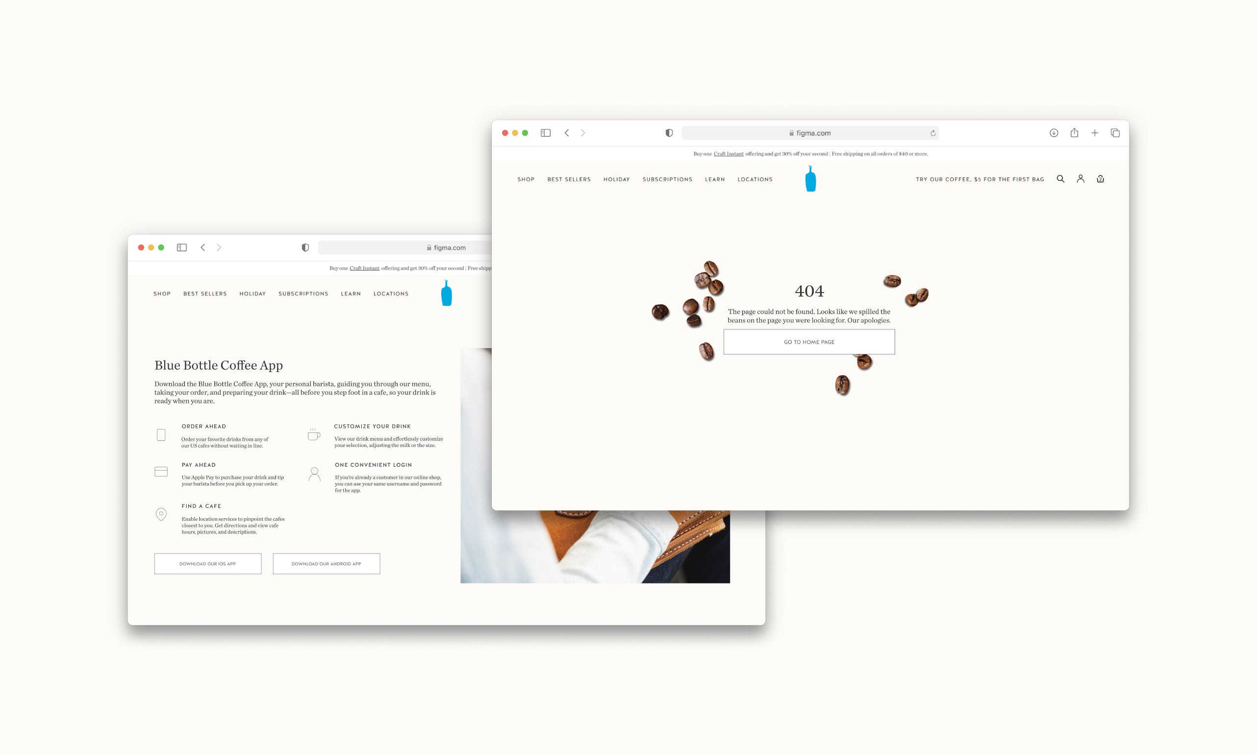
Blue Bottle has an app for ordering and pre-paying at their coffee shops, streamlining users’ coffee experience. However, on the website’s locations page, they overlooked a chance to promote their app. This valuable opportunity will not only benefit the user but also benefit the business.
Benefits for the user:
- Convenience
With the app downloaded onto the user’s phone, access is immediate. This not only speeds up locating a nearby coffee shop but also ensures quicker coffee retrieval. It brings consumers one step closer to that next satisfying sip of coffee.
Benefits for the business:
- Free advertising
When users are on the location page of the website, they are likely interested in finding a nearby coffee shop. By advertising the app on this page, providing both iOS and Android download options, and highlighting the main features of what the app can do, it will captivate users, enticing them to download the app. - Data Collection
Incorporating this into the website would certainly boost app downloads, enabling Blue Bottle to collect valuable user data. This, in turn, allows the company to better cater to customers, enhance services, and overall improve its business model. - Push Notifications — on the app
Blue Bottle can efficiently market to users by sending strategic push notifications, such as during mid-day/afternoon slumps to boost and encourage purchases. Push notifications can also serve as reminders, keeping the business in users’ minds and increasing the likelihood of them returning. Timing is crucial in sending these notifications to maximize their impact.

Breadcrumbs
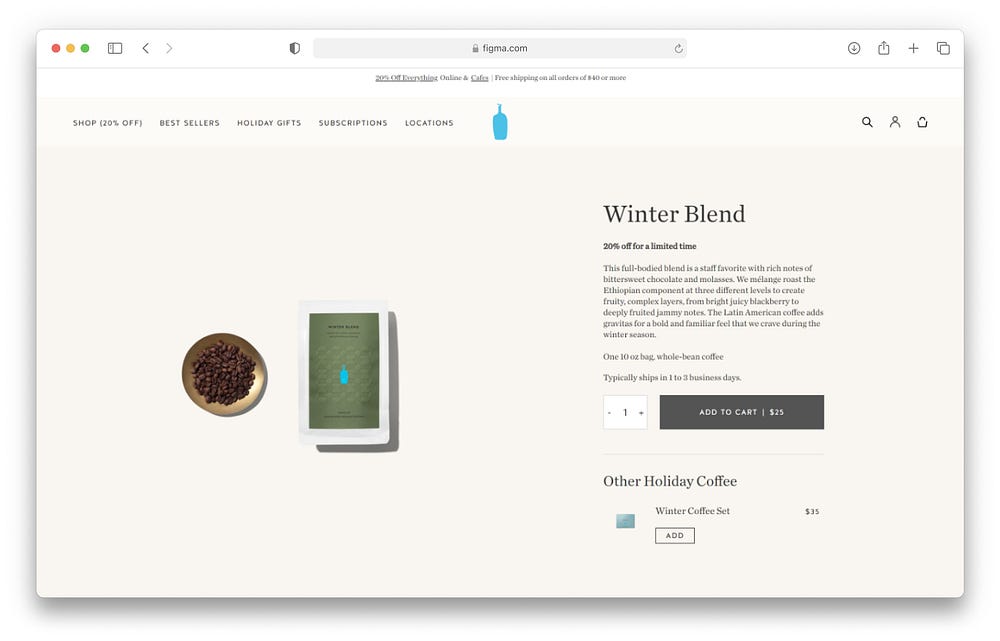
Another well-neglected feature that people forget to design is breadcrumbs, and Blue Bottle missed incorporating this essential navigational element. Breadcrumbs aid wayfinding, keeping users aware of their current location within the website’s hierarchy. They are particularly valuable when users enter the site through an external link.

Well, this was a fun one! I enjoyed diving into the reasons behind my design choices and discovering ways to improve Blue Bottle’s website. If you’re doing the UI Challenge as well, are you designing purely for aesthetics? If so, I encourage you to revisit your design and tell the STORY, the WHY behind your design decisions!
If you enjoyed this one be sure to give me a clap. If you have any feedback or comments leave them below. Would love to hear other people’s perspectives on my redesign.
If you enjoyed this one be sure to give me a clap. If you have any feedback or comments leave them below. Would love to hear other people’s perspectives on my redesign. Otherwise, you can connect with me on LinkedIn (https://www.linkedin.com/in/michelle-ty-lee/ ) or email me (michelleleety@gmail.com).
Check out my portfolio: https://www.michelletylee.com/


