The UX of currency conventions for a global audience.
A guide on formatting currencies for digital interfaces.

Fifty thousand dollars
50,000.00 USD
USD 50,000.00
$50000.00
$50.000,00
US$ 50,000.00
$50,000.00 USD
What’s the right way to read and write currencies? Should they be locally recognizable or globally defined standards? Should they be a consistent across the product interface, or can they vary contextually? Should they be symbols or abbreviations?
Let’s jump into a short story.
John, from The United States is on a holiday in France. He incurred an expense of 123 456,78 $ in Monaco (France uses a comma as a decimal separator. The symbol is typically written to the right of the amount value with a hard space between the digits and the symbol).
Anyone in the US or these countries would read the amount to be twelve million three hundred forty-five thousand six hundred seventy-eight dollars.
But the actual amount spent is one hundred twenty-three thousand four hundred fifty-six dollars and seventy-eight cents.
One would write the same amount as $123,456.89 in the US (America uses a point as a decimal separator. The symbol is typically written to the left of the amount value with a non-breaking space between the digits and the symbol).
Does $123,456.89 mean the American dollar or could it also be the Canadian, Singapore or Hong Kong dollar?
Currencies can become confusing with varying representations and common currency symbols across varying geographies.
ISO 4217 is a standard published by the International Organization for Standardization that defines alpha codes and numeric codes to represent currencies. However, the ISO does not regulate either the spacing, prefixing, or suffixing in the usage of currency codes.
Localization in products can help present geography sensitive formats for an end user based on their location and personal preferences.
While defining a globally accepted standard could help make your product consistent, it need not necessarily be the most optimal view for your end users.
Why?
Users are reading currencies in different contexts. Hence a single format might not work everywhere.
Currencies can broadly be formatted in-
- Short format (The currency symbol written alongside the amount, e.g. $10)
- Explicit format (The currency symbol, amount, and the ISO code written alongside each other, e.g., USD 10 or $10 USD)
Context and currency
Quick reads, news, and updates
Space tech start-ups raise record funding amid billionaire hype
Space-related technology is a $200 billion market that spans companies building products and services to use on Earth, in orbit, or for space exploration and colonization missions
Space-related technology is a $200,000,000,000 market that spans companies building products and services to use on Earth, in orbit, or for space exploration and colonization missions.
I’m sure you counted the zero’s as you read the above figure to arrive at the number. One can only imagine the time spent on having to comprehend the numerical value if the amount was represented as written above.
Informal updates and quick reads can be represented in words for easier readability when the voice and tone of communication is casual.
Data that drives decision making
In contexts where a user is trying to understand, compare or make a decision, it is imperative to provide the user with currency in the explicit format to give at most clarity to the user.
Total amounts
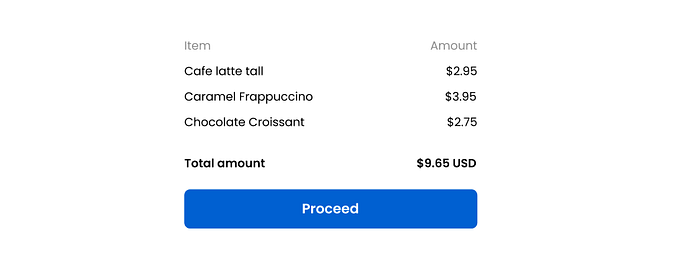
In invoices, bill summaries, and accounts, the total amount is usually the value that the user is most concerned with before checking out or proceeding. Using an explicit format for the total amount removes any scope for doubt and allows the user to proceed without any contemplation.
Currency in buttons

When currency is placed in a clickable element like a button, it involves the user making a decision before proceeding with the action. Using the explicit format here gives confidence to the user in making a fully informed decision.
Currency in data tables
Data without easy readability is like coffee mugs without handles. Data is abundant in the digital world.
When it comes to currency in tables, a user is mostly scanning across or comparing values. It is often harder to grasp and consume the information in a table than in stand-alone or isolated bits of data.

Items in data tables are typically left-aligned but doing the same with numerical values does not allow one to view numerical digits meaningfully. The place values of numbers are staggered and can be misinterpreted.

Right aligning numerical values with the currency ISO code placed to the right of the amount allows for quick and accurate scanning of currencies in a data table.
Repetitive and obvious information
Is it always necessary to use the explicit format? No.
While using the explicit format provides at most clarity, over-communicating information in obvious contexts increases the visual density of the UI and demeans the cognitive capacity of your users. They don’t always need to be spoon-fed.
In cases of unit prices, non total amounts, and repetitive list items, it is sufficient to use the short format. This helps present information in a cleaner manner and avoids over-communicating with users.

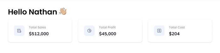
Dashboards and previews
Dashboards are usually interfaces that collate data for a specific user or account. Accounts are associated with a distinct user, geography and their preferences. Hence there is no scope for ambiguity in the type of currency displayed in ost cases, and the short format can be easily recognized by the user.
Dashboards and previews are also designed to give the user a quick update and are not intended for detailed study. Using the short format in these cases reduces clutter, simplifies, and helps absorb data in just a glance.
Negative currency
Negative currencies are typically enclosed within parentheses in accounting and finance.
($1234.56)
However, this convention is not commonly understood if your target users are not domain experts.
A friendlier representation uses the minus sign to signify a negative currency. While there can be geographical exceptions, the minus sign is usually placed to the left of the currency symbol, and it is the most commonly recognized format.


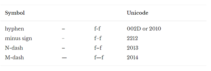
Hyphens are often confused for the minus symbol. Hyphens, dashes, and the minus sign look similar, but they’re not interchangeable.
Hyphens are short and visually dainty when placed beside a number glyph. One might almost miss seeing it. They are typically used for word breaks and multi-part words (e.g.non-profit).
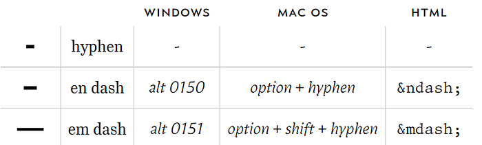
Dashes come in two sizes: the en dash and the em dash. The em dash ( — ) is typically about as wide as a capital H. The en dash (–) is about half as wide and visually matches the weight and size of a number glyph that it attaches itself to. It is acceptable to use an en dash in place of a minus sign since they are almost similar. However, the minus sign is typographically thinner and different from an en dash. Unicode clearly distinguishes each of these characters.
Color can also be used to signify negative amounts in the UI.
“Red ink”
The usage of red in finance can mainly be attributed to the old custom of accountants opting to use the color to denote losses. When company books were maintained manually, or by hand, red and black ink were convenient methods to call attention to those variables losing money, and those adding value.

However, using color to denote negative currencies can be used as an additional format to the minus sign rather than an alternative one since color does not always account for accessibility.
The above examples clearly illustrate how the placement and formatting of currency can impact how data is consumed by the user. While the examples may serve as guides for most cases, the ultimate design decision boils down to striking a balance between what your end-user is most familiar with and the context in which they are viewing the information.
Consistency is key, but context is king. Currencies within the product must be consistent to maintain product hygiene but can vary contextually to ensure appropriate communication of data with your end-users.