The UX Laws That Every Designer Should Know

In this reading, we will be seeing the 10 laws of UX, originally curated by the leading designer Jon Yablonski, in his book and on his website, lawsofUX.
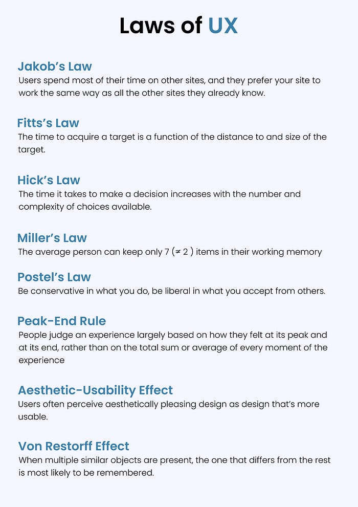
Jakob’s Law:
Users spend most of their time on other sites, and they prefer your site to work the same way as all the other sites they already know.
Below are screenshots of India’s top two food delivery companies.

As you can see, the App’s functionality is nearly identical. Take a look at the menu button at the bottom. One is placed in the center of the screen, while the other is kept on the right side, but both are kept at the bottom for easy access. Consider another app that places the menu at the top of the screen; users used to this navigation will undoubtedly struggle to find the menu button. “ The easier we make it for users to achieve their goals, the more likely they are to do so successfully. “
Does this mean that all websites or applications should follow the same design conventions?
Definitely not! The best advice out there is to always start with established patterns and conventions and depart from them only when it makes sense. If you can make a convincing argument for doing something new to improve the core user experience, it’s a solid indication that it’s worth exploring. If you use an unusual approach, test your design with people to ensure they understand how it works.
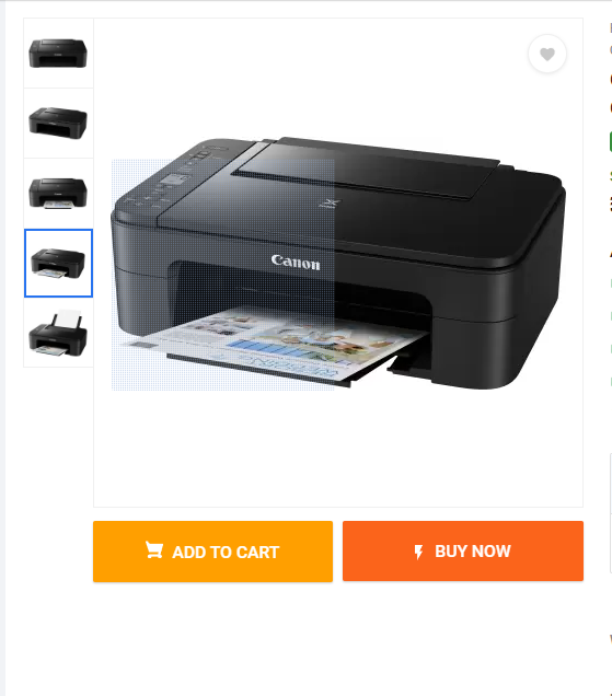
Fitts’s Law
The time to acquire a target is a function of the distance to and size of the target.
E-commerce sites have designed their “buy now” and “add to cart” buttons to be larger than average, a design choice meant to make the act of purchasing a product as quick and effortless as possible for the user.

While designing, make sure the touch targets are adequately sized to allow for accurate selection, that there is enough breathing room between them, and that they are strategically placed in areas that are easily accessible to the user. This will allow for a more intuitive and seamless user experience.
Hick’s Law
The time it takes to make a decision increases with the number and complexity of choices available.
Avoid overwhelming users by giving them lots of options. Recognize what users require and provide options accordingly. The best example of this is the Telvision remote we use.
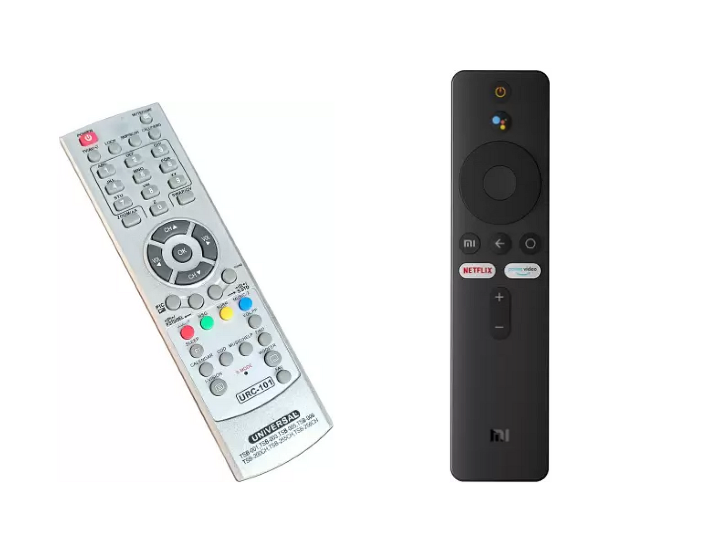
We had a lot of options with the old remotes. However, as technology advanced, features expanded, and you can see that the number of buttons decreased. As a result, the amount of working memory required to use the remote has been reduced.
Miller’s Law
The average person can keep only 7( ≠ 2) items in their working memory.
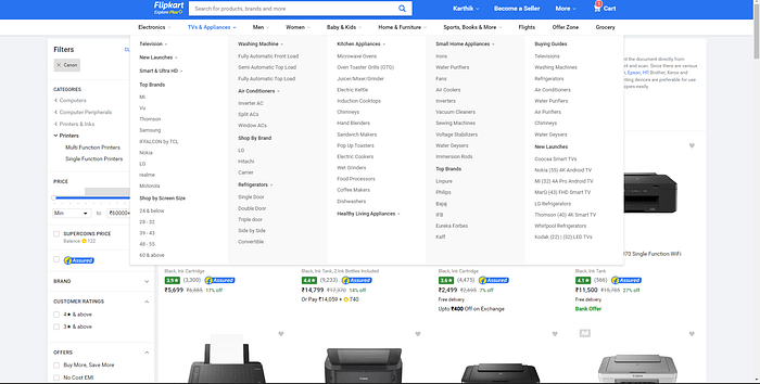
The best way to implement this law in our design is through chunking. The simplest example of chunking can be found on e-commerce sites like Amazon, Flipkart, etc.
“ Don’t stick with the number 7 to justify the unnecessary design limitations. “
Postel’s Law
Be conservative in what you do, be liberal in what you accept from others.
Ask only the necessary information or inputs from the user and find a way to decode the information. This will reduce the cognitive load on the users and increase their chances of achieving their goal. And try to build your design more like a human than a machine. If a user types "US" instead of "United States," accept it and convert the data to answer the user’s question.

Responsive web design is an example of Postel’s Law: Make your design more humanized by accepting whatever input the users provide. Determine which languages and devices your users use and design accordingly.
Peak-End Rule
People judge an experience largely based on how they felt at its peak and at its end, rather than the total sum or average of every moment of the experience.
Identify the moments when your product is most helpful, valuable, or entertaining, and pay close attention to them as you design it. Don’t forget that users recall negative events more vividly than positive ones.
Aesthetic-Usability Effect
Users often perceive aesthetically pleasing design as design that’s more usable.
We all know that people usually judge a book by its cover. So creating a design that is aesthetically pleasing will make users tolerate the minor usability issues.
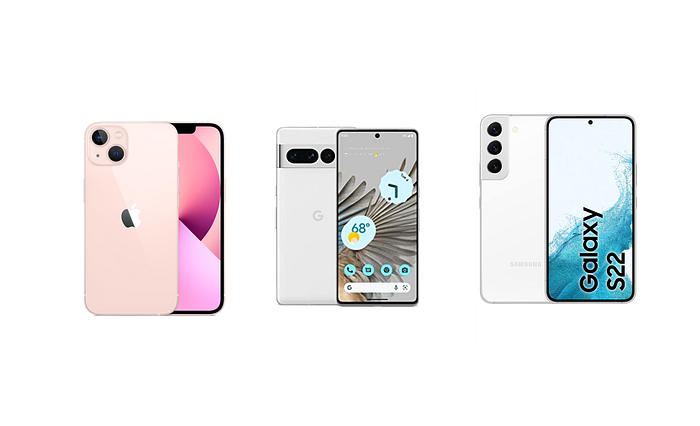
Why do people buy phones that don't have a headphone jack or don’t come with a charger in the box? Because the phones of those companies are so aesthetically pleasing, users are ready to buy them even if there are some minor usability effects.
Von Restorff Effect
When multiple similar objects are present, the one that differs from the rest is most likely to be remembered.
Grab the users’ attention to the important information or key actions that you want them to take by designing it differently, like giving it a different color, increasing the size, etc. That’s why we see the "buy now" button on e-commerce websites; they are uniquely designed.
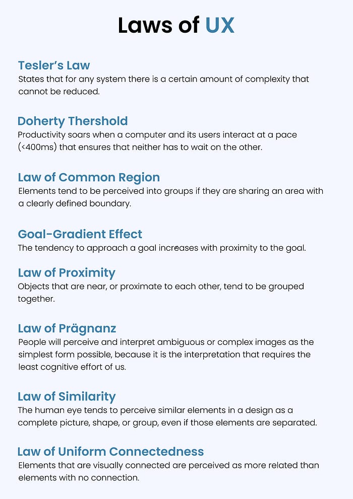
Tesler’s Law
Tesler’s Law, also known as The Law of Conservation of Complexity, states that for any system, there is a certain amount of complexity that cannot be reduced.
Each product has a certain level of complexity. We, as designers, should make sure that we reduce that complexity as much as possible. Take, for example, Disney Hotstar, which has a feature that allows you to end the credits and skip the episode’s intro.

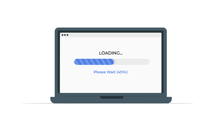
Doherty Threshold
Productivity soars when a computer and its users interact at a pace (<400ms) that ensures that neither has to wait on the other.
One of the key components of a positive user experience is performance. Long wait times can easily become unpleasant experiences and prevent users from reaching their goals. If we are forced to make the users wait, then adding some responsive elements to the design helps to create the perception that a website or an app is performing in the background. Loading screen is the best example of Doherty Threshold.
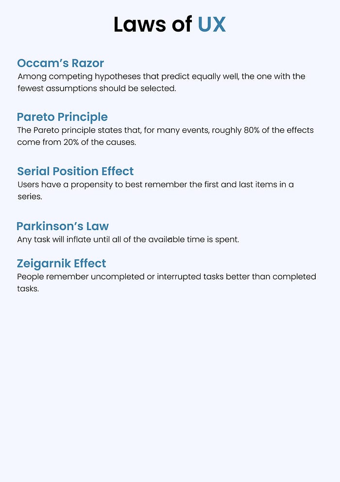
The other remaining laws of UX are:
Thank you for taking the time to read this far. I hope you had a wonderful day and learned something new from this article. If you have any suggestions or thoughts to share, please leave them in the comments below. Your input is always valued and appreciated.

