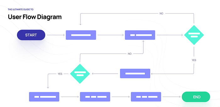
The ultimate guide to User Flow Diagram
User flow diagrams are indispensable in mastering user experience. They allow you to understand how users interact with your app or website, and the steps required to complete a task or achieve a goal on your website. In this article, we’ll look at the critical role user flow diagrams play in UX design, how to make a user flow diagram, and the best practices you should keep in mind. This will help you create a superior user experience for the user and meet their needs more efficiently.
What is a User Flow Diagram?
A user flow diagram (also known as an interaction or task flow diagram) is a step-by-step visual mapping process, outlining what a user does to finish a task or complete a goal through your product or experience. User flow diagrams are a tool used by the product and UX teams to figure out the optimal ways of interacting with the app after they define the user needs. To best understand these needs and the experience you want your users to have, it’s important to map and visualize them.
Why are they important?
A general rule that you should keep in mind is that the better you facilitate the user moving from start to finish on a particular process, the easier the product is to work with and the more likely that you are to deliver an awesome user experience.
Because of this, product managers, UX designers, and other product team members employ user flows. Here are some additional reasons:
Promote user-centered design
The most important aspect of user flows is that they force the product team to think through their product’s interface from the user’s perspective.
Diagramming the user flow can help interpret the quality or experience of the path a user chooses. The flow can also reveal how many steps they chose to complete a task and what pathways they decide to take when interacting with your product or service to solve a pain point.
Doing this work upfront can lead to a more intuitive product that delights customers.❤️
Communicate product goals and plans to stakeholders.
User flows create a visual illustration of the steps a user will take to get things done in an app.
Having this visual walkthrough helps everyone understand what the product should do, in what order it should present the user with information, and why each feature or page belongs where it is.
Speed up development and reduce errors
When developers are working from a visual depiction of how the user will complete tasks in the product, they are more likely to code the product in the way the product team envisions. This reduces the chances of rework and delays.
How to make a user flow diagram
When crafting your user flow diagram, discuss the following with your team:
- What is the user trying to do? — Determine your objective and your users’ objectives.
- What is the entry point into this flow? — Identify where your users are coming from.
- What extra information will the user need to be successful? — Identify what information your users need and when they need it.
- What are the user’s hesitations or barriers to accomplishing the task? — Identify the challenges and keep them in mind when designing the full experience.
As a visual tool, the user flow shows the relationship between a website or app’s functionality, potential actions a user could take, and the outcome of what the user decides to do by using a standard set of symbols that are universally understood. Let’s have a look at the most common flowchart symbols used in UX design and what they mean:

- Oval — start or endpoint
The oval symbolises the start or the end in a flowchart.
- Rectangle — process or action
The rectangle symbolize steps in the process. This is your go-to symbol in any flowchart and by far the most commonly used.
- Parallelogram — input or output
The parallelogram symbolizes input/output of external data.
- Diamond — decision
The diamond symbolise decisions. This will typically split your flowchart using arrows.
- Arrow — direction
The arrow symbol is used to represent a flow direction. This will be, coupled with the rectangle, your go-to symbol.
A user flow helps us get a better understanding of the steps a user takes through an entire service, app or a website. Let’s have a look at a simple example — entering an eCommerce site to purchase confirmation — and how a user flow diagram using the symbols presented above could look like:

However, once the design team wireframes their product’s screens, their user flow diagrams often substitute the rectangles for these screens. This combination of a user flow and a wireframe is sometimes referred to as a Screenflow in the design world.

Which tools should I use?
There are a multitude of tools to chose from — see a complete list here.
My top recommendation would be Miro as it is incredibly easy to use. Miro’s whiteboard tool is the perfect canvas to create and share your diagram. Here is the link to the User Flow Template that you can use to create your own.
User flow diagram is a tool in your UX design process offers a lot in return with very little effort. Hopefully you will use it in your next design project.

