The Ultimate Guide to Responsive Design: Bending Pixels for Optimal User Experiences
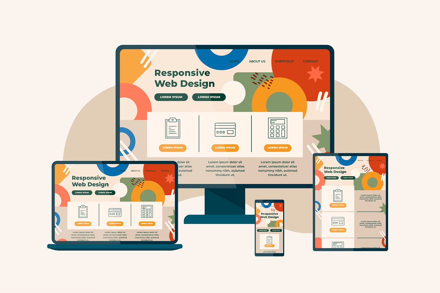
The digital frontier expands beyond desktops and laptops. Smartphones, tablets, and a universe of other devices rule the land. As designers, we’re pioneers crafting interfaces that bend and flex, conquering this diverse landscape with responsive design as our weapon of choice.
Imagine pouring your heart into a website, only to witness its pixelated demise on a phone. Responsive design saves the day, ensuring your interfaces deliver optimum experiences regardless of the screen real estate users claim.
The Pillars of Responsive Design:
- Flexibility: Ditch rigid pixels for fluid grids and adaptable sizes. Text, images, and buttons should gracefully waltz across different screen dimensions.
- Media Queries: These are the secret whispers that tell your website how to shapeshift. Using screen width, viewport size, and even device orientation, they trigger layout adjustments for a pixel-perfect fit on every device.
- Content Prioritization: Not everything deserves front-row seats on every screen. Identify the essential content users crave and make it readily accessible, regardless of device. Think hierarchical structures and progressive disclosure for a layered user experience.
- Touch-Friendly Thinking: In the mobile kingdom, fingers rule, not mouse pointers. Buttons need to be bigger, tap targets generously spaced, and interactions intuitive for the touch-centric world.
Responsive Design Tools:
- Design Thinking: Put on your user’s hat and understand their device interaction styles. Empathize with their needs and prioritize design decisions accordingly.
- Prototyping Powerhouses: Tools like Figma, Adobe XD, and Sketch let you mock up prototypes and test responsiveness across various screen sizes. See your design bend and adjust before a single line of code is written.
- Front-End Frameworks: Bootstrap, Foundation, and Material Design offer pre-built components and code snippets that jumpstart your development process and ensure consistent responsiveness, saving you precious time.
Tips & Tricks for Responsive Awesomeness:
- Start Responsive, Stay Responsive: Don’t wait until the eleventh hour to add responsiveness. Build it into your design DNA from the very beginning. It’s easier to design with flexibility in mind than to retrofit later.
- Testing is Key: Don’t trust emulators alone! Get real users involved, testing your design across a variety of devices and screen sizes. Observe their interactions and identify any bumps in the road to user delight.
- Iteration is Your Friend: Responsive design is a journey, not a destination. Be prepared to refine and adapt your layouts based on user feedback and evolving trends. The digital landscape keeps changing, so your design should too.
Beyond the Basics:
Responsive design goes beyond screen size. Consider factors like different browsers, resolutions, and accessibility needs. The more flexible and adaptable your design, the wider your reach and the better the user experience.
Embrace the flexibility, bend your pixels with grace, and leave a lasting positive impact on your users. Go forth, conquer the digital frontiers, and design interfaces that dance across screens, leaving pixelated frustration in the dust!
Bonus Tip: Remember, white space is your friend! Don’t cram elements together on smaller screens. Use generous spacing to create a clean and user-friendly experience, even on the tiniest of devices.
Now, go forth and bend those pixels with the confidence of a responsive design master! This is just the end of Chapter 1! Let’s connect and share ideas. Whether you’re a fellow design enthusiast or simply curious about the digital world, let’s take the conversation to the next level!
Happy designing!
