The Ultimate Guide To Best Free Font For UX UI Design
The most important element of delightful design is Typography. The text represents more than 90% of all the information on the internet. Investing your time in typeface or choosing the right fonts for your project is a vital role in web design, web applications, and mobile applications. The user visiting your digital products or services for probing solutions, the only way to communicate on your website is to read your offered content. You’ve chosen the wrong font for your website or if your users are unable to read your content due to bad typography or small size, then you’re having a towering bounce rate on your website.
This article will guide you through The role of typography in design, Elements of typography, Typography resources, Define type scale guidelines, and introduce the best Ten free fonts for your web design project.
The role of typography in design
The great design is a great experience. The people acknowledge that communication is fundamental in any industry. If you have bumped into someone on the street, while you’re talking you addressed that she or he has good communication skills, and ceased meeting the experience was great. Definitely, you’d share that with your friends about the incident, isn’t it? On the other, typography helps the design to deliver information to people that’s include font size, font width, font color, and line length — all elements of typography work together to create a great user experience.
Elements of typography
Before choosing a typeface better understand the function of typography or fonts.
Typefaces and Fonts
Sometimes we may address ‘typeface’ and ‘Fonts’ hand-in-hand. However, those are not the same thing. A typeface is a design of type, while a font is a type of a particular size and weight. In short, a typeface is something like a family, and fonts are parts of it according to Nick Babich
Limit the number of fonts
First thing is first, too many fonts neglect your user experience and user interface. Most designers may use two font is one for the Header section and a secondary for the body, button, caption, and overline. Recommending you can add the limit is three fonts, despite if you’re focusing on great experience then you should move with one font.
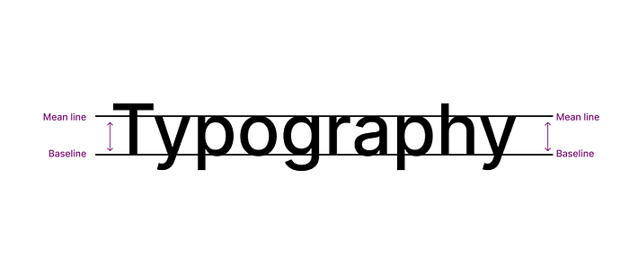
Mean line and Baseline
The mean line marks the top and the Baseline sign bottom of the body character. In another way, the mean line hanging on top and baseline resting of the body character.
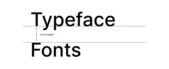
Line Height
The distance between the mean line and the baseline of lowercase letters in a typeface. The scaled line height vital part of the reading score.
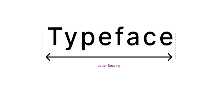
Letter Spacing
Profusely the word expresses the space between each letter. The graphic designers set a wide range of space between text for poster design, despite the web designer setting minimal space between letters for reading scores.
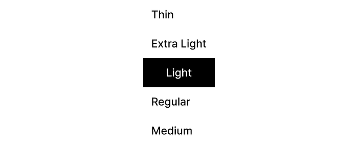
Font Weight
The designers choose fonts with the implication of font-weight. The font weight represents Thin, Extra Light, Light, Regular, Medium, Semi Bold, Bold, and so on. The font weight is interchangeable from Headline 1 to Overline.
Base Line
The baseline is an inevitable font size in your website or web app, and mobile app. The baseline is known as Default or Primary it’s mainly used for body copy, labels, menu, and list. In the modern design, the website’s default size is 16 PX, iO’s baseline size is 11 PX, and Android baseline text size is at least 12 PX up to 14 PX.
Discovering new Typeface
The designers are prone to finding font pairs or identifying typefaces for the project subject. As usually people seeking through typefaces or fonts from Google search recommendations or following influence designers on social media, misfortune you select the typeface or fonts for urgency, on the other that fonts are limited sources even you don’t use them properly.
Here I’m introducing a couple of tools that will eliminate your font pairs or typeface obstacle from now. Though guide you similar fonts for your existing fonts because designers use more than one font for the project Header section and Body section, sometimes the situation demands two fonts.
Fontjoy
Fontjoy is a number one priority tool for Typography design. Fontjoy assists you in finding similar fonts for your project for instance you decided on Poppins as your header font although the Poppins Subtitle and Body character may be a bad selection. You can ask Fontjoy for ideal fonts for your website, and the procedure is very simple to devote your prime font lock it, and generate.
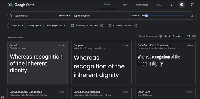
Google Fonts
Many designers are seasoned web designers don’t fall back on premium fonts instead use google fonts, and Google offers a wide range of typefaces and fonts. Google is a leading Search Engine market on the internet, therefore most of their free fonts are available in WordPress and other CMS to build your websites.
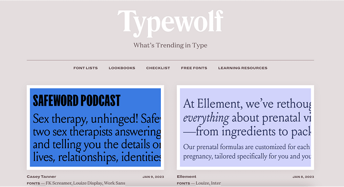
Typewolf
Typewolf is an awesome website for Typography resources and it was created by Jeremiah Shoaf. Typewolf showcases a variety of typefaces, the advantage is offering type hierarchy through the live website, that illustrates how it’s suitable for headers, body characters, and Buttons.
Define Type scale guidelines
The aforementioned finding typeface or fonts is really frustrating but in my perspective finding font scale is very tough until I met these websites. Before that usually I do, throw a ring and select a random font size even don’t care about the line height or letter spacing. Even though Material Design and Typescale guide me in the measurement of Heading one font weight, font size, and so on.
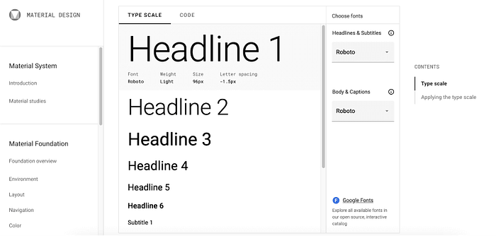
Material Design
Material design created by Google and this absolutely free source for scaling your fonts. Material design offers two sections for scale one for the heading on the other for the body and caption. If you’re a style guide designer in Figma, you can replicate the screen on your canvas this is a shared language with other designers and engineers.
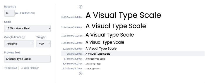
Typescale
Typescale is a perfect website for your font scale, when compared to Material design it’s complicated in my experience. The brownie thing is the typescale is starting from the Baseline you can adjust your baseline for your website.
How to choose the best fonts
Every year new fonts are released enormously and it’s daunting to pick the right fonts for your website. Though pleasant designer is a font with multifaceted font weights at least six font weights, like I remind you before Thin, Extra Light, Light, Regular, Medium, Semi Bold, Bold, and so on.
I’m sharing with you the top 10 free fonts for your website. The introducing fonts have multifaceted font weights, and these fonts are supported in Material Design type scale guidelines.
Inter
Inter is a Google font and easily the most popular UI design font. The Figma designer is familiar with this font because Figma is set as their Default font. Inter a shines through the good legibility, readability, and perfectly symmetrical characteristics of each letter.

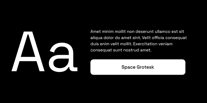
Space Grotesk
Space Grotesk is based on Mono space, and the font was designed by Colophon Foundry in 2016. Many designers choose Space Grotesk as a font for a project involving Fintech or any tech branding for its iconic flared Serif. Space Grostek is excellent readability at small and large scales.
Roboto
Roboto is an open-source San serif typeface created for legibility in UI design. Roboto offers a variety of weights that read easily at all sizes, and Roboto provides clear headers as well as highly-readable body text. This font is a default font on the Android and Chrome operating systems.

Montserrat
Montserrat is a geometric sans-serif typeface designed by Argentinian designer Julieta Ulanovsky, and inspired by posters and signage from her historic Buenos Aires neighborhood of the same name. Montserrat is often mentioned as the coolest free alternative to Gotham and Proxima Nova.

Open Sans
Open Sans is a humanist sans serif typeface designed by Steve Matteson, Type Director of Ascender Corp. Open Sans was designed with an upright stress, open forms, and a neutral, yet friendly appearance. It was optimized for print, web, and mobile interfaces, and has excellent legibility characteristics in its letterforms.

Lato
Lato is a humanist sans-serif typeface designed by Łukasz Dziedzic. It was released in 2015. The name “Lato” is Polish for “summer”. Lato is used on more than 9.6 million websites, and is the third most-served font on Google Fonts, with over one billion views per day.

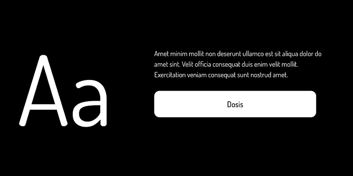
Dosis
Dosis is a free font, is a very simple, rounded, and San Serif family. It comes with seven multifaceted weights Extra Light, Light, Medium, Regular, Semi-Bold, Bold, and Extra Bold. The over result is a family that’s clean and modern based on my experience because it’s my website font, you can check shareefrahman.com and see how the headings, body character, and buttons text are working. Also, let me know your experience :)
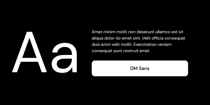
DM Sans
DM Sans is produced by Google from Colophon Foundry with creative direction from MultiAdaptor and the DeepMind team. It’s a low-contrast geometric san serif design intended for use for smaller text sizes.
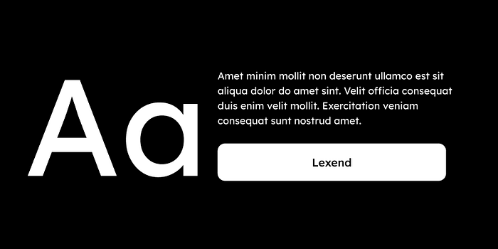
Lexend
Lexend was developed by Thomas Jockin based on research studies, and it introduced Google through Google Docs, Sheets, and Slides to eliminate reading struggles and it’s designed to improve reading speeds.
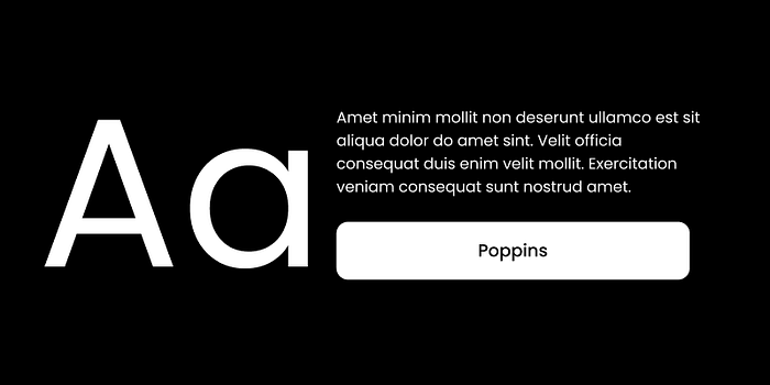
Poppins
Poppins is a geometric sans-serif typeface published by Indian Type Foundry in 2014. It was released as open-source and is available for free on Google Fonts. Indian Type Foundry describes Poppins as “an internationalist take on the geometric sans genre.
Conclusion
Typography is a core skill in the modern digital world the good typeface enhances the user experience of your visitors, and a bad selection of font affects your website performance, recommending change your font and changing your outcome. Perhaps mastering typography is tough but the only way is to practice and learn from the best resources.
Would you like to create Style Guide in Figma for your UI? In a nutshell, we can connect through Linked In or via email chat.