The Psychology of Color in UX Design: How Color Affects User Behavior and Emotion
A deep dive into the science behind color psychology and how it can be used in UX design to create better user experiences.
Color is an important element in design, and its effects go beyond aesthetics. In fact, color plays a critical role in shaping user behavior and emotion in UX design. Understanding color psychology is therefore an essential component of creating effective user experiences.
In this article, we’ll take a deep dive into the science behind color psychology and how it can be applied in UX design. We’ll explore how color affects user behavior and emotion, and we’ll provide practical tips for using color in your designs to create better user experiences.
The science behind color psychology
Color psychology is the study of how colors affect human behavior and emotion. This field of study is based on the idea that different colors have different psychological effects on people, and that these effects can be used to influence behavior and emotion.
Research has shown that colors can have a significant impact on mood, perception, and even physical reactions. For example, warm colors like red and orange are associated with excitement and energy, while cool colors like blue and green are associated with calm and relaxation.
Understanding these color associations and the psychological effects of color can help designers create more effective user experiences. By choosing the right colors for a design, designers can elicit specific emotions and behaviors in users.

Color and user behavior
Color can have a significant impact on user behavior in UX design. For example, using a bright and contrasting color for a call-to-action button can draw the user’s attention and encourage them to take action.
On the other hand, using a muted color for a non-critical element can help reduce visual noise and keep the user focused on the most important parts of the design.
Additionally, color can be used to create visual hierarchy in a design. By using color to distinguish between different levels of importance, designers can guide users through the design and make it easier to navigate.
Color and emotional design
Color can also play an important role in emotional design. Emotional design is the process of designing products that elicit specific emotions in users, such as joy, excitement, or calm.
By using the right colors, designers can create emotional connections with users and enhance the overall user experience. For example, using warm colors like red and yellow in a design can create a sense of excitement and energy, while using cool colors like blue and green can create a sense of calm and relaxation.
However, it’s important to note that the emotional response to color is not universal. Different cultures and individuals may have different emotional associations with certain colors, so it’s important to consider the target audience when using color to create emotional connections.
Using color in branding
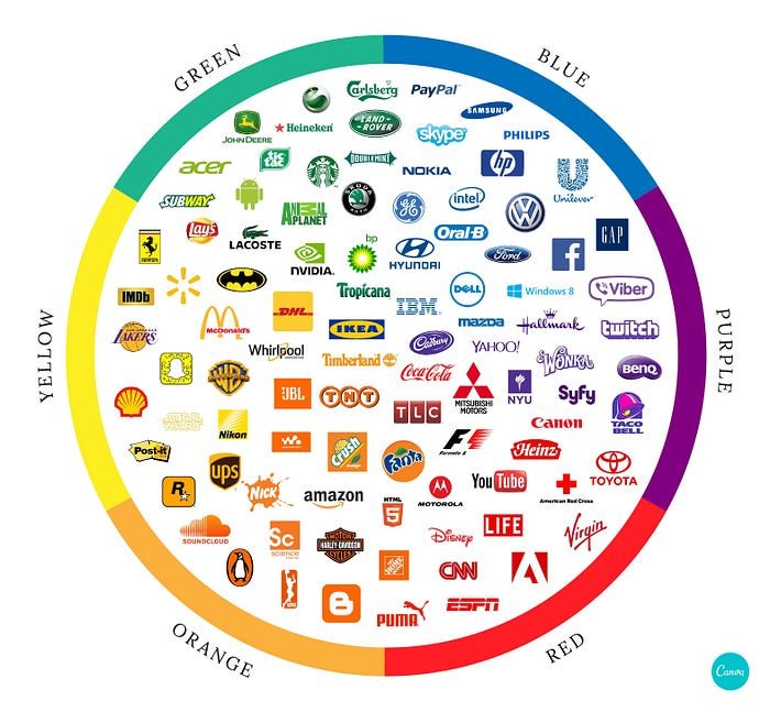
Color is also an important element in branding. The colors used in a brand can elicit specific emotions and associations in users, and can help create a strong brand identity.
For example, the color blue is often used in technology brands to convey a sense of reliability and trustworthiness. The color green is often used in eco-friendly brands to convey a sense of sustainability and environmental awareness.
When using color in branding, it’s important to choose colors that are aligned with the brand’s values and message, and to consider the emotional associations that the colors may have with the target audience.
Practical tips for using color in UX design
Here are some practical tips for using color in UX design:
- Use color to create visual hierarchy and guide users through the design.
- Use contrasting colors for call-to-action buttons to draw the user’s attention.
- Use muted colors for non-critical elements to reduce visual noise.
- Use warm colors like red and orange for elements that require attention or energy.
- Use cool colors like blue and green for elements that require calmness or relaxation.
- Consider the emotional associations of colors when choosing them for a design.
- Test the design with the target audience to ensure that the colors are effective in eliciting the desired emotions and behaviours.
Conclusion
Color plays a critical role in shaping user behavior and emotion in UX design. Understanding color psychology and its effects on user behavior and emotion is therefore essential for creating effective user experiences. By using color strategically in a design, designers can create emotional connections with users, guide them through the design, and encourage specific behaviors. Write
As a UX designer, it’s important to consider the cultural and individual differences in emotional associations with color and test designs with the target audience to ensure the effectiveness of the chosen color schemes. Color is a powerful tool in creating user experiences that are both aesthetically pleasing and effective in eliciting the desired emotions and behaviors from users.
👋🏼 If you found this article helpful and would like to stay updated on the latest design and productivity tips, be sure to follow me on Medium. I regularly publish articles on design, technology, and productivity, and I would love for you to join the conversation. You can click the “Follow” button on my profile to get notifications of my new articles, and feel free to share your thoughts and feedback in the comments. I look forward to connecting with you!

