
The Most User Friendly Website
--
In the digital design world, creating a portfolio website is about more than just showcasing skills. It’s about building a space where visitors can easily navigate through your professional journey. That’s what I aimed for with my new portfolio website, designed in the style of MacOS on web and iOS on mobile and tablet. It’s a straightforward, user-friendly approach that breaks away from the clutter we often see in this space.
I dove into user experience (UX) and human-computer interaction (HCI) design to make this happen. The idea was simple: create a portfolio site that feels familiar to almost anyone who visits, thanks to the ubiquitous interfaces of MacOS and iOS. This wasn’t about copying Apple’s style; it was about leveraging the intuitive, user-centric design ethos that Apple has nailed down so well.
This project was also about rethinking the portfolio itself. It’s supposed to be the bridge between a designer and the visitor, but too often, it ends up being a maze of confusing layouts that do more to alienate visitors than welcome them.
The Problem with more Portfolio sites
Every time I’d venture into someone’s portfolio website, I found myself entangled in a web of complex layouts. It was as if the quest for uniqueness had overshadowed the essence of user-friendliness. I’d find myself lost, clicking through a labyrinth of pages just to find basic information. And the mobile experience? It often felt like an afterthought. Some sites even threw in the towel on smaller screens, displaying a “view in desktop” message. Seriously, that’s not how you showcase your adaptability as a designer.
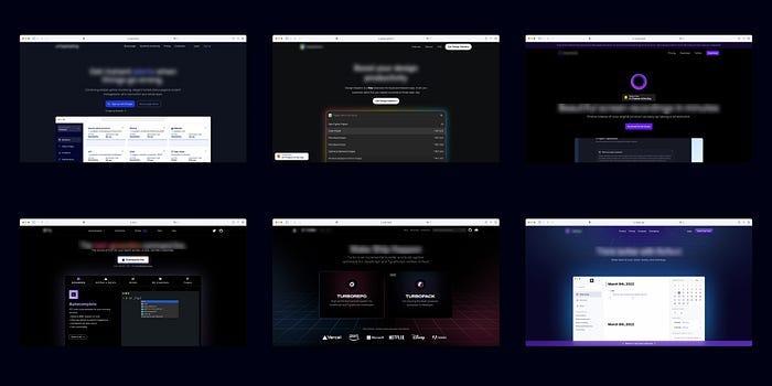
The pursuit of differentiation has led many down a path of complexity, where the primary goal of clear communication gets tossed aside. For instance, take a look at various user flows, dribble shots, and websites. They often venture so far off the beaten path in an attempt to stand out that they lose their core functionality. It’s like they’re speaking a different language, one that’s alien to the average user.
But Rico, Why do designers want to be sooo different? It’s because the space is pretty much split into two. Those who want to comply with the norms and those who want to be zero to one.
Heres what the former looks like:

When I blur the copy on these images trying to find a specific company from these landing pages becomes a guessing game. This visual noise, this is why designers aim to differentiate, is a prime example of what going from Zero to N looks like.
The irony is, in the race to be different, many end up blending into a sea of complexity that deters rather than attracts. This isn’t about shaming creativity or innovation, but about calling out the abandonment of user-centric design principles. The more complicated the layout, the steeper the learning curve for the visitor. And let’s face it, in a fast-paced digital world, no one has the time or patience to decipher a convoluted website.
Designers often fall into a common trap: the desire to showcase their creativity often trumps the fundamental goal of user accessibility. But what’s the point if your audience can’t navigate your portfolio effortlessly? The misplaced focus on being different for the sake of being different leads to a disservice not only to the visitors but to the designers themselves. It’s a missed opportunity to showcase one’s ability to balance creativity with functionality.
The prime example of this is the “view in desktop” message on mobile versions. It’s a clear sign that the design didn’t account for user accessibility across different devices. It’s not just about looking good; it’s about creating a seamless user experience regardless of the platform.
In conclusion, the chaos that often characterises portfolio websites is a call for designers to re-evaluate their approach. It’s about going back to the basics, prioritising user experience over flashy design, and ensuring your portfolio is accessible to all, regardless of the device they use.
Going from Zero to One: A Philosophical Dive

The design world often operates on a spectrum: at one end, there’s the “Zero to One” approach, and at the other, the “One to N” mindset. The latter is about taking what already exists, tweaking it, making incremental improvements. It’s the safer route, less risky, and often favoured in a field where deadlines are tight and budgets are tighter. However, it’s a path laden with familiarity, lacking the spark of innovation.
Now, shift the gaze to the “Zero to One” approach — this is where the magic happens. It’s about creating something entirely new, something that hasn’t been done before. It’s the road less traveled in design, often seen as risky or resource-draining. But it’s also where groundbreaking ideas are born, where designers can really push the envelope and create something fresh and exciting.
Look around, and you’ll see the “One to N” mindset reflected in many website designs. They adhere to certain templates, follow tried-and-tested layouts, and often shy away from straying too far from the norm. And then there are dribble shots and user flows that follow a similar pattern, becoming almost indistinguishable from one another.
This conformity is safe, yes, but it’s also stifling. It’s a loop of recycling and refining what’s already out there rather than venturing into the unknown. But the unknown is where innovation lives. That’s the essence of the “Zero to One” approach — stepping outside the comfort zone, facing the unknown head-on, and creating something truly unique from scratch.
The reasons why designers shy away from the “Zero to One” approach are many
- fear of failure
- lack of resources
- or the pressure to conform to industry or client expectations.
It’s easier to follow a set pattern, to use a familiar template, to meet the standard rather than set a new one. But in doing so, we miss out on the opportunity to truly innovate, to challenge the status quo, and to evolve the design narrative.
For instance, when analysing various user flows, dribble shots, and websites, the pattern of conformity becomes clear. Here’s where the example of the SaaS sites comes into play once more. When the copy on the images is blurred…
…distinguishing each company’s landing page amidst a sea of similar designs becomes a Herculean task. This visual demonstration is a stark reminder of what going from “Zero to N” looks like, and the lack of distinctive identity in many design outputs.
Now, juxtapose this with the audacious journey of going from “Zero to One”. It’s about crafting a narrative that hasn’t been told before, designing an experience that hasn’t been felt before, and ultimately, setting a new standard that challenges and inspires.
What makes it user-friendly?
The idea was to break free from the shackles of convention that seemed to bind many portfolio websites. I wanted to move beyond the typical, to create a space that was as innovative as it was user-friendly. The title of this journey wasn’t about boasting a fancy design; it was about making the most user-friendly portfolio site possible, and for that, I had to think from first principles.
When studying UX design, one comes across the concept of schemas — mental frameworks that help individuals process information based on their past experiences. Every user has a schema, but no two users have the exact same one. These schemas are shaped over time, through interactions with various interfaces and systems. Despite the individual differences, there’s a commonality in the way many of us interact with certain well-designed systems. Apple’s operating systems, for instance, have a way of aligning with users’ schemas, making the interaction smooth and intuitive.
In the sea of digital portfolios, being different for the sake of being different seemed to be the norm. It felt like a game where designers tried to outdo each other in creativity, often at the expense of user experience. But what’s the point if a visitor needs a map to navigate your portfolio? The objective should be to create an intuitive, enjoyable experience, not a puzzle that needs solving.
That’s why I steered away from the beaten path. By adopting a design reminiscent of MacOS on web and iOS on mobile and tablet, I aimed to tap into the existing schemas most users have. It’s highly unlikely that a visitor would feel lost on my site, as the interface is modelled after systems they use daily. They’re navigating my portfolio through a familiar environment, making the experience intuitive and the transition from section to section seamless.
It shouldn’t be a chore to find the information you’re looking for. With my portfolio, I wanted to challenge the status quo, to show that you can be creative and user-friendly at the same time. It’s about finding that sweet spot where design meets functionality, where creativity enhances rather than hinders the user experience.
Looking Ahead: Pixel Unicorn’s Philosophy
At Pixel Unicorn , the Design Studio I’m building, the ethos of going from “Zero to One” isn’t confined to my portfolio; it’s the bedrock of our design philosophy. In a world saturated with templates and cookie-cutter solutions, we aspire to tread the less traveled path of innovation. It’s about pushing the boundaries, not for the sake of rebellion, but for meaningful evolution in user experience design.
Our approach isn’t about discarding what works but about challenging what could work better. Each project is a canvas, an opportunity to question the norms and to explore the uncharted territories of design that resonate with users on a deeper level. Whether it’s web design, product design, or any other avenue of digital creativity, the goal is to stretch the boundaries of the conventional, to find that sweet spot where innovation enhances usability, not complicates it.
The hope is that viewing my site and reading this narrative will inspire others in the design community to think outside the box. To not fear the unknown, but to see it as a realm full of possibilities waiting to be explored. The “Zero to One” mindset is not about being different for the sake of being different, but about striving for meaningful innovation that pushes the design industry forward.
Embarking on this journey of conceptualising and bringing to life a unique portfolio website was about more than just showcasing my work. It was about challenging the norms, questioning the established pathways, and endeavouring to create a user-centric digital experience. The design philosophy of going from “Zero to One” was the compass that guided this venture, illuminating the potential of marrying creativity with usability.
The result is more than a portfolio website; it’s a narrative. A narrative that advocates for a user-centric approach to design, an invitation to fellow designers to break free from the shackles of the conventional and explore the unchartered territories of creativity. It’s about not settling for the easy route of following established templates, but daring to venture into the realm of innovative, intuitive design that enhances user experience.
I hope that as you navigate through my portfolio and read through this narrative, you’re inspired to think differently, to challenge your own design philosophies, and to explore the vast spectrum of possibilities that the “Zero to One” mindset opens up. At Pixel Unicorn, this philosophy is not just a tagline; it’s our driving force, a commitment to pushing the boundaries of what’s possible in design.
In the ever-evolving landscape of digital design, standing still is not an option. It’s about continuously learning, growing, and striving to create digital experiences that resonate with users, that are intuitive, engaging, and above all, user-friendly. The journey from “Zero to One” is an invitation to innovate, to evolve, and to make a meaningful impact in the design world.

