The Martians Mobile App— a UX/UI Case Study
Using 3D-printing technology to build your home on Mars
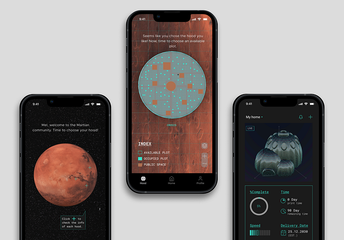
My Role: research & design, individual project
Timeline: 2 weeks (Aug.2022 — Sep.2022)
Platform: iOS mobile app
Tools: Figma, Rhino, Grasshopper, pen & paper
Project Brief: think of a unique idea that you can translate into a digital app. This idea should (not must) be futuristic — using technology that we don’t yet have but could be possible. The idea should solve a real problem for the users.
Summary
As the first mobile app I’ve designed, first of all, I must say that I’m very happy with the final outcome👏👏👏This is an interdisciplinary practice that I challenged myself — trying to achieve it from both the Architecture and UX/UI perspectives. This means the content in the info card is meaningful. The Martian cities and buildings shown in the app are based on scientific approval.
Although this two-week journey was intense and I got stuck many times, I managed to unblock them in the end. The biggest challenge for this project was finding the user’s motivation and making sense of the storyline.
This project taught me how to ground a broad topic into a clear design path, and how to ask the right questions to find the user’s motivation.
Project Background
Coming from an architectural designer’s background, I have always dreamed of designing houses in outer space. On this futuristic project of mobile app design, finally, I got the chance to build something on Mars.
Although it sounded exciting at first, the developing process was just like the surface of Mars, full of bumps! However, this journey of overcoming those bumps revealed to me the most interesting part of UX design — human psychology.
Design Process
Value Proposition
The app can help the new Martians to build a house in harsh conditions on Mars. By leveraging 3D-printing technology, users can customize their own homes before their arrival on Mars.
To validate the value proposition, I followed these six steps:
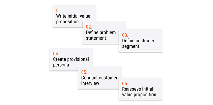
However, due to the wrong questions that I asked while conducting the customer interview, the validation failed.

Bump💣…First Interview (failed)
Unexpectedly, after talking to 3 interviewees, I realized something was not right. They all had no interest in moving to Mars! Rather than thinking about the house, many other concerns were raised:
…Actually, I am not interested in living on Mars. But if I have to, I need to know my neighborhood first. What will the Martian city look like? Will my family and friends move there as well? …
(quote from one interviewee)
The user feedbacks were not helpful, instead, it confused me even more — I couldn’t find the user’s motivation, moreover, I have no clue what features I should design for. As a novice in UX/UI design, the first time I realized that understanding the user’s motivation is vital.
Once you understand the user’s motivation, the design will follow.
To unblock this bump, I learned that the problem came from the interview questions — they were still too broad and vague. Since this is a very futuristic topic, I should give the interviewees a certain context, putting them into a story and then asking them the according questions. Because I didn’t define the context well, my interviewees started to lead me, create their own context, and give irrelevant feedback.
Secondary Research (succeed)
Learning from the failure of the first interview, this time I decided to start with online research, aiming to find more clues to help me build up my story. While browsing Mars-related news, I found the so-called “The Mars One Mission”. This ongoing mission plans to land the first Mars colonists by 2023, with more than 165,000 applications willing to participate.
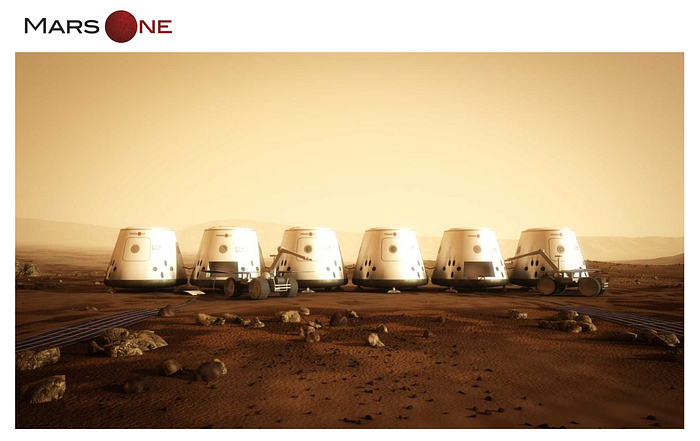
While digging deeper into the Mars One Mission, excitingly, I found the right users who fit exactly my project’s user persona:
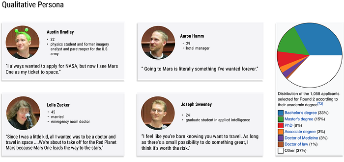
According to the motivation of the applicants, finally, I was able to build up my project’s story and reassess the value proposition:
The Backstory of the App
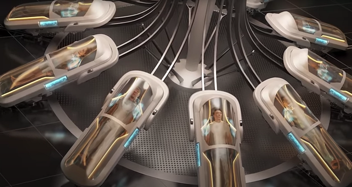
It’s been three years since “The Mars One mission” sent the first colonists to Mars. The mission was a huge success. The first colonists, or the Martians as they should be called now, found sufficient resources on Mars and built three hoods called: Rith, Nuva, and Crossis. As the three hoods are developing rapidly, more human support is needed. Therefore, “The Mars Two Mission” was recently launched with the aim of attracting 10,000 talented researchers and space enthusiasts from various fields. Those chosen will receive 50 funding tokens to use to build their own house on Mars. The app is designed to help them quickly build a home before their arrival on Mars.
User Flow
Since this application takes place in the future and may be slightly different from the one we know nowadays, I decided to show a new user onboarding flow:

Sketches & Wireframes
Based on the new user onboarding flow, I started to sketch the wireframes and translated them into Figma:


Visual System
Moodboard
Based on the material I collected, I prepared two moodboards. Option A won the test with 54.5% votes, so I chose option A as the app’s moodboard.
Which mood board do you associate more with the following attributes?
• futuristic • progressive • techy • laboratory • spacecraft

Style Tile
Based on the chosen moodboard, I made style tile as a guide:

Final Design
Key Moment 1: Onboarding
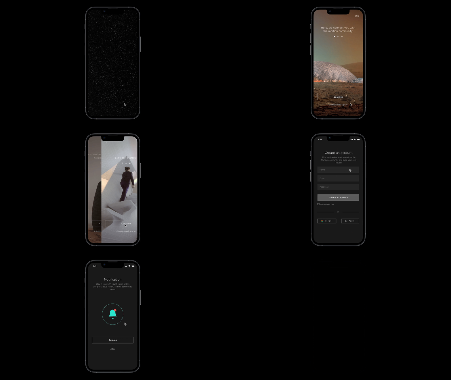
A scrolling Mars slowly appears on the screen, introducing you to the app’s two main features. You will then be guided through a new user registration page.
Key Moment 2: Choose A Hood
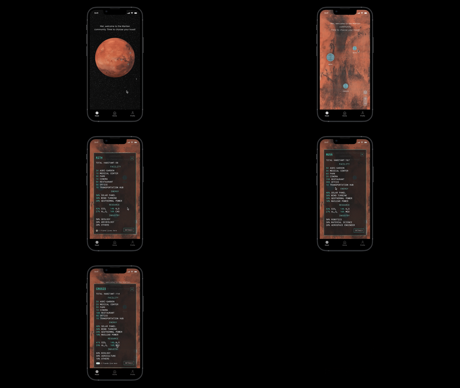
At present, three hoods are built on Mars, which are Rith, NUVA, and Crosis. You can click the cursor of each hood and view its info card. At the bottom of the info card, you can also find if any of your friends live here.
Key Moment 3: Choose A Plot
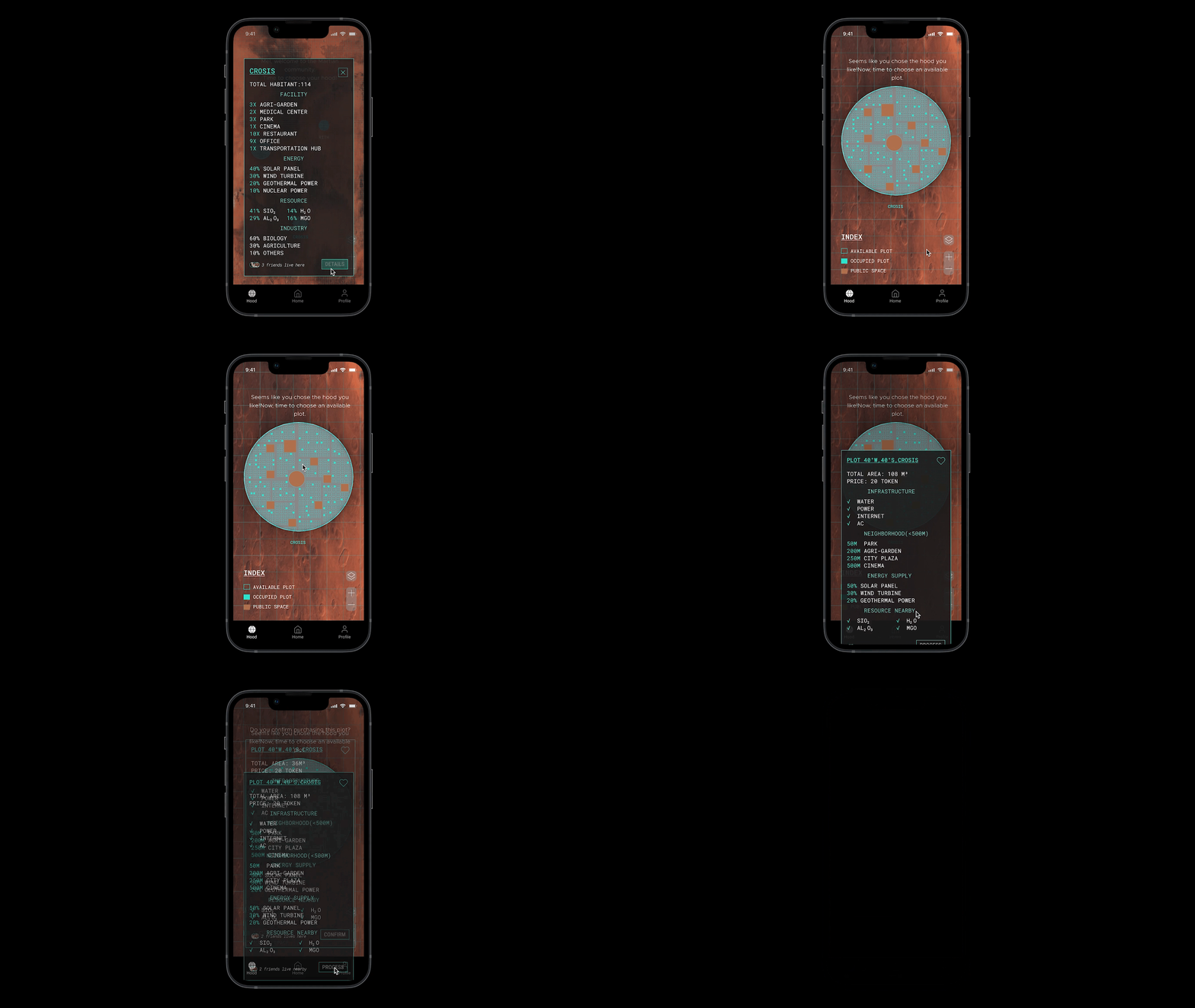
After clicking the “detail” button on the hood Crosis, the city map slowly unfolded. Vertical and horizontal streets cut the land into plots. Different colors indicate different functions of the land. Based on the index, you choose a plot and read the info card.
Key Moment 4: Choose A House Type
The app offers three types of homes with detailed instructions for each. After choosing your home type, you will be taken to a customization page where you can personalize your home.

Key Moment 5: Confirm & Track The Progress
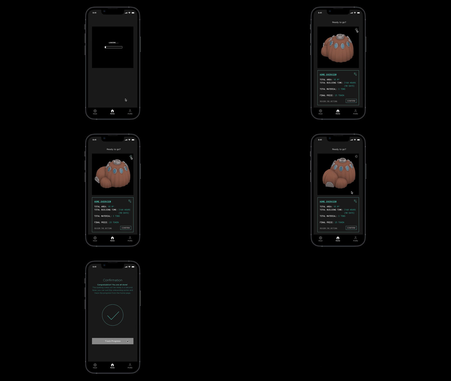
Once loaded, the app generated a 3D model with rotation capabilities. It gives you a panoramic view of the house from every angle. After some minor adjustments, you confirm the final version and send the model for printing. The screen then takes you to the tracking dashboard where all relevant 3D printing data can be found.
Testing
After completing the application design, I sent it to 6 users for testing. Most feedback is positive, except for some small improvements, such as increasing the size of the buttons and adding the readability of text (size, color).
Takeaway
Mobile apps are much harder to design than desktops due to limited space on mobile devices. Therefore, accessibility should always be kept in mind.

