The Journey from Newton to Today’s color theory
Understanding the key aspects of Color Schemes in color theory
In the whimsical world of colors, there is an undeniable emotional power that the colors hold. They have a knack for speaking to us on a level beyond mere shapes and forms, tapping into the depths of our souls. It seemed almost irrational until the brilliant minds of color theory stepped in to shed light on this magic.
Let’s talk about how these enchanting hues entice us, play with our feelings, and ignite our creative sparks. They do it by forming special relationships, like the coolest duos in town. We’ve got six main contenders stealing the spotlight:
- Analogous color scheme
- Monochromatic Color Scheme
- Complementary color scheme
- Split-Complementary color scheme
- Triadic Color Scheme
- Tetradic Color Scheme
A brief history lesson
Sir Isaac Newton himself unleashed his scientific genius to explain the logic behind it all, and us designers, well, we’re familiar with it (or so we like to think), even if we don’t always use it consciously. In the 1660s, Newton began a series of experiments with sunlight and prisms. He demonstrated that clear white light was composed of seven visible colors today called Newton’s Rainbow.
You see, these relationships serve as the foundation of our knowledge gained from countless hours in design schools and years of experience. But here’s the funny part: sometimes, we need a gentle reminder to revisit the basics and marvel at colors in this extraordinary way. It’s a journey that brings us inspiration, floods our minds with ideas, and provides the much-needed clarity we crave.

Fun fact: Aristotle developed the first known theory of color believing it was sent by God from heaven through celestial rays of light. He suggested that all colors came from white and black (lightness and darkness). For more than 2000 years, Aristotle’s captivating ideas held sway, shaping the understanding of colors until being replaced by those of Newton.
In 1720, Johann Wolfgang von Goethe challenged Newton’s views on color, arguing that color was not simply a scientific measurement, but a subjective experience perceived differently by each viewer. His contribution was the first systematic study on the physiological effects of color. Goethe’s views were widely adopted by artists. Although Goethe is best known for his poetry and prose, he considered Theory of Colors his most important work.

“Colour are light’s suffering and joy.”
–Johann Wolfgang von Goethe
Enough of the history lesson now! Grab your creative compass and let’s embark on an adventure through the captivating world of complementary and analogous color schemes. Prepare to be amazed, tickled, and maybe even fall in love with colors all over again. Trust me, it’s going to be a colorful ride!
The Color Wheel — The Bedrock of color theory
Picture those vibrant wheels that Drew Carey spun on ‘The price is right’ TV show, like a rainbow dressed in an organized fashion. Today, we’re dusting off that memory and bringing it back into the spotlight, for it holds the key to unraveling the mysteries of color schemes.
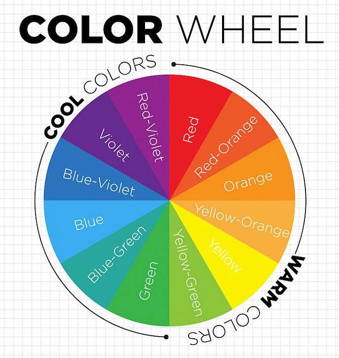
The Color Wheel stands tall as the foundation of color theory, guiding us through the fascinating realm of different color relationships.
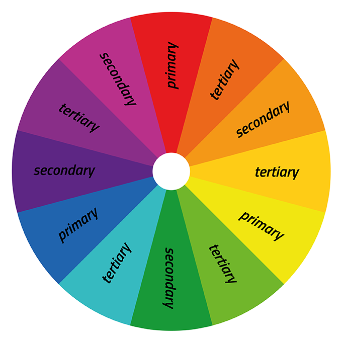
Now, let’s dive into the time-honored wisdom of traditional color theory, gifted to us by none other than the legendary Sir Isaac Newton from the 16th century (cue applause 👏👏👏). According to this theory, colors can be grouped into three delightful categories:
- Primary,
- Secondary, and
- Tertiary.
Think of primary colors as the bold heroes of every paint set: red, blue, and yellow, ready to conquer the canvas.
Secondary colors, on the other hand, are the result of a secret alliance between two primaries. For example the enchanting offspring of purple, orange, and green fall into this category!
And let’s not forget about the mischievous tertiary colors that play hide-and-seek between the primaries and secondaries. They bear names like red-violet, yellow-orange, and blue-green, adding a dash of intrigue to our colorful adventure.
Unveil a scientific secret
Objects don’t possess colors in the way we imagine. Instead, they possess the power to deflect light, and it’s the way our brilliant brains perceive this light that brings colors to life. If an object decides to absorb all light frequencies except for red, our mind paints it as a vibrant shade of red. If an object boldly deflects all light, we hail it as the mighty white. And if it chooses to greedily absorb every single ray of light, we shudder in darkness and call it pitch black. Isn't this pure magic!
Take a moment to cast your gaze upon the Color Wheel, and you’ll notice the colors that cozy up together on one end, harmoniously mingling like old friends at a vibrant soirée. In contrast, the colors seated on opposite sides seem to engage in a dance of contrast and surprise. But why does this happen? Ah, my dear curious reader, the answer lies just around the corner. Let us proceed on this whimsical journey of discovery together!
The Analogous Color Scheme
Ah, let me weave a colorful tale about the captivating world of analogous color schemes. Imagine a gathering of colors on the illustrious color wheel, where certain hues sit side by side, creating a harmonious slice of the spectrum. These hues form the backbone of analogous color schemes, consisting of a marvelous trio: a main color, a supporting color, and an accent color.
Picture a delightful ensemble of reds, pinks, and purples gracefully mingling together, or perhaps a lively squad of blues, greens, and turquoise engaging in a chromatic dance. Due to their close relationship and striking resemblance, these colors collaborate to create a unified and sometimes even monochromatic appearance.
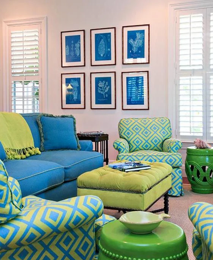
There’s something undeniably pleasing about analogous color schemes, for they exude a sense of balance, tranquility, and neutrality that resonates deeply within us. These magnificent color palettes find their place in various realms of design, from graphic design to interior design. Through the clever use of different shades and tints, they breathe life into spaces, infusing them with depth, intrigue, and an enchanting harmony. Think of that quintessential monochromatic look we all recognize instantly — the captivating shades of blues that evoke visions of vast oceans, summer skies, and the serenity of water.
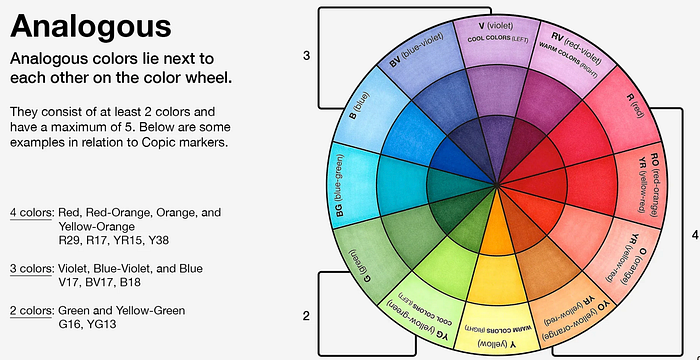
On the color wheel, analogous colors hold a special place. They nestle comfortably beside each other on the color wheel, forming a harmonious bond that delights the eyes. Imagine the seamless transition from blue to blue-violet and then to violet — these hues are practically destined to create a visually pleasing symphony due to their close proximity.
In the enchanting world of analogous color schemes, the most common group consists of three colors. However, rest assured that a minimum of two colors is required to embark on this delightful journey. But, dear designer, don’t get carried away! Remember that a maximum of five colors is the golden rule. Anything more, and you risk only exploring half of the magical color wheel, missing out on the full spectrum of possibilities. So, let your creativity flourish within the boundaries of this vibrant family, and let the harmonious dance of analogous colors weave its magic!
TIP: Analogous color schemes work best for data visualisations or data-heavy products.
The other different color schemes
Let’s embark on a colorful journey and explore the vast array of color schemes beyond the realm of analogous. While analogous color schemes bring joy and excitement to your designs, there’s a whole palette of options for you to explore. Let’s dive in!
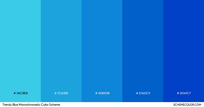
1. Monochromatic Color Scheme: Embrace the power of a single base color and unleash its full potential by incorporating various shades to add depth and dimension to your Design. Imagine a range of captivating blues coming together to create a mesmerizing harmony in your product.
2. Complementary Color Scheme: Prepare to meet the dynamic duo of the color wheel — complementary colors! These captivating pairs reside on opposite ends, creating a striking visual harmony that captures our attention. Picture some of your beloved sports teams: the LA Lakers donning vibrant violet and bold yellow jerseys, or the Chicago Bears proudly showcasing the combination of blue and orange. Now, while it’s highly unlikely to find a sports team sporting the colors red and green due to their strong association with the holiday season (Santa Claus approves!), you can easily envision the power of complementary colors.
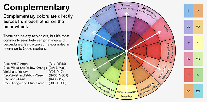
Complementary colors exude a natural balance that draws us in. They always consist of a warm and a cool color, creating a captivating contrast that ignites our senses. Whether it’s the fiery passion of red paired with the refreshing coolness of green, or the electric energy of violet alongside the vibrant warmth of yellow, these complementary color pairs mesmerize us with their captivating interplay. So, embrace the power of complementary colors and unleash their harmonious energy in your designs!
3. Split-Complementary Color Scheme: Prepare to play with a trio of colors that exude delightful synergy. Start with a base color and complement it with the two colors adjacent to its complement on the color wheel. Imagine the captivating blend of blue, red-orange, and yellow-orange coming together to create a dynamic and eye-catching palette.
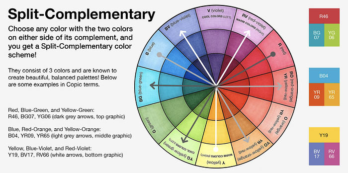
For instance, consider the complement of violet, which is yellow. In a split-complementary color scheme, we expand the palette by embracing the neighboring colors of the complementary hue. In this case, we welcome the enchanting companionship of yellow-green and yellow-orange. These shades blend seamlessly with violet, creating a captivating trio that evokes a sense of balance and visual interest.
Nature itself showcases the splendor of the split-complementary color scheme on numerous occasions, particularly within the realm of flowers. Just envision a lovely violet pansy with its delicate yellow-orange highlights gracefully accentuated by the surrounding yellow-green leaves. The result is a truly mesmerizing sight, brimming with natural beauty and harmony.
4. Triadic Color Scheme: Triadic color schemes are a captivating exploration of color harmony that brings together three colors equidistant from each other on the color wheel. This delightful trio forms a harmonious relationship, creating a vibrant and visually appealing palette. Let’s uncover the magic of triadic color schemes!
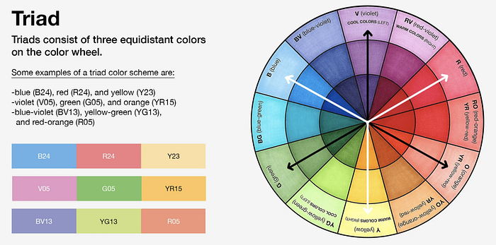
Imagine the color wheel as your creative playground. To create a triadic color scheme, you select three colors that are evenly spaced from one another, creating an equilateral triangle on the color wheel. This selection ensures a balanced and dynamic interaction between the colors, resulting in a visually striking composition.
For example, you might choose the timeless trio of blue, red, and yellow. These primary colors form the foundation of the triadic color scheme, and their equidistant placement on the color wheel creates a sense of balance and visual harmony.
Triadic color schemes offer a diverse range of possibilities. They infuse your designs with a lively energy and a captivating interplay of colors. Whether you’re seeking a bold and vibrant aesthetic or a more subtle and harmonious combination, the triadic color scheme provides a versatile palette to work with.
5. Tetradic Color Scheme: Tetradic color schemes, also known as rectangular color schemes or double complementary color schemes, are a captivating exploration of color combinations that involve four colors. This harmonious quartet is derived from selecting two pairs of complementary colors on the color wheel. Let’s dive into the fascinating world of tetradic color schemes!
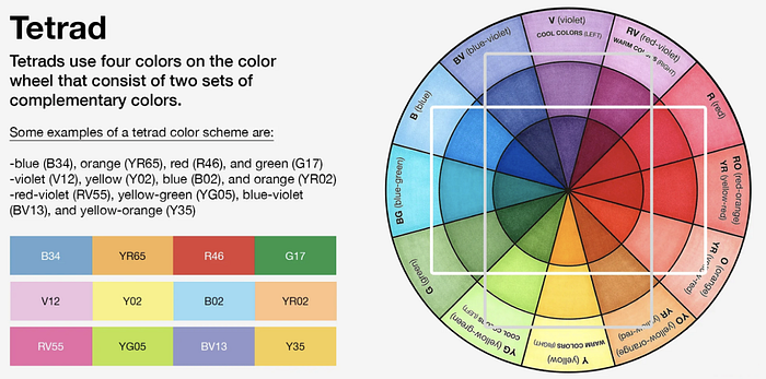
Brace yourself for a vivid burst of creativity with a quartet of colors. To create a tetradic color scheme, you start with a base color and then select its complement on the color wheel. From there, you choose another color that is two steps away from the base color on the color wheel, creating a vibrant and diverse palette. Lastly, you complete the quartet by selecting the complement of the second color chosen.
For example, envision the following combination: blue as the base color, its complement being orange, a secondary color two steps away being violet, and the complement of violet being yellow. This quartet of colors creates a visually dynamic and balanced tetradic color scheme.
Tetradic color schemes offer a rich variety of hues and allow for a wide range of possibilities in your designs. They provide a striking contrast and an exciting interplay of colors. When implemented thoughtfully, tetradic color schemes can add depth, vibrancy, and visual interest to your creations.
In conclusion, remember these color schemes act as a springboard for your creativity, inviting you to play with lightness, darkness, and saturation to add depth and dimension to your app or website. They serve as a starting point, allowing you to embark on an experimental journey and discover your unique design narrative. So, let your imagination run wild and create something truly extraordinary!
Let me know your thoughts…
— — —
Thanks for reading! If you found it helpful, please share it with your friends and colleagues. If you enjoyed this post, consider following me, and this will inspire me to write more!
You can also subscribe here to get new articles delivered right to your inbox! Or, if you would like to pick my brain on any design topic, block a slot with me!

