Case study: When being different is more important than serving the customer
The HVV (Hamburger Verkehrsverbund) recently did a brand refresh and updated their mobile app and website to match a new design language. Personally, I think some decisions that were made here are pretty controversial and deserve some more attention. This case is an excellent example, in my opinion, of a public service attempting to appeal to a younger audience by making their brand more “edgy”. More often than not, this means that the most basic design principles and rules of accessibility are scrapped in order to be bold and fancy, creating a worse user experience for everybody.
For all those not familiar with what the HVV is, here is a little breakdown from Wikipedia:
The Hamburger Verkehrsverbund (HVV) (English: “Hamburg Transport Association”) is a transport association coordinating public transport in and around Hamburg, Germany. Its main objectives are to provide a unified fare system, requiring only a single ticket for journeys with transfers between different operating companies, and to facilitate and speed up travel by harmonising the individual companies’ schedules. At its inception in 1965, HVV was the first organisation of this kind worldwide.
Source: https://en.wikipedia.org/wiki/Hamburger_Verkehrsverbund
Pretty cool, huh?
Misunderstanding design
A short lecture in design (since I think it is needed): Design is not Art. Art can exist and stand for itself. Design, on the other hand, always serves a simple yet important purpose. Making things easier to understand.
Good design makes things simple and intuitive. It’s often not even noticeable because it steps aside to let the users focus on their task. Giving subtle hints to push them in the right direction towards their goal gently. Good design creates easy-to-understand and predictable systems.
Bad design, in contrast, complicates things. It is loud, overwhelming, and distracting. Drawing away focus from the actual purpose and claims all the attention for itself by, for example, making fonts harder to read, colors harder to distinguish, patterns challenging to understand. The less users are familiar with the medium (website, app, newspaper, etc.) the design is covering, the easier it is for the user to get confused and overwhelmed, and the harder it is for them to notice patterns.
Accessibility denied
That being said, it’s completely fine to do bold design. It’s fine. As long as you’ve ensured your users can handle it. In this particular case of the HVV redesign, you might want to settle for a more accessible design approach, though, since your target group is as brought as it can possibly be.
The HVV is a public transport provider. Thus, a redesign should be done to serve the needs of… you guessed it … the public. Especially in Hamburg, which is one of the biggest and most diverse cities in Germany, this should be priority NUMERO UNO. Obviously, numerous people will be affected by that change.
Thus, there is a lot of responsibility involved when attempting a redesign like that. Everybody who wants to move around the city will eventually come across this new design. We’re talking about older people, people with bad vision, people with all types of disabilities, people that are in a hurry or not very tech-savvy, just to name a few. All of those people have to be considered every step of the way. Every design decision has to be carefully checked against all those cases to create something significant.
This redesign worries me because it straight up ignores all those people by combining those colors, putting thin text on top of noisy images, and by creating an overly complicated and inconsistent app experience.

I wish the stereotypes were true, and Germany really still was the country of fax machines. Because then everybody would have noticed that this logo doesn’t translate well to black and white.
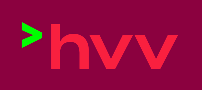
Putting light-green symbols on a bright-red background would be a questionable decision for any company. For a public service provider, though, it’s just not acceptable. Whoever thought this was a good idea had, I’m very sorry, no idea what they were doing and (even more important) for whom.

To be fair, on the HVV website, there is an accessibility switch that basically removes all design and reduces the page to a wireframe-like state. But when the only way to make your design accessible is to wipe it completely, you might want to rethink some of the decisions you’ve made on the way.

With that being out of the way, let’s focus on the actual point of this article. Since I’m not much of a corporate design guy but a product designer, I wanted to talk a bit more about the usability and information hierarchy of the new HVV iOS app.
The new HVV app
Maybe I’m missing something, but the general task of getting a bus/train ticket is pretty straightforward and can be broken down into three basic steps:
- I figure out where I am
- I know where I want to go
- I buy the ticket
The new HVV app does a remarkable job in taking this easy-to-understand outline and turning it into a complicated quest. There are literally dozens of steps and screens and dialogues and overlays that serve no purpose other than making stuff way more complex than it has to be.
No matter where I swipe or tab, screens are coming from all over the place. Some of them fade in, some slide from the left, and some from the right. Some screens are so similar in looks and functionality that they might as well be the same screen. Ever so often, there’s even the possibility to swipe down to reveal content that’s hidden behind the current screen. This app is all over the place and severely lacks a clear and straightforward navigation concept, which makes it nearly impossible to buy your ticket in one go. Especially, on the first try. Especially, if you are not a heavy smartphone user.
Settling for one transition type, one primary action concept, and one flow per action without confusing branches would have helped a lot. As often in life, less is more here as well.
Let’s try to buy a ticket together, shall we?
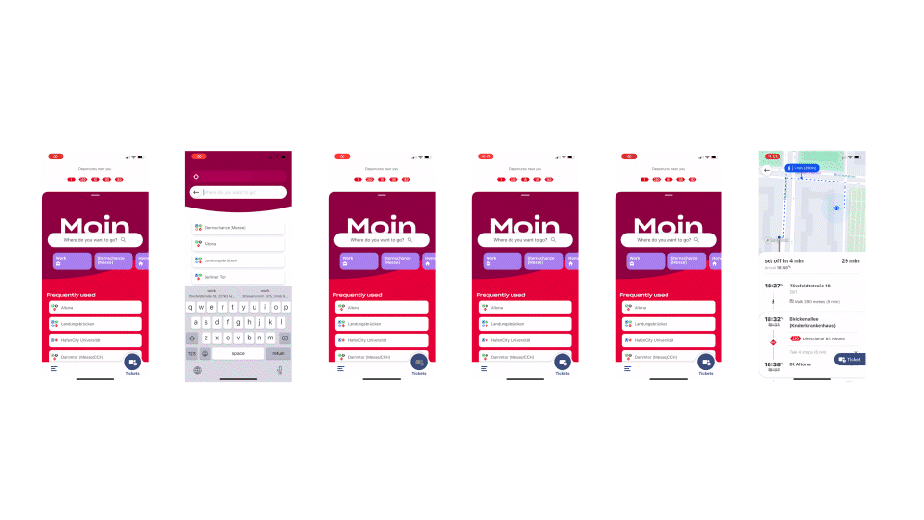
In order to better visualize what I’m talking about, I want to go over the basic ticket flow with you and discuss every screen on the way in detail. Because it’s the details that make or break a great user experience.
Step 1 — Open the app
First, I have to use spotlight to search the app because there is no way I would want to have that app icon anywhere near my home screen. That eye cancer causing light green arrow on RGB(255,0,0) is securely hidden in the depths of the app library, of course. It stands out that I have to admit. But does it have to? I don’t think the HVV should be competing for my attention against TikTok, Instagram, or Snapchat.
That seems like nitpicking, but I think it’s not. Just respect my home screen and create an App-Icon that can live and harmonize next to all the other apps on my phone. I’d like to have you on my first page, but I can’t.

Step 2 — Entering the Main screen
I open the app, and I’m greeted with a very fancy placed “Moin” that seemingly tries to hide behind the search bar to keep its dignity. It’s a small design choice, but I bet it’s off-putting for numerous users already because it’s not evident whether this is intended (I guess so), or if it’s a mistake.
Underneath, there is a headline saying, “It’s looking pretty empty here”. This is funny because that statement couldn’t be further from the truth. The screen is filled with lines and lines of text. For sure one of the most bloated and uninspired onboarding copies, I’ve ever read. This is a pity because it entirely ruins the first impression. Why even bother to communicate all that information? There is nothing I can do about that empty state as of now. Even worse, as an inexperienced user, I might feel the need to read that text only to find out it doesn’t really help.
Here’s the exact text; I hope you feel welcomed.
It’s looking pretty empty here.
The more often you enter a destination, the more we learn from you — and show you your frequently used destinations here. So let’s start looking, set, and go. You can soon change that, though — by searching for connections! We’ll list the places you travel to frequently here in the future so that you can select them directly.
So… get searching!
Empty states, in my opinion, are some of the most important screens in an app because users see them a) if they are new b) if there is something wrong. In both cases, you as a designer want to ensure to support the user and build trust. That’s the best place to be playful and fun and take away all that anxiety users feel when faced with too many options.

Apart from the overwhelming empty state, there are more actions than I can count on one hand. Let’s break them down:
- I can slide down to see the times of departure for busses and trains near to me.
- I can search where I want to go.
- I have a number of locations I can curate myself.
- If the empty state is not there, I have a frequently used destinations list that fills automatically.
- There’s a ticket button that leads to an older-looking view where I can buy all types of special tickets (Single Tickets, Day Tickets, Tourist Offers, etc.)
- And there is, of course, a Hamburger menu because there can never be an app without a Hamburger menu. There I’ll find all the legal stuff, access to my favorites, and announcements.
Those are a lot of options, and on the first glimpse, all of them seem in some way useful. However, the sheer number of actions makes it hard to understand what I’m actually supposed to do. Especially the two types of recommendations seem a bit over the top since I don’t think people will spend a ton of time configuring their HVV app.
Step 3 — Searching
Hitting the search bar with the oddly placed magnifying icon fades in a search screen. Here I get access to a bunch of recommendations and search for my destination. It took me a while to realize that I could change my departure location as well, since the input looks not a lot like a clickable element to me.
Also, there is this odd design choice of putting the back button into the active text field, and changing its position when switching to the second search input. I guess that’s because the app is desperately trying to introduce a different way of navigating on every single screen, as we will discover in the next step.

Step 4 — Picking the connection
When submitting the destination, the back button moves to the top left, where it should have been all along. Hitting it now, doesn’t transition back to the last screen but to the home screen. I guess that’s because it’s technically still the same screen as before. However, the radical change of layout and move of the back button made me think it’s a separate step. I found myself switching back and forth quite a lot to figure out when exactly the app decides to switch to the second version of the search view. The two screens basically do the same thing but look quite different.
The seconding version of the screen being the much more useful one. In fact, so useful, in my opinion, it should have been the default home screen all along. I can pick my location, I pick where I want to go, what time I want to travel, and there’s a neat little overview of all the possible connections. That’s what I’m talking about!

Step 5 — Looking at the connection
The next view is a bit redundant, but I can see how it might be useful for new people in the city. It’s basically a detailed breakdown of my journey with a nice little map on top. Boy, even the back button leads to the previous view this time. I guess my only problem here is the lack of a clear Call-to-Action. Instead of a prominent big button saying “BUY THIS TICKET”, an oddly placed flag-looking thing blends in a bit too well with the other elements on the screen. Even worse, the primary button completely disappears when enlarging the map view.
One simple principle in UI design is to NEVER hide your primary action. You never want users to search for the primary action. Label it clear, make it big, make it pop. No user should pay 60 bugs for being caught without a ticket because they didn’t find the primary button in the ticket view.

A positive example of the points mentioned above could be the BVG (Berliner Verkehrsbetriebe). The jumping Back-Button seems to be a necessity for public transportation apps, but at least there is no confusion regarding the primary action in this one. Notice how the Tickets-Button is consistently and presently placed in every state of the screen.

Step 6 — Selecting the actual ticket
The next screen is one of my favorites for a couple of reasons:
- It doesn’t look like anything we’ve seen before
- The back button (top-left) turned into a close button (top-right)
- There are strike prices as if we are optimizing for conversion. I am pretty sure everybody would have bought this ticket anyway because they have to take the bus. Or did I earn a discount because I got this far?
- Beautiful combination of vertical a horizontal scrolling
In the last three screens, we saw three different implementations of the back button. I’m curious how this is even possible, since it would be easier to stick to the familiar master-detail-view navigation concept. With a back button permanently placed in the top-left corner of the navigation bar. There could even be a little label indicating what view the user will end up in when deciding to go back. That might seem boring, but it’s a learned pattern and, thus, effective. Don’t reinvent the wheel when the best option is right in front of you — and easier to implement.
Brief side node: I cannot select multiple tickets on this screen. In order to buy a ticket for my imaginary child and me, I have to go through the process a second time.

Step 7 — Buying the ticket
Now we are back in the old app. From here on, it’s just a couple of clicks, and that precious ticket is finally mine. If I already have an account, this is kid’s stuff. Even though the UI here seems a bit outdated, the linear flow of the process is much more clear in those views. That’s due to the back button and the overall design being unified. It might not look sexy, but it’s transparent and predictable. Attributes that almost all of the new views are missing.

Step 8 — Going back
After the purchase is made, I would have thought I’ll end up on the Home screen again, maybe with a little congrats message somewhere. That would have been nice, since I’m always anxious that something when wrong during the payment process.
Instead, I end up on my favorite screen again, with the only difference being that there’s a fancy-looking ticket in my multi-directional-scrolling list, and the ticket options have different colors than before for some reason. Clicking the ticket does… nothing. In order to go back, I have to hit close, back, back, back. And we have our ticket. 🎉
If I was a confused user, though, I’d actually be scared to close this screen because nothing is telling me that the ticket will be reachable again. Since I don’t know where my tickets will be stored at that point. This fear is, of course, unjustified, but I could see my mum being a bit nervous hitting the x button.

So, what’s the point?
As mentioned in the beginning, I’m not complaining for the sake of complaining, but because it worries me how an app and design like that can exist. If this was a third-party application done by a random start-up, it would be bad, but it wouldn’t cause any harm since no one would actually be using it. But since this is the official app of a major public service provider, the unstructured and inconsistent interface becomes a real struggle for thousands of people every day. And that’s just ticket purchasing. We haven’t even talked about customized destinations and lines that can be named and edited or custom announcements that deliver news tied to the user’s most frequent connections.
Those features will hardly be used in real life, distract from the main objective, and suffer from the same quirks and inconsistencies as the ticket flow. The app tries to do a lot but ultimately fails to make its core purpose easy and accessible. If anything, the app perfectly fits the redesign — It’s trying to be fancy while ignoring the most basic design principles, as well as its audience.
Plot Switch!
The most amazing thing to me is that the HVV released another App called “HVV Switch” a while ago, which is actually fantastic and solves each and every single one of the problems mentioned above. Three simple steps. No more, no less.
The only thing missing here would be a destination search since I often have no idea whether a journey is a “Short journey” or a “Local journey”.
Add that, and it’s perfect.⭐️

What went wrong?
There could be a number of reasons: Maybe the requirements were not clear from the beginning and features had to be tagged on left, and right in a later stage of development. Maybe the HVV didn’t know what they wanted, and contradicting feedback led to inconsistent design decisions in order to please the client. Maybe, and just maybe, the design goal was not to create something useful but to create something unique.
We have to understand that there is no way to do a brand redesign in 2021 without having the accessibility/user experience aspect in mind from the very beginning. Over are the times when visual designers carefully crafted expensive corporate designs consisting of logos, letterheads, and guides that cover some standard paper formats.
Think of all the states first! Do your colors pass the contrast test? Even the disabled states? Is the text readable? Even in DARK MODE? What about dynamic type? What about the grayscale accessibility feature?
Not every app has to pass all the tests… but the HVV app has to.
The HVV redesign, in my opinion, is not bold, it’s ignorant.
It’s not refreshing, it’s confusing.
It’s not welcoming, it’s excluding.
When it comes to UI design, more often than not, it’s better to stay on the safe path and use standard patterns that proved to be effective. Make use of all the knowledge users required over the years using their smartphones. Especially when your task is to please a broader audience. Never design for yourself. Design for your mom. She’ll be proud of you. In modern design, the biggest challenge is not how it looks but how it feels.
And only when it feels good for EVERYBODY. You did a decent job.
XOXO,
Christian 👨🏻💻

