The Hidden Dangers of Automated Color Palette Generators
As designers, we often develop a sense of good and bad design, but explaining our choices to clients can sometimes be challenging.

Project Overview
In this article, I’ll outline my process for choosing colours for a branding kit and explain how research can inform these decisions. My example is based on a project where I worked on a branding redesign for a youth adventure camp’s website. Since the camp depended heavily on word-of-mouth promotion, establishing a compelling visual identity was essential.
Mistake #1: Using Automated Color Palettes
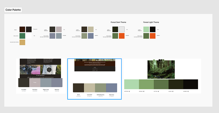
At first, I thought I could simplify the process by using automated colour palette generators like Coolors or Adobe. It seemed like an efficient approach, especially since we had a tight budget and timeline. However, I soon ran into problems. While these tools are convenient, they present two key issues:
Subjective Preference: I was selecting colours based solely on personal taste, without any objective rationale.
Audience Relevance: I had no data on whether these colours would resonate with the camp’s target audience.
Building a Research Framework
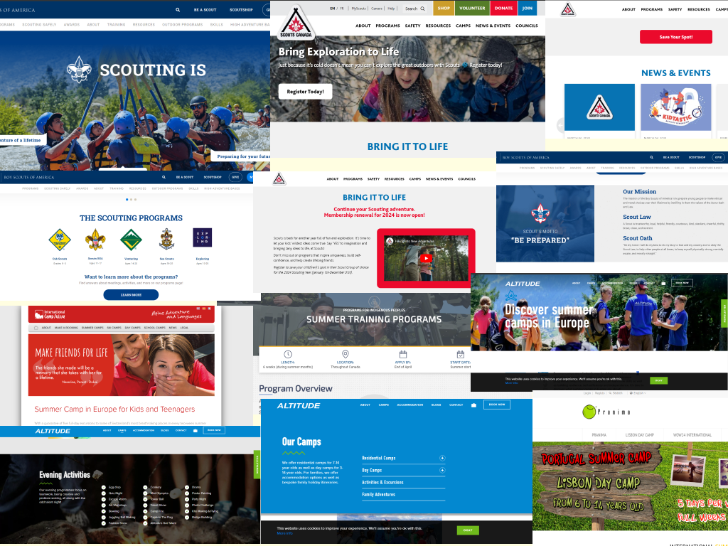
To develop a research-backed strategy, I initiated the process by seeking inspiration from websites that provide comparable outdoor activities and cater to the same demographic (parents, schools, and children). This exploration offered insights into the prevailing colour palettes commonly utilized within the industry.
To tackle these challenges effectively, I crafted a structured framework to inform my colour selections.

Mistake #2: Over-Reliance on Competitors’ Websites
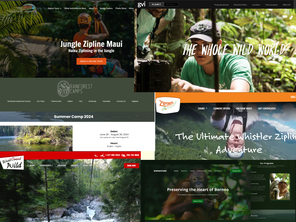
At first, I focused my inspiration on other camp-related websites, leading me to the common colour schemes of blue, white, and red — colours that convey seriousness and credibility, typically found in educational settings. The existing website was using browns and greys, and the client had expressed a desire to stand out and evoke a sense of nature. Realizing this, I knew we needed to broaden our search to include companies that better captured the adventurous and outdoorsy spirit of an adventure camp.


Realizing my error, I pivoted to draw inspiration from outdoor adventure companies like WildPlay and Sweden Zipline. This shift provided a broader perspective on how to visually communicate adventure and excitement.
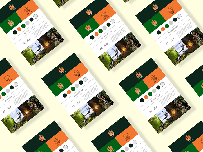
With this new framework, I revisited the colour palettes I had initially generated and eliminated those that didn’t align with the adventure theme. I then refined my choices, aiming for a polished yet vibrant look that conveyed the outdoor experience.
In the final step, I presented my slide deck to the client, explaining my rationale and highlighting the changes I had made. I emphasized that colours play a crucial role in shaping a brand’s personality and message — they communicate values, evoke emotions, and create a unique visual identity. This approach fosters a more natural, organic connection with the brand, allowing the audience to engage without feeling like they’re being aggressively marketed to.

Key Takeaways
- Automated colour palette generators can be a good starting point, but they can also be too generic. It’s essential to establish a research-backed framework to guide your design decisions.
- Engaging with the client through a well-prepared presentation helps build confidence in your decisions and fosters a collaborative approach to branding.
In summary, by embracing a research-backed approach, you can provide clients with a clear rationale for your design decisions, leading to better outcomes and a more successful project. And it doesn’t have to be time-consuming or require extensive research.
Future Considerations
- Conduct colour testing to refine selections.
- Allocate time for holistic exploration of physical product designs such as t-shirts, hats, brochures, and posters.
- Invest resources into researching social media and marketing strategies to enhance brand visibility and engagement.
Additional Resources
Check out this article by Jakob Nielson on the benefits and risks of using AI to streamline your work. The article emphasizes that AI has the potential to automate repetitive tasks, analyze large sets of user data, and offer personalized user experiences, which can significantly impact UX design. However, the author warns against overly relying on AI, as it still requires human oversight and ethical considerations.
Learn more about choosing colours that influence a brand’s personality and message. By thoughtfully choosing and consistently applying brand colours across all platforms, companies can build a cohesive and easily recognizable image.
