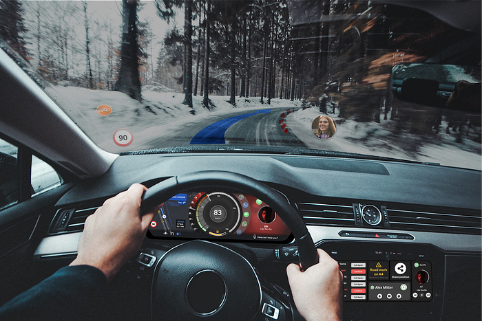
The future of car infotainment
A unifying digital ecosystem for vehicles
00 Background
Drivers know how cluttered these systems are and how little space they give to the user experience while driving.

Why Infotainments are so bad?
- Nest menus deep inside other submenus
- Icon system outdated
- Buttons not so easy to tap while driving
- Cluttered menu
- Bad information architecture


01 Research
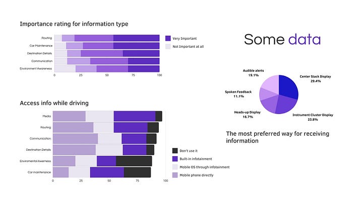
I did some research, interviews and surveys and I discovered that drivers access most info directly by the phone.
Also, the most preferred way to receive information is by centre stack display, instrumental cluster display and heads-up display

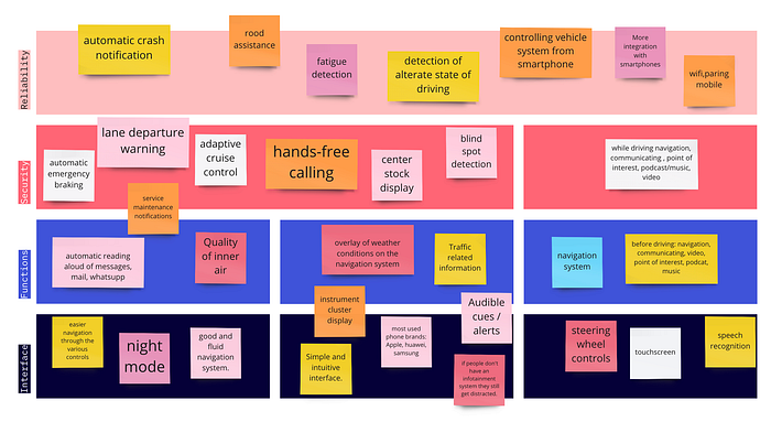


02 Empathize


Problem & Hypotheses Statement
Based on that this is the problem and hypothesis statement: infotainment that prioritizes the safeness of people while allowing the digital flow in the car:
Car users need an infotainment system that is up to date with vehicle technology so that it can replace the smartphone while driving and provide greater safety.
We believe creating an OS that communicates with both the car and the phone applications for drivers of A-B-C car segments, will bring security without distractions, smart vehicle checking and the possibility to continue digital activities safely even during the trip.
We will know we are right when, after the adoption of the system, the interactions with the infotainment will be reduced by 20% while maintaining the usability and functions to the maximum.
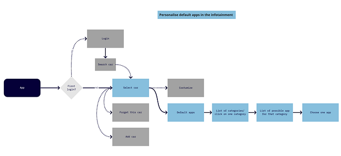
04 Design

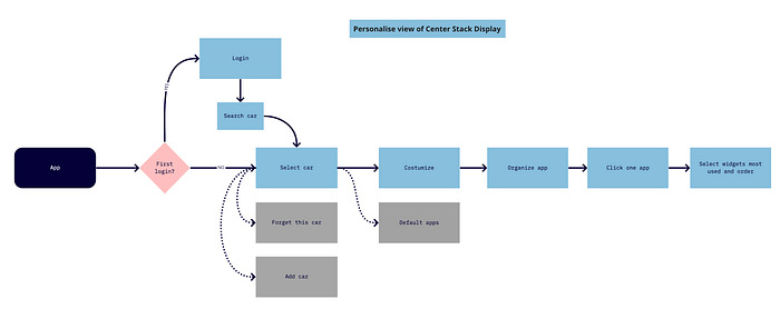
05 Prototype


To visualize better this concept I created a mood board that encourages to design a minimalistic interface that users will be familiar with whiteout distracting them
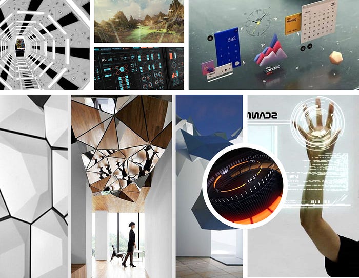
I created a design system that requires a humanist font family that’s comfortable to read even in challenging situation and parameters in colour contrast and minimum sizes
Typeface:
Slate offers the user comfortable reading even in challenging technical environments.
Visual Requirements:
- contrast ratio: 7.0 +
- Minimum font-size: 13 pt
- Advised font-size: 24 pt
- Icon-size: minimum 30px
- Color feedback:
- red danger/missing,
- yellow: alert,
- green: active/success,
- blue: navigation/system.

06 Final Product
The system differs in its ability to interface the user with both the car and the phone.
In fact, there are systems such as CarPlay or Android Auto that only allow streaming with your phone, enabling only certain functions without interacting with the car.
On the other hand, customised systems for each automaker cannot manage all the applications on the phone
Supported Technologies:
- Head-up Display
- Instrument Cluster Display
- Center Stack Display
- Vocal Assistant
- Control app
To see the final product visit my portfolio ➡️ HERE 💁♀️
07 Next Steps
- Designing several screens to assess different real-life situations
- Test it directly in the car environment
- Propose it to carmakers
08 Takeaway
- This project led me to discover a world of which I had superficial information, and not knowing anything helped me to listen more.
- The best projects are the ones you are afraid of because they will help you to have new eyes.
- The best projects are the ones you are afraid of because they will help you to have new eyes.
Thank you for your time, and feel free to leave a comment!
See you to the next project!

