The evolution of my personal branding
Brand design requires a deep and thorough understanding of the brand you’re representing. Personal branding is particularly fun in that sense because no one can understand you better than yourself. So I kept personal branding as my ongoing side project for a few years, and here’s how it evolved over time.
2018
This is the year that I began to explore designing my own visual identity. I began to use the wave as my core visual element.
Why the wave?
The wave comes from the alias I used when I was an editor at a feminist online magazine in South Korea. The editors all used an alias because of the possible backlash from working at feminist media. I used the name “해일," or “the wave” because of an anecdote of a prominent Korean political figure. The elections were coming, and there were sexual harassment allegations in his party. This was his remark on the matter:
The wave is coming, and you are picking up seashells.
He meant that the party needed to focus on the elections, rather than wasting their energy on minor issues like sexual harassment. The problem is that for women, addressing the sexual harassment in the party was the focus. So I started to use the alias “wave” to symbolize that for women, women’s issues are the wave.
I only wrote a few articles using that alias, but the alias stuck with me. I used the visual image of the wave for my personal branding. It was perfect because it was a basic enough shape that can be applied in a lot of different ways but also distinct enough to make my materials recognizable.


I was in love with the Freight font family at the time for its sophistication and decided to use it for my visual identity.
2019
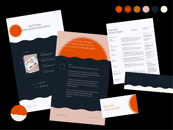
I was graduating from college in Korea and about to head off to the U.S. for my master’s degree. I decided to do a full rebrand and redevelopment of my portfolio to mark a new chapter of my life.
I took some time to reflect on my previous visual identity. I thought the vibrant colors did not go very well with Freight Big Pro. I wanted to keep the look of a delicate serif font, so I decided to modify the colors around it to match that feel.

The rebrand was a lot more work than I thought. I planned to get this done by February as a start-of-the-year project, but I was only able to publish the first version of the new website in August.
The reason why it took so long was that I wanted to build the website in React even though I have never built anything in React. It was a painstaking process full of trial, error, and compromise, but I was able to finish it. My engineer friends would gasp at how messy my code is, but I’m proud that it kinda worked.
I liked the combination of a sophisticated serif font and more readable body text font from my previous brand, so I wanted to keep that structure. I dug through Adobe Fonts to find the right serif font and instantly fell in love with Orpheus Pro.
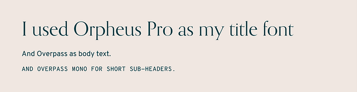
How I chose the body font, Overpass, was pretty random. I just scrolled down on my fonts list and Overpass was right under Orpheus. I liked how it looked and decided to keep it. I still use Overpass in my visual identity.
2020
I wanted to make my rebranding a yearly ritual. But I liked the 2019 version a lot so I didn’t want to diverge from it too much. So instead of making a whole new website and branding, I decided to build upon what I had.
I made the colors starker and cleaner so there’s more emphasis on the content. To compensate for the starker contrast, I gave a blur to the sun element to make it more subtle.
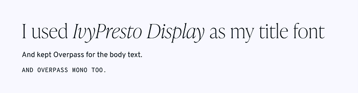
I wanted a different typeface to match the clean look of the new color palette. I also wanted to change the title font. Orpheus Pro had become very popular since 2019, and I wanted to use a distinctive font. I chose IvyPresto Display because of its clean but delicate look, and also because of the fact that I haven’t seen it in a lot of other places.
Now
I updated my visual identity every year to present the best of myself and how my skills grew, and also just because it’s fun. Pushing myself to update it every year was also a great way to keep my skills sharp.
I was supposed to have finished another version of the rebranding this year by now. But this year I decided to give myself a break because this past year has been exhausting for me and everyone else. Instead, I decided to write a post reflecting on my past brandings.
I hope my journey inspires you to represent yourself visually as well! I’d love to see everyone’s personal branding.

