The design of everyday things
What I’ve learned and why you should read it too
I am sure a lot of designers heard about Don Norman as he is an iconic personality in the design world, many considering him the father of UX. His well known book, The Design of Everyday Things is a remarkable book, but not only for designers. No, it’s for everyone that has the curiosity of reading about how the human memory works and how ‘things’ can help extend our abilities exemplified through a lot of real examples (those were my favourite parts).
“ The day a product development process starts, it is behind schedule and above budget.”, Don Norman
It took me a ridiculous time to finish this book, not because it was hard to read, but I felt that I need to take in every word and truly understand it. I have this tendency to read through words, but not with this book.
I believe in the power of short and to the point article so I should get straight to the things I’ve learned. In not particular order, my favourite wow moments while reading this book were:
Human error — more likely bad design
Ever called yourself stupid because you didn’t figure out how to use a product? I did. That’s bad design.
Sadly, there were many accidents produced by drivers, pilots or even nuclear power plants workers. In this book you will read about some of these accidents. Why do you think these accidents happened? We can thing about 2 causes:
- The workers didn’t know how to remediate the problem or they induced it through a series of wrong uses.
- The people had to work in unacceptable conditions and because of tiredness they made a mistake.
The first one is the most important case because, as explained in the book, the superiors had the tendency to blame the person in control, not to ask ‘Why it happened?’ and to question the design.
The second one is pretty self-explanatory, we are all human beings and we can go through harder times and we can be prone to make slips/mistakes while working.
Hint: There is also a comparison between slips and mistakes in the book.
How our memory works
Basically there are 2 types of memory:
Long-term memory (LTM)
This is the knowledge in our heads that is constructed throughout years of learning and experiences. It’s important to think about LTM because most times when we need an information for the head we might not get it, for example that feeling when you know something, but you don’t know to access it.
Short-term/Working memory (STM)
This is our in the moment memory that help us with our current activities, the one that is right there to get and use and the one that gets cleared first. In STM we can keep between 5 and 7 things, but it’s safer to say 3–5 if they complexity is higher.
“People judge an experience largely based on how they felt at its peak and at its end, rather than on the total sum or average of every moment of the experience.”, Peak-End Law
The 3 levels of design processing
Did you know there are 3 aspects of a design? Neither did I.
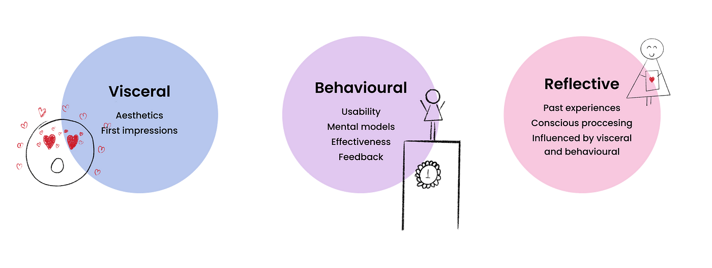
Visceral
This level is tightly connected to the muscular system of a person, the facial expressions, tension in the body. It’s about our subconscious first responses to a product, for example when we download a new game on our smartphone and their design is beautifully crafted with animations, sounds and haptic feedback. This level is about the “package”, the exterior and how we can influence the consumer to buy or to use our product.
“Users often perceive aesthetically pleasing design as design that’s more usable.”, Aesthetics Usability Effect
Behavioural
As the term may suggest, this level is about our reflexes and our unconscious behaviours. For example, if I tell you to move your head left to right you don’t think about how to move your head, you just do it. This is reflected in how we use a product and get used to some standards (for example, we know that underlined text is a link without questioning it).
Reflective
This last level is about consciousness and how our past experiences reflect our future choices. This is also about our way of living and how a product can impact our social life or public image. Using the 2 levels above, we make a decision of buying a product/service, but we also think about how this might make us look or will change our life. For example, a lot of people buy designer bags because of their well known logos and how others will turn their heads when seeing them.
Why technology breakthroughs are not always a good thing
Nowadays technology changes fast, people don’t.
I think this is a very interesting period when a lot of services and products are introduced in our world. How do you make sure people will want to get to know your product or change their way of doing things? Especially older people will be resilient to change to other solutions or newer, shiner products if their old ones are doing their job just fine.
This section is about how many ideas failed because they didn’t think about the human factor in creating a solution and why their customers will actually use it. Also, this is about how some solutions where bought and integrated in popular products that everybody uses.
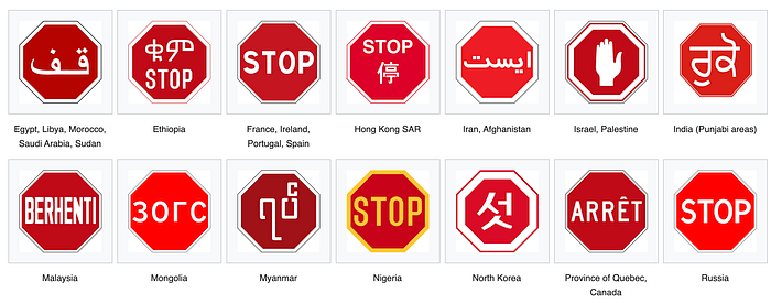
Complexity vs Confusion
I think we often think that complex things are difficult to understand hence giving us confusion. But actually, if the design was well thought the complexity can be broken into logical bits until we figure it out. With the help of standardisation we can easily understand new interactions, like the red STOP sign that looks similarly in all countries.
Confusion is created when the design is flawed. Nobody want or will buy a product they don’t know how to use. More important, people that have to work with sensible control panels, that looks like an alien ship, should interact with buttons/switches/inputs that are confusion free, so in case of an emergency they could act as expected.
If you want to know more about Don Norman and his work, you can go to NNGroup where you will find a lot of yummy articles.
Thank you for reading my article and if you’d like to read my next articles about UX Design follow and 👏🏻.

