The Dark Side of UX: Uncovering Deceptive Design Patterns
Dark patterns are deceptive design elements in user interfaces that manipulate users into performing actions they might not have otherwise done. These practices go against user-centered design principles and exploit users to benefit businesses. Dark patterns are prevalent across the web, mobile, and enterprise applications, from hidden fees and opt-out tricks to misleading button labels and forced actions. They are becoming an increasingly pressing issue in User Experience (UX) design. Let’s look at some types of dark patterns, the harm they cause to users, and what can be done to prevent them.
“Dark Patterns “dirty tricks designers use to make people do stuff” — Harry Brignull
1: Forced Continuity — Cancel anytime
When your free trial with a service comes to an end, your credit card silently starts getting charged without any warning. Sometimes, this is made even worse by making it easier to cancel the membership. [1]
Example: Audible
Audible.com invites the user to sign up for a free trial. Once the free trial ends, the site automatically bills the user without warning. The site also makes it difficult for the user to cancel the subscription.

Alternate Solution: Adobe
Adobe on the other hand, calls out clearly (not so clearly) and also sends an email reminding the user about their upcoming charges.

2: Roach Motel
The design makes it very easy for you to get into a specific situation but then makes it hard to get out of it (e.g., a subscription). [1]
Example: Amazon
Amazon makes it extremely difficult to cancel the Prime Membership once subscribed by nesting the cancellation option 5 level deep within the UI. The user needs to hunt for it by going through several horizontal and vertical navigation. One may get tired/frustrated and abandon the cancellation task before achieving it.

Alternate Solution: Youtube
In the cloud world, subscribing and canceling services is very common. In most subscription-based applications, the standard solution is to have all the account-related information in the Accounts Menu. The flexibility to discover and cancel anytime is critical, given the user’s paying. Google Youtube Premium membership has a straightforward and intuitive path to cancellation.

3: Hidden Costs
You get to the last step of the checkout process, only to discover some unexpected charges have appeared, e.g. delivery charges, tax, etc. [1]
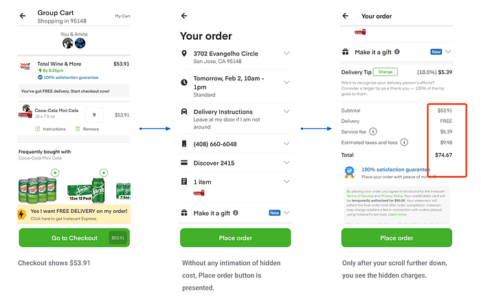
Example: Instacart
Throughout the checkout process, Instacart shows the total bill in a very prominent way. And then, right at the final step, it adds hidden costs (tip, service fee, taxes). To make things worse, it craftily hides these additional costs under the scrollable screen, which has a prominent overlay button — “Place order.”
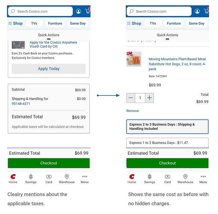
Alternate: Costco
Contrarily, the online Costco delivery app lets the user know that the taxes will be counted and added at the final step. Other than the taxes, there are no hidden fees. The app sets shipping to free by default, but the user can pay extra to expedite shipping.
4: Misdirection
The design purposefully focuses your attention on one thing in order to distract your attention from another. [1]
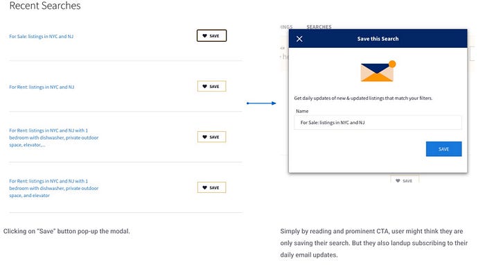
Example: StreetEasy
StreetEasy allows users to “Save” their property searches in the “My Activity” section. The idea is that the user could find and see their searches later. Clicking on “Save” pops up a modal with the “Title” — “Save this search” and a very inviting CTA button — “Save.” When the user clicks on “Save” to save, it sneakingly subscribes the user to the daily email updates without an option to opt out.
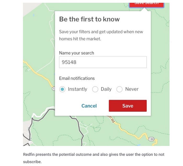
Alternate: Redfin
Redfin (www.redfin.com) also has this feature and a very similar interaction. Redfin calls out the action and allows the user to opt for a subscription. Every option is weighted equally, and there isn’t any misdirection. You can easily understand what is happening, what actions are required, and what the result will be.
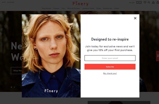
5: Confirm Shaming
The act of guilting the user into opting into something. The option to decline is worded in such a way as to shame the user into compliance.[1]
Example: Loft
Loft displays a message that says, “NO THANKS, I PREFER TO PAY FULL PRICE” when the user tries to decline a special offer. The negative language used here aims to make the user feel guilty for declining the offer and encourages them to accept it instead.

Alternate: AYR
AYR keeps it simple by providing an option to close the modal or simply click on “No Thank You”. There is no shame or guilt in rejecting the 15% offer.
Conclusion
Design for the users, fairness, and ethics. Persuade and be transparent, not deceive and be sneaky. Remember, sh** can take you on top but can’t keep you there.
There are several more Dark Patterns/ Deceptive Design patterns than covered here. If you are interested in reading more about this, please checkout https://www.deceptive.design/
References:
1: www.darkpatterns.org
2: Gray, C.M., Kou, Y., Battles, B., Hoggatt, J., & Toombs, A. (2018). The Dark (Patterns) Side of UX Design. Proceedings of the 2018 CHI Conference on Human Factors in Computing Systems.

