The Art of Perception: Colour
How perceiving the colours of reality can lead to good design.

I am not an expert on design or reality.
I have always been fascinated by documenting and recreating reality in design, and this is why I decided to start writing about it. Perhaps this will be an exciting beginning to understand what makes good design in the eyes of a beginner, or a philosophical analysis of a very simple fact: reality is kinda cool.
Reality is a subjective experience, and our perception of it is often influenced by our surroundings, including the design, color, and texture of the environment. Whether it’s the soft pastels of a sunrise or the bold hues of an urban landscape, colour always has something to say.
Green is The Colour
Close your eyes and think of the color green. What comes to your mind? Perhaps you see the leaves of a sprawling forest, the delicate stems of a garden bed, or the soft blades of grass beneath your feet. But for me, green is more than just a color. It’s a symbol of beginnings, of the very origins of our existence as a species. (Uf, heavy.)
Long before the age of technology and industry, our ancestors roamed the great outdoors, carving out a place for themselves in the natural world. Green was the dominant hue of their environment, signaling life and growth in every direction. It was the color of the trees that sheltered them and the grass on the ground that led their steps. Humans started their life in the great outdoors, and since then we started to.. everything. We started. We were turned on (excuse the pun). We began our journey, our existence, our impact as a species on this planet. A pretty cool choice of colour for this global symbol.

Tangled Up In Blue
As I dipped my hands into the sea for the very first time, I anticipated a breathtakingly maintained and saturated water full of all shades of blue. But to my dismay, it appeared to be just a dull reflection of the sky above. What a bummer that was. However, no amount of science was enough to strip away the magic of blue in my eyes.
Blue is us. At one point in time, our planet was merely a collision of the sky and the oceans. Blue was everywhere. Our connection to it goes beyond the physical aspects of our historical climate. It is a part of our identity, and a reminder of our place in the natural world. While the world has been undergoing its very own design process, , in every pair of coordinates a blue drop was waiting to be transformed. Basically, Blue was the oldest map to ever exist, covering the entirety of our planet, and giving it a name that will continue to be trending millions of years later, The Blue Planet. So, honestly, there is no better choice for the following symbol other than blue.

Red (Taylor’s Version)
As you may have noticed, we are currently discussing RGB using famous song titles because why not? So, while you’re trying to get rid of these songs in your head, it’s a good time to take a moment and realise how these three colours make up everything we see.
Personally, when I think about the colour red, it elicits a sense of alarm and danger. In design, we use red to pause, to stop, and to end. However, red reminds me of [insert obvious answer here] blood. The colour of alarm, attention, and caution. If blue is us, then red is in us. It is what fuels our hearts and bodies. With every breath, blood rushes through our veins, and then, we pause, we stop, we take a moment to be able to breathe out again. How can our very being unveil our fascinating relationship with colour? We all need a pause to start again, to breathe, to pay attention of where we are, and most importantly, to recover. It only makes sense for stop signs to be red. It only makes sense for it to indicate a wrong answer in Trivia Hero, but oh how it fills me with the ultimate happiness of realisation to have it as the colour of a first aid kid.

We happen to exist in a reality that’s full of colour. Regardless of the fact if we are to believe that everything on this planet happen for a reason, it is the most exciting of ideas to realize how we are recreating our historical being into elements of design. Some people would argue that human beings, and designers in specific, are always recycling content and ideas that already exist, but I beg to differ. We are not carelessly recycling, we are recreating. Recreating our surroundings, our planet, our bodies, and minds, trying to understand what and how the hell is happening. It’s only when we start to perceive the world in a new light that we can truly appreciate the wonder and excitement of our existence.
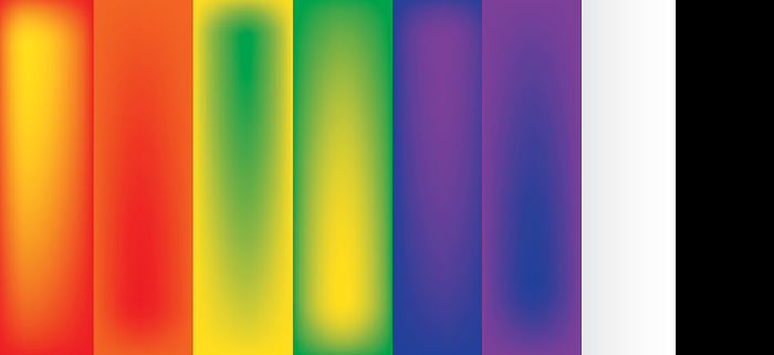
*The three illustrations in this article are designed by me using Adobe Illustrator.

