The 8 obvious design mistakes in your game & app
A practical guide for beginners
Of course I get it, you’re Indie. Or switching careers. Or fresh out of school — or any number of legitimately good excuses. You’ve got a lot on your plate, and not nearly enough time to master one of the most complicated artforms in the modern world.
I should know, I’m your friendly neighborhood UI UX Designer, Director and Mentor with a specialty in games & apps. Having mentored who-knows-how-many students in UI UX Design, I wanted to give back generously to those students I simply can not teach (just yet!). So I’ve put together some wise words in the wisest format known: bullet points; ably ready to help every newbie, indie and Up-And-Comer avoid obvious mistakes… and make brand new mistakes of their own!
A note to my fellow designers: Nope. I’m going to stop you right there. Yes, there are other ways, considerations, exceptions, etc. to these guidelines. This is meant for the non-designer; a Survival Guide if you find yourself lost in a Bauhaus desert. These rules aren’t meant to shape an incredible UI designer — just spare the world a ruinously terrible one.

- Bad Typography
We’ll start with the obvious. Oh aspiring designer, your choice and use of the written word is crazy-bad. Some Graphic Designers spend the better part of their careers studying Typography, so there is little shame in being hot garbage when put to task. Nevertheless, your typesetting can truly add or rob a project of its luster. Here are a few easy typography lessons to remember:
- Pick a Sans Serif (fonts without the “fiddly bits”). They read better, especially on mobile screens
- Work around 2 fonts: a Title font and a Body font. A Title font should be used sparingly as titles(!) and subheadings. A body font should be comparatively boring, and read well in dense paragraphs and at small sizes
- As a guideline for beginners, pick 2 font sizes at most and stay consistent on all your screens. Optimally pick two sizes exclusively for your Title font and two sizes exclusively for the body font. Determine an appropriate font size based on your worst-case text fields on your worst-case medium!
- Solve for long text fields by making them double-lined. It’s a simpler solution than something programmatic. Translating? German is often twice as long as any English equivalent, so work around the idea of strings inflating by at least double.
- When in doubt, left justify. Right justifying will get you killed in Art School, or worse…

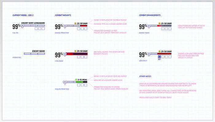
2. Horrible HUDs
HUD design, like typography, is an ocean unto itself replete with pearlescent beauty and abyssal frights. Like I tell every student and every dev team, ”We’ll be working on the HUD all the way up until we ship”.
And we do. Every. Single. Time.
Thus, having an awed appreciation (and primal terror) of HUDs, there are a few things you can fix that will make you read like a Designer well beyond your years:
- No thin lines! These are easily lost when the action heats up, and they turn damn-near translucent on mobile
- No red HUDs! Red reads as invalid or conditional, and you’ll have a Sisyphean time trying to create a visual language without using red as a cautionary.
- Try not to have floating text, support it with a shape or design behind it to help separate vital information from screen noise. Can’t do that? Add a subtle stroke or shadow around floating text fields to draw it out from the background. You are using a thick sans serif, right?
- Take a video of the game in action and superimpose your HUD on top of it as early as possible (not even, especially duringthe wireframe phase!). When I’m on the job I always try to see how the HUD works in motion and in hectic, colorful action. No HUD will ever exist statically, so video helps me prototype under realistic conditions that much faster.
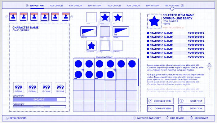
3. Overabundance of Information
I love my designers, love ’em to death — but I also believe they think their job is to put as much on the screen as humanly possible (The Great Kitchen Sink School of Applied Design). Absent a finger-wagging UX Designer by your side, you’ve probably fallen into the “100% of this information is relevant and needed, dammit!” trap a few times yourself. A few ways to avoid that:
- Write down everything you want to display on the screen and assign it a number value from most to least important. That’s your Hierarchy, a critical concept in UX design. Place the items on your list in order, with the highest value owning more real-estate and prominence than the lower values. Build on top of your numerical importance. Trees never start with the leaves — and neither should you. Start with the root, vital priorities of your design, and build on top of your foundations.
- Have “opt-in” information, that is to say, information that is present only if a user requests it. This can be: displays that only come out when the information is relevant (updates or experience gained). Info that fades away after X amount of time (HUD without action, achievement milestones). You can even tuck awkward tertiary-level functions away under a single option button (ellipsis or hamburger menu buttons).
- Start removing huge portions of your Interface and test it out. Or try the opposite and start with the 3 most basic elements and build from that. You’ll be genuinely surprised how little you need on screen to be happy. You’ll also discover that the less there is on screen, the less chance you have to mess it all up, either aesthetically or logistically. Minimalism saves projects and lives.
4. No Grid System
A consistent grid system helps readers parse information cleanly and swiftly. New Designers tend to place objects by eyeball’n ‘er in, with all the tempestuous results you would expect. Placing elements on a tight grid with comfortable margins will make any screen read with crystalline clarity. In general:
- When in doubt, space things in Golden Ratio 3rds. Pairing ⅓ with ⅔ has been an attractive rule since long before the Renaissance; no reason to think it’ll get stale now.
- If your text is inside a shape, make sure that it has a comfortable margin of space around it. If you don’t have the visual chops for this, just make sure your text doesn’t run all the way to the edge of a shape or past it. You’d think this’d be obvious, but… here we are.
- Conceptualize your screen in terms of horizontal slices, like a hamburger (even your Headers and Footers can be thought of as the bread). This isn’t just good practice for responsive design, it also helps to compartmentalize the information for both the designer and the poor coder.
5. Crazy Colors
Color Theory is a skill that every Designer intuits. But for the color-infirmed, the idea that a red health bar can somehow be the wrong red or that an app’s blue header can be too “corporate” might seem baffling. Nonetheless, color on an interface is as vital as any line of code. It can also ruin a color-agnostic wireframe that looked so elegant mere days before, so beware:
- There are 3 dimensions to color: Brightness, Hue and Saturation. Brightness you can reason out yourself. Hue is the textbook definition of color (green vs blue vs violet), and Saturation is how intense or faded the color is (bug-zapper blue vs Easter-egg blue). Most Indies tend to pick wildly saturated colors thinking they pop, but they distract like a pigeon in a restaurant. Fiddle with a color’s brightness and saturation first — until you know what you’re doing, keep it subtle.
- The eye is attracted to the following things in order of growing attraction: vibrant colors, high contrast, faces. Reinforce your hierarchy to lead the eye, create a starting point, or play keep-away from certain areas. Dial back decals or backgrounds with darkness and deeper saturation. Dial up areas of importance with brightness, high contrast, avatars and portraits, etc.
- Once again, never use red as the primary color for a UI. It will always read as invalid or conditional and best of luck making an entire interface without the color red as a conditional or warning.
- Have a color set aside exclusively for navigation, especially if navigation appears in multiple places. It doesn’t have to be offensively obvious, but you should be consistent with how the audience moves from one screen to another. Encircling navigation in geometry also helps drive the “click me” narrative home.
6. Importing the Wrong Solutions
Tell me if you’ve heard this one before. You’re on Pinterest or Google grabbing whatever UI screens you can find. In this hydra-handed snatchfest, you find an interface you like and exclaim, “Why, this interface is perfect for my needs, I’ll just copy this and my troubles will be over!”
Except them troubles are about to go though cellular mitosis.
When you copy/paste an interface, you’re not taking into account the months, possibly years of refinement it took several Talents to solve a very specific problem. You’re grabbing somebody else’s answer to a visual question only obliquely related to yours.
And this is the classic, possibly classical mistake of focusing on technique first. For reasons that are difficult to fully articulate here, copying somebody else’s interface verbatim always leads to problems, most especially when you don’t understand the logical and artistic underpinnings that make it all work. Instead of committing grand-theft-design, snag something far more valuable: a better process:
- Sketch out your ideas first. This is known as the Conceptualization phase of my job, where I figure out what all the “low-hanging fruit”-level problems are. Sketch until you’ve built the basic “scaffolding” around the project’s basic issues, quirks, and challenges
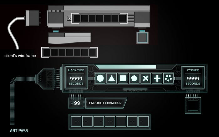
- Wireframe. There’s lots of ways to do it, mostly because it’s an intermediary between sketches and final art. Think of the wireframe as a TV-dinner: each section is meant for a different part of the meal, compartmentalized and specially sized for the meat, the veggies, the cobbler… This stage raises answers and poses even better questions.
- Art pass. If the wireframe phase was done with respectable vigilance, you can simply paint-over your Wires with pixel-perfect art in the Art Pass (this rarely happens). So make sure when you wireframe, set it up as close to the final dimensions as possible and throw it in the game in as early a form as possible. Real testing doesn’t happen in a lab — it happens in the field.

7. Not Using UI as Proving Grounds
And hey — speaking of testing, this last one is near and dear to my heart as a man who can’t perform his job without doing a little of everyone else’s. And here’s the dirty secret I know about being the man who wears many hats:
If your UI guy/gal is reasonably talented and they’re struggling to realize your design — it’s a bad design. Full stop. Here’s how to fix design issues from the UI/UX on backwards:
- For games, if your inventory system requires massive space, ask yourself just how much loot the player receives every 5 minutes, every hour, and by endgame. Did you include filters and other quality of life improvements? Nobody has fun with inventory management — make sure you’re balancing the game to mitigate the player’s annoyance first!
- If you’re showing a variable number of elements on screen like alerts or status effects, how many are there on average? How many can there be max? Fun fact: I had to make a blackjack minigame back at Midway Games. The average Blackjack hand is around 2–3 cards… but you can absolutely get 4 aces, 4 twos, 4threes… now you try to make a single system that accounts for world-ending exceptions!
- For apps, are people dropping within the first 5 seconds? It might be the long load or a landing screen that portends poor things to come. Free apps and games create astounding amounts of flight-or-fight response, and you’d be surprised how easily people are turned off when they have no financial commitment. Make the first 5 seconds your priority, then the next 5 seconds, then the next…
- For games, if your players end up dying a lot, it might not be the difficulty. It might be poor feedback. Do you have potent signals for low health and ammo? Are there audio as well as visual cues, for example, the sound of a clip sounding more hollow with lower bullets? Did the player suffer a debilitating effect and not know about it? Are you showing too much information and as a result, nobody’s reading it?
8. Not Getting Outside Help
No Designer is an island. The good ones humble themselves before the existential horror that they might not know everything there is to know about design. So we network, we showcase work-in-progress, and perhaps most shocking of all — we ask for help.
- If you can’t get anyone to test or critique your work, you’ll have to synthesize some perspective on your own. Learn to walk away from your projects for a few hours so that you can come back with fresh eyes. You’ll be stunned how many times you’ll save yourself from a creative cul-de-sac if you just stop moving so fast.
- Get another Creative at any skill level to look at your work. While you should weigh every form of criticism, for your artwork (UI), presume that only Artists in your field and above your skill-level have the best advice. For your architecture (UX), presume everybody has a valid answer to the question of, “But is this usable?”. Again, by comparison, very few people should be taken seriously when asked, “But is this art?”
- Get a Mentor, Consultant — anyone who is in the know and has walked the same path that you are about to. Consultation can help you sidestep problems that are counter-intuitive or provide you with benefits you wouldn’t even know to know about. Mentors give you years worth of study in a scant few months. They also prep you for a career with practical guidance and even help you barn-raise a portfolio and resume. When I Mentor, my final lesson is usually my most poignant, so here it is: if there are no maps, better ask the locals!

