The 60:30:10 color rule for UI design
Color is one of the most important thing for UI Design. It represents your brand also has psychology meaning behind it. But the question is, how do you balance your color selection for your interface and how to implement it?
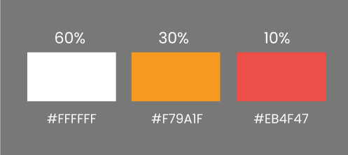
The answer is the 60:30:10 color rule. Each number represents the portion of each color that you have chosen.
The 60%
The 60% is usually the neutral or primary color. This portion will be used as the base color of the design.
The 30%
The 30% is the secondary color. It is still visible and will be used for some medium components such as card, carousel, etc.
The 10%
The 10% is the accent color. This portion will be used for highlight of the design. For example, CTA button, pop up, and some important points of your interface.
The Good Examples of The 60:30:10 Rule
- Prospect Farms


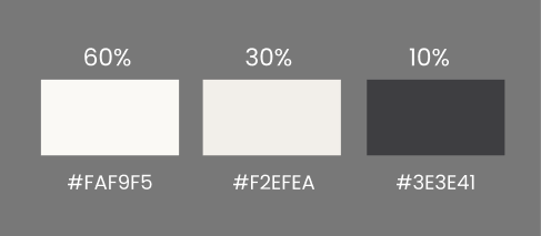
#FAF9F5 or the 60% is used for background color while #F2EFEA or the 30% is used for their cards, and #3E3E41 or the rest 10% is used for the buttons.
2. Tenneyson


A very similar way to Prospect Farms in the application of 60:30:10 rule, Tenneyson uses 60% portion for the background, 30% for the banner, header, and their brand name, and the rest 10% for buttons and some lines for giving accent to their website.
60:30:10 is one of the method that you can choose to make well-balanced color website or mobile app. It makes your website or mobile app more mature, neater, proportional, and more eye-catching for users.
As we are all know, when our digital product is neat and eye-catching in general (from colors and contents), users will stick to our product because it is easier for them to use even find the smallest thing in our product.

