
The top 4 design lessons I learned in Preply, a hyper-growth startup
For the last four years, I’ve been a proud member of the Preply design team, a small startup that’s managed to grow 10x! Working in a “hyper-growth” startup is inspiring but, to be honest, can also be stressful. It requires efficiency, quick decision-making, and a commitment to making sure your team focuses on creating features that help your customers and the business.
However, despite our best efforts, we made some mistakes.
Today, as I say goodbye to Preply and begin a new adventure I want to share the biggest mistakes we made. With luck, I’ll help you start learning from feature launches right away by succeeding and failing faster, two essential practices to drive growth.
Here are the 4 most important lessons that I’ve learned
- Validate whether the feature brings value without building the whole damn thing.
- Don’t try to handle all the possible edge cases before the first launch.
- Feature introduction is as important as the feature itself.
- Don’t request data that won’t affect the outcome solution.
So let’s do it!

Preply is a tutoring marketplace for language learning which connects students to tutors. With more than 140,000 tutors from 203 countries and more than 1,000,000 active students, Preply is currently the largest marketplace for private language tutoring.
Lesson 1: Validate whether the feature brings value without building the whole damn thing
Context
To be honest, this was one of the most painful and expensive lessons that I’ve ever had.
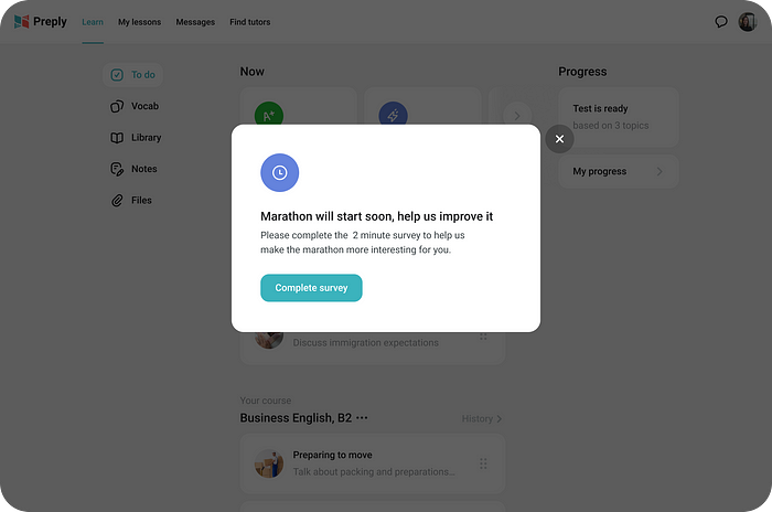
Our team wanted to improve our students’ average LTV (lifetime value) by implementing some gamification mechanics at Preply. We decided to organize a tournament between students where winners would receive additional hours on their balance.
Solution and results
While the idea sounded interesting, the experiment results were frustrating: the experiment didn’t affect any business metrics. After conducting post-launch qualitative and quantitative research, we found several key insights that helped us understand our main reason for failure — the students just didn’t see enough value in the learning marathon.
- Less than 10% of the students in the experiment visited the learning marathon page
- We found out that users have a specific studying schedule and they cannot easily change for the sake of the marathon

What we could have done instead ?
Did we really need to spend 2 months to understand that our users won’t see any value in the 1st iteration of the learning marathon?
Nope, we didn’t.
Here is what we could have done instead.
Firstly, we could have validated the demand for the learning marathon page by launching a painted door test on 1–5% of our users in which we could have just built the entry points to the learning marathon without implementing the whole marathon page.

In this test, we needed to track when the modal was closed (the user didn’t show interest in a marathon) or when the user clicked the ‘View my ranking’ button (the user was interested in a marathon).
It would have helped us understand that only 10% of students have the intention to visit the learning marathon page and that we have an obvious value communication problem.
Secondly, we could have targeted Hotjar surveys at students who weren’t interested in the learning marathon (haven’t clicked on the button) to better understand why they are not interested. This could have helped us better understand the motivation of our students.

And finally, for the students interested in the marathon (clicked ‘View my ranking’ button), we could have explained that the leaderboard is still under development and asked them to complete a survey and participate in the interview/usability testing sessions to find additional insights before the coding phase.
These 3 steps could have been done in 1–2 weeks with minimal development effort and could have helped us find signals that the current implementation won’t work and that we clearly needed to focus on rethinking the value proposition and value communication of this feature.
How did we apply this knowledge for the next feature?
When we were working on another feature we remembered this lesson and decided to validate another hypothesis with a painted door test before building the whole feature.

The main hypothesis was that by offering our new students 3 trial lessons (30 minutes each) with different tutors, we’ll help them experience different teaching styles and methods on our platform and therefore increase their CR and LTV.
Thanks to the painted door test we were able to save money for the business as we found out that the CTR for this banner would be too small. As a result we decided to deprioritize this feature for the other ones.
Learning summary
Just because we’ve invested the time and effort to create a feature doesn’t mean anyone will want to use it. If you don’t want to spend time building a huge feature that won’t be needed, always try measuring initial interest in a solution with a minimal cost.
Lesson 2: Don’t try to handle all the possible edge cases before the first launch
Context
Based on the competitors research we understood that several competitors were exploring the idea of ‘Weekly lessons’. Leadership team also liked this idea and gave us a green light to investigate it further.
Solution and results
Our team fully believed in this feature and we wanted to provide the best possible experience for our students, so every time we’ve found an additional edge case that we can handle — we’ve spent our time working on that edge case.


Fast forward to the feature launch — it took us 4 months to build this feature. We’ve experienced tons of bugs and development issues, and team morale was close to negative.

What was even worse is that when we finally launched it, this feature generated a lot of negative feedback from students and tutors. Many edge cases that we thought were important turned out to be useless and some edge cases that we’ve covered generated more confusion than benefit.

What could we have done instead?
We should have asked ourselves: how by coding only 20% of the designed solution we can bring 80% of this feature’s value?
How can we cut the scope while still shipping the same value?
We could have quickly launched with only a fraction of the planned scope, receive valuable feedback from the customers, and iterate on it. Sadly, we took the path of building a spaceship, which resulted in a lot of frustration and a significant opportunity cost.
How did we apply this knowledge in the next feature?
We were working on a new Landing page that would prompt customers to pre-filter the tutors on the search page and therefore help our learners find their perfect tutor quicker.

My first design iteration included several elements, the implementation of which required huge dev effort. Based on our previous takeaways we asked ourselves ‘Which elements can we remove and still test the hypothesis?’
In the end, we’ve decided to cut almost half of the elements from our initial page.
Learning summary
It’s tempting for the designers to think about every possible edge case and how it can be handled so that the user will have a great experience. Always ask yourself — how can you minimize the scope and still deliver the same value to customers? How can you solve the problem in a simpler way?
Lesson 3: Feature introduction is as important as the feature itself
Context
Since Preply started, one of the most frequent students’ requests to customer support was to transfer the balance from one tutor to another.
We thought that if we automate this manual customer support flow, we’ll encourage students to try different tutors and study more on the platform. The idea was to test this hypothesis by building the ‘Transfer credits’ feature.
Solution and results
After many syncs with the Finance department, navigating the legacy code, and handling a tremendous number of necessary edge cases, we came up with the solution that we thought will dramatically benefit our customers.

Imagine how surprised we were when the number of Intercom conversations related to the credits transfer hasn’t changed after we’ve launched the A/B test. The students were still writing customer support when they wanted to transfer the balance from one tutor to another.

As we started diving deeper into the data, we understood that the problem’s root cause was that the new and old users don’t notice the small ‘Transfer credits’ button.
This was a huge problem because if out of all test participants, most students didn’t notice the change, we couldn’t have proven or disproven our hypothesis as the A/B test results were diluted with users who were in group B but didn’t even know that this feature existed.
What could we have done instead?
Looking at this situation retrospectively, we could have easily avoided this mistake and saved our nerves and time by introducing ‘Transfer credits’ contextually to our students.

How did we apply this knowledge in the next feature?
When my colleague Vlad Solomakha was working on the new feature for our video conferencing tool they took into account this learning and included a proper onboarding into the MVP of their feature.

Thanks to the onboarding, during their launch they managed to achieve a pretty solid engagement with their feature.
Learning summary
If the feature value is not presented the way the customer can recognize it, the feature basically doesn’t exist. Ask yourself — How will the customer find my feature? Is there something I can do to make it easier for the customer to find the feature?
Lesson 4: Don’t request the data that won’t affect the outcome solution
Context
One of my first biggest tasks in Preply was to redesign the messaging experience. We wanted to unify and improve the current messaging experience and make it consistent throughout Preply.
Solution and results
I was pretty excited about this task, so my first thought before I started working on low-fidelity mockups was, ‘I want to know as much as possible about how our students and tutors chat with each other!’
The pre-research took 2 weeks of 2 designers during which we
- Fully decomposed the current messaging flows
- Manually analyzed anonymized conversations and grouped them by different types
- Analyzed the median length of messages, the average number of dialogs per tutor, files exchange frequency, and the number of new requests that the tutor gets per day
- Analyzed customer feedback from the Userfeed
- Watched hundreds of Hotjar webwizor recordings to better understand how our users use the current messenger
- Created and analyzed heatmaps


When we started designing the new messaging flows and investigating our design options, we understood that our possibilities were limited to only several different options.
After a few design iterations, we’ve finally come with the final version that students and tutors use on Preply today.


Unfortunately, most of the data we collected didn’t help us during the design phase.
What could we have done instead?
During our work on this feature, we needed to start working on low-fidelity first and if during the design phase, we would have had a data question then we should have requested the data.
Instead, we tried to stock up the data like hamsters stock up food before the winter just in case and it led to wasted time spent and a delay in the feature launch.
How did we apply this knowledge in the next feature?
We’ve changed our processes a bit and now every time anyone creates a request for a research, this person would need to answer a set of questions.
- Why have you decided to do it?
- Why can’t you move forward without it?
- How does this project connect with the mission of the Squad or Preply?
- What are we trying to reach/understand?
- How insights are going to be used?
- Main assumptions and Hypotheses?

This way we make sure that the data requested won’t end up being wasted and the research and DA effort would be valuable.
Learning summary
Next time you start working on a big project, ask yourself, ‘What is the minimum amount of information I need to get to the next step,’ ‘How will this data affect the outcome? Do I really need this data?’
Don’t be afraid to make mistakes!
It’s normal to make mistakes. If you are not making them, that means that you are not doing something that matches your current professional level and something that challenges you.
However, by reading this article, I hope that your mistakes won’t be as painful, and you’ll learn much quicker than we did.
Thank you for reading! Please share this with friends who are involved in the product process.
If you found this article helpful, 👏👏👏.
Check my other cases at elvisobanya.com
Feel free to get in touch elsewhere: Facebook, Instagram, Linkedin

