Case Study: A start-up needs to launch the first hotel web app for onsite interactions
IRON HACK — Final Project, collaboration with a Start-up
Well, the time has come; my last project as a student, a collaboration with a Start-Up. We had a list of 23 companies to work with; my first choice was Tabhotel and I was granted it, lucky me!
After 7 weeks of working with a partner; for this last project, I wanted to challenge myself and work on my own. Was it a good idea? Will I make it?
What is the challenge?
Tabhotel needs to develop the first design of a web application for hotel guests during their stay:
The guest is geolocalized in the premises thanks to the contextualized QR codes they can flash in rooms, in common areas such as restaurants, lobby, or coworking space. The web app will then open in the browser, no need to download a native app through a store: Practical.
They want to focus on developing the guest ordering and the guest relation through smart and fast contact within the building.
How should we improve these features based on the final user, the guest of the hotel?
My main goal was to develop a clean, clear, and generic product for the hotel to customize but centered on the final user’s needs, who is the guest of the hotel.
❓ Who are you

After the kick-off meeting with Tabhotel, I was able to present a SWOT of the company which means Strengths, Weaknesses, Opportunities, and lastly Threat, to improve upon what already exists rather than reinventing the wheel.

Remember, so far they would like to offer the first design of a web app so they provided me info regarding their indirect competitors: LoungeUp, Edgar, Altitude, and Experience hotel, which can show how it would be interesting to develop the expected features.
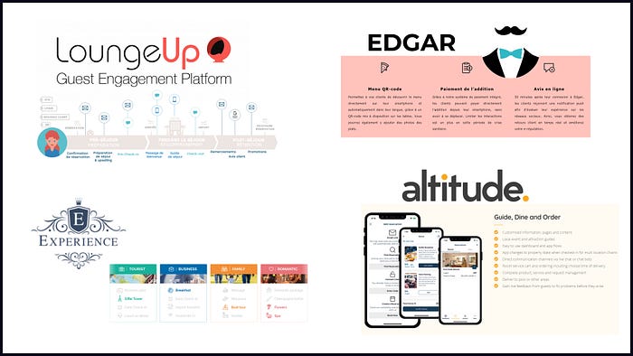
With this map, we can see where Tabhotel would like to stand compared to the other competitors: Generic, more customizable, and easy to use.

😃💬 UX research
During the UX research process, I have deployed a survey to gather quantitative data: the majority of them think that this is a useful and practical product to have fast contact with the hotel team, and also they find it interesting to get everything, in one reach.

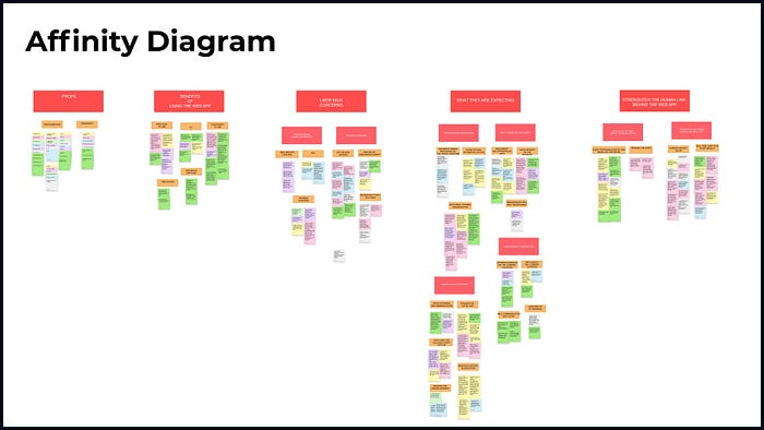
In addition to that, I have conducted interviews to finally identify what is frustrating, and what they gain.
By doing this I was able to set up this affinity diagram and classify all their opinions.
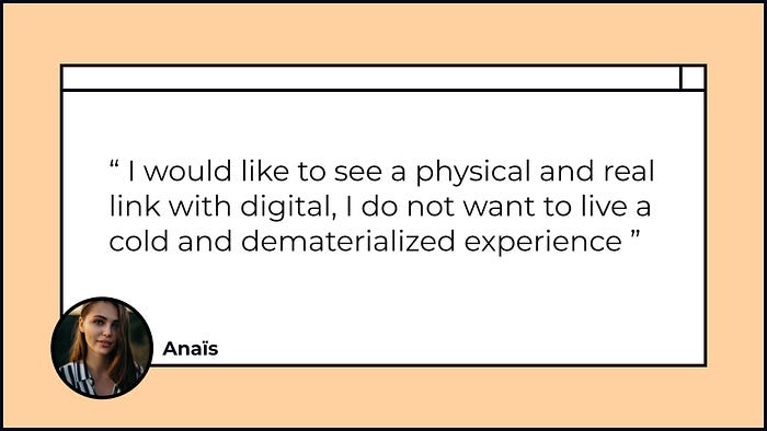
Obviously, the users find the features practical and useful, but as Anaïs said:
Thanks to the survey and the interviews, I was able to define my Primary Persona who goes by the name of Lauren.

Known as the demanding and foresight traveler, she is 34 years old, in a relationship, and follows a successful career as a Product Manager in the fashion industry.
We can say that she needs to organize her schedule because of her very dynamic professional and personal environment, she can’t afford to lose time to optimize her days, but that doesn’t mean she won’t take into account the quality of service.
With the User’s journey map you can see how her moods fluctuate according to the different events she goes thru during the day.
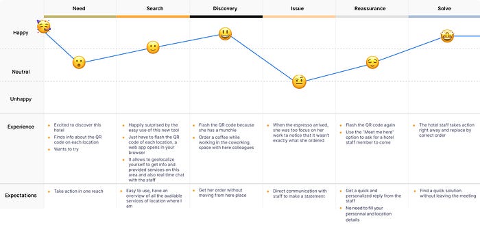
Initially very enthusiastic to visit Paris, she has to stay connected a few hours a day with her work; She notices the QR code to flash on her table, she wants to finish her tasks quickly to finally enjoy her stay. So she orders herself a coffee with it, but being too concentrated at the time of the service, she realizes that she was not served exactly what she had asked for. She uses the application again to manage the situation.
Everything is done efficiently and quickly, she can finally enjoy her espresso, battery recharged for the whole day.
This leads to the Problem statement, which is
Demanding and foresight hotel guests need to find a way to access all the available ordering and services easily and remotely because they expect high-quality service and instant fast reaction to satisfy their needs.
And then the Hypothesis statement:
We believe by offering fast and high-quality services while reinforcing the human link through the web app for people who want to save time during their stay and communicate in an efficient way with the staff will achieve satisfaction and loyalty.
We will know we are right if the guest comes back to our hotels and leaves a good review.
From this, we were able to identify our How Might We, to transform a problem into a challenge or an opportunity.
By using our business strategy and user research,
we have to think of the possible features by categorizing them as following
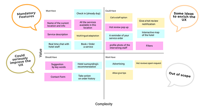
Then I could establish our Minimum Viable Product at the bare minimum :
The Goal of this App,
at the bare minimum,
is to make users aware of what product they can order at the current location by geolocating in flashing the QR Code.
As well as giving the option to contact by 3 means the staff.
By knowing what is available, the web app further aims to encourage guest action. Therefore, we must do the following:
This includes specific features such as :
1- Have an overview of all possible orders and available services
2- Possibility of purchasing products
3- Direct communication with staff
By ensuring that these things are available, the user will be able to review, purchase services with full knowledge of what is available to them whether they are on the web app or on-site. In addition to that, they will be able to get a fast reaction from the staff anytime with the real-time chat.
✏💻 Design iteration
Now it’s time to ideate with the Crazy 8s method

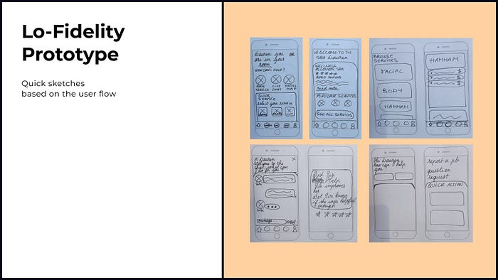
Secondly, I have imagined Lauren’s user flow and how it will conduct her to the happy path by ordering and fast communicating with the hotel.

Based on her user flow, I have made some quick sketches to validate the path with users.
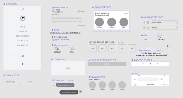
After validation, it was time to build the components and their variants to facilitate the assembling of my mid-fidelity prototype.
Mid-Fidelity prototype

Once I have finished linking my screens between them, I needed to test the mid-fidelity prototype with the users: Welcome to the USABILITY TESTING
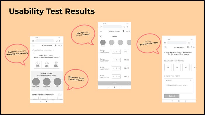
Thanks to this, I was able to collect some feedbacks and improve the interface of the web app.
💞👁🗨 Look and feel
Tabhotel provided a style guide of one of their clients to work with :

So I could establish and organize the hierarchy between the different components.
This leads to work on the Hi-Fidelity prototype,
let’s check it!
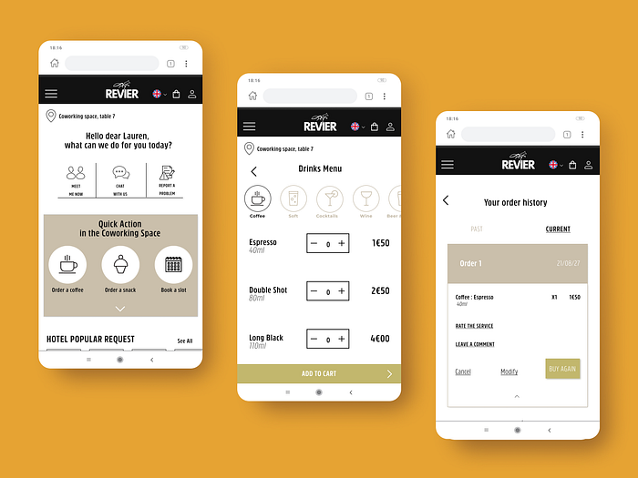
Lauren’s happy path starts after flashing the QR code of her table, she can see that indeed she was well localized.
As you know she would like to order a coffee. Too focus on her work she didn’t notice that she got a double shot instead.
So she wants to communicate it to the staff by using the “meet me now” option
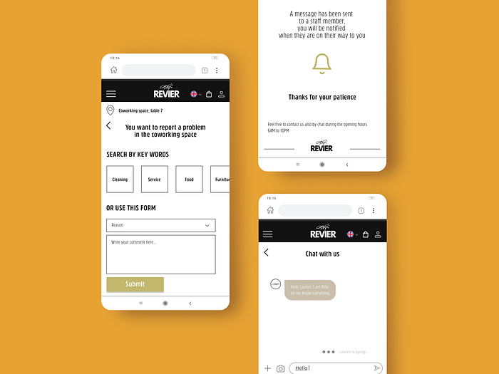

BUT it’s not the end, please bear in mind that :
I decided to conduct 2 desirability tests:
- 1st one, users, after trying the web app gave some brand attributes
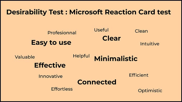
Clearly what popped the most is that this app is EASY TO USE, CLEAR, MINIMALISTIC, EFFECTIVE, AND CONNECTED
- In addition to the previous test, another bunch of users have 5 seconds to visualize one of the screens and let me know their first impression and what they have memorized.
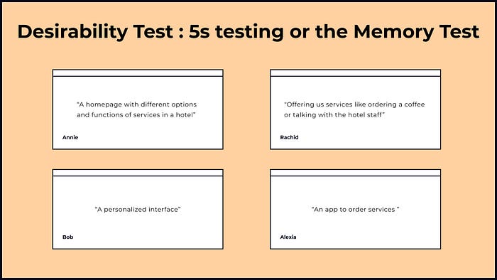
Here Annie “A homepage with different options and functions of services in a hotel”
🐾 Evolution
- What are the next steps?

- What I have learned
This type of app helps the hotel staff to be more efficient on the ground, focus on services quality, build a stronger, warmer, and enjoyable experience for the guest.
Lastly, we always have to bear in mind that the design is centered on the final user’s needs, the one who will use the product.
So thank you for following my work so far!
The Bootcamp has been such intense and productive, I have met wonderful people all along (big up to my teachers and classmates), also I had the opportunity to work in different teams where we have managed to bond easily and quickly!
I must say that I am proud to be part of the Ironhack community :)
Cheers!

