Case study: Super Market Experience Re-Imagined using Design Thinking.
Design Task by — Kaartik Malhotra
Introduction
According to “statista.com”, as of October 2021, India has over 12.8 million supermarkets catering to a vast majority of consumers, across different segments. With the advent of technology, and startups like Swiggy Instamart, and Blink-it, the offline supermarket industry in India is witnessing a stagnation, and that’s why, since 2016, India has witnessed a minimal growth of just 1.34% (170,000 supermarkets) in the supermarket number space, according to statista.com.
So, the question arises, why are supermarkets are not progressing, despite companies like Reliance, Amazon, Tata, Swiggy and more are investing heavily in the grocery space.
Here we intend to understand the reason of menial growth of offline supermarkets, the problems that persist, and develop a possible solution to solve the said problems keeping in mind the Indian market, and their buying habits.
Contents
- Scenario
- Scope of Work
- Competitor Analysis
- Roles and Responsibilities
- The Design Process
5.1 Empathise
5.1.1 Assumptions
5.1.2 Users and Audience
5.1.3 Contextual Inquiry
5.1.4 Empathy Maps
5.1.5 Constraints
5.2 Define
5.2.1 User Journey Analysis
5.2.2 Problem Statements
5.3 Ideate
5.3.1 Worst Possible Idea
5.3.2 Sketching
5.4 Prototype
5.4.1 Paper Prototyping
5.4.2 High-fidelity digital prototyping
5.4.2.1 Mood-board
5.4.2.2 Typography
5.4.2.3 Colour-Palette
5.4.2.4 Outcomes
5.5 Test
5.5.1 Moderated Usability Testing
6. KPIs
Scenario
The given scenario requires us to find possible room of improvement in supermarket purchasing experience, ie., finding possible problems in a supermarket purchasing experience and improving upon them.
Scope of Work
My scope of work for this assignment includes;
- Understanding users and audiences
- Empathising with users and creating problem statements
- Designing an efficient solution for the above problem statement
- Highlighting the design process to reach the above solution
- Highlighting relevant KPIs
Things outside of my scope;
- Creating a working prototype
- Performing thorough testing
Roles and Responsibilities
For this project, my current roles and responsibilities include, understanding users and audiences, understanding flaws and problems in the current offline experience of supermarkets, finding an efficient solution for the same, converting the proposed solution into lo-fi mockups, creating digital high- fidelity designs for the lo-fi mockups.
The Design Process
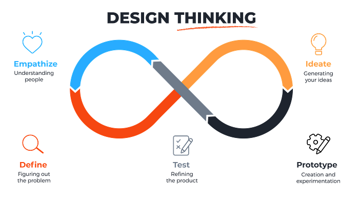
Since the task asks us to define problems in an attempt to in order to identify strategies and solutions that might not be instantly apparent with our level of initial understanding, this calls for the “Design Thinking” framework.
Since Design Thinking provides a solution-based approach to solving problems, this framework fits in perfectly to solve the task at hand.
The Design Thinking framework is further divided into five sub-parts:
- Empathise (with the user to understand their needs and how they feel)
- Define (the problem statements based on users’ needs)
- Ideate (come up with design solutions)
- Prototype (an early model of the product that illustrates the idea)
- Test (get feedback before it’s developed)
Empathise
In order to derive the possible problems supermarket users are facing, and design a user-centric experience, first, we need to understand who our users are, and what problems are they facing.
Assumptions
From the given scenario, we can safely deduce the following assumptions:
- The supermarket we are building will be a “Smart-Supermarket”
- There are limited budget constraints
- We are free to use technologies like Deep Learning, Sensor Fusion, Computer Vision and more
- We have full control on the stock we receive for our supermarket
Users and Audience
Based on the given scenario, and the goal at hand, there are a few burning questions I need answers to:
- What gender dominates shopping in supermarkets?
- What is their age group?
- Location of a supermarket respective to their houses
- Accessibility of the said supermarket
- How often do they visit a supermarket?
- What are the major challenges they face while shopping in a supermarket?
- Which supermarkets do people prefer?
The responses I received, in the limited time, for the above questions are as follows

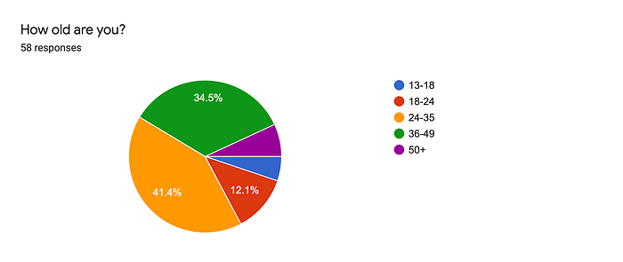
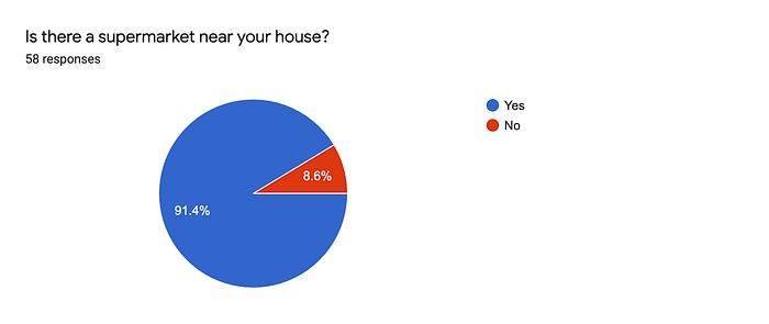

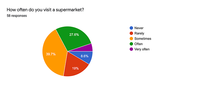
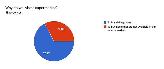

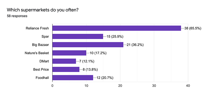
The above data allows us to understand who all are our “end-users”, and the kind of problems they are facing on a daily basis.
Summarising the above data:
- Gender that primarily visits supermarkets: Females
- Primary age-group that visits supermarkets: 24–35
- Top 4 major problems users face while visiting a supermarket:
Long queues at cash counters, Can’t find items easily, Get to know that the item is out-of-stock after entering the supermarket, Cleanliness and Sanitation issues
What Does this mean?
The above data allows us to make the following deductions
- Since our majority audience is women in the age range of 25–35, it would be a good idea to emphasise a healthy lifestyle through our final product.
- Since majority of the women are politically correct, especially related to matters like human rights, LGBTQ, women issues, etc, it is important that the product should not have a political bias
- While our secondary audience is male in the similar age range, adding sports and business references in the product will be a good idea
- Overall, the product should be clean, and simple to use, since most of our audience is the middle age range. Adding unnecessary information, and/or features might just hinder the simple task of buying groceries from a supermarket.
Contextual Inquiry
Due to current situation of lockdown and COVID-19, we will be using the “Passive Inquiry” model to understand our users better, watching previously conducted Passive Inquiries and user interviews via telephone should help us understand their experience and journey a lot better
References
The above videos and a few telephonic interviews with an ex-employee of Bharti Walmart, and friends and family, has allowed me to understand what supermarket psychology is, how people buy products and what is their journey.
To summarise the above data in the Contextual Inquiry Model:
- Context: The context of use in our situation is a typical supermarket where people go out to shop. The inquiry happens when people are in the place of context to help them jog their memory. This inquiry helped me place the user in the context before collaborating and understanding them.
- Partnership: Here I tried to build a partnership with the user in order to understand their journey through the entire shopping experience.
- Interpretation: Here I share my interpretation with the users to make sure we are on the same page.
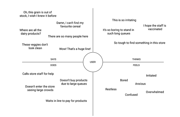
Empathy Map
Constraints
- Commercial constraints: For this project, time is extremely limited, therefore performing test analysis would be a tedious task.
- Sensory Design: Since this project is for representation purposes only, therefore, a sensory constraint comes into play.
- Integration Constraint: The proposed solution would require a lot of technology being integrated with each other in order to create a seamless ecosystem, therefore, there might be some Integration Constraints.
Define
In order to reach to our problem statements, we first have to analyse the above data to draw insights. To derive a problem statement from the above data, it’s best to conduct a quick user-journey analysis
User Journey Analysis
The following results were received using the above data

The above map helps us to clearly identify the possible pain points and problems the users face on a daily basis.
The following result can be deduced from above
Problem Statements
- Keeping in mind the pandemic situation, poor, or no temperature checks makes the user feel unsafe
- Due to relatively large size, finding and searching for items is tough task for users
- Not knowing the availability of items before leaving for the supermarket is severe problem for the user
- The entire checkout process, from waiting in queues, to scanning the items, to payment and finally getting the items verified with the guard is one of the biggest problem users face on a daily basis
Ideate
So far, we have understood the problems users are facing in a supermarket, in this phase, we will try to come up with ideas to solve the said problems.
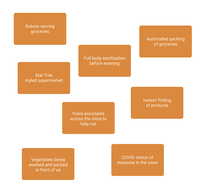
Worst Possible Ideas
A technique that allows us to stimulate free thinking and come up with ideas that might seem absurd at first, but may end up being the actual solution
Sketching
In this step, we sketch out possible solutions to our problem.
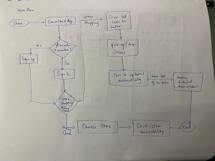
The following is a USER FLOW sketch that I have proposed for the problem at hand.
Prototype
Up till now, we have identified our audience, problems they face, and have come up with a possible solution. It’s time to convert the proposed solution into a prototype to test our idea.
Paper Prototyping
The following is my result of a quick paper prototype
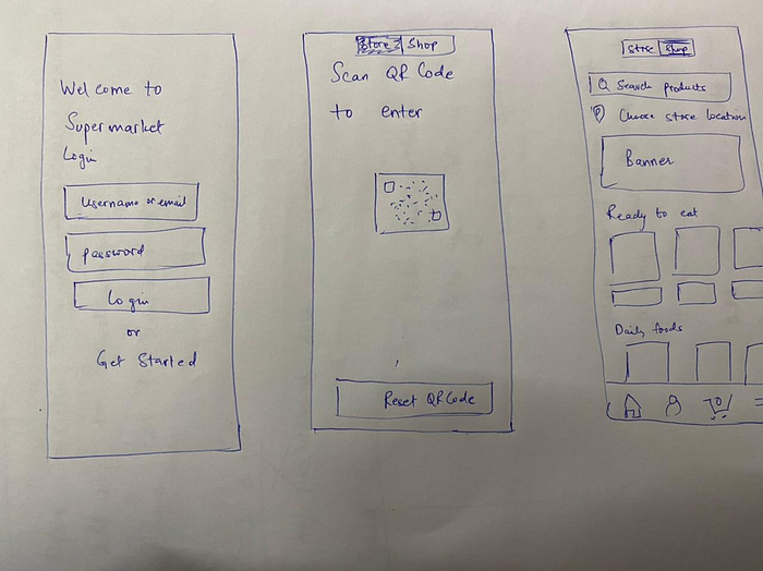
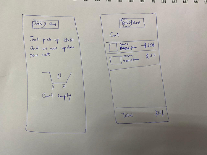
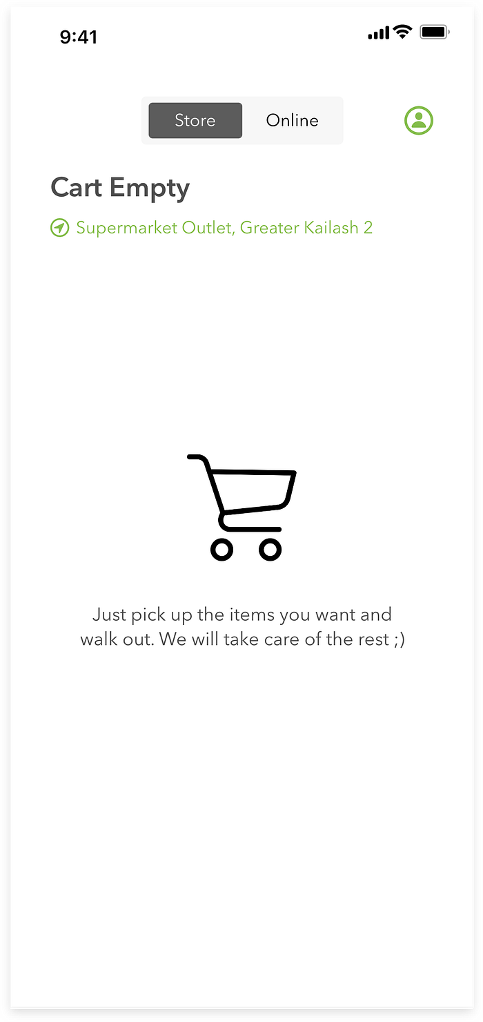
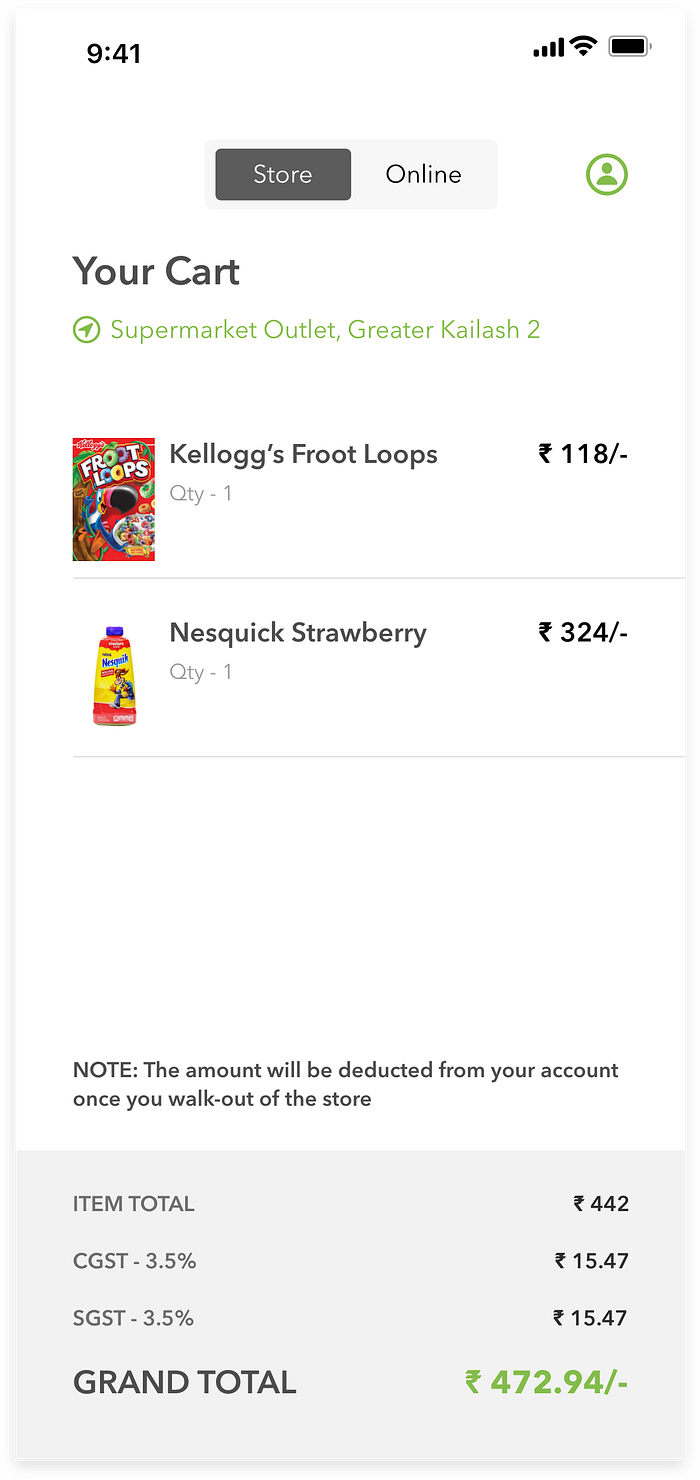
High-Fidelity Prototypes
Turning the above paper prototypes into high-fidelity prototypes
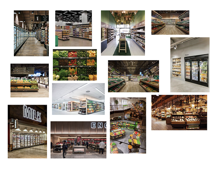
Mood-board
Typography
Avenir: The Avenir type family includes seven font weights; Avenir Light, Avenir Book, Avenir Roman, Avenir Medium, Avenir Heavy and Avenir Black. This typography is designed to match the visual clarity of the products UI as the font family is neutral and legible.

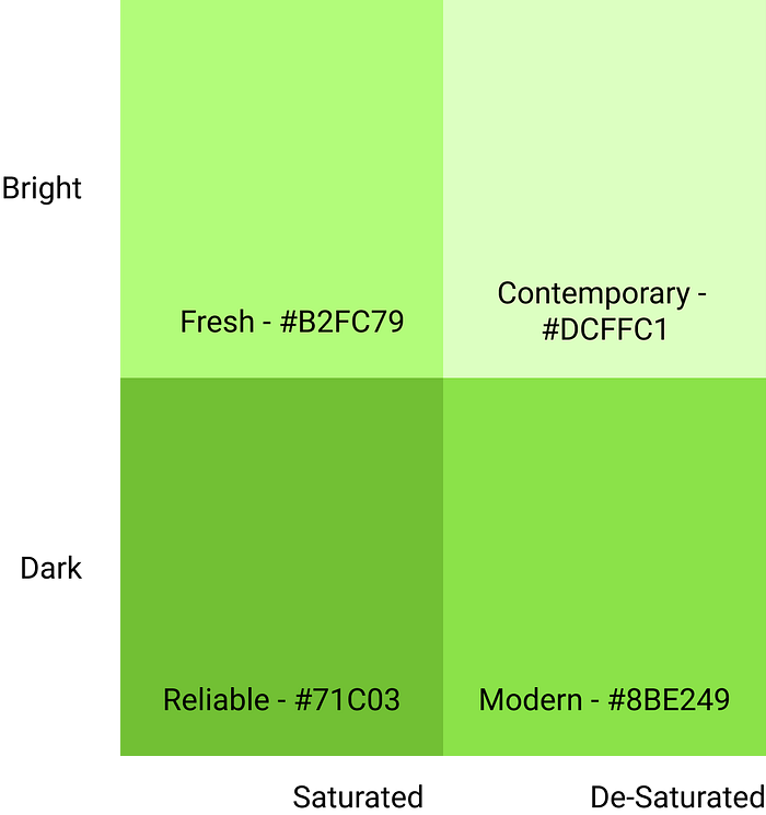
Colour-Palette
Understanding the product, I intend to convey the following emotions to the users when a user views our system.
- Fresh
- Reliable
- Trustworthy
- Contemporary
- Modern
Since the product is dealing with groceries, and wants to convey a fresh emotion, I have decided to go with the “green” family.
Outcome

Test
The goal here is to understand what parts of the design are effective and what are not. Due to limited time, testing at this stage will not be possible, but a Moderated Usability Testing Session will prove effective to understand how people are reacting to the proposed solution
KPIs
The KPIs for the proposed design are as follows which will allows us to measure the success of the proposed design:
- Task Success Rate
- Time on Task
- User Error Rate
- CSAT
- System Usability Scale
Thanks!

