Streamlining Client Onboarding for Scenes: Product Design Case Study
Context
While at 10kdesigners, I was presented with the option to undertake a capstone project for Scenes.
This case study aims to break down my take on the project and present my solution.
It is important to note that this solution is hypothetical and not live.

What is Scenes and what do they do?
Scenes is a community builder platform that allows individuals or brands to manage, moderate, and monetize their communities. Scenes describe themselves as a “white labeled Discord”.
Scenes allow creators to own their communities under their own branded platform. The platform offers a web app and mobile app with a variety of features, including audio/video rooms, live events, forums, chat, media, shop, community coins, and more. This eliminates the need for creators to juggle multiple digital products to manage and monetize their community.
Understanding the problem space

The onboarding process for new clients at Scenes is complex and often filled with confusion, frustration, and unnecessary effort.
The process begins with the client expressing interest in having their own community platform. The client then chooses a platform (either a web app or web app + mobile app) and has a call with a Scenes representative to discuss customization, strategies, and how to make the most of Scenes’ features. A community success manager is also assigned to the client to help them set up and run their community. Documentation and a loom video are also sent to the client to explain how to use the platform.
The next part of the onboarding process is where things get complex. The client is sent a form that collects information and other assets required to list their app on the Play Store and App Store. Many clients have difficulty understanding the questions in the form and call a Scenes developer for help. This prevents the developers from listing and testing apps and has them on calls with clients to clear up confusion regarding the form, which limits Scenes’ ability to scale its business.

Design Challenge
How might we simplify the onboarding process for new clients and streamline the form submission for app listing, in order to reduce confusion and frustration for the client, and time spent on calls for the developers, thereby enabling scalability of Scene’s business?
Who Is This Solution For?
The solution targets clients of Scenes, who have selected the Web-app + Mobile App community package.
Ideating on the solution
As we’ve established, Scenes offers its community platform to be either a web app or a web app and a mobile app. That would mean that regardless of what plan a client buys, a web app platform is mandatory.
This makes it the perfect opportunity for the solution’s platform to be a web app.
With the solution platform selected, I had to finalize what exactly the solution would do to help our case. Here are my final ideas:
- The solution must collect all the information currently collected via the form with helpful guides along the way to assist the clients. The product must try to break down all the information required into many different parts, as it can since it can get hectic very quickly. In other words, be mindful of drop-off.
- The solution should offer customization options for clients to modify the look and feel of their community, within the scope of the customization options offered by Scenes. As the solution would involve collecting information and declaring legal acknowledgments which could be stressful, this would add a delight factor to the client.
How can the success of this product be measured?
To design any solution that has an impact, it is necessary to define what the “impact/success” looks like. After some brainstorming, I defined the following as possible success metrics:
- If the number of calls between a developer and a client can be reduced, then that would be a good indicator of success as it aligns directly with what we primarily want to do with this solution.
- If the product can successfully convey what the different listing information means, and how to get that information, all without stressing out the client, then that would be a good measure of success for this product. This would require user interviews.
- Form completion speed.
Research
Before putting my efforts into research, I had to define why I wanted to do research in the first place, and what my goals were. My goals had to be as clear as possible, and after some brainstorming, these were my defined research goals:
- Understand how apps are currently listed on both Google Play Store and Apple App Store
- Understand the platform that Scenes offer
Why understand the app listing process?
The frustration of clients comes from a lack of understanding of the different information required on the form. To solve the problem at hand, it is required to understand how apps are currently listed on the App Store and Play Store and to seek opportunities to make the process easier for the clients.
Why understand the Scenes platform?
I wanted the solution to give clients the option to customize their desired end platform while remaining within the limits of what’s offered by Scenes. Naturally, this would require me to know the product offered by Scenes, inside out.
Understanding the app listing process
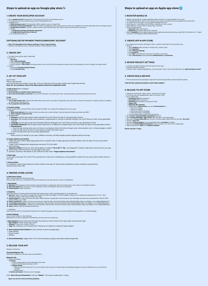
For the average person with zero understanding of the software world, the listing process of both the Google Play Store and the Apple App Store can be confusing. The process is very long and filled with tons of technical and legal jargon along the way. Having multiple high-level steps with each step having additional sub-steps does not make the process easy.
To demonstrate my argument, here’s an image that shows the different steps to list an app on both the Google Play Store and the Apple App Store
Understanding the Scenes platform
Abhinav Gupta, product designer at Scenes, gave me a good understanding of the Scenes platform, its customization abilities, and features and gave me access to the documentation that Scenes sends out to their clients during the onboarding process.
Aside from expected customization options such as app name and app icon, Scenes offers the following ‘basic’ customization options:
- Primary Color
- Primary and Secondary Fonts
- Chat Style
- Community Cover Image
In addition to ‘basic’ options, Scenes also offers a very long list of ‘advanced customization’ options. To top it all off, Scenes allows clients to write custom CSS code to tailor the community to their preferences. Custom CSS can always be reset to go back to the default one.
Finalizing client input and solution user flow
After research, I set out to compile all the data that a client would have to provide for their app to be listed on the Google Play Store and App Store.
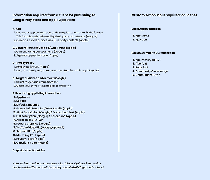
Decisions Made: Certain information currently being collected via the google form, such as app category and tags, phone and tablet screenshots, test email addresses have been omitted from being collected in this solution. App category can be understood on the discovery call between the client and Scenes representative, and the screenshots can be sourced by Scenes rather than the client sourcing it. Since testing is already done by Scenes, making dedicated testing emails and re-using them for clients would simplify the onboarding for a new client. Clients are asked to declare if developer access has been given to Scenes, as it is currently done via the google form. The decision to offload the task of creating developer accounts to Scenes engineers would be ideal, but was scrapped as it would require more time and effort from developers at Scenes.
It is important to note that this solution is hypothetical and it’s real-life feasability would be dependant on multiple factors.
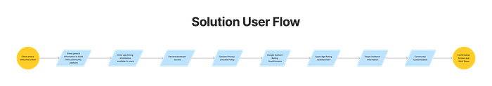
With the data required from a client finalized, I laid out the user flow for my solution:
Design Solution
1. Welcome Screen
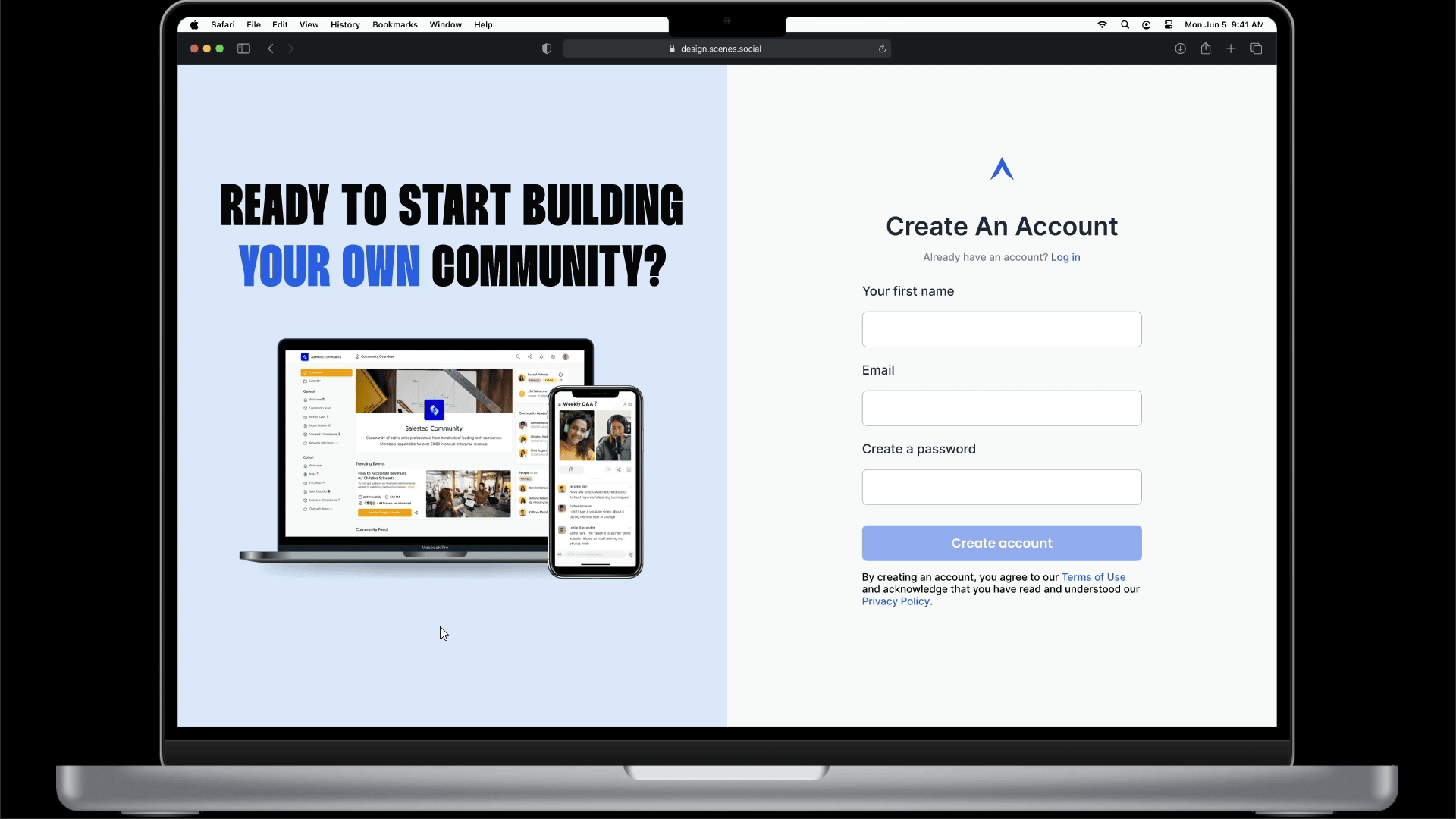
The client is welcomed with a screen where they can either create a new account or log in to an existing one. Initial versions of the design saw elements that demonstrated social proof, such as reviews and numbers, but were later discarded as the clients would have already purchased a plan before being introduced to this solution, which meant that they do not need to be sold to, again.
2. White-labelling — General Information
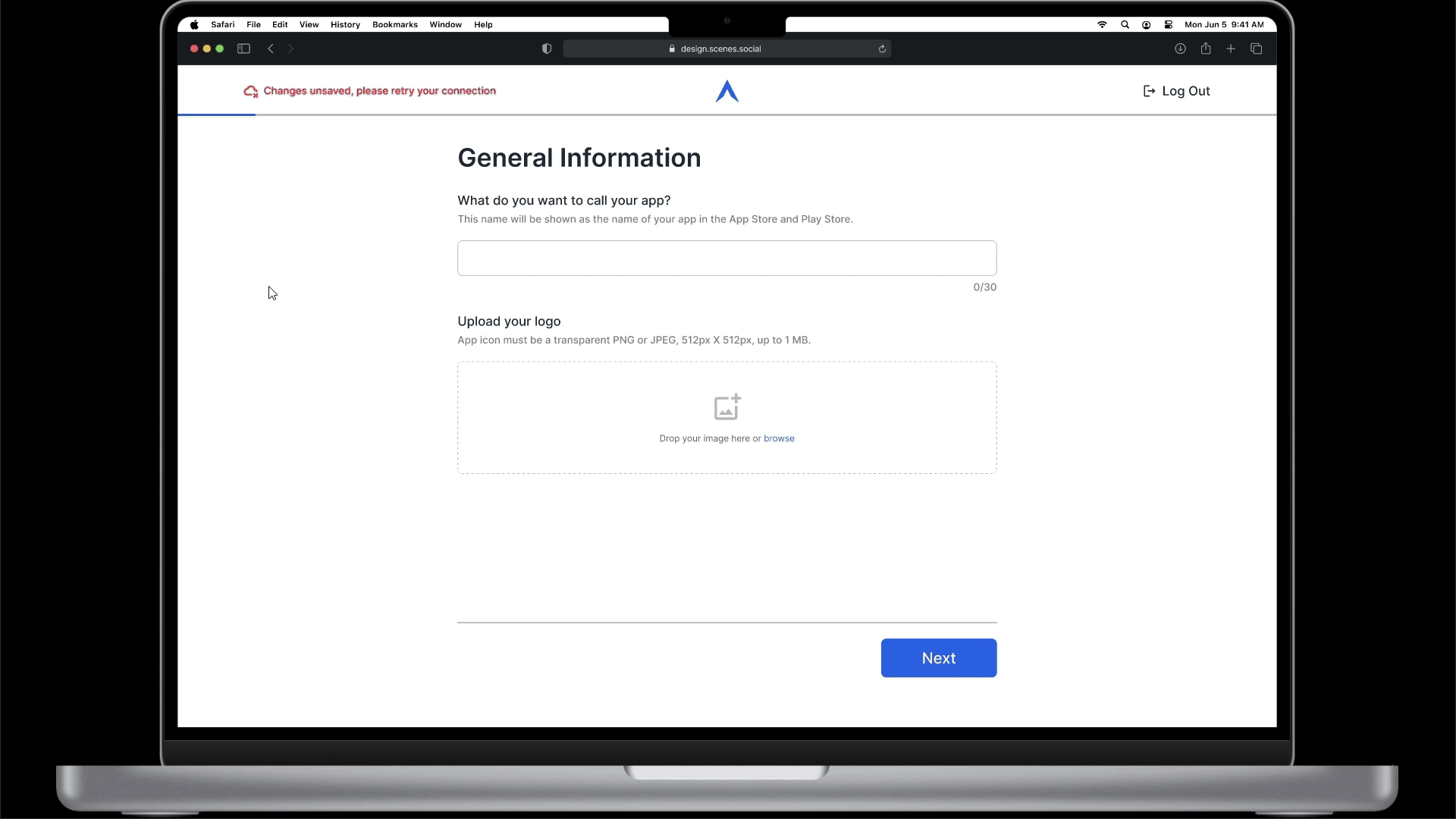
The client sees a screen that collects basic white labeling information required by Scenes. It includes the name of the community and its icon.
3. App Listing Information (1/6) — User-Facing Information
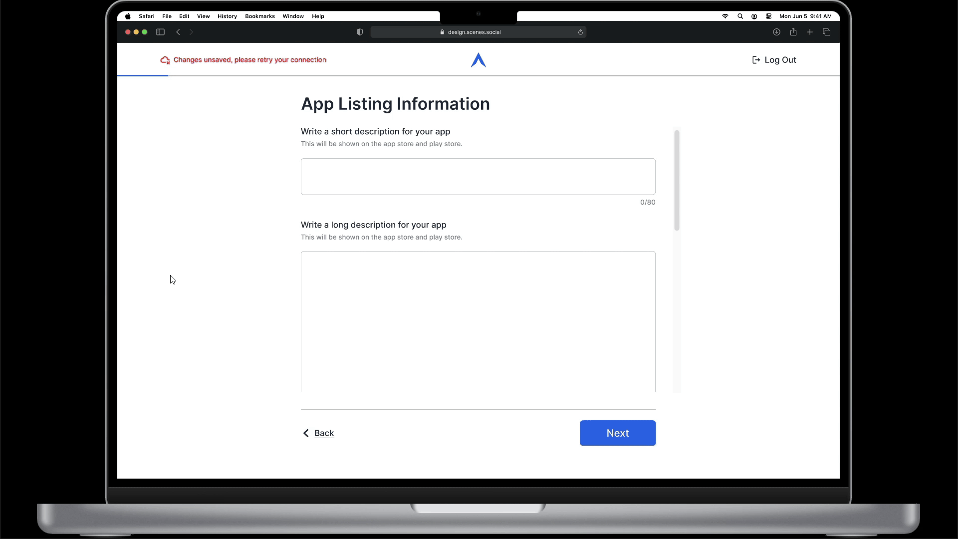
The client is shown a screen that collects information that typically influences a user’s decision to download an app. The information collected on this screen will be displayed on the app’s page in the Google Play Store and Apple App Store.
4. App Listing Information (2/6) — Developer Access
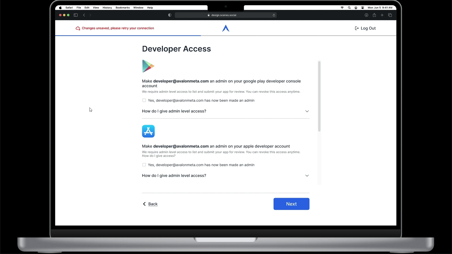
To publish an app onto the Google Play Store and the Apple App Store, it is mandatory for the publishing individual or team to have access clearance on the Google Developer Play Console and the Apple Developer Connect. The solution screen requires the client to declare that the appropriate access has been given.
5. App Listing Information (3/6) — Privacy Policy and Ads
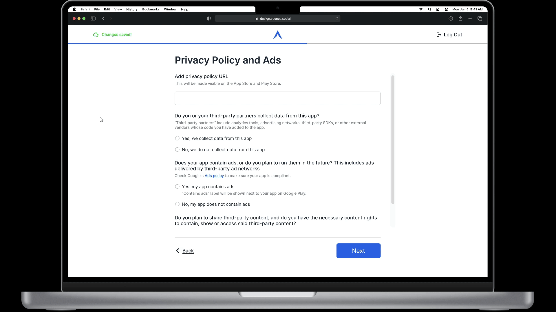
The Google Play Store and Apple App Store have strict policies around privacy and advertisement. When listing an app, it is required to declare if the app contains advertisements. Data collection policy and privacy policy are also collected in this screen. Additionally, the solution screen also out-links to Google’s Ads policy, so that the client has the opportunity to read it.
6. App Listing Information (4/6) — Google Content Rating Questionnaire
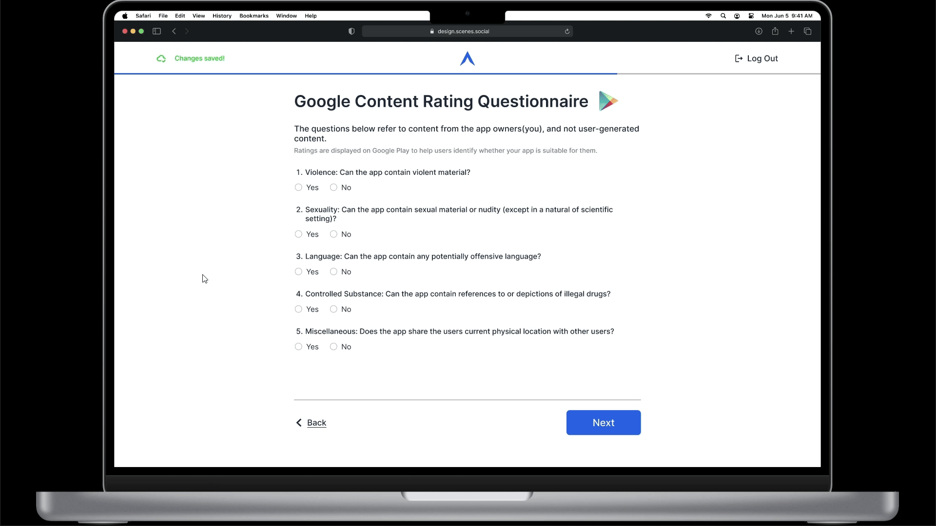
Google requires app publishers to fill out Google’s content rating questionnaire as part of the store listing process. The responses to this questionnaire will influence the age rating given to the client’s app, and will also be displayed on the app’s page in the Google Play Store.
7. App Listing Information (5/6) — Apple Age Rating Questionnaire
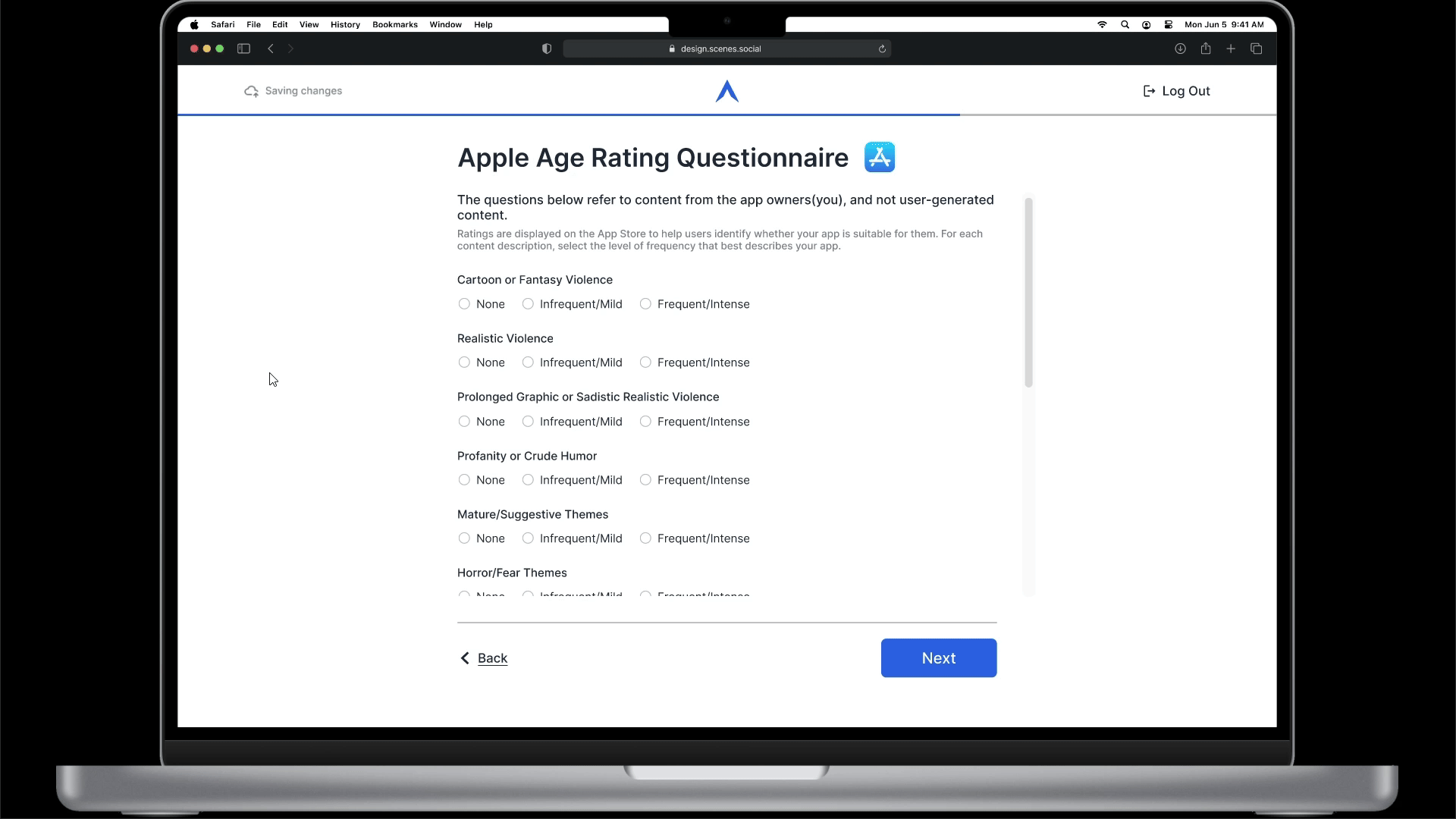
Apple requires publishers to complete an age-rating questionnaire as part of the process of publishing an app to the App Store. The responses given to this questionnaire affect the age rating given to the client’s app and will be displayed to the users when they come across the app in the App Store.
8. App Listing Information (6/6) — Target Audience Declaration
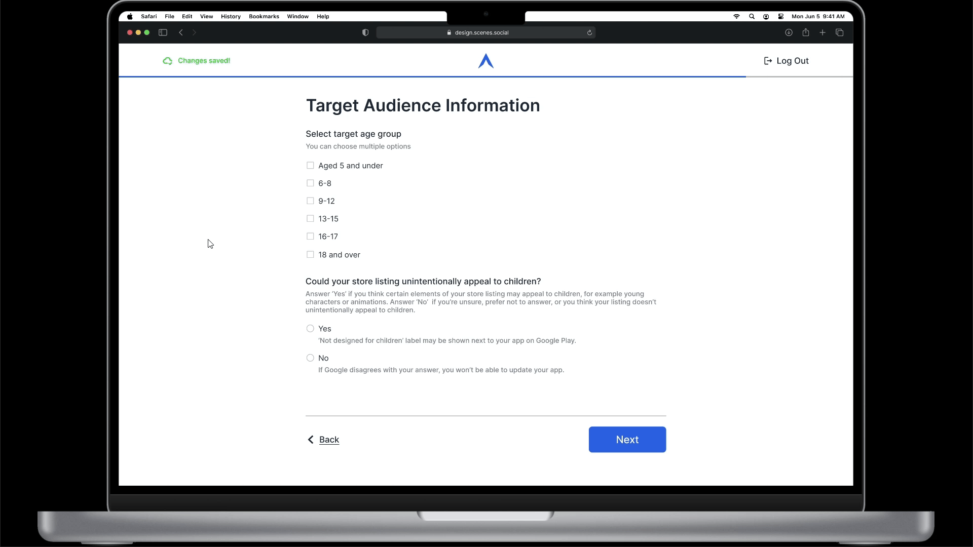
Google requires publishers to declare their app’s intended target audience before submitting the app for review. The declared information will be verified by the reviewers and will be displayed on the app’s page on the Play Store.
9. White-labeling — Community Customization

The client is now presented with ‘basic’ customization options to tailor the community to their liking. Advanced options were omitted here, as they are very specific and granular to the point that tweaking those options would take a lot of time and focus.
The design of the preview section here has been kept the same as it would be found inside the settings of a community on the web app.
10. Confirmation Screen and Next Steps
Forms are tedious and stress-inducing, especially in scenarios involving legal declarations. Knowing this, I decided to end this flow with a touch of fun and playfulness — which explains the confetti. Followed by the confirmation message are the next steps, which are currently shared with the clients via email/messaging.
Some Highlighted Design Decisions
1. Top Aligned Labels
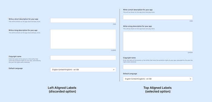
In the beginning stages of designing the UI, I had to make a choice on where I wanted the input labels to be placed. Having had a strong feeling that the end solution would mostly look like a form, I did some research and found evidence on the different form label layouts that are in use.
Top-aligned labels have been proven to reduce form completion times. Because I had defined form completion time as a potential success metric at the very beginning of this project, the choice between top-aligned and left-aligned labels was an easy one to make.
Source
2. Auto-save and Live Save Status

Working with online editor-like tools may elicit the feeling of fear of loss. The auto-save feature prevents this fear from coming alive.
Auto-save alone, however, is not enough. It has to be clearly communicated to the user. This led me to design different versions showcasing the status of auto-save functionality. This also ties nicely with the commonly followed heuristic — Visibility of System Status.
Reflection
Throughout my design journey, I actively steered clear of form design, avoiding it for as long as I could. However, upon completing this project, my perspective has undergone a significant change. I now find myself with a profound appreciation for the craft of form design and the methods employed by experienced designers to facilitate users’ interactions with these essential elements.
You’ve reached the end!
Thank you for taking the time to read this through. Putting together this case study was challenging, so I appreciate your interest and effort in reviewing it.
If you have any work opportunities, or questions, or just want to chat, feel free to connect with me on Twitter and LinkedIn. Additionally, you can reach out to me via email at cyrilstephenhere@gmail.com
Cheers ✌️

