State of Gambling Design
With American markets opening up, gambling design will be going through a renaissance soon.
But where’s the design in gambling now? Can we benchmark the good and the bad?
I’ll focus on the UK — the beast I know best. Online gambling is wide-spread and very popular in the UK. Teenagers grow up around sports betting; placing a casual bet while watching football is the norm. Unsurprisingly, there are quite a few digital bookies on the market. Some digital bookies are companions to real life betting shops, others are online only.

Language
With the move from betting shops to online that started in the late 90's, some of the terminology stuck around — e.g. betting slip or coupons. But it’s not just the terminology, but also designs that echo the physical betting sometimes.

The trend of keeping terminology consistent with real life is also seen in poker and casino, with labels like ‘cashier’ and ‘the rail’ used in digital products.

From personal research experience, some of these are labels are easily recognisable, like ‘cashier’; users have no trouble finding where to deposit or withdraw. But others, like ‘Rail’, are a textbook example of vague and non-descriptive labelling.
The usability risk with such language is that young people and non-professionals today often don’t have reference points for the terminology.

Another language challenge is that betting and gaming are jargon-heavy. It comes with no surprise that some of it seeps through into the product interfaces. Examples include accas, BOG, RG, BTTS, tote and many many more abbreviations, specific terminology and namings.

There are multiple glossary websites that cover betting terminology, but UX-wise it’s a great challenge of finding the opportunities for refreshing the language.
Look & Feel
Moving on from terminology, we get to legacy tech. Not only is legacy tech behind the outdated look and feel and inconsistent experiences, it also stands in the way of experimentation and quick live validation of ideas. If you work in design and pay attention when using the apps, you can easily tell how the business is structured purely based on the inconsistencies of design patterns used. When redesigns are rolled out gradually, some parts of the websites are refreshed faster, and if you know where to look, you’ll be able to tell the trade-offs for MVP and direction in which it will go. Old tech is a blocker for 21st century design solutions and in some use-cases it’s faster to rebuild from scratch to change the interface.


More contemporary apps like BetBull or Virgin Games are lucky to not have accumulated as much tech debt and existing architecture that dictate future decisions. These apps use more native interaction patterns, bringing the experience into the present and differentiating themselves from older players in this field. However, even they need to compromise and follow existing mental models for terminology and navigation if they want multi-brand customers to stick around. It’s one of the core NNg heuristics and a powerful one at that. Time and again we observed participants in usability testing struggle with same journeys presented in drastically different ways because they were already used to doing things a certain way. Perceived usability would always beat actual ‘by the book’ usability.
Another pattern that is prevalent in old-school websites are pop ups for everything (as seen in William Hill’s screenshots). Poor design decisions and rushed features lead to an abundance of these. The longer the product exists the more pop ups over pop ups would appear… Check out deposits in GG or PokerStars and this should be a cautionary tale for any young bookies and an encouragement to think the navigation through.
When it comes to online gambling, cognitive load seems to be the natural state of play. Information density on any page is insane, with more and more data points being added.

It’s easy to say that white space is your friend. But in reality, each page needs to communicate so much to the player — most relevant events, best gaming and betting opportunities, promotions, social proofing, stats… the list can go on forever. Right now the user is often expected to learn to recognize lots of not always intuitive icons and abbreviations.

From the design point of view the main challenge is figuring out when to use industry standards and when to differentiate, which ties up back to the same consistency heuristic. It’s especially tough to make a call if you know that the industry standard can be improved, but it is what users know and recognise. Innovation sounds great in theory, but is often done at the cost of recognisability.
Beyond the web
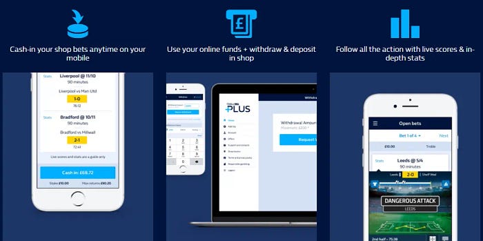
With all retail and e-commerce moving towards omnichannel experience, gambling is also keeping up. Tying retail and digital together via a card is the most obvious route — with William Hill and Paddy Power offering to manage funds through cards.

Mobile is another ‘bridge’ between online and retail environments and there is research on implementation strategies.
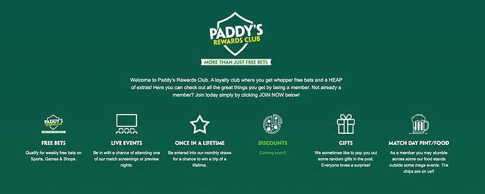
Subscriptions and memberships are another mechanic for a better experience that is gaining traction. Most brands introduce variations of loyalty schemes, some being more transparent than others. Paddy Power, however, take it beyond digital and offer a free match day pint for being a member, which is in line with the cheeky brand personality. Sky Bet also ventured into giving real-life rewards for Sky Bet Club premium members, thus continuing the trend.
In short , the state of gambling design could be better, but understanding the root of the problem is a step towards solving it. Gambling and gaming are fast-changing industries, there are always new features to be build and innovation is driven by both competition and regulations. Thanks to the new big players emerging and markets opening up I would expect companies to start investing more into long-term UX strategy and solid design decisions. And until that happens, let’s not be too harsh on ourselves, come to terms with the trade-offs and keep our fight for small wins for the users.

