Case Study : Usability Analysis and App Redesign For Starbucks Indonesia Mobile App

DISCLAIMER :
This case study is for my thesis. This is the implementation of what I have learned during my studies. This case study was created purely just for my study material and has no connection with the company at all.
Happy reading! :]
Duration
+/- 7 months (Feb-Sept 2023) with the timeline for making a thesis.
Overview
As of April 2022, Starbucks, a globally recognized brand, operates a total of 34,630 establishments in 84 countries, offering a range of coffee-based products and various beverages (Starbucks Corporation, 2022). In Indonesia, as of August 2022, Indonesia boasts 500 Starbucks stores spread across 36 cities, employing more than 4,300 individuals. Consequently, Indonesia has now become Starbucks’ 10th largest market globally.
Background
This case study is done to find out more about its usability and user experience including habits, constraints, and suggestions. This is based on the results of the initial observation of the application, namely through an assessment or rating on the Google Play Store and App Store which shows a low value of 2.9 and 2.2 from a maximum value of 5. Most users have given feedback primarily regarding the unsatisfactory user interface (UI), the requirement for extra time to grasp the application’s functionality, and the existence of glitches.
Design Process
The design process that is used for this case study is User-Centered Design (UCD) where it aims to maximize the usability of a product. This method is divided into four parts in the process. The initial step involves grasping the usage context, encompassing the application’s user base, its intended goals, and when users typically engage with it. Subsequently, the second phase delves into specifying user requirements aligned with the application’s objectives. Next, a solution is crafted to address the challenges users encounter based on their requirements. Lastly, an assessment of the designed solution is performed to determine its alignment with user needs or whether further refinements are necessary.

Source: https://www.interaction-design.org/literature/topics/user-centered-design
Research Framework
Data collection comprises two phases: the initial survey and user testing. The initial survey’s objective was to collect information about the experiences of at least 68 respondents while using the application. Following this, user testing was conducted with a group of five individuals chosen from the pool of initial survey participants. This user testing aimed to assess the usability of the current application and make comparisons with the redesign results. The selection of these five participants aligns with Nielsen’s recommendation (2000), ensuring a comprehensive level of insight.
The initial survey incorporated a blend of open and closed questions, while the user testing encompassed tasks, scenarios, interviews, usability testing, and SUS questionnaire statements. Consequently, this study fits within the realm of mixed research, combining both qualitative and quantitative approaches. For data analysis, the research will utilize the affinity diagram framework and the Maze tool to provide a comprehensive presentation of the overall usability testing scores.
Initial Survey
This stage involves understanding the context of use and specifying user requirements. In this initial survey, users will be asked about their demographics and experiences while using the app in terms of motivations, habits, obstacles, and suggestions.
The initial survey, which was distributed, received a total of 100 replies. Examination of these responses from the initial survey revealed that a considerable majority of participants, specifically 85 individuals, fell within the age range of 20 to 23. Concerning occupational classification, students constituted the most substantial group, accounting for 87 respondents (87%). Furthermore, regarding their place of residence, Jakarta emerged as the dominant location, with 30 respondents (30%).
Based on open-ended questions regarding user experience, users found several problems or obstacles encountered, namely:

Initial User Testing
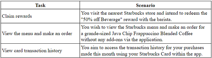
User testing involves conducting usability assessments and having five testers complete the SUS questionnaire. Testers will be assigned tasks and scenarios crafted based on the primary issues identified in the initial survey. The table below is the tasks and scenarios given to the testers.
The initial usability testing resulted in a score of 46, indicated by a red color code. This score indicates that the application’s usability is still at a low level. The calculation is automated through the Maze tool as the tester works on tasks and scenarios. The score takes into account various key indicators, such as task success (both direct and indirect), task duration, test exits, and misclick rates.
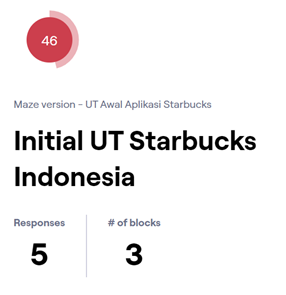
Additionally, concerning the SUS questionnaire responses, the existing application received an average score of 55. According to the SUS rating scale, this application is rated as ‘OK’ within the ‘Grade F’ category, and it falls within the marginally low range of acceptability. In summary, the Starbucks Indonesia application’s current system can be classified as somewhat less than ideal but still within the lower margin of acceptability.

At the conclusion of the initial test, the testers were also inquired about their overall experience, whether it was positive or not, and the reasons behind their responses. These questions revealed more insights regarding the challenges faced, including:
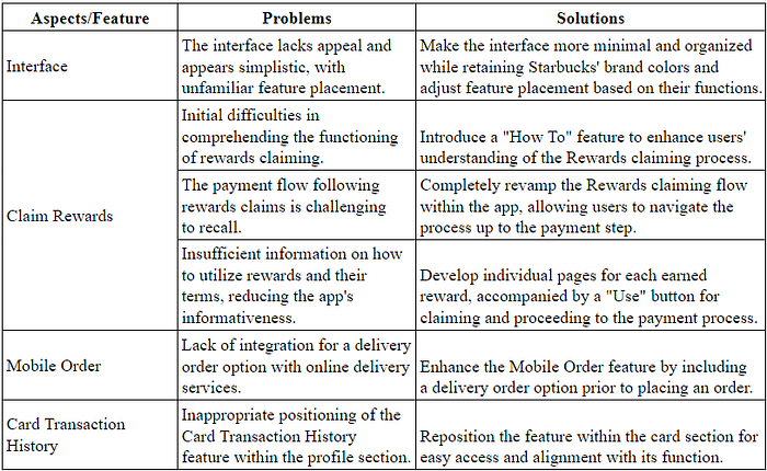
- An interface perceived as unattractive, simplistic, and featuring unfamiliar placements of elements
- Initial difficulties in understanding the functionality of the Rewards feature during the first use
- The absence of an integrated option for delivery orders through online delivery services
- A payment process following rewards redemption that is challenging to remember
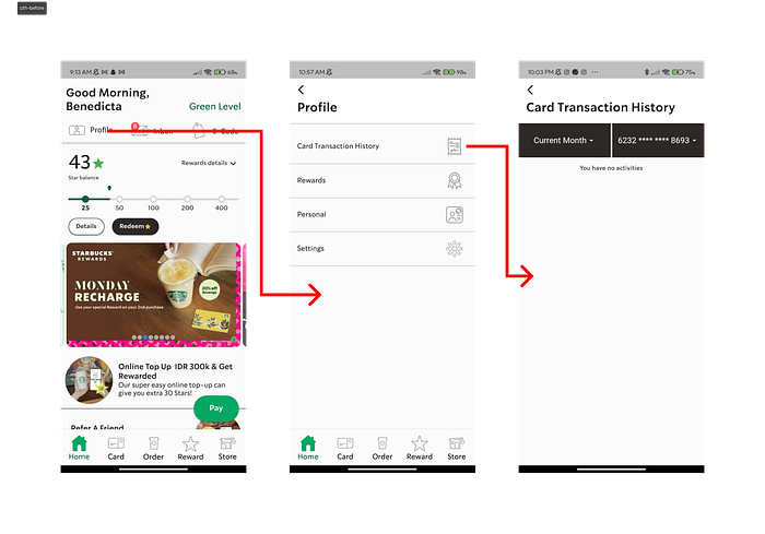
- The Card Transaction History feature’s improper placement within the profile section; and
- Inadequate information on how to utilize rewards and the associated terms, resulting in a lack of informativeness in the application.
Solutions
The six challenges encountered by users were identified as significant findings during subsequent interviews conducted in the usability testing phase. These user challenges serve as a basis for enhancing the application by devising solutions to address the issues outlined in the table below.
Information Architecture and User Flow
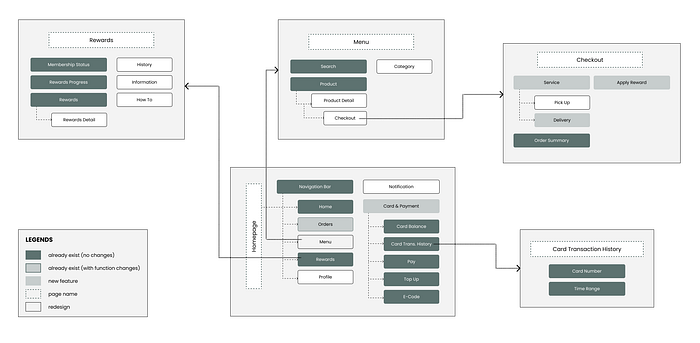
Following the identification of solutions for the issues encountered during testing with five participants, the subsequent phase involves developing an information architecture. Information architecture (IA) is instrumental in shaping design solutions within the UCD framework. IA serves to facilitate the accessibility and comprehensibility of information within an application or website (Interaction Design Foundation, n.d.-a). It involves structuring and presenting information based on its relevance and context. The IA for the Starbucks Indonesia mobile app redesign is illustrated in this figure below.
Following the establishment of the information architecture (IA), the next step involves the development of a user flow. User flow serves as a valuable tool to offer an insight into how users will navigate the application, outlining the path they take from opening the application to reaching their intended destination or goal. The user flow created for the redesign is readjusted from the current application flow by making all information easier to find and understand from the previous flow.
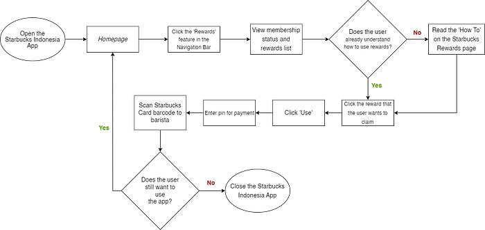
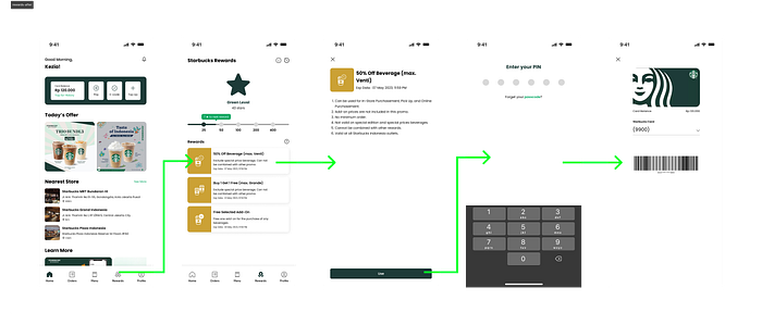
In the current application, to claim rewards, users cannot claim directly on the application and must say it directly to the barista. After that, the user returns to the homepage to make payment using the Starbucks E-Card barcode. In the redesigned application, all flows are contained in the application. The user can press the reward they want to claim and press the ‘Use’ button to use. After that, the user will be automatically redirected to the payment using Starbucks E-Card barcode and the discount will be immediately included in the calculation when making payment.
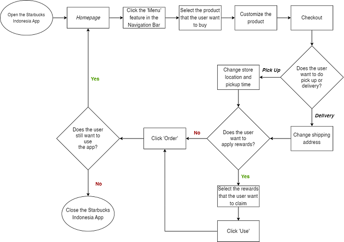
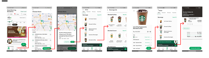
In the current application, to place an order, the user selects an outlet first. After that, the user can place an order and customize the product. If the user is confident with the selected order, the user can immediately place an order. Meanwhile, in the redesigned application, users are immediately presented with a menu of products available at Starbucks outlets that can also be selected on the same page. Furthermore, the user can select and customize the product. If the user is confident with the selected order, the user can checkout. On the checkout page, users can choose pick up or delivery services that are integrated with online delivery services and also choose to apply rewards or not.
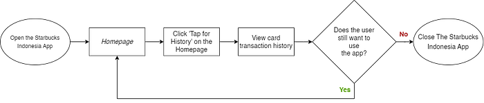
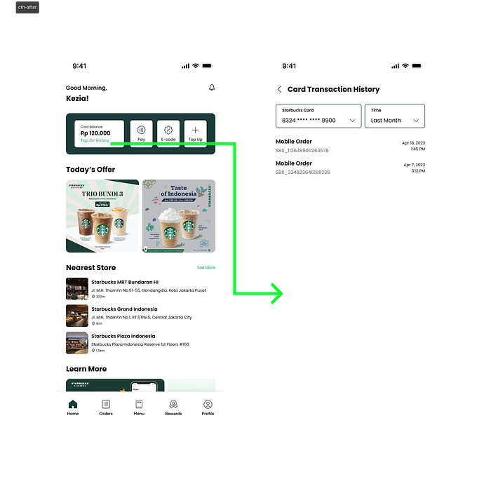
In the existing application, to see the history of purchase transactions using Starbucks Card, users must go through the profile section on the homepage. Meanwhile, for the redesigned application, users can access the purchase transaction history directly through the homepage in the payment section at the beginning of the homepage.
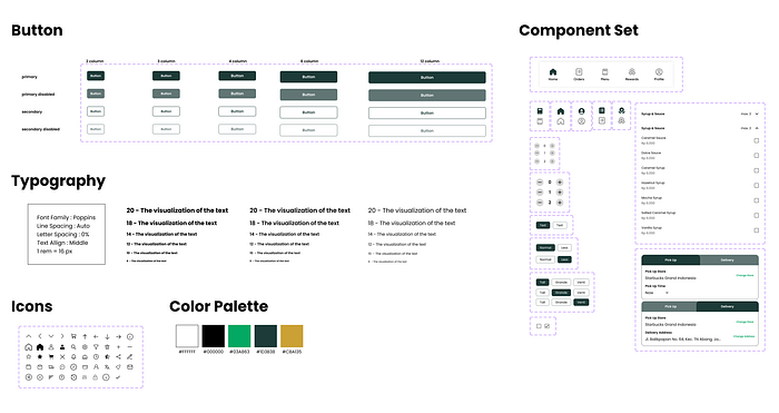
Wireframe and Design System
After forming the information architecture and user flow for application redesign, wireframes or page sketches are created as guidelines and frameworks to produce an application design.
Design system is created which is a standard guide or guideline for a digital product. This design system contains things that will be used continuously as long as the application continues to develop such as icon components, buttons, typography, color palettes, and sets of components for elements that will be used for applications such as navigation bars, tabs, dropdowns, and so on. This figure below is the design system used during the redesign of the Starbucks Indonesia application.
Design Alternative and Prototype
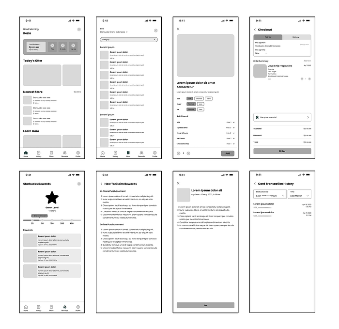
The alternative design serves as a visual representation of the proposed solutions to the identified problems. This prototype closely resembles the current application, with a primary emphasis on the features or pages that constitute the tasks and scenarios for usability testing. The redesign results are rooted in the previously established design system. During this phase, numerous pre-existing components, along with the content to be incorporated, are implemented.
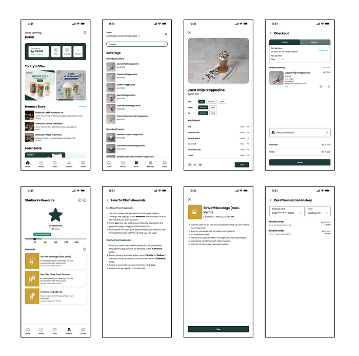
In addition, the complete redesigned prototype can be accessed through this link.
Not all of them are clickable. I made the flow based on the problem that I want to solve.
Flow Comparison
Claim Rewards

Menu/Mobile Order
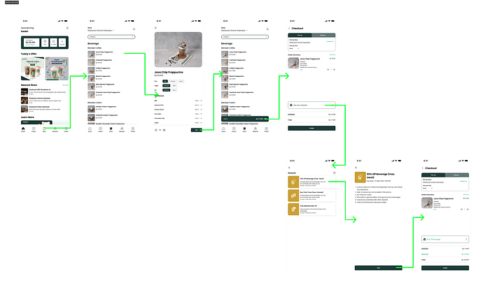
Card Transaction History
Final User Testing
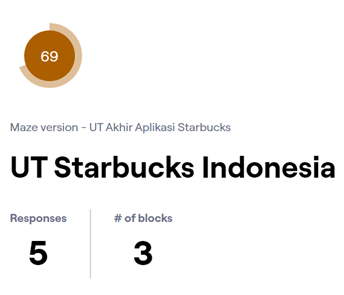
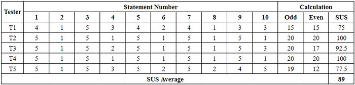
Subsequent testing was conducted to assess the application’s usability after the redesign. The tests encompassed usability testing and SUS evaluations performed by the same five testers who had previously engaged in the initial usability testing and SUS assessments, completing identical tasks and scenarios. The scores were derived by evaluating key indicators, which considered the successful task completion (both direct and indirect), task duration, test exits, and misclick rates. The overall score from the final usability test reached 69, signifying a high level of usability for the application.
Throughout the testing process, testers were queried about their general impressions of the redesign. The feedback offered by the testers encompassed the following observations: 1) the flow is now more straightforward and comprehensible, requiring minimal exploration for understanding; 2) the interface is no longer dull but instead appears sleek, minimalist, and informative; 3) the Card Transaction History feature is easier to locate as it’s no longer nested within the profile section; and 4) the provided features align with the Starbucks brand.
In the concluding phase of the final testing, the average SUS score from the five participating testers was determined. Through the SUS calculations, it’s evident that the average score for the redesigned Starbucks Indonesia application is 89. Referring to the SUS measurement scale, this application falls within the “Grade B” category, earning an adjective rating of “Excellent,” and residing in the acceptable range. In summary, the Starbucks Indonesia application can now be classified as excellent and widely acceptable.
Conclusion
The research aimed to enhance the usability of the Starbucks Indonesia mobile application, and the redesign was found to be effective in achieving this goal. This is demonstrated by the increase in the overall usability testing score from 46 to 69 and the average System Usability Scale (SUS) score from 55 to 89. As per the SUS measurement scale, the application’s usability has shifted from a borderline level of acceptability to a well-accepted level.

