Smooth Navigation, Captivating Experience: A UI/UX Design Guide for Effective Layout and Navigation
In the realm of user interface (UI) and user experience (UX) design, smooth and effective navigation is a key element in creating a captivating user experience. Well-designed layouts and navigation allow users to easily find information, explore content, and interact with applications or websites without any obstacles. In this article, we will discuss several principles and UI/UX design guidelines that will help you create effective layouts and navigation, enhance user satisfaction, and achieve your desired design goals.

Understanding Users and Context
When designers understand the context in which users are interacting with their product, they can create a better experience that is tailored to the user’s needs. For example, if a user is trying to book a flight while they are on the go, they will need a different experience than a user who is booking a flight from their home computer.
There are a number of ways to understand users and context. One way is to conduct user research, such as interviews, surveys, and usability testing. This can help designers to understand the user’s goals, needs, and pain points.
Another way to understand users and context is to use analytics data. This can help designers to see how users are interacting with their product, such as what pages they are visiting, what actions they are taking, and how long they are spending on each page.
By understanding users and context, designers can create products and services that are more user-friendly, efficient, and enjoyable. This can lead to increased user satisfaction, engagement, and loyalty.
Here are some specific examples of how understanding users and context can be applied to design:
- A website for a travel agency might display different information depending on the user’s location. For example, if the user is in the United States, the website might show information about flights to and from the United States. If the user is in Europe, the website might show information about flights to and from Europe.
- A mobile app for a grocery store might offer different features depending on the user’s location. For example, if the user is in the store, the app might show a map of the store’s layout. If the user is not in the store, the app might show a list of the store’s products.
- A website for a news organization might display different content depending on the user’s interests. For example, if the user has indicated that they are interested in politics, the website might show more political news articles. If the user has indicated that they are interested in sports, the website might show more sports news articles.
By understanding users and context, designers can create products and services that are more relevant, engaging, and useful for their users. This can lead to increased user satisfaction, engagement, and loyalty.
Simplifying Layouts
There are a number of benefits to simplifying layouts. First, it can make the content easier to scan and understand. This is especially important for users who are on a mobile device or who have limited time. Second, it can make the content more visually appealing. When there are fewer elements on a page, the elements that are there are more likely to stand out. Third, it can make the content more accessible to users with disabilities. Users with disabilities may have difficulty processing a lot of information at once, so simplifying the layout can make it easier for them to access the content.
There are a few things to keep in mind when simplifying layouts. First, it is important to remove unnecessary elements. This means removing elements that do not add any value to the content. Second, it is important to use clear and concise typography. This means using fonts that are easy to read and that have a good contrast ratio. Third, it is important to use whitespace effectively. Whitespace is the space around elements on a page. It can be used to create visual hierarchy, improve readability, and make a page more inviting.
Here are some specific tips for simplifying layouts:
- Remove unnecessary elements: Ask yourself if each element on the page is necessary. If it is not, remove it.
- Use clear and concise typography: Use fonts that are easy to read and that have a good contrast ratio.
- Use whitespace effectively: Use whitespace to create visual hierarchy, improve readability, and make a page more inviting.
- Test your layouts with users: Get feedback from users to see if they find the layouts easy to scan and understand.
By following these tips, you can create layouts that are simple, effective, and user-friendly.
Here are some examples of websites that have simplified layouts:
- Google: The Google homepage is a good example of a simple layout. The homepage is dominated by a search bar, and the rest of the page is relatively uncluttered. This makes it easy for users to find what they are looking for.
- Amazon: The Amazon homepage is another example of a simple layout. The homepage is divided into two main sections: a search bar and a list of products. This makes it easy for users to find what they are looking for, whether they know what they want or are just browsing.
- Netflix: The Netflix homepage is a good example of a simple layout that is also visually appealing. The homepage is dominated by a large image of a movie or TV show, and the rest of the page is relatively uncluttered. This makes it easy for users to find what they are looking for, and it also makes the homepage visually appealing.
By simplifying their layouts, these websites have made it easier for users to find what they are looking for and to enjoy the content.
Consistency in Design
There are a number of benefits to consistency in design. First, it can make the product or service more visually appealing. When all of the elements are consistent, the product or service looks more polished and professional. Second, it can make the product or service easier to use. When users know what to expect, they can find what they are looking for more quickly and easily. Third, it can make the product or service more accessible to users with disabilities. Users with disabilities may have difficulty processing a lot of different information, so consistency can make it easier for them to use the product or service.
There are a few things to keep in mind when creating consistent designs. First, it is important to have a clear design language. This means defining the fonts, colors, icons, and layouts that will be used throughout the product or service. Second, it is important to use the design language consistently. This means using the same elements in the same way throughout the product or service. Third, it is important to test the design with users. This will help to ensure that the design is consistent and easy to use.
Here are some specific tips for creating consistent designs:
- Define a design language: Define the fonts, colors, icons, and layouts that will be used throughout the product or service.
- Use the design language consistently: Use the same elements in the same way throughout the product or service.
- Test the design with users: Get feedback from users to see if they find the design consistent and easy to use.
By following these tips, you can create designs that are consistent, effective, and user-friendly.
Here are some examples of products or services that have consistent designs:
- Apple: Apple products are known for their consistent designs. The fonts, colors, and layouts are used consistently throughout all of Apple’s products, from the iPhone to the MacBook. This makes it easy for users to learn how to use one Apple product and then be able to use other Apple products with ease.
- Google: Google products are also known for their consistent designs. The fonts, colors, and layouts are used consistently throughout all of Google’s products, from the search engine to the Gmail app. This makes it easy for users to learn how to use one Google product and then be able to use other Google products with ease.
- Netflix: Netflix’s website has a consistent design. The fonts, colors, and layouts are used consistently throughout the website. This makes it easy for users to find what they are looking for and to enjoy the content.
It’s easier to learn how to use and enjoy these products and services because they’re designed consistently.
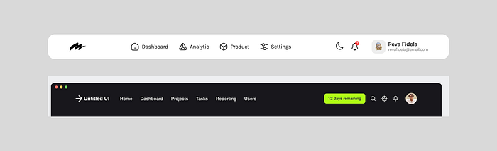
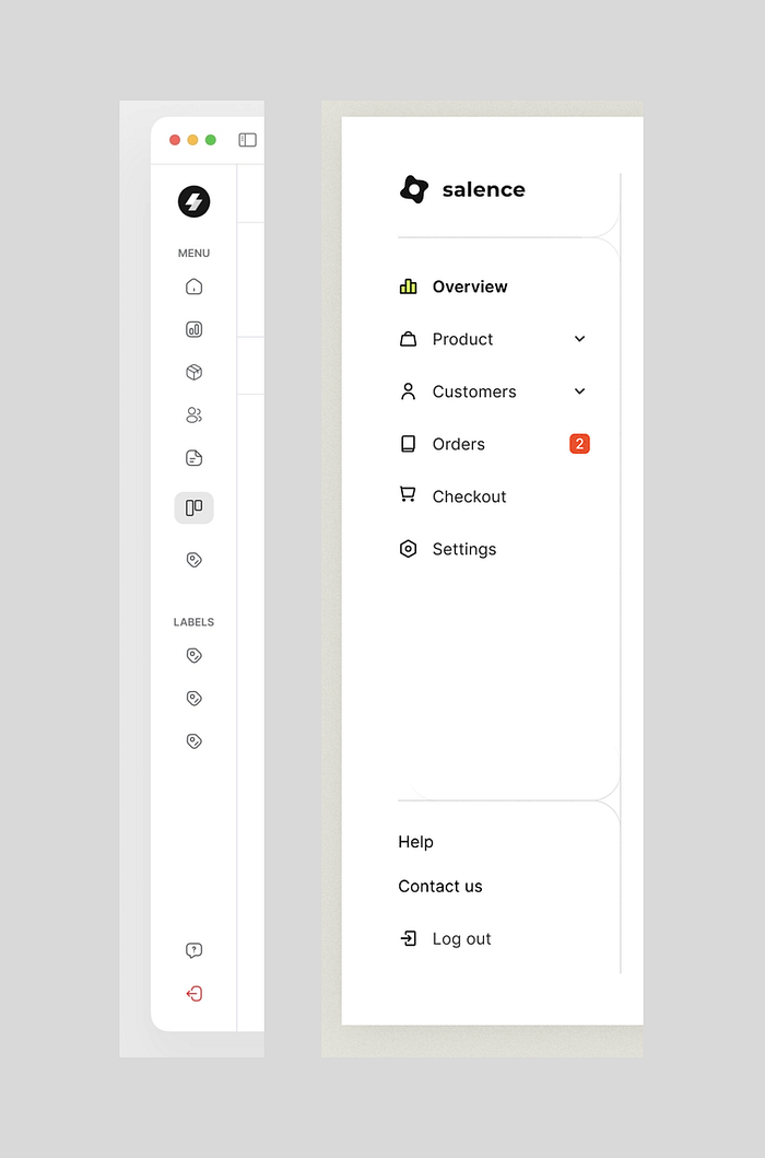
Choosing the Right Navigation Type
Choosing the right navigation type is essential for creating a user-friendly website or app. There are a number of factors to consider when choosing a navigation type, including the size of the website or app, the type of content, and the user’s needs.
Here are some of the most common navigation types:
- Top navigation: Top navigation is a horizontal navigation bar that is located at the top of a website or app. It is a good choice for websites or apps with a lot of content, as it allows users to quickly navigate to different parts of the site.
- Side navigation: Side navigation is a vertical navigation bar that is located on the left or right side of a website or app. It is a good choice for websites or apps with a lot of content, as it allows users to quickly navigate to different parts of the site without having to scroll up and down.
- Breadcrumb navigation: Breadcrumb navigation is a trail of links that shows the user’s current location in a website or app. It is a good choice for websites or apps with a lot of nested content, as it allows users to easily track their progress and find their way back to the top level.
- Dropdown navigation: Dropdown navigation is a type of navigation that allows users to access a list of options by clicking on a single button. It is a good choice for websites or apps with a lot of features, as it allows users to quickly access the features they need without having to scroll through a long list of options.
When choosing a navigation type, it is important to consider the following factors:
- The size of the website or app: If the website or app is small, a simple navigation type, such as top navigation, may be sufficient. However, if the website or app is large, a more complex navigation type, such as side navigation or breadcrumb navigation, may be necessary.
- The type of content: If the website or app contains a lot of text content, a top navigation bar may be the best option. However, if the website or app contains a lot of images or videos, a side navigation bar may be a better option.
- The user’s needs: It is important to consider the needs of the users when choosing a navigation type. For example, if the users are on mobile devices, a top navigation bar may not be the best option, as it may be difficult to reach.
By considering these factors, you can choose the right navigation type for your website or app. This will help to ensure that users can easily navigate your site and find the information they need.
Here are some additional tips for choosing the right navigation type:
- Make sure the navigation is visible and easy to find. The navigation should be located in a prominent location on the page and should be easy to identify.
- Use clear and concise labels for the navigation links. The labels should be clear and concise so that users know what each link will take them to.
- Use consistent navigation throughout your website or app. The navigation should be consistent throughout your website or app so that users know what to expect.
- Test the navigation with users. Get feedback from users to see if they find the navigation easy to use.
You can create a user-friendly website or app by following these tips for choosing the right navigation type.
Clear and Consistent Labels
Clear and consistent labels are essential for creating effective navigation. Labels should be clear and descriptive so that users can quickly identify the purpose of each link. Icons should also be consistent and easily recognizable. Additionally, tooltips can be used to provide additional information when users hover over navigation elements.
Here are some specific tips for creating clear and consistent labels:
- Use short, descriptive labels: The labels should be short and to the point, so that users can quickly understand them.
- Use consistent terminology: The labels should use consistent terminology throughout the site or app. This will help users to learn the labels and remember where to find the information they need.
- Use icons to supplement labels: Icons can be used to supplement labels, making them easier to understand. However, the icons should be consistent and easily recognizable.
- Use tooltips to provide additional information: Tooltips can be used to provide additional information when users hover over navigation elements. This can be helpful for users who are not familiar with the labels or icons.
By following these tips, you can create clear and consistent labels that will help users to navigate your site or app easily.
Here are some examples of clear and consistent labels:
- Home: This label is short and descriptive, and it is consistent with the labels used on other sites and apps.
- About: This label is also short and descriptive, and it is consistent with the labels used on other sites and apps.
- Contact: This label is short and descriptive, and it is consistent with the labels used on other sites and apps.
Here are some examples of icons that are consistent and easily recognizable:
- Home: This icon is a house, and it is a common icon that is used to represent the home page on many sites and apps.
- About: This icon is a person, and it is a common icon that is used to represent the about page on many sites and apps.
- Contact: This icon is an envelope, and it is a common icon that is used to represent the contact page on many sites and apps.
Using these tips, you can create clear and consistent labels, icons, and tooltips that will help users navigate your site or app.
Effective Search Functionality
Effective search functionality is an important feature in good layout and navigation. A well-designed search function can help users to quickly find the information they need, regardless of how large or complex the site or app is.
Here are some specific tips for creating effective search functionality:
- Place the search function in a visible and easily accessible location: The search function should be placed in a location where users are likely to see it, such as in the top navigation bar or in the header of the page.
- Provide predictive search: Predictive search is a feature that suggests search terms as the user types. This can be helpful for users who are not sure what they are looking for.
- Provide auto-correction: Auto-correction is a feature that corrects spelling mistakes as the user types. This can help to ensure that users are able to find the information they need, even if they make a typo.
- Provide relevant search results: The search results should be relevant to the search terms that the user entered. This can be achieved by using a good search algorithm and by indexing the content of the site or app.
These tips can help you design effective search functionality that will help users find the information they are looking for quickly.
Responsive Navigation
Responsive navigation is essential for websites and apps that are designed to be used on multiple devices, including desktop computers, laptops, tablets, and smartphones. Responsive navigation ensures that the navigation menus and links are displayed correctly on all devices, regardless of the screen size or resolution.
There are a number of ways to create responsive navigation. One common approach is to use hamburger menu icons. Hamburger menu icons are small, three-line icons that represent a menu. When a user clicks on the hamburger menu icon, a dropdown menu is displayed with the navigation links. This is a good way to save space on mobile devices, as the navigation links are only displayed when the user needs them.
Another approach to creating responsive navigation is to use hidden navigation. Hidden navigation is navigation that is not initially displayed on the page. When a user clicks on a button or link, the navigation menu is displayed. This is a good way to keep the navigation bar out of the way on desktop computers and laptops, while still making it accessible on mobile devices.
Finally, collapsible navigation is a type of navigation that allows users to collapse the navigation menu to save space. When the navigation menu is collapsed, the links are hidden. When the user clicks on the hamburger menu icon or a button, the navigation menu is expanded and the links are displayed. This is a good way to save space on mobile devices, while still making the navigation links accessible.
By using responsive navigation, you can ensure that your website or app is accessible on all devices. This will help to improve the user experience for all of your users.
Here are some additional tips for creating responsive navigation:
- Use clear and concise labels for the navigation links. The labels should be clear and concise so that users know what each link will take them to.
- Use consistent navigation throughout your website or app. The navigation should be consistent throughout your website or app so that users know what to expect.
- Test the navigation with users. Get feedback from users to see if they find the navigation easy to use.
Here are some tips you can follow to create responsive navigation for your site or app, which will make it easier for users to navigate your site or app.
Testing and Continuous Improvement
Testing and continuous improvement are essential for creating effective navigation. User testing can help you to identify any issues or difficulties that users may encounter with the navigation. This feedback can then be used to fix and improve the navigation.
Here are some specific tips for testing and continuous improvement:
- Regularly conduct user testing: User testing should be conducted on a regular basis to ensure that the navigation is meeting the needs of users.
- Get feedback from users: Get feedback from users about the navigation. This feedback can be used to identify any issues or difficulties that users are having.
- Fix and improve the navigation: Use the feedback from users to fix and improve the navigation. This will help to ensure that the navigation is effective and user-friendly.
- Iterate and continuously improve: The navigation should be iteratively improved over time. This will help to ensure that the navigation is always meeting the needs of users.
By following these tips, you can create effective navigation that will help users to navigate your site or app easily.
Here are some additional examples of how testing and continuous improvement can be used to improve navigation:
- A website might conduct user testing to see if users are able to find the information they need quickly and easily. If the user testing reveals that users are having difficulty finding the information they need, the website might make changes to the navigation to make it easier to use.
- An app might conduct user testing to see if users are able to navigate through the app’s different features. If the user testing reveals that users are having difficulty navigating through the app, the app might make changes to the navigation to make it easier to use.
By conducting user testing and continuously improving the navigation, you can create a user experience that is effective and user-friendly.
Smooth navigation and effective layouts are key to creating a captivating user experience. In UI/UX design, it is important to understand users, simplify layouts, maintain consistency, choose the right navigation types, use clear labels, provide effective search functionality, design responsively, and engage in testing and continuous improvement. By following these guidelines, you can create interfaces that are easy to navigate and satisfy your users.
So let’s start designing interfaces with smooth and effective navigation for a captivating user experience!
And that’s a wrap! Thanks for reading!


