Smashing Conf Design & UX 2023 — my sketchnotes & key takeaways
Smashing Magazine’s brand new conference on design & UX


Smashing Magazine is an epic online publication founded by Vitaly Friedman. I read many-many articles and some books published by them, I attended several Smashing workshops, and one of the peak experiences of my isolation times in 2020 was the online SmashingConf in August, 2020. Each and every detail of that event was so well-designed, I really felt welcomed. The mood was exceptional, and even though it was a remote event, I experienced similar vibes to an in-person conference, I felt the energy of belonging to a tribe of other great design professionals.
So I was really excited about Smashing Magazine’s brand new conference format that focuses on design & UX! This time, I attended remotely again, just like back in 2020. I could watch & live sketchnote 7 talks (and I’m looking forward to watching back the remaining ones I couldn’t attend live — here is the full agenda).
In this article, I share my key takeaways and my sketchnotes of those 7 talks.
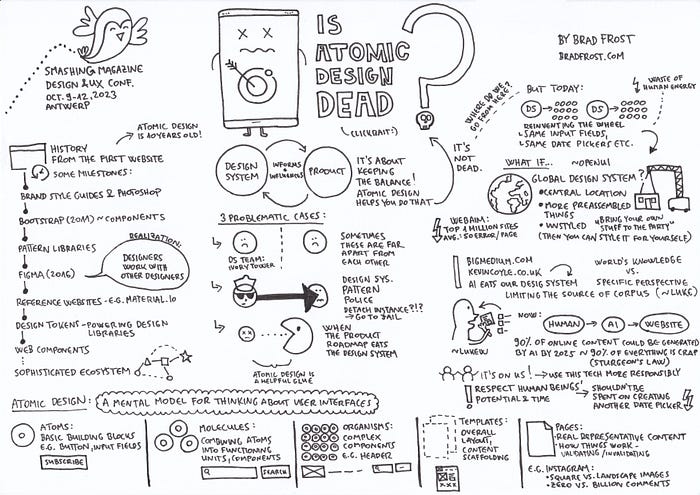
Is Atomic Design Dead? by Brad Frost

In the first part of the talk, Brad gave us a little WWW history starting from the first website all the way to web components, then he summarized that design systems inform and influence products and vica versa.

I really liked that he listed out 3 problematic cases:
- when the design system team is very separated, sitting in their ivory tower
- when the design system police puts everyone in the design system jail for detaching an instance
- when the product roadmaps eats the design system efforts
He then summarized the foundations of atomic design (atoms, molecules, organisms, templates and pages), and gave a nice example using Instagram.

He answered the question asked in the title of the talk: atomic design is not dead, since it is still a useful mental model for thinking about user interfaces, and it helps teams find a balance, and equilibrium between design systems and products.
And then here came the most interesting and thought provoking part: where do we go from here?
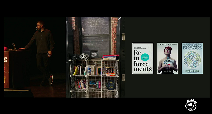
1. What if we don’t waste any more human potential on designing yet another date picker, but instead, we create a global design system together, collaboratively? It’d be an unstyled component that you can style for yourself.
2. The other topic he brought up is the use of AI, and he mentioned Luke Wroblewski’s talk, too. He also talked about the project he is working on with Kevin Coyle.
His main point was that while the genie is out of the bottle, it is on us to use AI more responsibly.
Brad closed his talk by highlighting the importance of using human potential and time for better causes than designing one more date picker.
It’s a Marathon, and a Sprint by Fabricio Teixeira
The key takeaway is that we as a design community focus a lot on processes, and of course there is no one way to do design, you should combine sprints and marathons, adjust your approach to the needs of the given project, and most of all, focus more on principles, e.g. how we, as a team, want to work together?
Fabricio also mentioned in the post-talk discussion with Vitaly Friedman that having a 1–3-hour long kick-off meeting with your team is too short, you’ll work on something for e.g. 6 months, so they introduced kick-off weeks.
During his talk, he used the analogy of running. When you prepare for a long distance running competition, 80% of the time you should do easy runs, 20% of the time should be devoted to intensive, short interval runs to get the best results.
He mentioned 4 case studies, all of these projects required a different, unique approach and design process:
- Product requirements are not required.
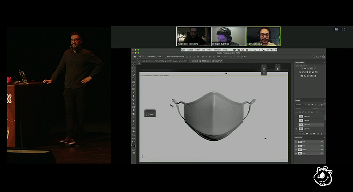
Vistaprint and designing face masks — the world needed them to design really fast, it was a 15-day sprint, they did not have time to design all the color and sizing selectors (and only after the launch, it turned into a marathon)
- Timelines aren’t straight lines
Case study: Equinox — treadmill UI — they created a fake treadmill to prototype the experience, they didn’t wait for the hardware to get completed (the hardware got delayed due to manufacturing issues), so there was no delay in the project even in the face of uncertaintity and ambiguity. E.g. they took into account the hand reach zones, increased the spacing between UI elements so that these remained usable even while the user was running and so on.

- Research is a mindset, not a step
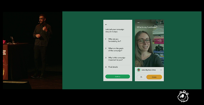
He mentioned the Gofundme project, where they applied a fluid approach to research meaning that design and research ran in parallel, the design informed research and vica versa. Also, insights can come from anyone from the team, not just from researchers. I really liked that they started a book club, everyone read a book about social impact, and they created a Figma file that served as a knowledge hub.
- Be ready for some math
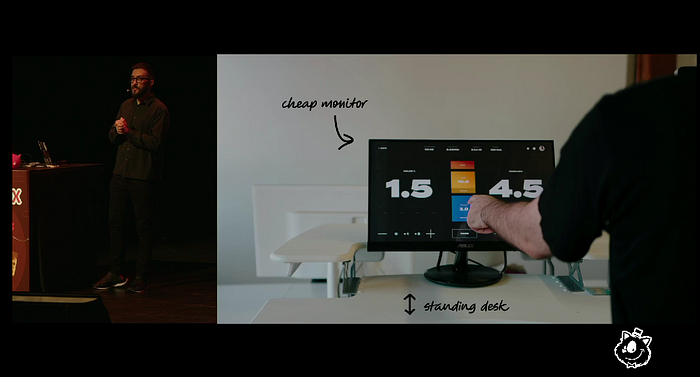
During the New York City Transit project, they created a real-time map of the subway system, that required them to create a lot of vectors and do some math :) One of the main design challenges was: “How to clean up complexity?”

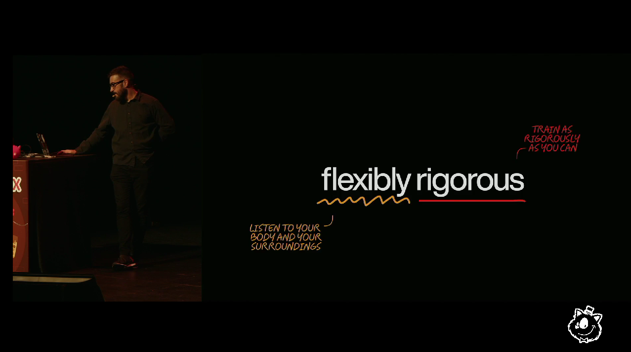
Fabricio shared that we should be “flexibly rigorous”: just as during running, we should listen to our body, we should listen to the special context of a given project. There is no magic formula out there. Rigor and discipline is important, but you must listen to your body so that you don’t lose touch of reality.
He also highlighted that just like during a marathon running, things will get hard during your product design projects, but you must remember how much you trained (btw. someone from the audience asked how to not get overly confident, he said that we should build an environment of trust so that other people on your team can make you realize if you’ve become too confident.)

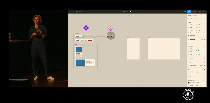
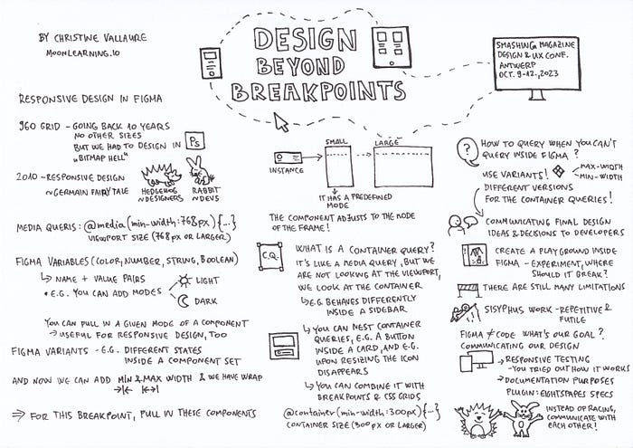
Design Beyond Breakpoints by Christine Vallaure

Christine’s talk was about pushing the current limits of Figma: how to do responsive design in Figma e.g. by using the so-called container queries (which are like media queries, but we are not looking at the viewport size, instead, we are looking at the container — so a component behaves differently if e.g. it is inside a sidebar, and you can also nest container queries, and e.g. tell an icon button inside a card that upon resizing the icon should disappear).
But the morale of the talk was not really about pushing these limits, it was about reminding us of why we are doing all this:
- to communicate our design decisions better to the developers
- to try out how our design behaves in different cases (e.g. where it should break and how), and
- it is also great for documentation purposes, she recommended the EightShapes Specs plugin by Nathan Curtis.
Her advice is:
- create a playground inside Figma, try out how your components and designs should work (and let developers try out your demo, too)
- have many-many discussions with developers, and don’t start these discussions from zero, e.g. read a bit about frontend development, have a fundamental knowledge of development aspect.
I’m very passionate about the designer-developer collaboration topic (I have a course and some articles about it), so it was really great to hear her advice!
She also shared that there is a German fairy tale about a race between a hedgehog and a rabbit. The hedgehog wins the race even tough he is slower, since he is smarter, he sends his wife (who looks exactly like him) to the finish line in advance. Christine told us that she had mixed feelings about this story, she didn’t like the idea of pretending to be fast when someone has other great skills. In her analogy, the rabbits are the developers, and the hedgehogs are the designers. We should embrace each others’ tools and skills instead of trying to mimic each others’ work.

A Journey in Enterprise UX by Stéphanie Walter

Stéphanie’s talk resonated with me on so many levels, here is a short summary of her insightful presentation.
This is how she made sense of the complexity:
1. Looking at quantitative data — What? How much?
Doing some content analysis (e.g. any duplicates?)
2. After the “what” and discovering the “as-is”: Why? How?
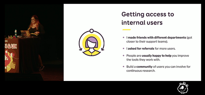
- By getting access to internal users
- Conducting task-focused user interviews
- Documenting everything throughout the process
- “Show me how you do this today” to tackle the “jumping into solutions” mindset
There are 2 types of processes:
- Fast track: small features, tweaks on the UI
- Specific research for high-impact parts
The latter involved e.g.
- Observational testing: “Please do the things you did with the old tool but with the new tool” (Instead of using detailed usability test scripts)
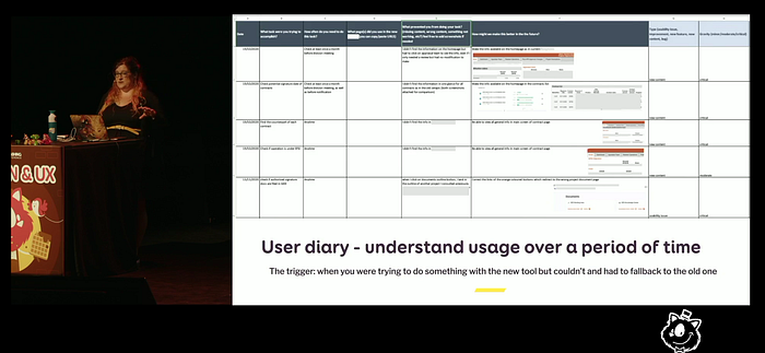
- User diary (longer studies to understand the behavior over a period of time)
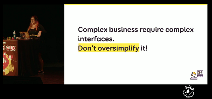
She also shared what she wishes she knew sooner about designing for enterprise experiences, e.g. it can be a trap to oversimplify the UI, or the importance of customization and providing all the data pieces needed.
It was also very refreshing that she corrected the age-old saying about user interfaces, you know the one that starts with “The user interface is like a joke…”. The thing is, sometimes you need some prior knowledge to understand a joke. It this fact doesn’t make a joke bad. It is the same with user interfaces. Sometimes you just need some prior knowledge to understand it.

Finally, she talked about some of the main challenges in such environments, like change management, design politics and complexity.
Her design process in enterprise UX looks like this:
- Complexity: How am I supposed to design that?
- Analysis: Making sense of this complexity
- Research: Finding & understanding the puzzle pieces
- Solution design: Eventually, everything clicks into place

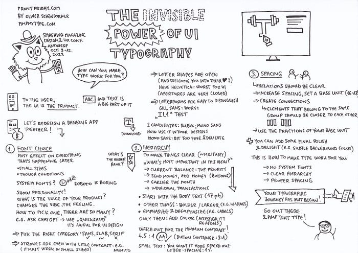
The Invisible Power of UI Typography by Oliver Schöndorfer

To the user, the UI is the product, and a big part of it is text.
How can you make type work for you?
During the talk, Oliver redesigned a banking app screen, gradually adding the enhancements he talked about.
1. Font choice
System fonts are boring. Think about what is the voice of your product?
Pick fonts that
- are in the right category (mostly sans, sometimes slabs)
- have even strokes with a little contrast (it must work in small sizes)
- have open letter shapes
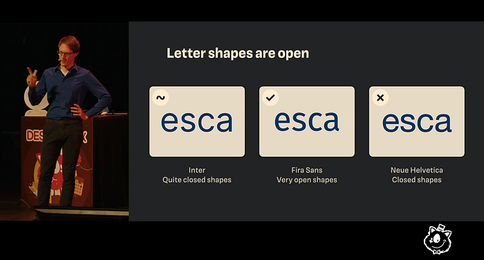
- have letterforms that are easy to distinguish (the “Il1” test)
2. Hierarchy
“What is the most important thing in this view?”
Start with the body text, then emphasize and deemphasize everything else.
And watch out for the accessibility aspects (e.g. minimum contrast ratios)

3. Spacing
- Relations should be clear (law of proximity)
- Define a base unit
Then you can add some final polish (and if it is appropriate, some delight)
As Oliver said, “Go out there and pimp that type”!
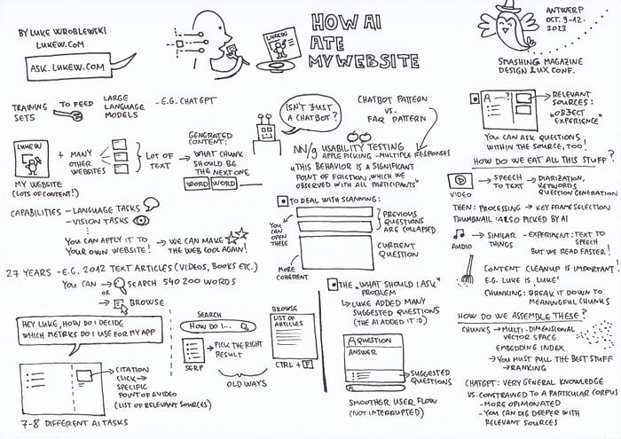
How AI Ate My Website by Luke Wroblewski

Luke has been creating content for 27 years, e.g. there are 2012 articles on his website. There are also videos, books, pdfs.
He created an experience that let’s you ask questions from AI that has been fed with this data.
In his talk, he explained how he created the interaction pattern. It is more like a FAQ pattern and not a chatbot pattern.
1. Nielsen Norman Group has recently conducted usability tests (“Accordion Editing and Apple Picking: Early Generative-AI User Behaviors: Two new user behaviors are prevalent in interactions with text-based AI chatbots.”). The new apple picking pattern is about combining relevant pieces of answers, it causes a “significant amount of friction” for the users. Luke created a pattern where previous answers are collapsed, and the current answers is shown by default, this provides a more coherent experience.
2. He also tackled the “what I should ask” problem by providing suggested questions below the most recent answer, that way he can provide a smoother, uninterrupted user flow.

3. He linked all the relevant sources, so that users can dig deeper (he calls it the “object experience”), users can click on a citation link and then taken to e.g. a specific point of a video.
He also showed us how AI eat all this stuff (e.g. processing, data cleaning), and talked about how it assembles the answers (e.g. how to pick the best answers).
So to compare Luke’s experience to e.g. Chat GPT, here are some points:
- it is more opinionated and specific (Chat GPT gives a “general world knowledge” answer)
- you can dig deeper by using the relevant resources.
You can try it out on the ask.lukew.com website.
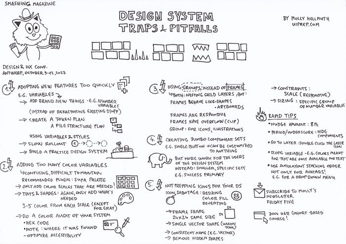
Design System Traps & Pitfalls by Molly Hellmuth

Molly shared the most common mistakes she experienced during her courses:
- Adopting new features too quickly
- Adding too many color variables
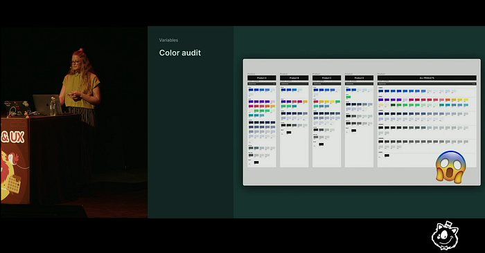
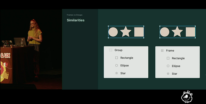
- Using groups instead of frames
- Creating jumbo component sets
- Not prepping icons for your design system
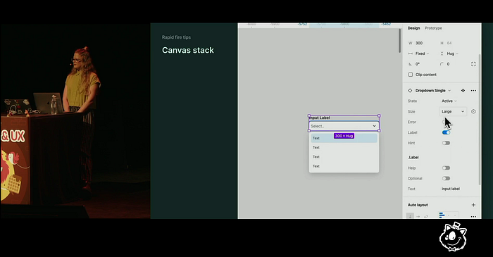
And shared some rapid design tips:
- Set the nudge amount to 8
- You can hide components in a library by adding a period or an underscore
- You can go to a specific layer by douple clicking on the layer icon
- Scope variables, e.g. colors meant for text is only available for text
- Use autolayout stacking order (it is not only for avatars, e.g. it is great for dropdown menus, too)
Some “online moments”


Photos of the event
Marc Thiele captured the in-person vibes of the conference:
Full agenda
There were more great talks, sadly I wasn’t able to attend all of the talks live, but I’ll surely watch back the recordings later:
- Designing a Product with a Point of View by Nick DiLallo
- Trends To Live and Die For by Claudio Guglieri
- Back FOR the Future by Chiara Aliotta
- Design Ethically: From Imperative to Action by Kat Zhou
- And there was also a talk by Seb Lester (“Mystery Speaker”)
Here is the full agenda of the conference: