Skeuomorphism. Evolution behind the scene
This is my first shot at the medium and I’d like to start with the non-technical topic. Today I gonna tell you about the friendly dispute between me and my friend who is a designer.
What was the dispute about? I’ve tried to prove that skeuomorphism is still popular, and actively evolving. This conception also is a part of all modern design ways. The opposite opinion is skeuomorphism is an old and pointless design way that Apple abandon since iOS7.
Ok. Let’s take a look few pictures:
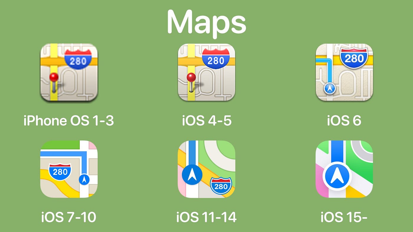
As you see from iOS 1 to iOS 5 we had almost the same icons. Using habitual images of a map, or a pin the designer explains to you the point of this app. Of course, every app has a title but a recognizable image increases the search speed in many times because the graphical area is much larger than the text area. Since iOS 7 we can see the same entities. Of course, there are a lot of graphical changes but conceptually the changes are difficult to call radical.

Skeuomorphism is a term most often used in graphical user interface design to describe interface objects that mimic their real-world counterparts in how they appear and/or how the user can interact with them.
Can we say that the iOS 1 icon mimics a telephone/address book? Yes, definitely. But can we say the same about the last version of the icon? I think yes. We still see the representation of the telephone book. Based on these images we can also notice iterative simplification of some elements. The Apple version-to-version smoothly removes not necessary graphical elements — graphical complications that do not affect our final perception like an address book spring, letters, and a person’s shape.
Even Google in the last Android versions keeps the familiar shapes for the basic icons like the phone, camera, clock, calculator, and chat.

Google also keeps the familiar shapes for the basic icons like the phone, camera, clock, calculator, chat, etc in the last Android versions.
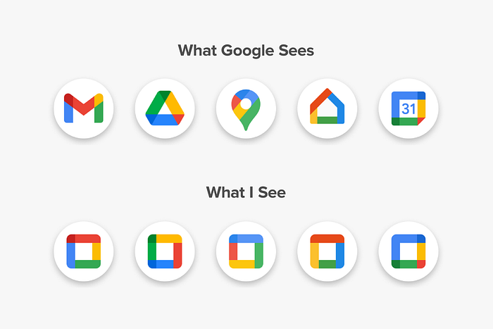
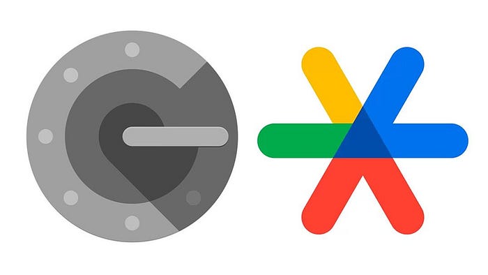
At the same time, Google for some products for design unifies purposes implements solutions that go very far from skeuomorphism. These icons are hard to perceive and distinguish. I believe the time needed to recognize the needed app, in this case, will be much larger compared to the usual skeuomorphic icons. That’s why, I guess, has been created the next meme:
I have no goal to convince you Apple design is the best one (icons of the apps like App Store, Reminders, and Shortcuts raising some questions). I also do not try to prove Google’s experimental way is bad. The Material Design always improving. As you know the current version is the 3rd generation of the Material Design. Anyway, Google actively works on this concept. Compared to this, Microsoft, unfortunately, abandoned the Metro Design and stopped development on this UI system. But I think that the Metro UI was underestimated design system with huge potential.
At the end of the article, I want to summarize. My point is skeuomorphism is an actual design concept. Do not scare to use this building your UI. Provide more visual images and graphical associations to your users.
The icons of a magnifying glass and a ringing bell will be for a long time with us although many of us have these items no longer at home.
Thanks for reading!