Seven steps to create your first UX portfolio website that lands a FAANG interview (Examples from new 2022 Amazon, Facebook, Microsoft designers)
Portfolio questions are one of the most common students ask me “Hey Leon, where do I start, what do I put on it, who will be looking at it?”
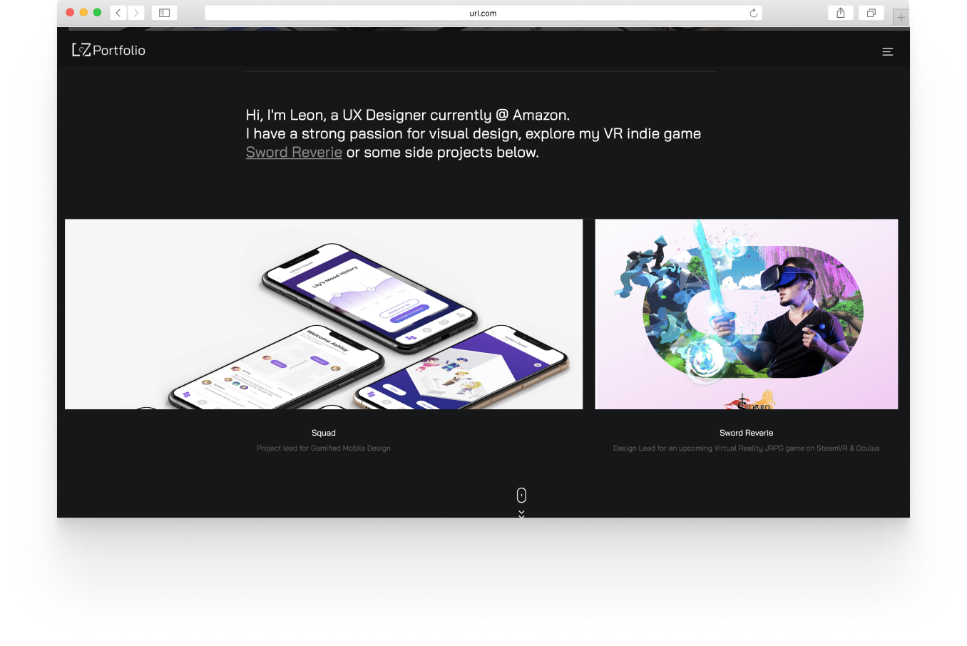
Quickly saying hi to my new readers, my name is Leon I am currently a UX designer at Expedia. In the past, I have interned or worked contract roles while attending school from startups to big techs like Amazon & Google.
As a core coach at UXGO, I write articles and offer 1:1 help for students and up-and-coming designers transitioning into the industry.
Creating your first portfolio site can be an overwhelming experience. If you have any of these questions, or just don't know how exactly to take your portfolio to the next level, this is the article for you.
Below are seven easy steps to follow for success,
Step 1 Understand what recruiters or design managers are looking for.
Step 2. Collect all your projects and case studies.
Step 3. The selection process.
Step 4. Find your style and select the site-building tool that works best for you.
Step 5. Understand basic responsive & web design principles
Step 6 Design your website and information
Step 7. Testing, updating, and refining.
If you already have a portfolio, and just want to iterate and improve your portfolio you can find examples by skipping straight to the very end of step 7.
Step 1. Understand what recruiters or design managers are looking for.
Depending on what stage of the hiring process you are at, the audience of your portfolio website will be very different. For the sake of landing your first interview, or an interview with FANNG your portfolio should both serve to be easy to view and accessible for none designers such as recruiters, and have enough depth to impress a design manager when given a detailed inspection.
So first things first, common areas a recruiter could look at are,
“Does this person understand the UX design process, or is this person a more traditional visual and graphic designer where they just showed me the end product?”
“What design experience does this person have, how did they use the opportunity to produce something of real value and not just eye candy for the organization.”
Based on more detailed requirements such as job and role-specific things, each recruiter will pay attention to other details. However, making sure your portfolio is user-friendly (recruiter friendly)is something many designers tend to forget. An example of more recruiter-friendly would be to make navigation faster by minimizing clicks.
When I was creating the second version of my portfolio, I was so caught up with the idea that I had to create something unique and outside the box, and not the run-in-the-mill design portfolio website, that I too made that mistake.
Take a look at the cool example below or try it here. This gamified driving design is very eye catchy, but if you do something like this for recruiters to navigate, it will be so hard to get to the right project and show them you are a UX designer, making it arguably a very unfriendly UX portfolio design.
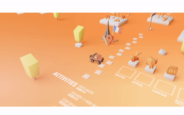
Not telling you to not be creative, but always prioritize the user (recruiter) experience first. For inspiration, see some of our more creative student/coach examples made with Webflow at the very end of the article.
Step 2. Collect all your projects and case studies.
Most likely as a student or new UX professional, you might have worked on many different types of side projects and tasks, meaning not everything will be relevant for your audience aka the recruiters mentioned above in step 1.
Therefore, I always recommend students I coach first collect everything they did, before narrowing down what to include in their portfolio.

When I say everything, I mean everything! From photography, art, logo designs, just make a huge list first, write everything down or start putting it in a folder.
It is important to wrap your head around just everything creative, product, or even business you have done. This will allow you to really get an idea of what projects you have are truly relevant to your UX recruiter and what projects might just be your personal favorites and their “value” could be a lot more personal to yourself. You also will learn a lot about yourself through this process.
- What are my UX superpowers?
- Which UX areas do I still need to improve?
- What makes me stand out from the crowd?
- Which projects I did make the best case studies?
- Which projects did I learn the most?
- What interesting stories can I tell about myself through these projects?
If possible try to include all the in-progress work, documentation, and artifacts when collecting the case study. Take a look at the below motion design-focused project not on my portfolio.

I can still access it whenever I want. That is why in the future, try to always keep your work well documented and accessible such as on Behance or in a private folder.
Gathering and categorizing every project will be very important as we move on to the next step, which is of the most crucial steps of creating a successful portfolio website.
Step 3. The selection process.
Now if you followed step 1 and step 2, you should both know who is looking at your website, and all the projects you have available. So step 3 is all about planning how you can impress them.
Select just 3–4 projects and eliminate the noise.
When creating any UX design-related portfolio, job hunting, or client-facing, tailoring your project selection to fit the right niche is crucial.
Your recruiters will have limited attention. Our coaches at UXGO did a study in 2021, we gave 12 big tech UXD student program recruiters 100 portfolio websites each to skim and look for potential candidates. On average every recruiter only spent an average of 56 seconds on a portfolio during the initial screening. That is less than a minute to grab someone's attention. Meaning even if you have a great UX project and content, if it isn't “surfaced” properly, you will not have a chance at all.

Many new UX designers or students fail to recognize this, adding either too many projects or too little. That is why I always recognize to all the students I coach, 3–4 projects are a good number to aim for.
One of my first-ever design professors Karen, author of the well-known Designing Type, always reminded us, “your portfolio is only as strong as your weakest project, so select carefully.”
Expect the recruiter to click into any of your projects/case studies, and they should all convince them you are a great UX designer.
A good project/case study should cover the entire design process. Meaning in the <56 seconds of attention, the recruiter should be able to skim through:
- How do you introduce your design problem?
- Why it’s worth solving?
- How do you approach solving it?
- What research you have done?
- What data supports your design?
- How do you bridge research with design?
- How do you iterate and prototype?
- How do you test your prototype?
- Finally, how do you hand off your design or what the shipped product looks like?
The structure of how you surface the information will also be very important, which we will discuss more once you start to build out your site in step 6.

If you want to learn more about how to structure a successful UX case study, you can learn that in great detail here in my other article. (How to create a successful UX case study in 2022 to ace your first interview)
It is ok if your project does not have all the above steps, but generally, you should understand this goal-directed design approach method to solving UX problems, since this is the industry standard at FAANG. (What most recruiters we studied with mentioned they will be looking for in that precious minute.)
Step 4. Find your style and select the site-building tool that works best for you.
Now we get into the fun parts. Oh don't we love making things pretty.
Usually, many UX designers do not have the proper coding experience to create a website so they choose to use a site builder. This is nothing to be ashamed of as site builders have become popular for a reason.
So a piece of advice is, do not consider coding your own website, unless proving your front-end coding experience is something very important for the niche role you are looking for. Coding your website is very time-consuming and will take a long time to polish.
So for this article, I will briefly introduce you to three popular site-building platforms, Wix, Webflow, and WordPress.
Yes, I have personally used all three of these platforms countless times, so my goal here isn’t to endorse any of them, but to explain which is best for what situation. (Just to note, there are tons of other platforms out there, such as Adobe portfolio, Square space, Semplice, however, they are very similar to these tools we are discussing so I won’t be going over all of them)
Technically you can start at this step first when creating a portfolio website then move back to step 1, but I recommend you start with step 1 because it’s always better to know what you plan to put on a site before building the site. Knowing what projects you want to use and the general visual aesthetics for each of them will make choosing the site builder easier.
Try to look at at least 50 portfolios you really enjoy. Look at ones built with Webflow, Wix, and WordPress, before deciding. Make note of what visual elements or micro-interactions you find delightful.
Don't get too carried away with the graphical assets someone has created since those have nothing to do with which web building tool you choose, but it's important to have a general sense of what is possible or easy to make with each site building tool.

Generally, sites like Wix/Squarespace are super easy to understand for most people. You drag and drop elements into your page, which works very similar to photoshop or Figma if those are tools you are familiar with. I call these sites easy template builders because they offer tons of great templates that can easily turn into a design portfolio once you upload your personalized projects and graphical assets you collected steps before.
If you are like some of my students who want more motion and a bit more personality such as this one below. (Not saying having motion makes the best UX portfolio, see actual FAANG UX portfolio samples that are simple at the end)

Portfolio sites that look like these are generally built with Webflow, or possibly WordPress. However, I would recommend Webflow over WordPress because WordPress's big benefit comes from supporting more powerful backend code for larger data-driven companies that need more complex functions. So I only used it when creating websites such as our VR indie game Sword Reverie’s website. (Feel free to take a look)
Webflow already has all the customization you possibly need to create more stunning frontend interactions so if customization and cooler micro-interactions are something you want then Webflow is the way to go.
However, before you automatically go with Webflow just remember, Wix/Squarespace these site builders will generally be faster than Webflow for beginners so see how much time you have.
Step 5. Understand basic responsive & web design principles
As mentioned in step 4, understanding front-end coding is no longer a requirement for most UX designers in this modern era. However, understanding basic responsive & web design principles is a different story.
Not only will you need to be familiar with these at your day-to-day UX work, but it is also best to learn the basics if you plan to create a good design portfolio. (Even if you end up using a template from Wix or square space.)
Here are a few key terms I want to define for you, Responsive, CMS, HTML, CSS, Front-end, Back-end.
Responsive means if the website can flex for different screen sizes like this below. This is a must-have, and every designer needs to consider it when building any website. This is the foundation for cross-platform design.

HTML is the backbone of every website, the code that creates the website, here click inspects on Chrome like this example below to see what I mean.

CMS, is a collection of items, think about blogs or Instagram where you post an image it automatically updates. CMS is often an extra-paid feature for site builders to offer. CMS is not to be confused with CSS. CSS stands for Cascading Style Sheet, if HTML is the backbone, CSS is the skin of the website, controlling things like color or layouts like the example below.

Finally, for “frontend”, we usually refer to things the user interacts with directly such as buttons or menus. Items you see with your eyes are generally considered frontend.
Backend on the other hand usually means server-side code. These are items you can't see and can not interact with, such as data collected from the website. This is something your portfolio site definitely does not need and should not need, so do not worry about it at all.
The example below look is made with Wix, so don’t think Wix creates ugly designs. That is not true. I would argue where Wix really falls short compared to Webflow is its responsive design and page design limitations.

Therefore when using a tool like Webflow, make sure to understand these basic web design principles, and test your page design on multiple breakpoints for different screens. These are a few of the most popular ones, mobile, tablet, and desktop. For a portfolio prioritize desktop, but make sure your site does not break on any other screen size.
Here is a free tool for you to test the responsiveness on any website!
Step 6. Design your website and information
Ok if you followed all the above steps carefully, and did your own research, you should be in good hands and well set up for success. For these last two steps, I will just be sharing with you some more advanced site-building experience.
Think back to what I taught you in Step 1. Your portfolio is your product. The recruiters are your user. So as a UX designer, think about how can you present your information in a more user-friendly way.
Here are some examples, what should you're recruiter land on. If they only have a minute are you sure you want them to read your bio first? Or do you want them to go straight into your best project?
How accessible do you want your resume CTA to be, should it be on every page, or just your about me?
If I take my own case studies as an example shown below, they are really detailed and long, so perhaps do I want to add an anchor or sticky navs(highlighted in red) to quickly navigate between sections?

These will be different for every portfolio website, but as a UX designer, you should consider all these use cases and really one-up your portfolio.
This step is also a great place for you to consider adding flavor to your website. Add flavor elements by including other passion projects from step 2 that you collected but didn't make the cut.
Take a look at my student’s example below. Jackson is big on photography so it’s a great personal touch to have an art or photography section.

Maybe you love writing blogs, doing illustrations, or even just singing and dancing, anything goes, show those off! Just make sure the hierarchy of your site navigation is clear so these never draw attention away from the recruiter who is going to be in and out.
Step 7. Testing, updating, and refining.
A good UX designer should always trust in testing and data, so the last step is test, test, test! Iterate, iterate, ittarte! Design done without testing is speculation at best.
Even if you ask me or any of the other talented new designers (whose portfolio I will show you as samples below) to show you our portfolio, you will hear from all of us, “oh my god, I just didn’t have time to update and change my portfolio”.
That is because, in classic UX fashion, no portfolio will ever be perfect. What’s important is to always get feedback, critiques, and have others test the navigation of your site. Iteration will be very natural.
“Hey, Leon so when is my portfolio “finished”?”
Well, that depends on just exactly how much time you have, and what are the most important features you need to get done. Think about it as an MVP if you will, and keep polishing it.
Your goal following these seven steps is to lay the solid foundations of a successful portfolio. Keep imagining your portfolio as your UX design product, it won’t be perfect the first time around, and iteration is just part of the process.
I always remind my students, unlike your resume which once you submit its set in stone, you can always update your portfolio even after you submit it, so keep it iterative.
Below are some examples from our coaches at UXGO, and students we coached. Like I said, none are perfect, so learn only the best parts from each example.
Not a big visual designer? Take a look at these two examples. Hannah & Isabelle. Although both have a more simple landing page, the information hierarchy is clear. The meat is in each case study, having clear storytelling and UX logic.
https://www.meihannah.com/projects (UXGO Coach Example — Epic games)

https://isabellecordova.com/ (Guest coach Example — Facebook)

Are you someone who likes to push for more pixel-perfect aesthetics and meaningful micro-interactions? Take a look at Jaspers and Jacksons' example. In these examples, we discussed how to have these interactions serve as good “flare” without distracting the audience. Because remember the “meat” should always be inside each case study.
https://www.yichenxie.com/ (Guest coach Example — Microsoft)
https://www.jacksonjiang.com/ (Coached Student Example)
Thanks for reading!
Every UX portfolio you might come across is different, but if you start paying attention to the successful ones, you’ll start to see more similarities than you would have imagined.
My name is Leon, and I’m always happy to chat! Feel free to connect with me on LinkedIn or check out our UXGO platform for more free resources such as 2023 job boards, industry courses, and 1:1 coaching sessions.

