Revolutionizing Cipher Docs: A Ground-Up Redesign Case Study
I joined Zeta in August 2021 and had the opportunity to work on Cipher Docs, one of my first projects. Initially, we focused on enhancing the article consumption experience. In March 2022, I had the chance to work on this project again and embarked on a complete revamp of the documentation portal from the ground up.
Throughout the project, I collaborated with my colleagues Subhasis Bhattacharjee and Kishore Vidyasagar. We formed a great team and had a lot of fun working together on this project!
What is Cipher Docs?
Cipher docs’ primary purpose is to enable developers and administrators to implement and configure Cipher’s services for their organization. It is a one-stop-shop solution for all the information one might need, ranging from implementation guides to the glossary.
What is Cipher and who uses Cipher Docs?
Cipher is Zeta’s offering that addresses all of its clients’ authentication and authorization requirements. It facilitates the setup and configuration of login credentials and role-based access control (RBAC) for users, as well as payment verification methods for card products via Authentication Center — which is the GUI tool that caters to these requirements. Cipher encompasses three offerings: Cipher ACS, Cipher CIAM, and Cipher EIAM.
We’re catering to 2 personas —
1. Developers
They use Cipher Docs to implement Authentication (AuthN) and Authorization (AuthZ) services using Authentication Center
2. Administrators
They use Cipher Docs to configure Authentication and Authorization services using Authentication Center

Why did we revisit Cipher Docs Design?
- The user journey for a user to get to the article relevant to the service they wanted to implement, was too long and required them to make too many clicks
- The Business Head of Cipher came to us with the requirement to revamp Cipher Docs, since the existing version was confusing for internal Zeta developers
- The search results on the documentation portal would repeat, weren’t categorised and were haphazardly listed, which ended up confusing the users
- Security in banking is extremely important, so we wanted a well-designed documentation experience to avoid security breaches
Understanding the problems in detail
In March 2022, we conducted a round of exploratory research in the form of user testing with active users of the Cipher Documentation Portal to gain insights into their problems with the existing version. The following are the insights we gained from these sessions 👇
- Users found the top navigation and mega menu unclear, leading them to favour the left navigation instead. Moreover, the extensive information architecture (IA) of the portal resulted in a time-consuming user journey with excessive clicks required to access the relevant article
- The product descriptions on the landing page lacked sufficient context and failed to assist users in selecting the appropriate product for their specific use case
- The search results on the portal were disorganized and lacked categorization, causing difficulty for users in determining the relevance of the results to specific products
- Due to the technical nature of Cipher, users found specific keywords such as Domain ID and Tokens unfamiliar
- The prerequisites preceding each article lacked comprehensive coverage in terms of the requirements
Constraints
- The lack of availability of users for Feedback/User Testing (UT) Sessions, the available ones were internal Zeta employees.
- No users for the admin persona were available within the pool of available internal Zeta employees
We worked our way through these constraints by shortlisting a few power users from the pool of internal Zeta employees who used Cipher Docs and conducting these sessions with them to gain valuable insights.
Our Approach to Problem-Solving
To tackle the problems we identified in Cipher Docs, we employed a systematic approach to find effective solutions. Here’s how we addressed each challenge:
Information Architecture (IA)
After conducting feedback sessions and gathering insights, we initiated a complete overhaul of the portal by redefining the information architecture (IA) for Cipher Docs. Our process began with an extensive review of various existing documentation portals, including Chargebee, Freshworks, Razorpay, Stripe, and Figma, for inspiration and best practices.
We conducted an in-depth analysis of the information architecture (IA) of the aforementioned portals to enhance our initial idea. Based on our findings, we proposed a more streamlined and well-organized IA for the entire portal. The aim was to minimize the user journey from the landing page to a specific article, thereby reducing the number of clicks needed to reach the desired information

Explorations
We took two stabs at the IA for Cipher Docs while keeping in mind the depth and the number of clicks it would take the user to reach a specific article.

One flaw in the initial approach was that every user, whether returning or new, had to go through the product overview section every time they accessed the portal

In the second approach, we encountered some redundancy as the entry point to view persona-specific content was provided in two locations: the landing page and the overview section.
Landing Page
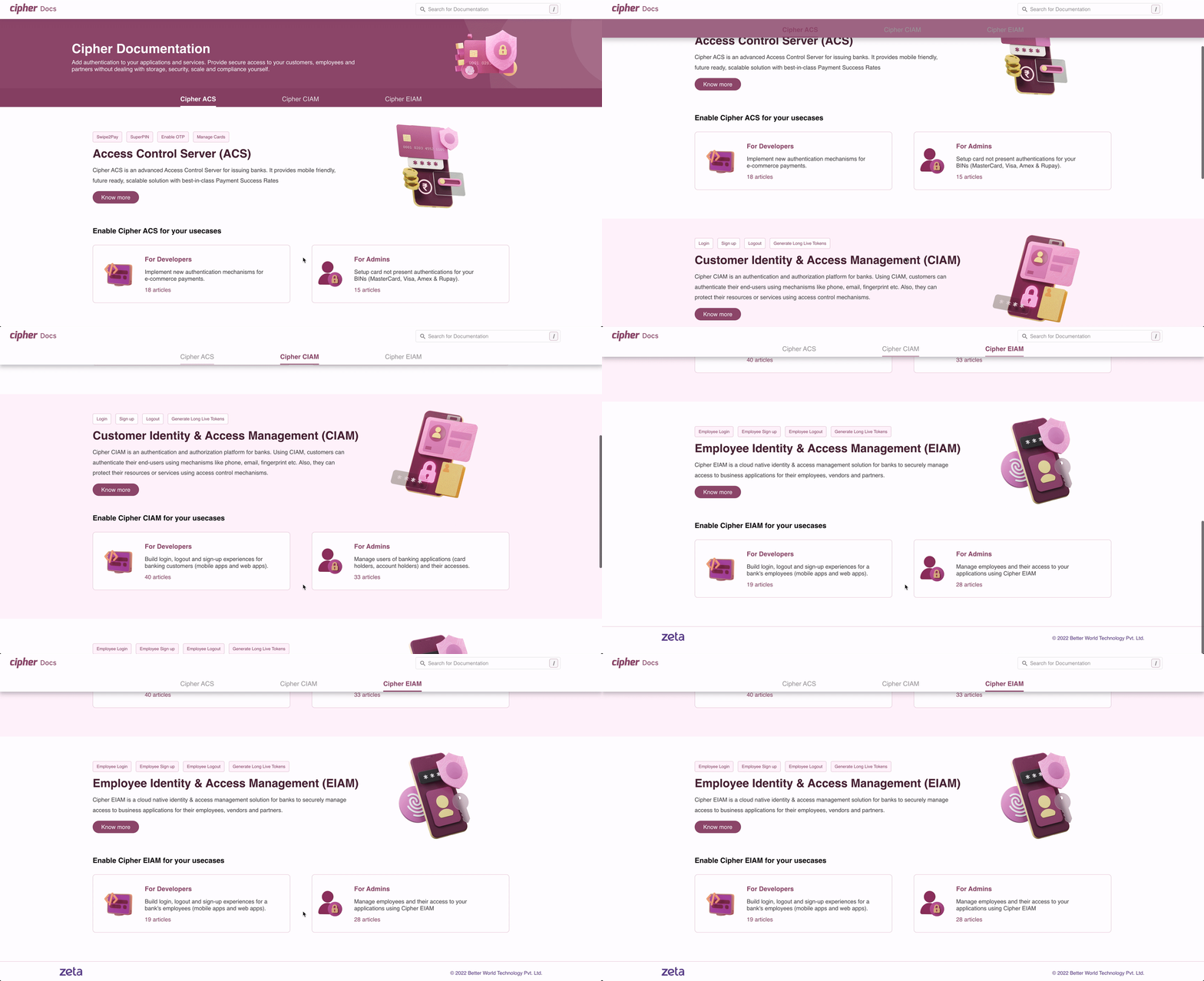
When designing the landing page, we prioritized two key factors: scalability and adherence to the defined information architecture (IA).
To address scalability, we considered the potential addition of more products under Cipher’s purview. We ensured that the landing page could accommodate future product expansions seamlessly.
To reduce the number of clicks required to access an article, we strictly followed the defined IA. This approach aimed to optimize the user journey and improve overall navigation efficiency.
In addition, we incorporated tags with commonly used and related keywords within each product section on the landing page. These tags were intended to assist users in quickly identifying the most relevant product for their specific use case.

To adhere to the IA, we decided to eliminate the persona-specific entry points from the overview section. Instead, we came up with the idea of placing a section switcher directly on the global header. This switcher would allow users to easily switch between different sections based on their specific needs and personas.
- On the left side of the global header, we incorporated the following label: “Cipher CIAM (Overview/For Persona 1/For Persona 2)” based on the selection made by the user. This ensured clear navigation and allowed users to switch between different sections, including the overview and persona-specific content.
- Based on the section selected by the user, the content and menu items in the global header and primary nav bar were dynamically updated. This would help in providing users with a streamlined experience, enabling them to easily find the information they were looking for.

After finalizing the information architecture, we proceeded to the next stage, which involved the redesign of the portal according to the defined structure, while taking into account all the other insights we had collected.
Search Experience
The search experience for Cipher Docs was flawed as the results lacked proper categorization and failed to provide additional information beyond the article title, URL, and a brief excerpt. Moreover, despite having dedicated sections for each product, the categorization system did not effectively serve its purpose.

How did we fix it?
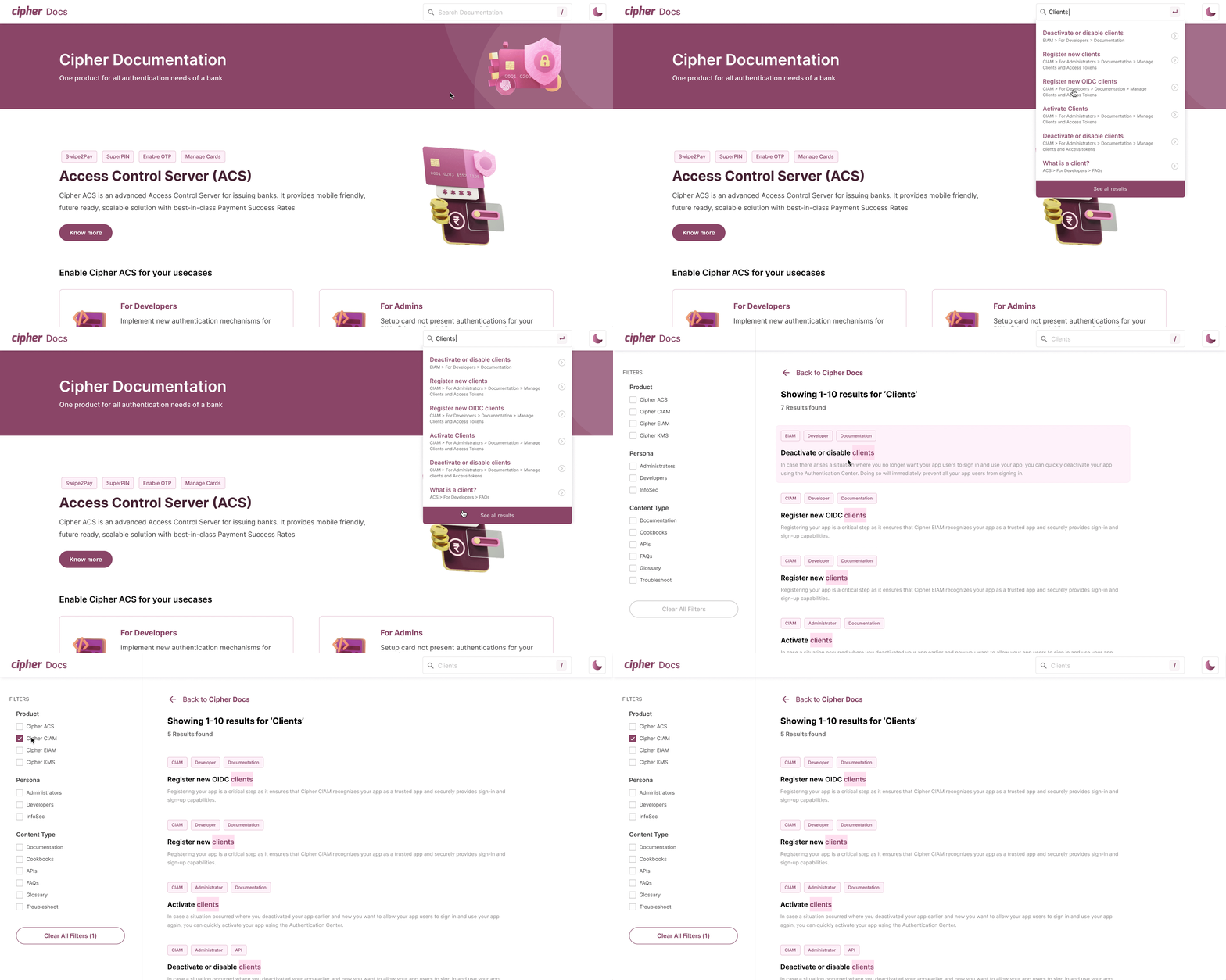
To enhance the search experience in Cipher Docs, we introduced filters on the search page. These filters allowed users to narrow down their search results and quickly find the desired articles after conducting a single keyword search.
During our analysis of search results, we categorized them into distinct groups and gained a deeper understanding of their content. Through this exercise, we identified three potential identifiers that could assist users in selecting from the search results: [Product Name], [Role/Persona], and [Content Type].
With this insight, we redesigned the search experience and improved the presentation of results by incorporating these three identifiers as tags. We removed the article URL from the results and implemented filters to help users sort through the search results more effectively.

Primary Side Nav Bar
The primary side nav bar was enhanced in 2 aspects — visual and functional.
Visual Aspect
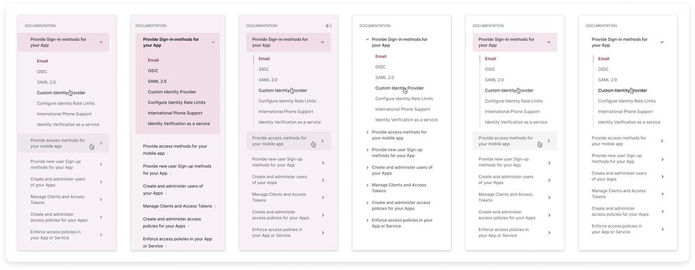
For the visual bit, we gathered a bunch of references and explored them until we narrowed it down to one approach.
Functional Aspect
We added a filter capability to the navigation bar, enabling users to find relevant articles and categories based on keywords without searching the entire portal.

Explorations
We did a few visual explorations for the primary sidebar, this is what they looked like 👇

Content Framework
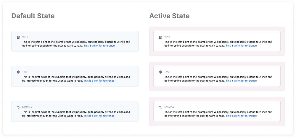
Once we had all the insights collated, we created a content framework for the content team to follow and bring consistency throughout all articles across all products. It helps decide which out of the 5 W’s (What, Why, When, Where, Who) should be answered at which level of the article. Additionally, we also defined how each component should be used, for example — links and components for notes, tips and examples.

Second Round of User Testing
After the redesign, we conducted user testing sessions with 7 participants to validate the changes. Based on their feedback, we made the following improvements:
- Simplified and clarified category and article titles for better user understanding.
- Ensured consistent usage of Cipher-specific terms to eliminate confusion.
- Incorporated tab-based navigation on the landing page for easier access to specific sections.
- Revised glossary definitions to use user-friendly language.
- Enhanced visual emphasis for highlighted glossary terms.
After making the required design changes based on user feedback, we handed over the updated designs for development. Following two rounds of usability testing and multiple iterations, we proudly present the new and improved Cipher Docs.
Special thanks to all the folks who participated in our UT sessions and provided us with valuable feedback and insights, as well as the PMs and developers without whom this project wouldn’t have been possible!
Hi, my name is Neel and I like to solve problems with design. I am currently looking for freelance projects, you can view more of my work on my website. If you’d like to get in touch, send me an email at hello@neellakhwani.com.

