Retaining styles when swapping instances within a nested component — Figma 201
It’s all about making sure your layer names and hierarchy match

If you’re not familiar with the design tool Figma, two recommendations:
- Get familiar. It’s awesome.
- This article might be a bit more than you need, since it deals with some of the more advanced concepts of the tool. I recommend checking out the Figma Youtube channel if you want to get up to speed quickly. If you really want to get serious, check out the Shift Nudge design course by Matt D. Smith. It’s done a lot for my growth in the last year.
But if you’re like me, you know your way around Figma pretty well and you’re trying to gain an edge; you want to be a power user.
A lot of times, to gain an edge, you need to drag through some tough problems. If you’re stuck on this particular problem we’ll talk about today, I hope this helps. I couldn’t find the exact information I needed on the subject, so hopefully, this helps you not have to experience that.
The issue I ran into today was centered around components. I was trying to create a nested component (like all the cool kids these days) that would allow me to create three different states for a navigation menu that could be executed within a prototype. The three menu item variants looked like this:

Nothing too crazy. A leading icon, and a label.
Naturally, this item was going to be used repeatedly with different contents, so I needed a way to swap out the contents while maintaining the overarching styles. The most basic way to get past this problem would be to simply create a variant for each different use. But this would turn a simple interaction into a huge design file, and that’s not going to fly.
So I decided that I would use an instance of the master component for each menu item and swap the icons from my icon bank. Figma makes this pretty simple.
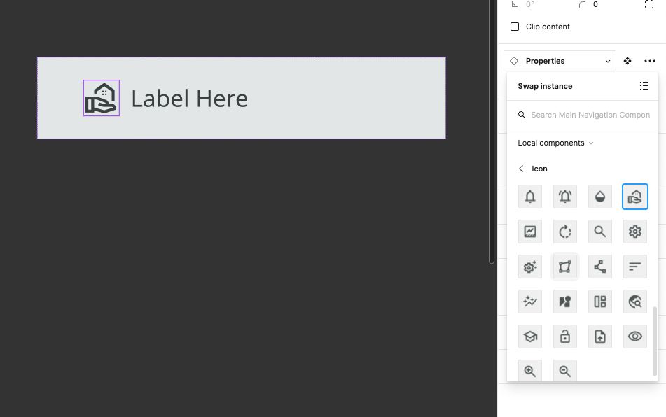
The problem was that my icons all naturally have a base color, and at first, they were not playing together nicely.
I was swapping icons in and ending up with states that looked like this; a style smoothie with different colors mixed together.

I won’t keep you hanging too long. After some intense googling which discovered lots of people with similar issues but not much in the way of answers, I came across this help document from Figma. Good start.
The most applicable parts were:

But the part that really helped was this:

So that was what I needed to do.
- Make sure what I was trying to change is actually a color fill on a layer, not some other color property.
- Make sure that my layer names were identical, between my icons and my nav menu items
So that’s what I did. For the current project I’m working on, I’m using the Material Symbols icon library, and those icons look like this out of the box:

Notice the bounding box (it’s a mask) and the unique name of the icon.
I removed the bounding box and made sure the color was set as a fill. If you remove the bounding box without having another frame to maintain the bounds, you’ll end up with icons of all different sizes since the dimensions will depend on the actual size of the shape, instead of having a uniform outer size (ie 20px).
Then, I renamed each of the actual shapes to icon Don’t worry, the outer component still defines the name of the icon, so I don’t have a mess of icons all named the same thing.

After that, I made sure each icon used a simple fill color.
That about does it. I went back to my main component to make sure that the icons used within the variants were the new ones I’d just fixed up, and then I created all my instances and then swapped in the appropriate icons.
Because the color properties are correct and the layers and hierarchy are the same, I was pleasantly rewarded for my toil.

PS — This technique is not necessarily reserved for icons. It would be smart to review your components and make sure they fit these constraints if you’re having issues.
I hope that helps! If you have any questions, feel free to leave a comment or add me on LinkedIn. Have a blessed day.


