Case study: Restructuring the Brooklyn Public Library’s information architecture
The Brooklyn Public Library is one of three separate and independent public library systems in New York City, with 58 branches and an enormous catalog. To better serve their community of 2.6 million people, BPL tasked our team with researching and redesigning the information architecture of their website.

We were provided a user persona, Priya, to guide our decisions when restructuring the BPL’s information architecture. Our objective- keep her in mind through research and design.

Business Analysis
Research began with business analysis. Using a Business Model Canvas template, we were able to ask the right questions to get a deeper understanding of BPL.
We examined BPL’s:
- Partners
- Activities
- Resources
- Value Propositions
- Customer Relationships
- Channels
- Customer Segments
- Cost Structure
- Revenue Stream

We learned that BPL:
- is an independent and nonprofit
- provides material to borrow for free- books, audiobooks, publications, music, movies, etc
- hosts classes and workshops for all ages
- provides community outreach programs for educators, immigrants, and entrepreneurs
- provides a public place to study with free access to wifi
- funded by the city, the state, fundraisers, a shop, & donations
- follows a B2C or “business to consumer” model
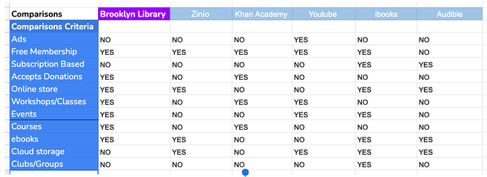
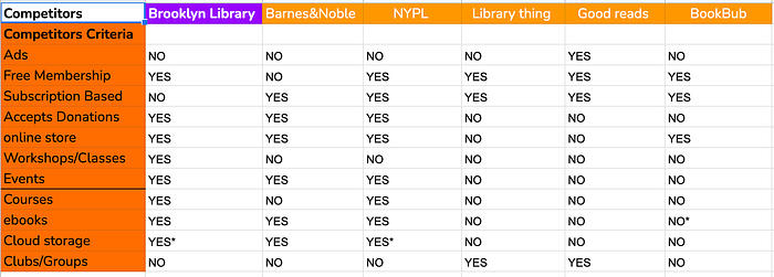
Next, we created a Feature Analysis spreadsheet to examine what features are successful with competitors and other similar business models so that we can apply what works to the redesign. Some highlights:
- Amazon’s no-frills, readable filtering system
- Barnes & Noble’s clean, right home page navigation
- Audible’s ability to browse content by genre
UX Research
After grasping the business side, we dove into UX research. We needed to see how users were currently navigating the site, so we conducted three studies using Optimal Workshop:
- Tree Study
- Open Card Sort
- Closed Card Sort
Tree Study
Our tree study was conducted by giving twelve participants three tasks to complete using a simple, text-only version of BPL’s navigational structure.
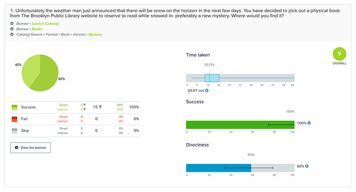
In the first task, the participants were to place a hold on a physical copy of a book- specifically a new mystery.
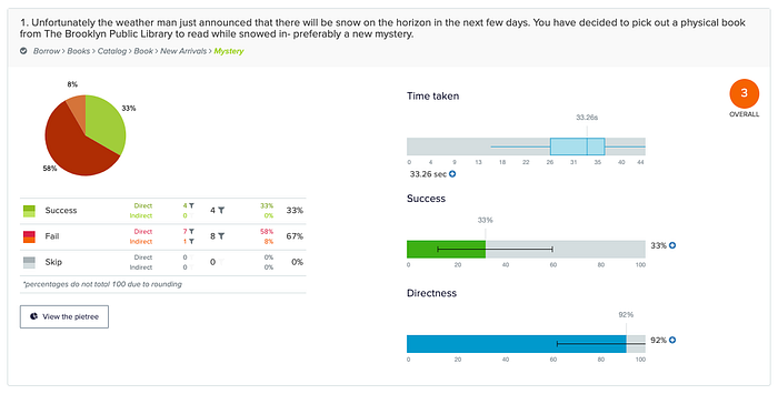
Results informed us that only 33% were successful completing what should be a simple task for a library website.
A user flow for this specific task on the existing website can be seen here:
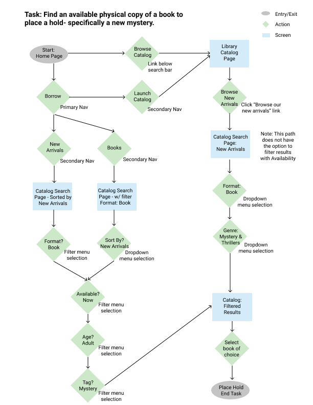
The possible tasks, broken down into steps:

Not only are there too many steps to complete an essential task, it is evident that much of the content is grouped into navigation categories that don’t make sense to users. We aimed to find out what categories would be intuitive so they can find the information they need.
Open Card Sort
We conducted an Open Card Sort study- where we listed all of the content that goes within the navigational items onto individual cards. Participants were tasked with grouping the cards into categories they deemed logical, and generating labels for them. This helped us find patterns in how users organized the site’s taxonomy.
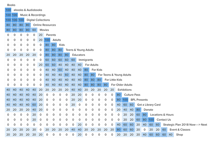
Users did not have much commonality when labeling categories. This is probably due to lack of context, which is okay for this task, as they weren’t subjected to any bias.
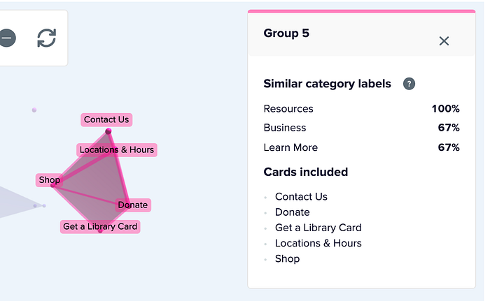
Many participants grouped these items together: Contact Us, Donate, Get a Library Card, Location & Hours, and Shop. These are often utility elements on a library’s website, so that was noted and will be implemented in the redesign.
The Closed Card Sort study is similar, except instead of having users generate their own labels, they are given the names, and are tasked with sorting the cards into those categories, as they deem logical. This is to evaluate if users found the existing taxonomy to be in sync with their own ideas of classification.
The existing category names did not perform well, with an average of only 47% of cards that were sorted inside them.
- “Attend” was the most problematic- with 62% of users placing the default cards outside of the category.
- “More” had the most success, which is not a good sign as that category is used as a catch-all for content that cannot otherwise be easily classified.
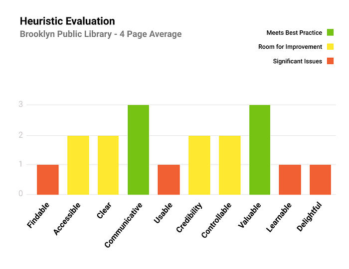
Heuristic Evaluation
Before planning the redesign and further user testing, we thought it important to carry out an heuristic evaluation. We used the “Abby Method” as a checklist to critique the design of four high-traffic pages of the website. We recorded our observations and recommendations for each heuristic. This helped deduce usability problems based on recognized design principles. The following chart is a summary of those four:
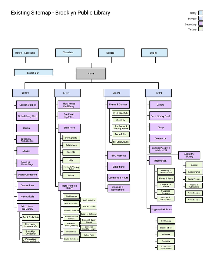
Sitemap
Next, the team made a sitemap of the proposed navigational structure, based on the previous evaluations. Here is a comparison of the existing sitemap and the proposed, with annotations to highlight the changes.


Another Round of Studies
We created another Tree Study and Closed Card Sort to compare our results with the existing site.
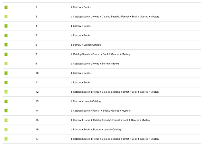
This Tree Study had fifteen participants and 100% completed the aforementioned task, with a 60% direct success rate. Users completed the tasks using three different available routes- a necessary feature to implement in the redesign, as the library’s primary purpose to help the community have access to material.
The next round of Closed Card Sorting was conducted with eight participants, the same way as before.
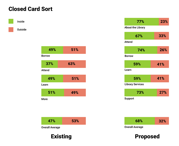
Overall, this reorganization performed much better with a 21% increase in cards that were sorted inside the “correct” categories.
The lower performing categories- Learn and Library Resources may need renaming or reorganizing.
The Redesign
We created a prototype of our redesign, which you can find here.
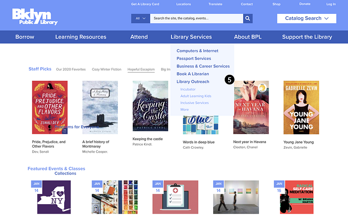
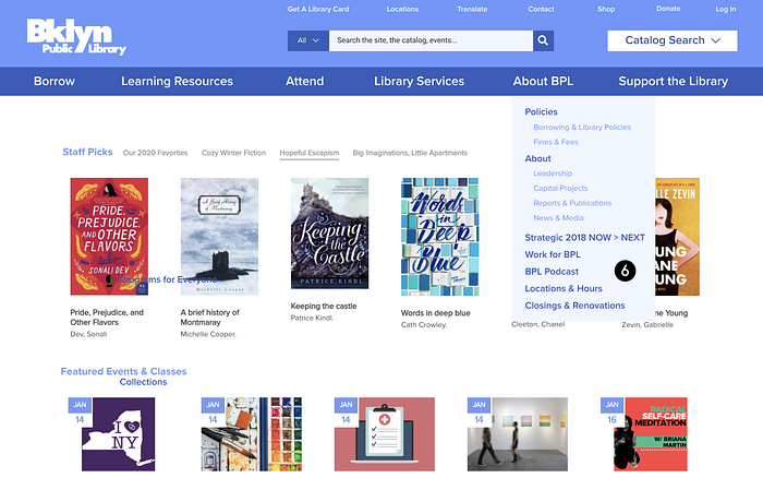
Here is a screenshot of the main page of the prototype with annotations of highlighted changes:
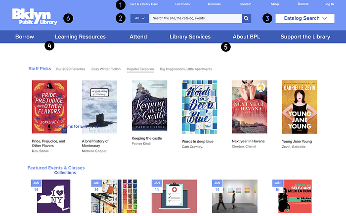

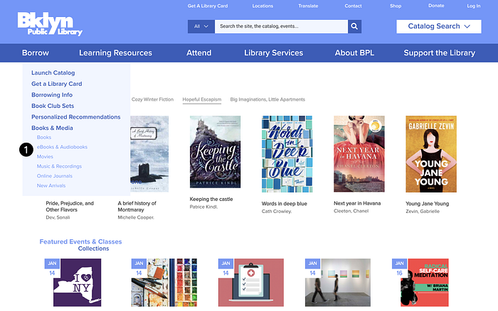
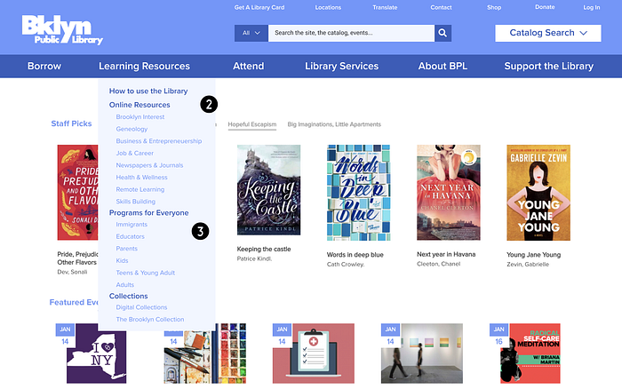
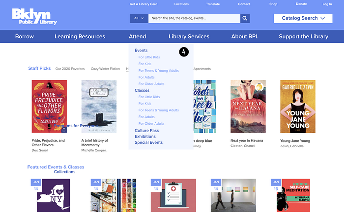
And now a walkthrough of the rest of the primary nav elements


Last, but not least, we added a Catalog Search filter to the home page, which will save Priya several steps when she wants to search for a book in a particular genre.


Recommendations
The data proves that we have made significant strides for Priya and BPL’s users, but our work isn’t done yet- another iteration of research and design would further improve results. We will:
- Test to determine if users will take advantage of the catalog filters on the home page.
- Conduct an open card sort study with the lower-performing primary classifications
- Iterate another closed card sorting test with relabeled categories to see if results improve
- A redesign of the inconsistent catalog search pages may help users narrow their search

