Responsive Design: Scaling UI from Desktop screen to Mobile screen

It is challenging to design a responsive website or application. There will always be obstacles to overcome, regardless of whether you focus on mobile or desktop first. When more coding is required for the solution, these obstacles can make the job of front-end developers even more difficult. The good news is that there are ways to prepare before getting your hands dirty with the design.
Responsive Layout

Before embarking on the journey of UI design, it is important to plan the layout first. To achieve this, it is recommended to use either a notebook or a drawing app on a tablet to conceptualize flexible layouts that can be easily transformed from desktop to mobile without the need for breakpoints. A fluid layout allows for conversion from four columns to two, or even one column, without sacrificing its overall structure. However, some sections may require more imaginative approaches. While more creativity often leads to a more complex layout, it is still possible to design a partially adaptable and fluid layout that will look great on mobile devices, as long as the parts of the section are logically connected.
Font Scaling

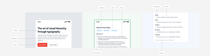
To ensure a consistent and legible experience across different devices, font scaling from desktop to mobile is crucial in UI design. On desktop, a common font size for paragraphs ranges from 16px to 18px, while on mobile, a size range of 14px to 16px is ideal for easy reading. To implement proper font scaling, it is recommended to create a style guide that lists all text elements, such as titles, paragraph, link, blockquote, etc.
By defining a default font size for elements like paragraphs and setting a relative scale for other text elements, such as titles, links, labels, and button labels, you can ensure consistency across desktop and mobile devices. Using a tool like type-scale.com can assist in finding a suitable scale and font sizes that work well together. It is important to keep in mind that font scaling should prioritize readability and accessibility, not just aesthetics.
Demographic considerations can play a significant role in determining appropriate font scaling for different audiences. For example, older populations may have difficulty reading small text, so larger font sizes may be necessary. Conversely, younger populations may prefer smaller font sizes, so they can fit more content on their screens. Additionally, cultural and linguistic differences can also impact font scaling, as some languages or alphabets may require larger or smaller font sizes for optimal readability. It’s important to consider these factors when designing a user interface to ensure that text is easily legible and accessible to the target audience.
Using “em” and “rem” units for font scaling in responsive design is a common best practice. “Em” and “rem” units are relative units of measurement that adjust automatically based on the user’s default font size, making it easier to maintain a consistent font size across different devices and screen sizes. Additionally, using “vw” (viewport width) and “vh” (viewport height) units for full-page designs, such as landing pages, can provide precise scaling and ensure that the font size adjusts dynamically as the screen size changes. This approach allows for a more fluid and user-friendly design that adjusts seamlessly to different devices and screen sizes.
Icon Scaling

Icons are often placed next to text labels or titles to provide visual context and clarify the meaning of the text. When icons are positioned above text, they are typically larger in size to ensure visibility and create a clear hierarchy. In general, it’s important to maintain consistency in the size of icons and text elements to ensure a visually harmonious design and make the user interface easy to understand. However, the specific size and placement of icons may vary depending on the design goals and the needs of the target audience.
Button Scaling
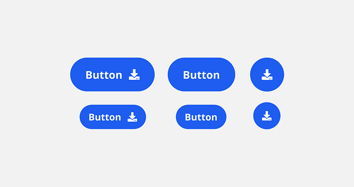
A good point to keep in mind when designing buttons with icons. In a mobile-first design approach, buttons should be large enough for easy tapping with a finger, as users may interact with the interface using their fingers rather than a mouse. A button size of 46px is a commonly recommended size to ensure comfortable tapping with a finger, but this may vary depending on the specific design requirements and the target audience’s needs. In general, it’s important to consider the interactivity of the interface and make sure that buttons are large enough for easy tapping, while also taking into account the overall design aesthetic and layout.
Menu Scaling
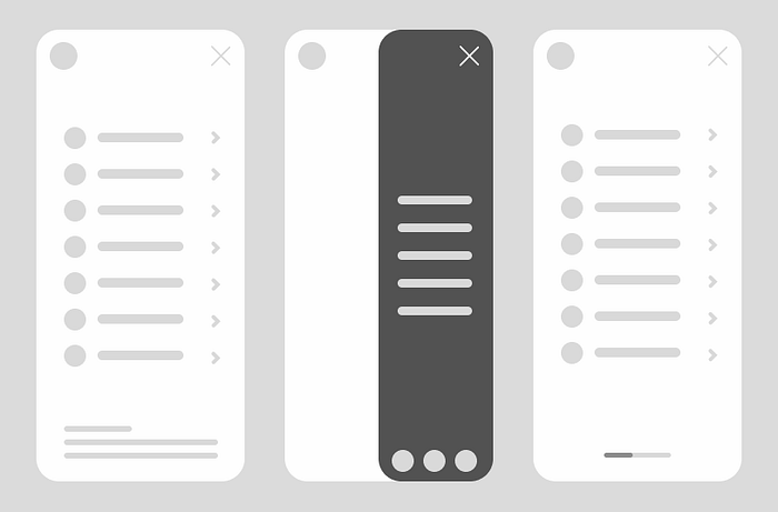
Designing menus can become more challenging as the number of items increases, especially when there are submenus involved. One popular approach for mobile apps is to use a hamburger menu, which can effectively condense a large number of menu items into a compact space.
However, when it comes to displaying submenus, there are different options to consider, such as expanding submenus and allowing for scrolling, displaying submenus in a horizontal carousel, or using side menus that open from right to left and take up 50% of the screen. Each of these approaches has its own benefits and trade-offs, and the best choice depends on the specific design goals and the needs of the target audience.
For example, expanding submenus may allow for easy access to all menu items, while a horizontal carousel may be more visually appealing. On the other hand, a side menu may be more user-friendly for one-handed use. It’s important to consider the specific needs of the target audience and the context of use when deciding on the best approach for a menu design.
Conclusion
In conclusion, responsive layout and scaling techniques are essential for designing user interfaces that work well across a range of devices and screen sizes. By implementing font scaling, icon scaling, button scaling, and menu scaling, designers can ensure that their designs are readable, usable, and accessible on any device. The key to effective scaling is to maintain consistency in the design and layout while adjusting elements to fit different screen sizes.
Responsive design enables designers to provide an optimal user experience, regardless of the device being used. In today’s mobile-first world, it is more important than ever to design websites and applications with responsiveness in mind. By prioritizing responsive layout and scaling, designers can create interfaces that are visually appealing, user-friendly, and accessible to all.


