Responsive Across All Devices: An Incredible Guide to Responsive UI/UX Design
In today’s digital landscape, responsive UI/UX design is essential. With the wide variety of devices that users use to access websites and applications, it is critical that your design adapts seamlessly to different screen sizes and resolutions. In this article, we will provide a comprehensive guide to responsive UI/UX design, helping you create visually stunning and user-friendly designs that work on any device.

Understanding Responsive Design
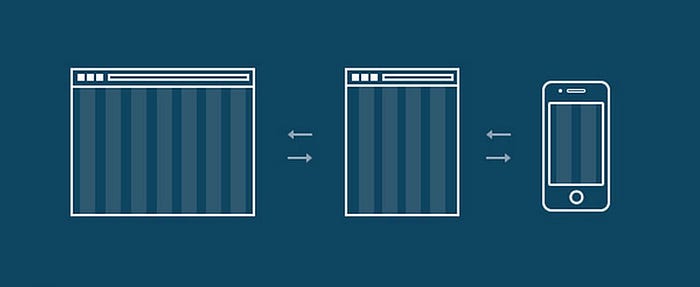
Responsive design is a web design approach that makes websites and applications adapt to the size and resolution of the device being used. This ensures that users have a consistent and enjoyable experience regardless of the device they are using.
Traditionally, websites were designed for a specific screen size, such as a desktop computer. This meant that websites would look different on different devices, and could be difficult to use on smaller screens. Responsive design solves this problem by using a fluid grid layout and flexible images. This allows the website to adjust its layout and content to fit the size of the device being used.
There are a number of benefits to using responsive design. First, it ensures that your website or application is accessible to users on all devices. This is important because more and more people are using their smartphones and tablets to access the web. Second, responsive design can improve the user experience by making it easier for users to interact with your website or application on different devices. Third, responsive design can save you time and money by eliminating the need to create separate websites for different devices.
There are a few things to keep in mind when creating responsive designs. First, you need to use a fluid grid layout. This means that the width of the columns in your layout should be fluid, and should adjust to the width of the device being used. Second, you need to use flexible images. This means that your images should resize to fit the available space without distorting the image. Third, you need to use media queries. Media queries are CSS rules that allow you to specify how your design should behave on different screen sizes.
By following these principles, you can create responsive designs that are visually stunning and user-friendly on any device.
Mobile-First Approach
A mobile-first approach is a design philosophy that prioritizes the mobile experience over the desktop experience. This means that when designing a website or application, the first step is to design for mobile devices, and then to scale up the design for larger screens.
There are a few reasons why a mobile-first approach is important. First, more and more people are using their smartphones and tablets to access the web. In fact, according to Statista, mobile devices accounted for 54.2% of global web traffic in 2022. This means that if you’re not designing for mobile, you’re missing out on a significant portion of your audience.
Second, a mobile-first approach can improve the user experience. Mobile devices have smaller screens, so it’s important to design your website or application in a way that is easy to use on these devices.
Third, a mobile-first approach can save you time and money. By designing for mobile first, you can avoid having to create separate designs for desktop and mobile devices. This can save you time and money in the long run.
If you’re considering adopting a mobile-first approach, there are a few things you need to keep in mind. First, you need to make sure that your website or application is responsive. This means that it should adapt to the size of the device being used. Second, you need to use clear and concise typography. This is especially important on mobile devices, where screen space is limited. Third, you need to use whitespace effectively. Whitespace can be used to create visual hierarchy and to make your design more visually appealing.
By following these tips, you can create a mobile-first website or application that is both user-friendly and visually appealing.

Here are some additional benefits of using a mobile-first approach:
- Improved SEO: Google and other search engines now prioritize mobile-friendly websites in their search results. This means that if you have a mobile-first website, you’re more likely to appear higher in search results, which can lead to more traffic to your website.
- Increased engagement: Studies have shown that users are more likely to engage with websites and applications that are designed for mobile devices. This means that if you have a mobile-first website, you’re more likely to keep users engaged and on your site.
- Lower bounce rates: Bounce rate is the percentage of visitors who leave your website after viewing only one page. Mobile-friendly websites have lower bounce rates than non-mobile-friendly websites. This means that if you have a mobile-first website, you’re less likely to lose visitors after they’ve visited your site.
If you’re not sure whether or not a mobile-first approach is right for you, I recommend doing some research and reading articles from experts in the field. There are many resources available that can help you learn more about mobile-first design and how it can benefit your website or application.
Fluid and Flexible Layouts
Fluid and flexible layouts are two important concepts in responsive web design. A fluid layout is a layout that adjusts to the width of the device being used. This means that the columns in your layout will be wider on larger screens and narrower on smaller screens. A flexible layout is a layout that allows the elements on a page to resize to fit the available space. This means that images, text, and other elements will resize without distorting their appearance.
Here are some of the benefits of using fluid and flexible layouts:
- Improved user experience: Fluid and flexible layouts can improve the user experience by making it easier for users to view and interact with your content on different devices.
- Increased accessibility: Fluid and flexible layouts can also increase the accessibility of your website or application by making it easier for users with disabilities to use your content.
- Reduced development costs: Fluid and flexible layouts can reduce development costs by eliminating the need to create separate layouts for different devices.
There are a few things to keep in mind when using fluid and flexible layouts:
- Use media queries: Media queries are CSS rules that allow you to specify how your layout should behave on different screen sizes. This is a powerful tool that can be used to create truly responsive layouts.
- Test your layouts on different devices: It is important to test your layouts on a variety of devices to ensure that they look and function properly. This will help you to identify any potential problems and make necessary adjustments.
- Use clear and concise typography: Typography is an important element of any design, but it is especially important for fluid and flexible layouts. Make sure that your typography is easy to read on all devices, regardless of the screen size.
- Use whitespace effectively: Whitespace is the space around elements on a page. It can be used to create visual hierarchy, to make your design more visually appealing, and to improve readability.
By following these principles, you can create fluid and flexible layouts that are both visually stunning and user-friendly.
Responsive Images
Responsive images are images that resize to fit the available space without distorting their appearance. This is important for responsive web design, as it allows you to use the same images on different devices without having to worry about them looking blurry or pixelated on smaller screens.
Here are some of the benefits of using responsive images:
- Improved user experience: Responsive images can improve the user experience by making it easier for users to view your content on different devices.
- Increased accessibility: Responsive images can also increase the accessibility of your website or application by making it easier for users with disabilities to view your content.
- Reduced bandwidth usage: Responsive images can reduce bandwidth usage by only loading the image size that is needed for the current device.
There are a few things to keep in mind when using responsive images:
- Use the right image formats: Not all image formats are created equal. Some image formats, such as PNG, are lossless, meaning that they retain all of the original image data. Other image formats, such as JPEG, are lossy, meaning that they discard some of the original image data to reduce the file size. For responsive images, it is important to use a lossless image format, such as PNG, so that the images do not lose quality when they are resized.
- Optimize your images: You can optimize your images by reducing their file size. This can be done using a variety of tools, such as Photoshop or GIMP.
- Test your images on different devices: It is important to test your images on a variety of devices to ensure that they look and function properly. This will help you to identify any potential problems and make necessary adjustments.
By following these principles, you can create responsive images that are both visually stunning and user-friendly.
Adaptive Typography
Adaptive typography refers to the practice of adjusting the typography, such as font sizes, line lengths, and line heights, to ensure optimal readability and visual appeal across different devices and screen sizes. It involves adapting the typographic elements of a design to accommodate varying viewing conditions, such as smaller screens on mobile devices or larger screens on desktop computers.
The goal of adaptive typography is to maintain legibility and provide a comfortable reading experience for users, regardless of the device they are using. By making typography adaptive, designers can ensure that the text remains visually appealing and easy to read, enhancing the overall user experience.

When implementing adaptive typography, designers consider the following aspects:
- Font Sizes: The font sizes are adjusted to be appropriate for different screen sizes. For example, on smaller screens, font sizes may be increased to ensure readability, while on larger screens, they may be adjusted to avoid excessive line lengths and improve readability.
- Line Lengths: The length of the lines of text is optimized to prevent readers from having to scan their eyes too far horizontally. On smaller screens, line lengths may be shorter to prevent excessive eye movement, while on larger screens, longer lines can be used to avoid having too many short lines that require frequent eye movement.
- Line Heights: The vertical spacing between lines of text, known as line height or leading, is adjusted to provide adequate breathing space and avoid text becoming crowded or too tightly packed. On smaller screens, line heights may be increased to enhance legibility, while on larger screens, they can be adjusted for better visual balance.
- Typeface Selection: Typeface choices can impact readability and legibility, especially on smaller screens. Designers select typefaces that are clear, legible, and suitable for various device sizes and resolutions. Sans-serif typefaces are often preferred for digital interfaces due to their clean and modern appearance, but the specific choice depends on the design context and brand identity.
Here are some of the benefits of using adaptive typography:
- Improved user experience: Adaptive typography can improve the user experience by making it easier for users to read your content on different devices.
- Increased accessibility: Adaptive typography can also increase the accessibility of your website or application by making it easier for users with disabilities to read your content.
- Reduced eye strain: Adaptive typography can reduce eye strain by ensuring that the text is always readable and easy to scan.
Breakpoints and Media Queries
Breakpoints and media queries are essential concepts in responsive web design. They allow designers to define specific screen widths or device conditions at which the layout and styling of a website or application should change to accommodate different screen sizes or orientations.
Breakpoints are predetermined points in the design where a significant layout adjustment is needed to ensure an optimal user experience. They are typically defined based on common device sizes or resolutions. For example, common breakpoints might include 320px for small mobile devices, 768px for tablets, and 1024px for desktop screens.
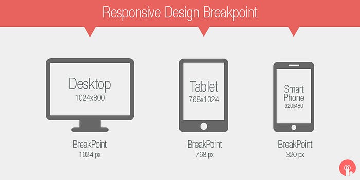
Media queries are CSS rules that are applied when specific conditions are met. These conditions are typically based on the width, height, orientation, or device characteristics of the user’s screen. By using media queries, designers can target specific breakpoints and apply different styles or layout changes accordingly.
Touch-Friendly Interactions
Touch-friendly interactions are interactions that are designed to be easy and intuitive to use on touch devices, such as smartphones and tablets. These interactions are important for creating a good user experience on touch devices, as they can make it easier for users to interact with your website or application.
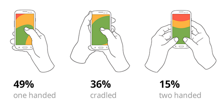
There are a few key principles to keep in mind when designing touch-friendly interactions:
- Use large, touchable elements: Elements that are large and easy to touch will be more likely to be interacted with by users. Use large buttons, clear menus, and other elements that are easy to tap or swipe.
- Use clear and concise labels: Labels should be clear and concise so that users know what they are interacting with. Use short, descriptive labels that are easy to read and understand.
- Use smooth and responsive animations: Animations can help to make your interactions more visually appealing and engaging. Use smooth and responsive animations that do not slow down the user experience.
- Test your interactions on touch devices: It is important to test your interactions on a variety of touch devices to ensure that they work properly. This will help you to identify any potential problems and make necessary adjustments.
By following these principles, you can create touch-friendly interactions that are both visually stunning and user-friendly.
Here are some additional tips for designing touch-friendly interactions:
- Use a mobile-first approach: This means designing your website or application for mobile devices first, and then scaling it up for larger screens. This will help you to ensure that your interactions are optimized for touch devices.
- Use a responsive design: A responsive design will allow your website or application to adapt to the size of the device being used. This will help to ensure that your interactions are always easy to use, regardless of the device.
- Use a clear and consistent design: A clear and consistent design will help users to understand how to interact with your website or application. Use a consistent design language throughout your site, and make sure that your interactions are clear and easy to understand.
By following these tips, you can create touch-friendly interactions that will make your website or application more user-friendly for everyone.
Performance Optimization
Performance optimization refers to the process of improving the speed, efficiency, and overall performance of a website or application. In the context of UI/UX design, performance optimization focuses on reducing loading times, minimizing resource consumption, and enhancing the user experience by ensuring smooth and responsive interactions.
Performance optimization involves several techniques and best practices:
- File Size Optimization: Compressing and minimizing file sizes, such as images, JavaScript files, and CSS files, reduces the amount of data that needs to be transferred, resulting in faster loading times. Techniques like image compression, minification of code, and bundling assets can significantly improve performance.
- Caching and Browser Storage: Leveraging browser caching and storage mechanisms allows certain files and data to be stored locally on the user’s device. This reduces the need for repeated downloads and improves the loading speed of subsequent visits or interactions.
- Content Delivery Network (CDN): Utilizing a CDN helps deliver static assets, such as images, scripts, and stylesheets, from servers located closer to the user’s geographic location. This reduces latency and improves loading times by minimizing the distance data needs to travel.
- Lazy Loading: Implementing lazy loading delays the loading of non-critical resources, such as images or sections of a webpage, until they are needed. This approach improves initial loading times and prioritizes the loading of essential content, providing a faster perceived performance.
- Minimizing HTTP Requests: Reducing the number of HTTP requests required to retrieve resources is crucial for optimizing performance. Combining files, using CSS sprites for images, or utilizing inline coding techniques can help minimize requests and speed up page loading.
- Performance Testing and Monitoring: Regularly testing and monitoring the performance of a website or application is essential to identify bottlenecks, slow-loading elements, or performance issues. Tools like Lighthouse, WebPageTest, or browser developer tools can help analyze performance metrics and provide insights for optimization.
- Mobile Optimization: Given the increasing use of mobile devices, optimizing performance for mobile platforms is crucial. Techniques like responsive design, adaptive images, and minimizing the use of resources that may be costly for mobile connections can enhance mobile performance.
By implementing these performance optimization techniques, designers can create UI/UX designs that load quickly, respond smoothly, and provide a seamless user experience. Optimized performance ensures that users can access and interact with the interface without delays or frustrations, ultimately improving user satisfaction and engagement.
Cross-Browser and Cross-Device Testing
Cross-browser and cross-device testing are two important aspects of website development. Cross-browser testing ensures that your website looks and behaves properly in different browsers, while cross-device testing ensures that your website looks and behaves properly on different devices.
There are a number of reasons why it is important to do cross-browser and cross-device testing:
- To ensure that your website is accessible to everyone: Different browsers and devices have different capabilities, so it is important to test your website on a variety of platforms to ensure that it is accessible to everyone.
- To improve the user experience: A website that looks different or behaves differently in different browsers or devices can be confusing and frustrating for users. By testing your website on a variety of platforms, you can ensure that it provides a consistent and user-friendly experience for everyone.
- To avoid compatibility issues: If your website is not compatible with a particular browser or device, users will not be able to access it. By testing your website on a variety of platforms, you can identify any compatibility issues and fix them before they cause problems for users.
There are a number of ways to do cross-browser and cross-device testing:
- Manual testing: This involves manually testing your website on a variety of browsers and devices. This can be time-consuming, but it is a reliable way to ensure that your website is compatible with all major platforms.
- Automated testing: This involves using a tool to automate the testing process. This can save time, but it is important to make sure that the tool you are using is comprehensive and up-to-date.
- Cloud-based testing services: These services allow you to test your website on a variety of browsers and devices in the cloud. This is a convenient way to test your website, and it can be a good option if you do not have the resources to do manual or automated testing yourself.
No matter which method you choose, it is important to test your website on a variety of browsers and devices to ensure that it is accessible to everyone and provides a consistent user experience.
Here are some additional tips for cross-browser and cross-device testing:
- Use a variety of browsers: Test your website on the most popular browsers, such as Chrome, Firefox, Safari, and Edge. You should also test your website on less popular browsers, such as Opera and IE.
- Use a variety of devices: Test your website on a variety of devices, such as desktops, laptops, tablets, and smartphones. You should also test your website on different screen sizes and resolutions.
- Use a variety of operating systems: Test your website on a variety of operating systems, such as Windows, macOS, Linux, and Android.
- Use a testing tool: There are a number of testing tools available that can help you to automate the testing process. These tools can save time and ensure that you are testing your website on a variety of platforms.
By following these tips, you can ensure that your website is compatible with all major platforms and provides a consistent user experience for everyone.
Continuous Iteration and Improvement
Continuous iteration and improvement is an iterative process of refining and enhancing a UI/UX design over time. It involves gathering user feedback, analyzing data, and making iterative updates to improve the design based on insights and observations.
Here are the key aspects of continuous iteration and improvement in UI/UX design:
- User Feedback: Actively seek feedback from users through methods like surveys, user testing sessions, or feedback forms. Collect qualitative and quantitative data to understand user preferences, pain points, and suggestions for improvement.
- Data Analysis: Analyze user behavior data, such as click-through rates, bounce rates, or conversion rates, to identify patterns and insights. Utilize analytics tools to gain quantitative insights into user interactions, popular features, or areas where users may face difficulties.
- Identify Areas for Improvement: Based on user feedback and data analysis, identify specific areas of the UI/UX design that can be enhanced or optimized. Prioritize improvements based on the impact they can have on user experience and business goals.
- Make Iterative Updates: Implement incremental changes or updates to the design based on the identified areas for improvement. This can involve refining visual elements, optimizing workflows, streamlining navigation, or enhancing interactive elements. Test these updates and monitor their impact on user experience.
- Usability Testing: Conduct usability testing sessions with representative users to evaluate the effectiveness of design changes and gather real-time feedback. Observe how users interact with the updated design and identify any usability issues or areas that require further improvement.
- A/B Testing: Perform A/B testing by creating variations of the design and testing them simultaneously with different user groups. Compare the performance and user response of each variation to determine the most effective design iteration.
- Regular Review and Maintenance: UI/UX design is an ongoing process. Regularly review and maintain the design to address emerging user needs, technological advancements, and evolving business goals. Stay updated with industry trends, user expectations, and new design patterns.
By continuously iterating and improving the UI/UX design, designers can create an interface that is more user-centered, intuitive, and aligned with user expectations. This iterative approach allows for incremental enhancements, addressing user feedback and evolving requirements over time, resulting in a continuously improved user experience.
Creating a responsive UI/UX design that seamlessly adapts to different devices is paramount in today’s digital landscape. By understanding responsive design principles, adopting a mobile-first approach, designing flexible layouts, optimizing images and typography, defining breakpoints, considering touch-friendly interactions, optimizing performance, conducting thorough testing, and embracing continuous iteration, you can create stunning UI/UX designs that provide an exceptional experience across all devices.
And that’s a wrap! Thanks for reading!


