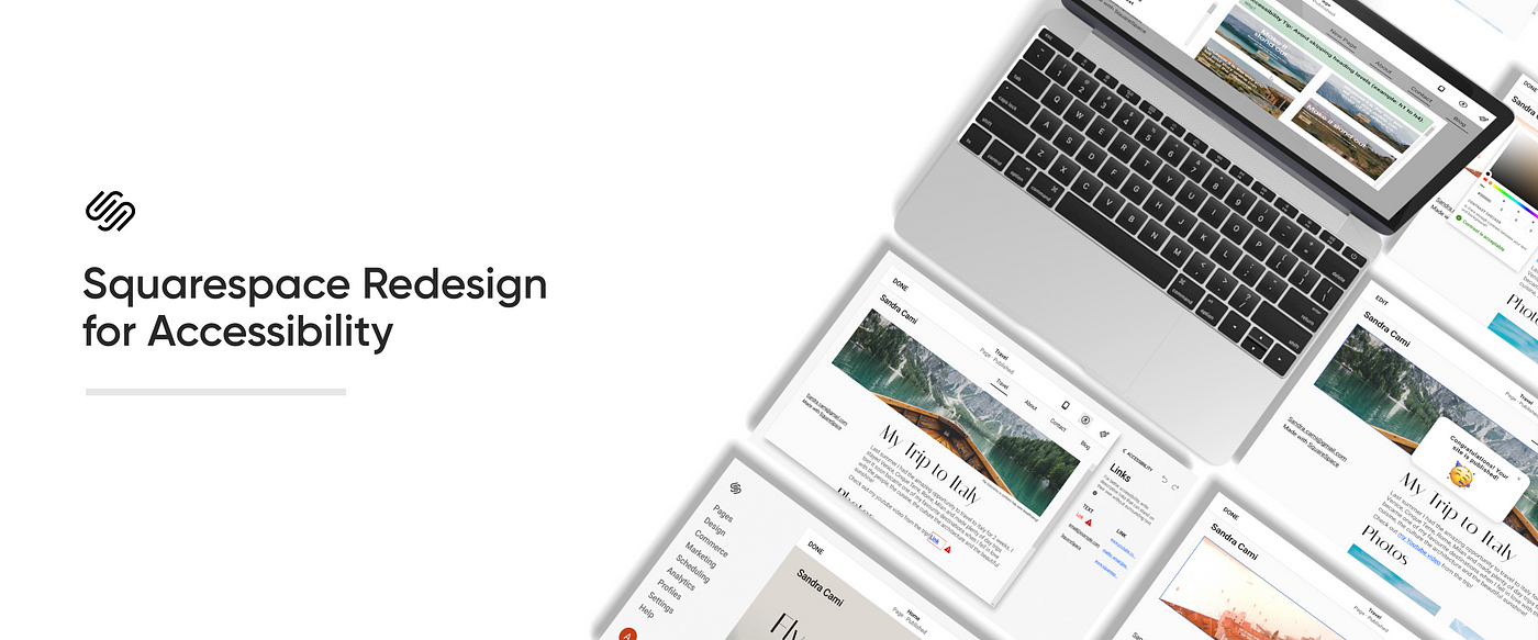
Case study: Reimagining Squarespace
for accessibility
Team
Sanskriti Negi: Product Design and UX Research
Mengming Luo: Product Design
Tasha McFarland: Product Design
Phoebe Yan: UX Research
Timeline
May 20 — May 26, 2021
6 days
Background
This project took place in Design Frontiers, an annual designathon run by UCSD Design Co. We followed this design Process for our design Sprint:

Result
After 6 days of rapid sprinting, we presented our project to industry judges from Fjord and we won first place! The Fjord judges appreciated our inclusion of user insights from research participants within our target community within such a tight timeline.
Overview
Many websites are inaccessible to users with disabilities, despite the array of digital creation tools that exist today. Over 1 billion people worldwide have disabilities. Of those in the US alone, an estimated 14 million people over the age of 12 have a visual impairment.

Our challenge was:
How might we empower website creators to make more accessible websites?
Problem
- Squarespace is one of the leading CMS websites.
- Still, it does not have accessibility support.
- Accessibility issues make blind and color blind users feel excluded.
- Disabled users find it difficult to build their own websites without help.
User Interviews
We conducted user interviews to better understand what our users know about CMS or any website builder. Most participants have little to no experience with building their own websites and citing
“What is accessibility? I have never heard of it”.
As a result of these user interviews, our team realized the majority of users who are using websites builder, no matter for their own business or their own personal use, have little knowledge about accessibility features due to which Throughout the user interviews, we needed to explain what are accessibility features and how they can help people with disabilities like visual impairments to browse the web.
Primary User Research

- The project began in dialogue when he mentioned a major insight of his: thousands of websites are created with content management systems (CMS), yet navigating those websites with a screen reader is a major frustration. He cited his own experience with Squarespace and provided a demonstration with his screenreader, showcasing the many obstacles.
- For additional user research, we interviewed Jason, a system developer who had been blind since birth. During the interview, he explained how he does his daily work through a screen reader, emphasizing that he often requires his sighted partner's aid to navigate sites with accessibility issues.
Ideation
We ideated three solutions to solve the problem

After all considerations, we chose to Redesign Squarespace, Why?
- By integrating these features into Squarespace, we reduce the barriers for users to create accessible websites. As found in our user research, many individuals have little awareness of accessibility issues and what accessible online content means making it unlikely to download a browser extension and new CMS service altogether.
- Furthermore, SquareSpace being a fairly popular CMS service will help impact the pre-existing user base to improve online accessibility. As a prominent CMS service, Squarespace sets an example for other CMS companies, modeling whether or not accessibility is worth prioritizing.
Goals
- Accessible: Make the site more accessible for users with visual impairments.
- Build empathy: Empathize with screen-reader users’ experience.
- Increase awareness: Educate surrounding online accessibility and allow website designers to learn from their accessibility mistakes.
Solution and Features
Based on the research findings reported by WebAIM, we’ve decided to focus on preventing the most common accessibility failures (low contrast text, missing alternative image text, and empty links), as well as implement several other features to improve website accessibility.
1. Proactive Education
Since many sighted users lack a mental model of how screen readers work, to help build awareness and education, we baked in tips and videos throughout the interface.
- “Heading Levels” checker:
- We include a description of what heading levels are, why they are important.
- A video showing a screenreader user interacting with headings to navigate a page.
- The user can just click on the actions to change the heading levels accordingly.

2. Auto-Check
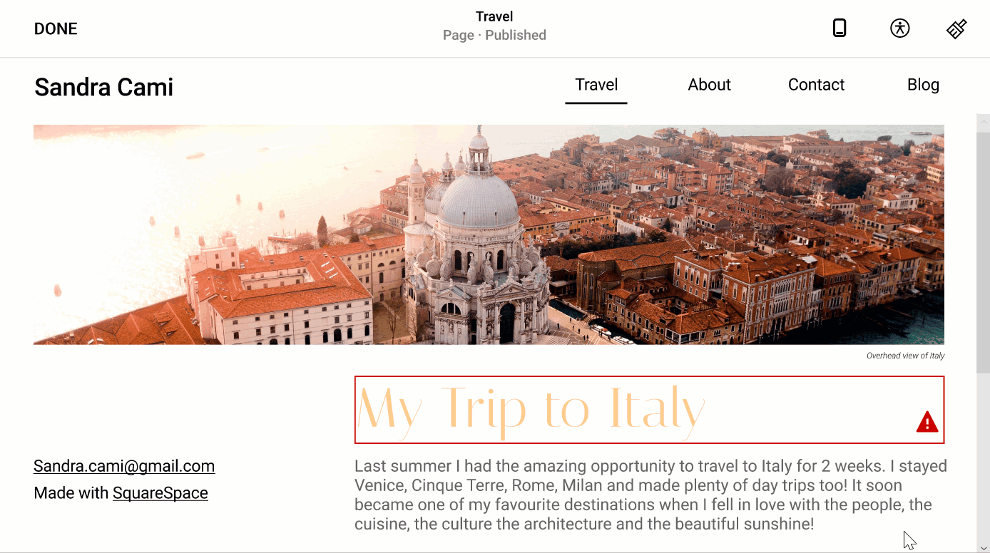
Instead of a retroactive check at the end, we’ll help users make accessibility changes in the beginning early in the process. Auto-check automatically detects accessibility issues and prompts the user to make accessibility changes.
In our prototype, we designed the auto-check feature to respond to skipped heading levels, low color contrast, and forgotten image alt text.
- “Low Contrast” checker: The user is alerted to change the low contrast text and directed to the color picker.
- Alt Text Checker: The user is notified of missing alt text and is directed to settings.

3. Accessibility Panel
After iterating the features we decided to make an accessibility panel that consists of all the general checks beside the design panel which has all features in one place.
- Grayscale Checker: Making the website accessible for Colorblind users.

- Final Check: If the user tries to publish changes, they are notified of any unresolved accessibility issues.

User Testing and Iterations
We tested our prototype on two users (23 yr olds who had experience with CMS services) and asked for their feedback as they went through the website.
Feedbacks
- Reduce Technical Jargon: We found that most users were unaware of accessibility terms and therefore we needed to make the cues understandable by avoiding technical jargon.
For example: Initially, we were going to provide numeric values to describe the contrast ratio of the text to the background alongside the recommended ratio. However, upon a quick user test, the user did not understand the meaning of the numbers and the overall information was too technical for their needs.

2. Effective Learning: Learning how unaware the users were, videos will help in conveying the message better.

Next Steps
- Prioritize other features: There are other common accessibility features we have yet to address, such as aria labels, form labels, etc. Also keeping in mind other disorders like vestibular disorders, to design the products accordingly.
- Address Social Layer and Education: Furthermore, one of the large challenges we found through user testing, was the lack of awareness and knowledge of accessibility issues. Thus, improving the education of accessibility must be our first priority.
What did I learn?
- Radical Empathy: Empathizing with the community and directly communicating with them helped me realize the importance of stepping into their shoes and realizing the issues.
- Improving social Aspects: As a designer, it has helped me understand that accessibility is part of the design, not just some applied features to enhance the product.
Lastly Thanks to my amazing team and Design Co. for this opportunity, it was a wonderful experience working around different time zones and finishing our product! 🥰

