Refining the Chennai Metro Rail App Experience- A UX case study

My Responsibilities
- User Research
- UX design: Sketching, Wireframing, Prototyping
- UI design + Iterations
Project Context
- I took approximately 3 weeks to come up with a viable solution
- Solo project
- A project dedicated to Chennai Metro Rail Limited, India
So, What was the Issue?
The Chennai metro saw a staggering increase in its users in the year 2022. According to CMRL officials, the ridership of Chennai Metro recorded a near 156 percentage increase by the end of the year. Despite the heavy ridership, the app is known to have a terrible rating both in the Play store and the App store. So this is why I decided to take it as a challenge and solve the issues majority of the users are facing.
The users are overwhelmed by the app’s complex interface and expect a much more simplified version.
Main Goals
- Simple UI for the target audience
- Less complex Information architecture
- A happy face while interacting with the app :)
The Target Audience
According to a research conducted by the CMRL authorities, it was found that more than 70% of the users using the services were working middle-aged people (25–45 years) who used the metro every day. They would most often use the app to check the Live timings and it was crucial for me to improve the experience of the overall app.
This is What I Came Up With!


I asked a few people what they expect from a Metro App..
During interviews with my peers, I inquired about their expectations from a metro app. The responses I recorded included:
— I want it to show me the live run times of the trains
— Ability to manage my cards and passes
— Hassle free payment process
It was shocking to discover that the old version of the app didn’t meet the users’ expectations at all. As a result, I made it my top priority to address these issues.
According to the feedback from my peers, it was difficult to locate features like passes, QR tickets, NFC, and train alerts. Therefore, it was important to simplify these features for easier access.
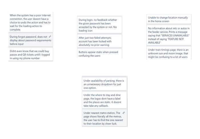
SO MANY USABILITY ISSUES!
I decided to evaluate the old version of the app using Nielsen’s Heuristics. The Major Usability problems are as follows:
Pooling in Ideas and Brainstorming
Here are some of the ideas I came up with. The best ones have been highlighted and implemented
— Show Favorite train stations
— Show notifications when there is a delay in trains
— QR tickets
— Pay Later/ Use wallet
— Modes of transport that a passenger can use
— Games the app could redirect when they are waiting at the train station
— Quick recharge without logging in
— Transfer funds from one card to another seamlessly
— Link card with mobile permanently
— Metro passes
— Set a reminder for upcoming trains
Sketching for Efficient Visualisation

Round of Testing and Improvements
On the final day of my sketching process, I sought feedback from my mentor. He pointed out some areas where I could improve the design, such as making the app less reliant on color for its functionality, adding visual indicators to let the user know their actions have been detected, and using horizontal scrolling instead of vertical scrolling where possible. I took these suggestions into account and made the necessary changes in my final prototype.
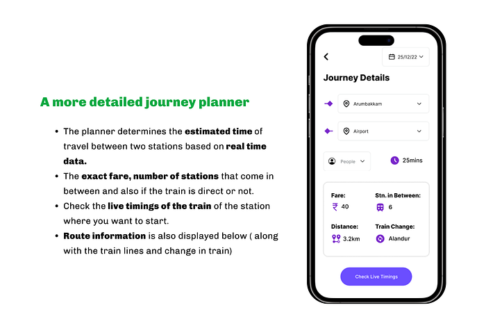
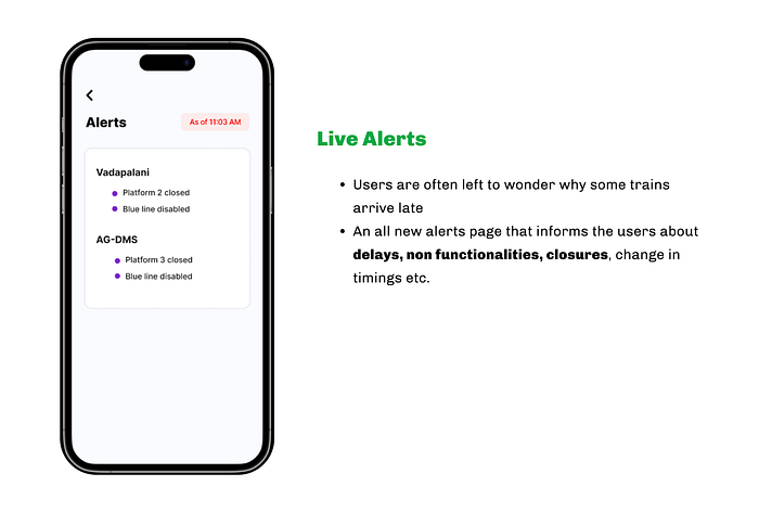
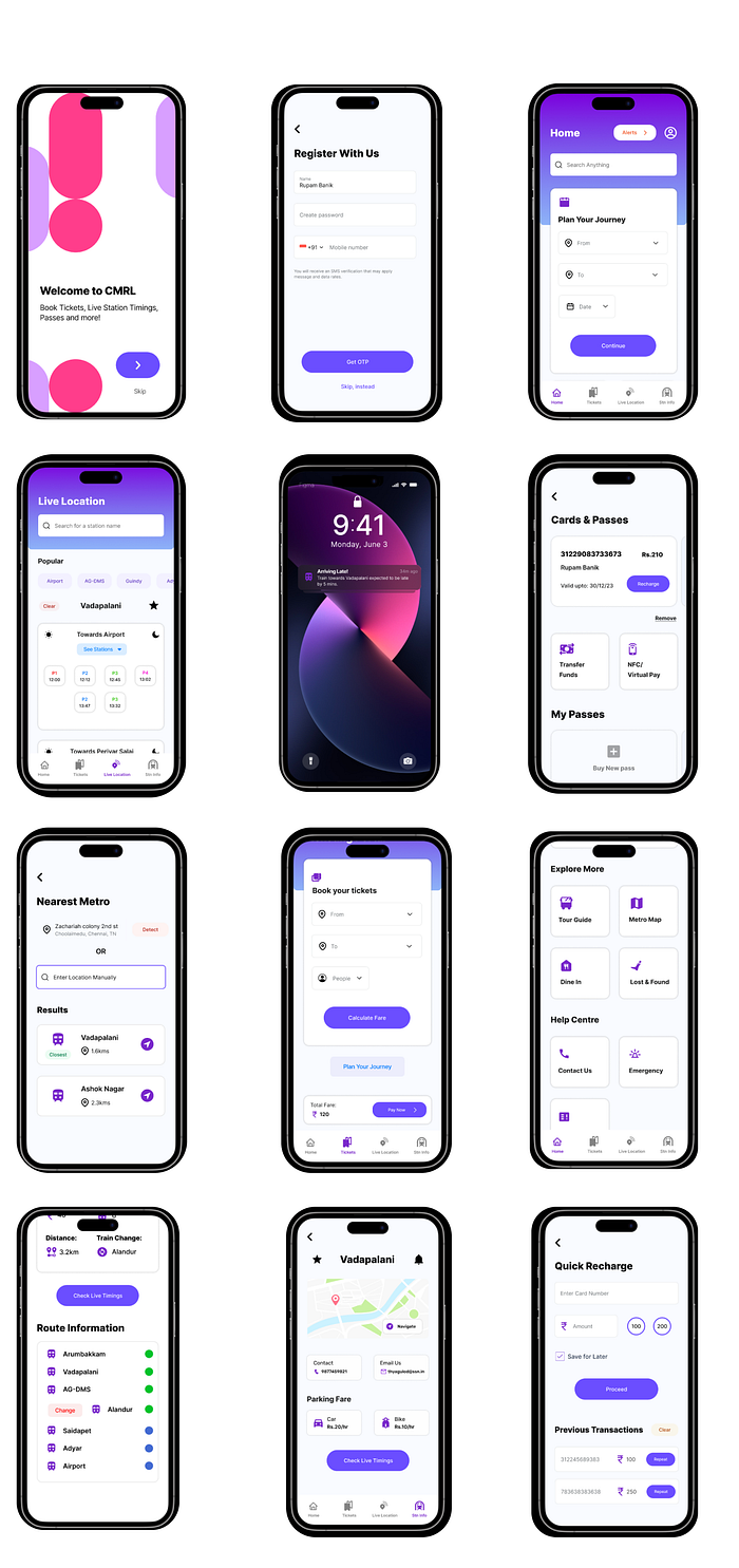
The Revamped Designs
My Learnings & What I would do differently
- Be cautious, but never assume. As it is my goal to design with as much empathy as possible, this project made me learn to be extremely sensitive with topics that deal with social disparities.
- Experiencing the problem first hand is the best research. Although I was not able to collaborate with the CMRL authorities, it turned into a riveting exercise to empathize with what it is like to be a daily metro user including the first-hand interview.
I have decided to share this file with the CMRL authorities in the hope that they can improve the app experience for our community. I believe that this design will empower our community as a whole and contribute to an upward journey. Let’s go!
Get In touch!
Hey, Liked the article? Hit me up on Linkedin. I’d love to chat about Product design with you :)
https://www.linkedin.com/in/rupam-banik-744350175/
My Zaap: http://zaap.bio/rupambanik

