
“Order and simplification are the first steps toward the mastery of a subject” Thomas Mann.
I’ve started reading this book right after I finished the Google UX design professional certification, a 7 parts course that cemented my passion for design, research and empathizing with your users -I will talk about the course in depth on another post-
Today my goal is to share notes from the book “Refactoring UI” written by Adam Wathan and Steve Schoger.
The book is mainly geared towards people who have no design experience but want to create great products.
I believe that it’s a handy book for designers starting their journey in this exciting field so let’s get straight to it.
Chapter 1: Starting from scratch
- Start with a feature, not a layout: what does that mean? When we start designing we tend to think of the big picture and final product first and that can hinder the design process if you dive right in without thinking of how smaller details interact with each other, so to avoid this, focus on a certain feature of the design
- Details come later, don’t obsess about color, typeface and all the shiny parts just yet, keep designing in greyscale before moving on to the next step.

- Don’t over invest, wire-frames are good for flushing out your ideas but they are not the end product, move on fast from that stage.
- Work in short cycles, design a simple version of the feature you’re building, iterate until no problems left.
- Give design a personality, font choice, color , border radius all play part in how the design feel.
For example: small border radius feels neutral, bigger round radius feels playful and non feels formal.


-Stay consistent through the design process.
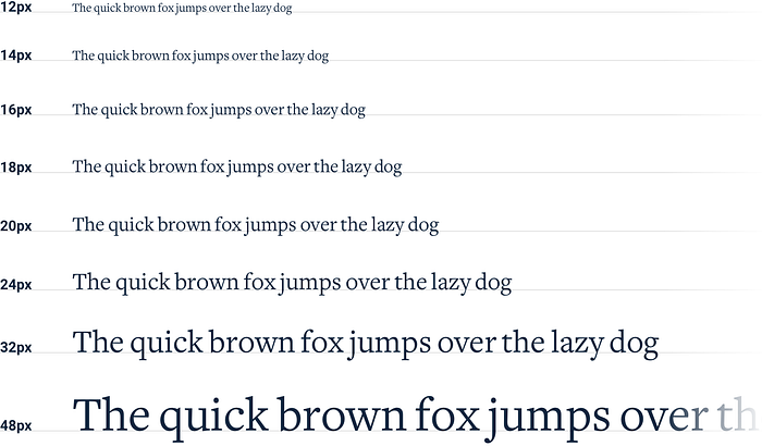
- Define systems in advance, for example when it comes to color choose from a set of 6–8 shades picked out ahead of time, for font size define a restrictive type scale in advance, this makes the process of eliminating what does not look good easier.

Does that mean that its better if you systematize every thing? According to the book the answer is yes, but you don’t have to do it all at once, just approach your design with a system focused mindset.
Chapter 2: Hierarchy is everything.
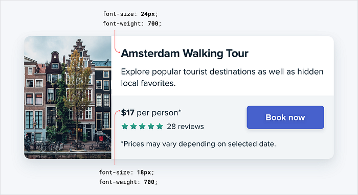
- Visual hierarchy matters: focus on how elements in the interface appear in relation to each other, highlight elements that are the most important and d-emphasize secondary information.
- Size is not everything : don’t rely too much on size to control hierarchy.
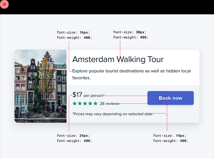
For example stick to two or three colors, dark for primary content, grey for secondary, lighter grey for things like footer, copy right section.
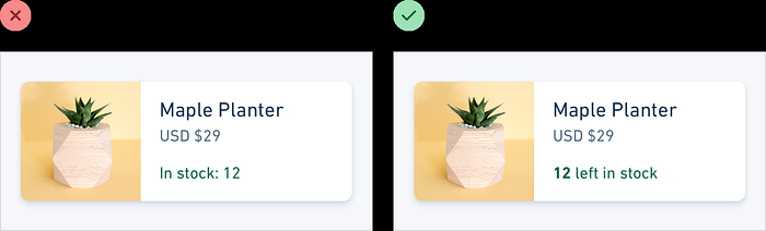
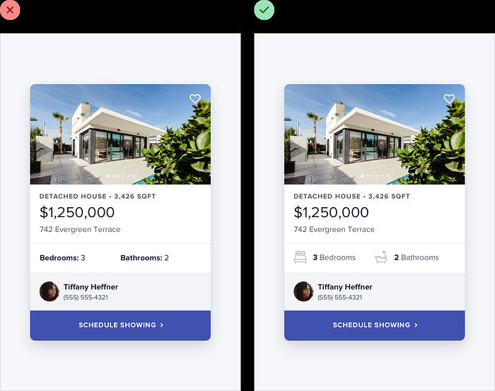
- Combine labels and data, sometimes a piece of data is not clear without a label so add a clarifying text.
Chapter 3: Layout and spacing
- Start with too much white space, one of the easiest ways to achieve a clean design is by giving every element a room to breath and that's where white space come in handy.
- You don't have to fill the whole screen.
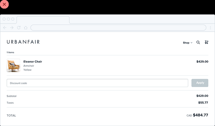
it’s nice to not fill the whole screen but don’t force yourself to cramp everything in small space if its not necessary.
Chapter 4: Designing text
This chapter covers tips on establishing type scale, choosing good fonts for you UI, how popular fonts can lead you to understand what font to use, inspecting you favorite websites to see what font has been used
Chapter 5: Working with color
This chapter as the name suggests is all about how to use color in your favor to make your design stand out, from saturation to hue there is a lot of great tips here.
Chapter 6: Creating depth
this chapter goes in details on how to emulate light on your interface, raised elements, using shadows and establishing elevation systems and creating depth with colors.
Chapter 7: Working with images
When choosing pictures for design, you have to keep in mind the quality of the images you want to upload, searching for high quality stock photos will add a nice touch to your design, using overlay for the cases when you want to add text to your images.
Chapter 8: Finishing touches
tips like adding color to accent borders, changing background color, adding shapes or illustrators and using fewer borders, are concepts that are explained in detail in this chapter.
Final Thoughts:
this book has definitely been fun to explore and its a resource I will refer back to through my journey in design, i recommend you take a look at it.
Thanks for reading

