How to Redesign a Compelling UI Component on Figma Like a Pro
This article details the process I used to redesign the card UI components of the Aggie Pride Shout-board. If you’re interested in viewing the code, scroll to the bottom to view the CodePen or grab the Github link.
What does Aggie Pride mean to you? Shout it out at https://singletaryscholarship.fund/aggiepride/
Introduction: Why Use a Card Component?
Card components are UI (user interface) components that are used to display bite-sized content. This content is typically easily digestible so you can scan it all at once. Cards can be used to present a series of products, blog posts, images, and more.
For my use case, I am displaying “Aggie Pride” submissions that have been shared on the Harrison R. & Azzie Bell Singletary Scholarship website.
Here is the old design:

What is Aggie Pride?
“Aggie Pride” is the catchphrase used by students of North Carolina A&T State University. It encompasses the students’ school spirit and is used as a greeting between fellow Aggies.
Our “Aggie Pride Shout-board” is a unifying way for students to express their pride for being an alumnus or current student of A&T.
Why the Redesign?
My goal was to give the quote a more prominent position on the card. Some of the submissions were longer than simple phrases and I wanted to work on a way to display those better. While some submissions were a simple “Aggie Pride!!” others went more in depth about why they’re proud to have attended A&T.
The environment at NCA&T nourished, prepared and encouraged me to seek higher levels of education — a legacy that continued with my children. — Dr. Saundra Singletary White
I also felt like the images and social media icons weren’t prominent enough and suspected they were the reason why users didn’t input these values.


I’d like to mention that I didn’t go into this redesign with any research. In an ideal scenario, I would utilize user testing tools to confirm my assumptions and test new solutions. I’d ideally research how users interact with the submission form as well as the card UI, however, given that this is a side project of mine, I decided to go ahead into the design phase.
If you are looking for user testing tools, I’d personally recommend Maze.co and UserTesting.com.
Step 1: Determine the Components You Wish to Display
My first step for this redesign was to gather the components I would like to display, and then write out their purpose.
- Aggie Pride quote — this is the main component and should have a prominent position
- User name and image — these are identifying components that tell us who wrote the quote
- User major and graduating class — these are identifying components that one may relate to as they’re reviewing the board
- User social media links — this is a way for fellow Aggies to connect with one another on social media
The list of components with their purpose gives me an idea of how they should be positioned relative to each other. The most important information I want to display to the audience is the “Aggie Pride” quote. Secondary to that would be that person’s name and image. Tertiary to that would be all other data.
Step 2: Seek Out Different Card Designs for Inspiration
It was important for me to find examples where the text was the main item to display instead of an image. Searching for these examples allowed me to see what’s already out there, what’s already well done, and things I should avoid.
The examples below all look like clean and easy to execute solutions, however, none of them fit my exact use case. That’s ok because I can pick and choose the right elements for my purpose.
Notice how much more real estate I would get for the “quote” component if I were to make the card horizontal. In addition, I can explore different ways of presenting the secondary and tertiary data.


Step 3: Sketch Out a Few Designs
For this step, I decided to use Figma, as it is my tool of choice for prototyping, but any other tool, including pen and paper, would do. Putting my designs in Figma, instead of going right to playing around with the CSS, was an important first step to conceptualizing my ideas. I was able to use these sketches to explore different possibilities and as a visual guide to follow. At this stage, I was able to figure out any potential issues that may arise in any of the new designs.
First, I created each component that I would like displayed on the card.

I then proceeded to create 3 designs: 1 vertical and 2 horizontal.

Step 4: Choose a Design to Implement
I immediately ruled out the second layout because it looked to busy to me. With both the side by side layout and the 2 different background colors, it looked like both the left and right sides were competing for attention.

That left me with the vertical and last horizontal one. I did like the new vertical layout better than the old one. There appeared to be more space for longer quotes, however, it didn’t look like that much more space from the old layout.
The single background vertical layout was more appealing because there is more horizontal spacing for long quotes. I also liked how the graduation year is more easily scannable if looking for cards who may have been in your graduating class.
My final test was to modify the wireframes with real data. From here, I was able to see font sizing issues with each design. I readjusted the fonts for both layouts to get an idea of how each would have to be implemented in accommodate the varying data.
Ultimately, I decided to try out the horizontal layout. The horizontal layout appeared to be easier to scan with all of the data at about the same eye level.
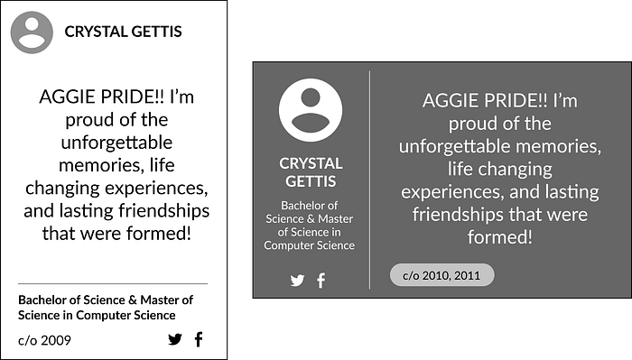
Final Result
Here is the final result after making CSS changes based on the chosen layout. Notice how for the old design, only 2 rows were visible, and now we have 3 rows visible before having to scroll.


If you’re interested in the implementation, I’ve created this CodePen, or you can view all the source code on Github at https://github.com/tnsingle/hrab.
Let us know what Aggie Pride means to you at https://singletaryscholarship.fund/aggiepride/!

