Case study: Redesigning the biggest food delivery app in Latin America
In 2015 I led the UX team responsible for solving iFood's user evasion problem on onboarding and checkout funnels
iFood is the biggest food delivery app in Latin America. Invested by Movile and Just-Eat, it connects 14mi users with 270k restaurants and is evaluated in US$1bi. In Brazil, iFood is almost synonymous with food delivery, and in 2015 it already had an 80% market share.
This article covers our design process from problem understanding through the solution proposal and implementation, encompassing SWOT and metrics analysis, heuristics evaluation, proto-personas, high-fidelity prototyping, and guerrilla user testing. Happy reading :D
Project goals
iFood’s exponential growth happened thanks to an aggressive company buying strategy. It helped them to reach and maintain its status as the market leader at the cost of compromising user experience in their apps. User evasion on signup and checkout funnels was the biggest symptom. The company also wanted to get featured on App Store and Google play as a marketing strategy.
Problem understanding
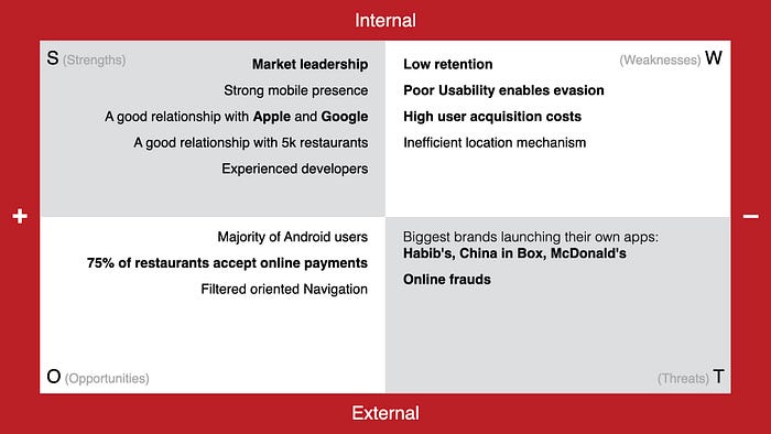
SWOT analysis
My team and I prepared a SWOT matrix to evaluate how internal and external factors would affect the project. Market leadership and good relationship with Apple and Google were the top Strengths. Low user retention, acquisition costs, and poor usability were the top Weaknesses. As an Opportunity, 75% of the restaurants received online payments, which was connected to the online frauds Threat.
Metrics analysis
Ordering data was pulled from Google Analytics and Facebook Apps and turned into spreadsheets. We sought patterns to segment users by their ordering frequency. After a deep analysis, we learned the following:
- 7% of users were responsible for 46% of orders, ordering four times per month or more. We called them heavy users.
- 47% of users were responsible for 44% of orders, ordering once to three times per month. We called them regular users.
- The final 46% of users were responsible for 10% of orders, ordering once per year. We called them unique order users.
- New users would have to make six orders to cover their cost of acquisition.
- 33% of evasions would occur on the first screen of the app: a wall where users should input their addresses.
User flow mapping and heuristics evaluation
We mapped all user flows, for both Android and iOS, followed by a heuristics analysis. We immediately noticed an unnecessary step in the onboarding: every time the app was opened by either a new or returning user, a complete address should be provided before accessing the rest of the app.

The apps were not using common auto location technologies, but legacy tech that forced the users to fill the state, city, street address, number, and apartment number fields. The app provided an easy address search via ZIP code (very common in Brazil), but it didn’t allow users to complete the address when the same ZIP code was used for an entire small city (also very common in Brazil). This violated the "user control and freedom", "flexibility and efficiency of use", and "match between system and the real world" heuristics.
After a thorough analysis, all heuristics violations were listed and grouped and then compared to the metrics findings and project goals to provide a better understanding of where to focus our efforts.

Proto-personas
We decided to focus on two user segments: heavy users and unique order users. The first represented a good opportunity to simplify frequently performed actions, and the latter was a clear match with the project goals. These user segments were turned into proto-personas with clear and distinct goals. Providing a better experience for them would mean that regular users would also benefit.

UX Canvas
The findings from previous steps were summarized in a UX canvas, emphasizing the primary personas, context, and scenarios of use, key features, and value proposition. Note how, at this moment, we had a much clearer problem definition.

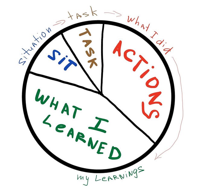
It may seem that the design process was linear. But most of the activities were overlapped, every discovery would trigger a new revision and a new approach. As taught by J. J. Garrett, instead of “finishing each step before starting the next one”, we focused on “finishing each step before finishing the next one”.
Designing the solution
All previous steps were focused on problem understanding and discoveries summarizing. At this point, we began our design propositions. We handled issues of all types and proposed improvements to the most used flows: restaurants and dishes searching, filtering, and browsing, order delivery status, notifications, repeating previous orders, credit card management, etc. I’ll focus the following examples on the location and cart evasion problems, to keep the article short.

Design principles and UX Goals
From what we learned on the previous steps, we compiled a list of UX goals and prepared a Design principles document to guide the team on the decisions to follow. Each Design principles was custom made or adapted for this project from other broadly accepted design principles (like Google’s), being closely attached to the project goals. These documents were also used during the quality assurance process, as a reference guide to validate the implemented solution. Although the UX goals would get updates according to the project development, the Design principles were our constant guidance through the next steps.

Prototyping
Just like during the problem understanding, this phase had overlapping activities: sketchframes being done at the same time as user flows and prototypes. I drafted dozens of proposals to quickly visualize if things seemed to make sense. Ideas that looked solid would be turned into mid-fidelity prototypes and this was repeated every time a new idea came up.
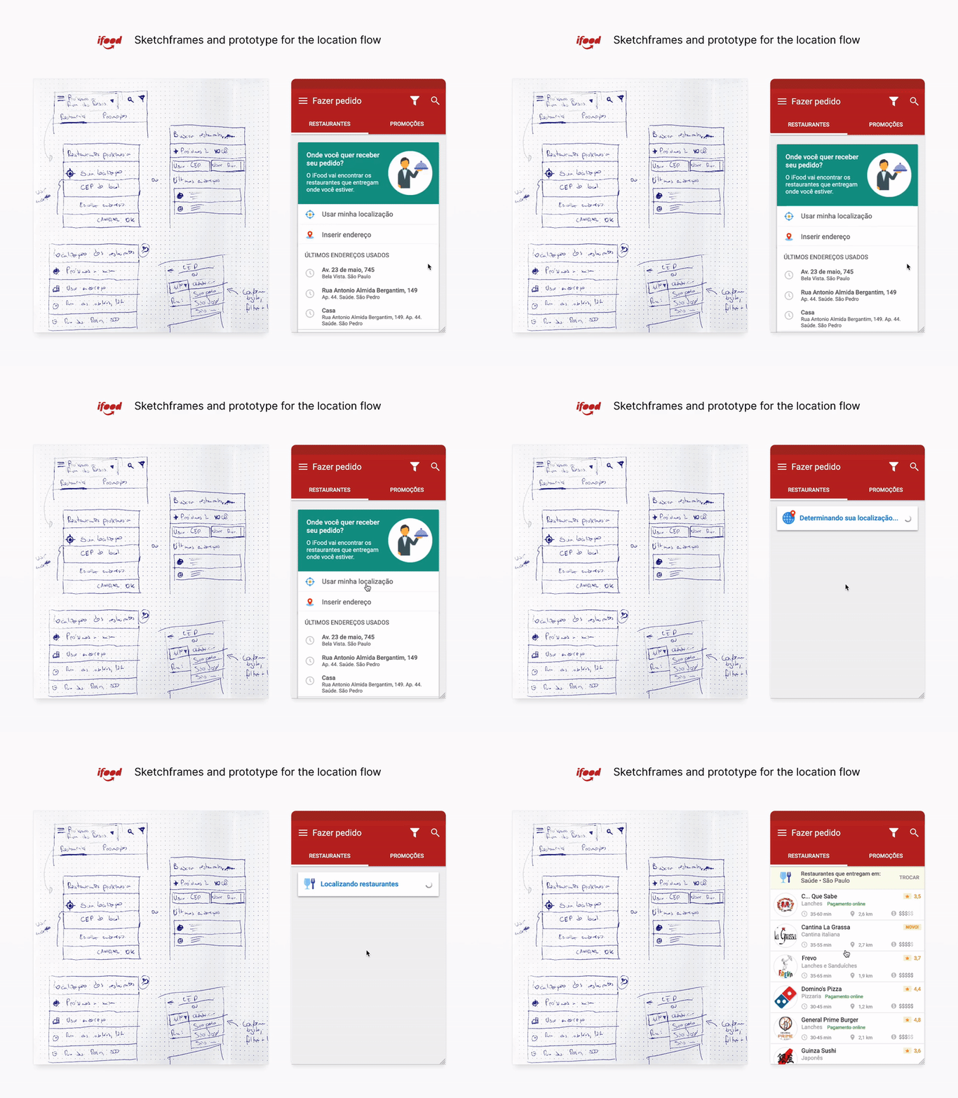
For the location problem, the proposed solution was to give users access to the app and the restaurants' list before choosing a complete address. The app would automatically use the device’s GPS approximate location and the remaining address information would be completed during checkout. That way, users could immediately get access to the restaurants list. The address would be fixed in the header, so users could always check if the information they were seeing was relevant to their location.

For the checkout evasion problem, we proposed to isolate the shopping cart from the rest of the app navigation. The cart would be shown only when items were added to it and the entire checkout flow would happen inside a modal screen, so users would only have the option to cancel or proceed with the current order. A new “Add more items” button was added to the cart, allowing users to easily add missing items from the same restaurant they were ordering from.
The other problems and UX goals, like menu browsing, searching for restaurants, and filtering, were handled the same way.
Iterating solution proposals
The problems we were trying to solve involved specific interactions with forms. It was important to us that users could test those interactions in realistic prototypes from onboarding to checkout. Linked PNGs would not do the trick this time, so I chose to prototype with Axure RP to make use of advanced widgets, states, and variables. The images were taken from iFood’s database and the icons were used from the Icons 8 free plan.

As the users interacted with the prototype, they believed it was the real app. I wanted this to happen so they would test it without lowering expectations and avoiding behaviors they could expect to generate prototype glitches.
Guerrilla testing
In a lean way, we adopted guerrilla usability testing so we could approach potential users in coffee shops, learn with their tests, fix critical issues, and then approach more users. This saved us a lot of screening and scheduling time, at the cost of occasionally having to discard users for not being focused on the test.

Scenarios were given to them, like "you will receive some friends at your place and you need to order dinner for everybody. 20 cheese and meet esfihas will be enough. Make this order using iFood app". Tests would take from 5 to 20 minutes, and participants were encouraged to "think out loud" while interacting with the prototype.
Twenty-one people between ages 18 and 40 were approached in Starbucks. Initially, I offered to pay for their drinks as a reward, but nobody accepted that (most of them enjoyed participating and felt a reward wasn’t necessary).
During the tests, we took notes about what was working well, what could be improved, questions, and ideas. All test notes were compiled in spreadsheets and later presented to stakeholders.
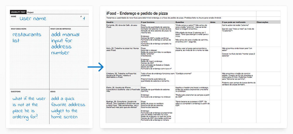
We learned that the cart being hidden until it was necessary worked well, and the location feature also worked as expected, raising questions from users, like “the address could be auto-filled from the ZIP code information, so I could add only the missing information”, which was expected. We also tested new restaurant menus, a new hierarchy system for the restaurants’ list, and a new dish configuration flow, which also had good performances with minor tweaks needed. Some users had trouble adding items to the cart because we were using a confusing label, which was quickly fixed.
The biggest learning was that besides testing the prototypes, we should have also tested the original apps. This seems obvious, but at the time we were convinced that the apps would be entirely rewritten and that didn’t happen. We had a long way until we got to convince the stakeholders that some changes were critical, and having usability testing evidence would have made the path shorter.
Visual Design
Once everybody on the team was on board with the proposed solutions, we would start the Visual Design implementation. At the time, was a clear distinction between the information architect and the UI designer roles. Although we would literally seat side to side and collaborate constantly, sharing decisions, gathering feedback, and frequently designing solutions together, some responsibilities were split.
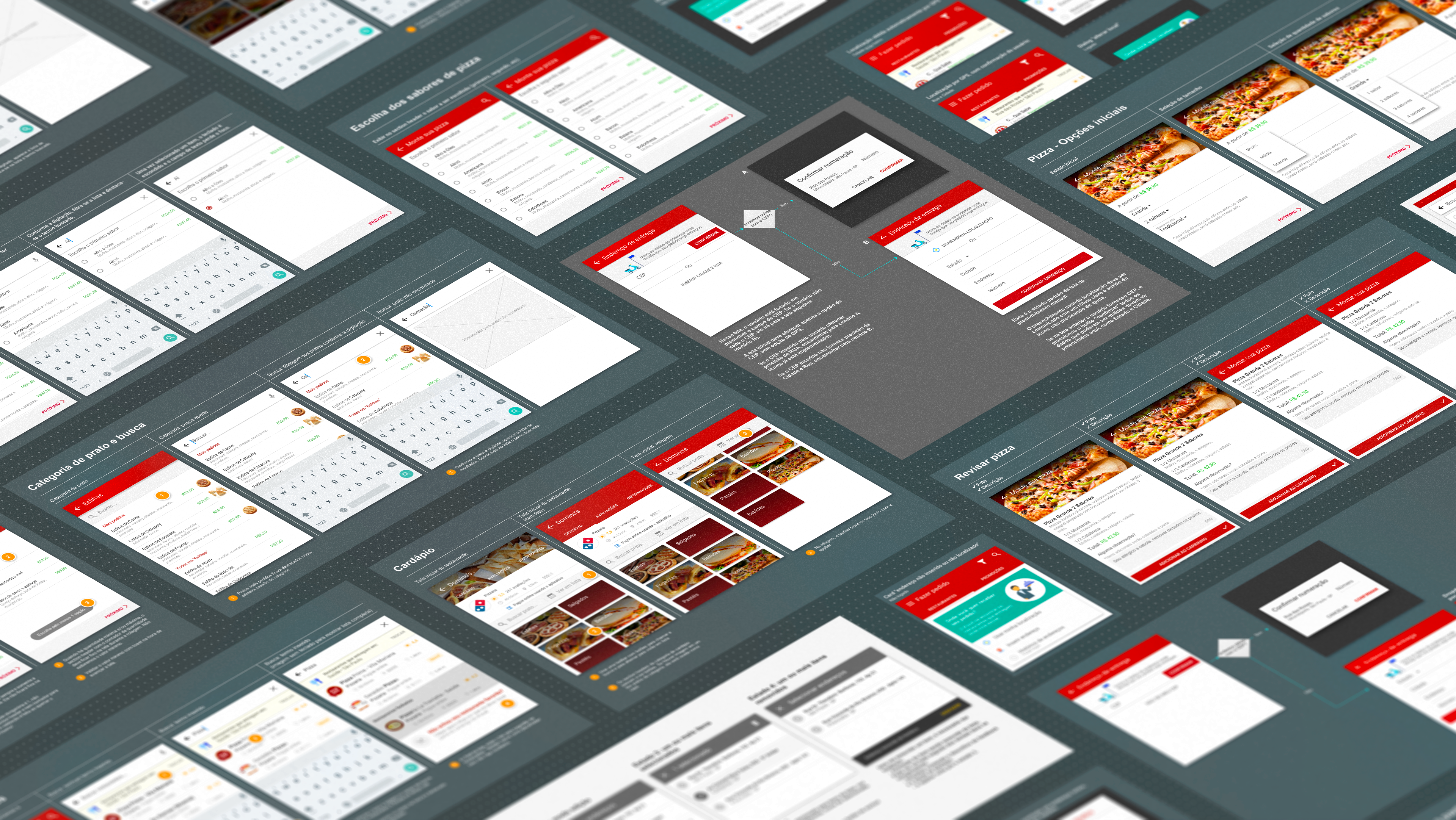
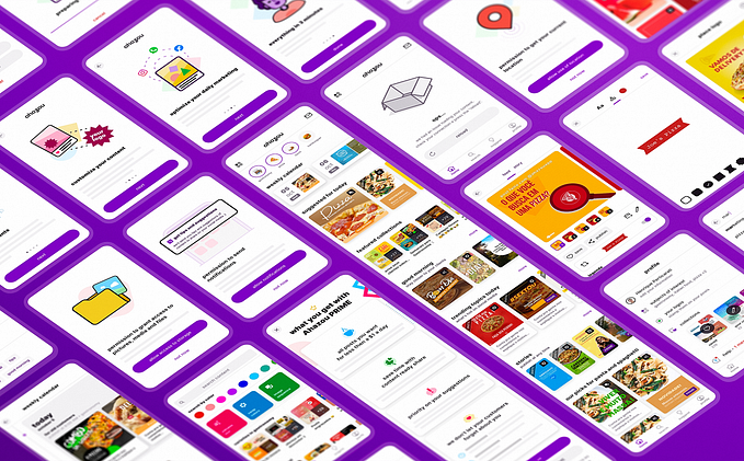
I was focusing most of my efforts from the problem understanding to the mid-fidelity prototypes, the brilliant designers Larissa Herbst (for the iOS app) and Marcel Müller (for the Android app) were in charge of designing the UI guidelines, components, and micro-interactions. Making use of color theory, typography, grid systems, and mobile usability standards, they prepared complete and outstanding UI documentation, and as a bonus, beautiful icon sets and illustrations. Some of this amazing work can be seen in the images below.

After validating the mid-fidelity solutions, these two worlds would converge into the final design documentation: lots of user flows translated into UI mockups on Sketch and video prototypes made in Principle.
Documentation and developer handoff
For design specifications, we tried to use a feature matrix spreadsheet combined with detailed user flows in PDF files (remember, it was 2015, and solutions like Zeplin hadn’t been broadly adopted yet).
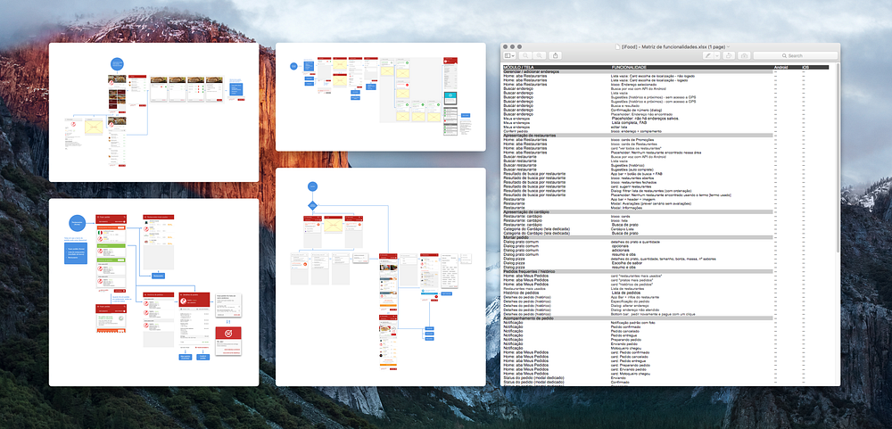
The developers found the process cumbersome and difficult to be integrated into their workflow, so we came up with an alternative approach: we broke down each major feature in smaller user stories and turned them into Jira tasks.

Each task would have a focused and complete description and “definition of done” criteria, illustrated with the corresponding annotated wireframes, video prototypes, and Zeplin links for UI specifications. Skype calls and presential meetings would happen many times a week so we were always in touch with the tech team for appropriate alignment and task validation.
Every time a task implementation was good enough to be tested, they would send us test builds, so we could validate what was completed and what was missing.
Conclusion
The complete redesign, implementation, QA, iterations, and launch for both apps took close to five months. Android app was initially launched for 5% of the user base and was gradually distributed for more users in the following weeks. iOS app was launched for the whole user base at once. Both apps were featured on their stores, weeks after launching. There was a 13,6% increase in sessions with orders.
After the redesign, iFood kept improving its apps and services and expanding its UX, tech, and product teams, reaching an impressive amount of 60 designers in their squads. I’m proud of being part of this process and grateful to Everaldo Coelho, Movile’s Design chairman at the time, for giving me this challenge and amazing experience.


