Redesigning BigBasket’s post-delivery experience
UI thoughts, and iterations that led to designing the final screens.
Overview
This is an exercise to hone my UI skills. I wanted to define and solve a clear-cut problem so the focus is more on the UI of the UX process. I’ve worked on an existing application with a huge userbase.
About BigBasket
BigBasket is India’s one of the largest online food and grocery stores selling over 40,000 products and more than 1,000 brands. It caters to 6 million customers spanning 26 cities in India and takes over 1.5 lakh orders per day.
Problem Statement
Generic: How can I design a seamless post-delivery experience for a BigBasket user?
Current App Flow Analysis

Peak-end rule
When experiencing dissatisfaction in the service provided, the user would prioritize to first (read, exclusively) address the concern rather than look to provide positive feedback about all things that went well.
- At the last leg of a delivery experience, users want to spend the least amount of time and effort to report concerns or provide feedback. Given a situation between providing feedback and addressing an issue, the hierarchy would be:
Missing muskmelons >> Amazing apples!
This led to focus on solving two specific problems.
Specific:
- How can a user easily understand what they got is what they ordered?
- How can a user provide feedback or raise concerns after the delivery? For example, identifying a faulty item after 2 days of delivery.
Visual Research
Moodboard for feedback collection

Inspiration for item card ideation

UI Approach
I listed down the possible range of emotions that could be witnessed in users with the current UI and compared that to an ideal happy user. What kind of a UI am I looking to create to enable this?

There are 2 screens I’ve worked on: The order details screen and items screen
Orders Details Screen
I’ve considered this as the home page of the post-delivery experience. The goal is to have an information hierarchy in place, declutter, and make it evident how the user can move to the items screen from here if they choose to.
Wireframes
This was a relatively quicker task as the tangibles were available and had to be arranged in a readable manner.
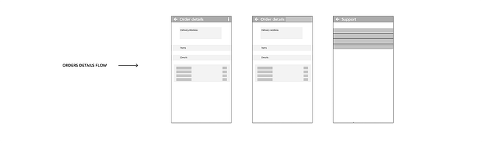
Final Design
- Order details are more organized with an information hierarchy in place.
- Items page is mentioned inside the order details screen; this is more intuitive to view the items list if needed.
- An extended support or chat feature is added for issues concerning the order as a whole.
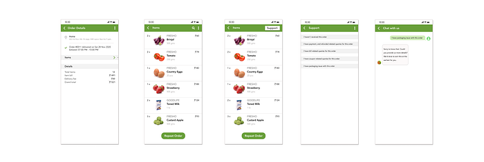
Items Screen
This screen had the maximum potential to enhance the overall experience.
I’ve worked on two functionalities along with overall UI improvisation:
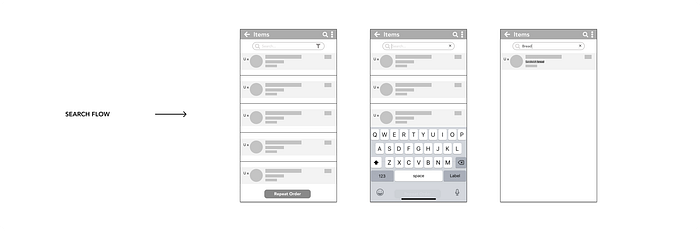
- Search: To ensure a quick discovery, I’ve added a search bar. This feature comes in handy for bulk orders as it saves time and effort for the user.
2. Feedback: A feature to raise concerns about issues post-delivery, and provide reviews for a smooth experience.
I listed down a few commonly occurring issues:
- Items found missing
- What I ordered is not what I got — delivered the wrong items
- Item found to be expired/expiring soon
- Item found to be of poor quality or damaged
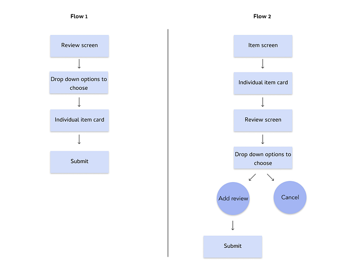
User Flowchart
I had two ideas for feedback flow — item screen to review screen and review screen to item screen. I had written on paper first and then made it digital.
Sketches
I still only had a vague idea of how the two flows would convert visually. So I made a rough sketch on paper to get a better visual idea.
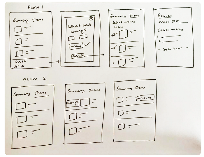
I picked the item screen to review screen transition as it reaffirmed a simple, minimal, and intuitive interface.
Wireframes
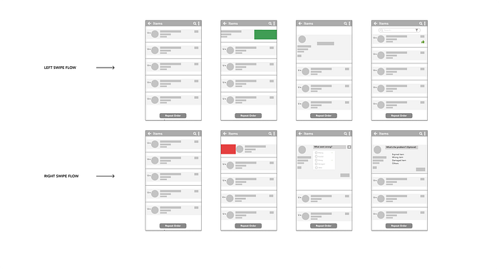
Swipe: Wireframes are great saviors to provide functional clarity without much time-kill. Ideated to keep a tinder-swipe interaction but the item card had to be retained in place. So I used left and right swipes to mark positive and negative experiences.
Micro-interactions
Scroll-Search-Swipe
Three subtle micro-interactions easing out both the problems.


Final Design
- Search: I wanted to keep a checklist and filter to enable checking-off items pretty much like a physical bill. Leaving it behind for now considering the heaviness of adding more features at the last leg. The crux is to save time and ensure to not agitate someone looking for something.

- Swipe right for negative feedback: This is the potential game-changer. Swiping helps to act and see the results quickly. I added the possible issues that come up along with the swiping experience.
Example: Missing items can either be refunded for or sent to the customer at the earliest. Customers get to choose at their convenience.

- Swipe left for positive feedback: Added this for two reasons: to keep swiping consistent on both sides and to let users quickly like an item without the usual long feedback forms. Cutting time-waste once again.

Interactive Prototype
Adding all the high-fidelity prototypes to show what it feels like in motion.


Conclusion
Learnings
- Work with assumptions till validated but back it up with reasons. Assumption: People tend to swipe right to like something, which meant the right side of something is for liking it. Reason: Tinder-swiping way of accepting and rejecting. So I placed the positive feedback CTA on the right side.
- Potential of intuitive UI to make the user let go of a poor experience like it never happened.
- Depending on which part of the experience cycle a problem lies in, UI solutions vary. Keeping UI light and usable backs up for the peak-end rule.
Next Steps
- Usability test of the prototype
- Deep understanding of UI
- Improve in color palette and typography selections
Future Features
- Voice-assistant to note down both positive and negative feedback from the users' responses.
- Checklist without disturbing or loading the existing priorities.
I’d love to get feedback and suggestions on improving the work. Find me here for design discussions and opportunities.

