Raj Shamani’s Live Investment Event; a UI/UX Case Study
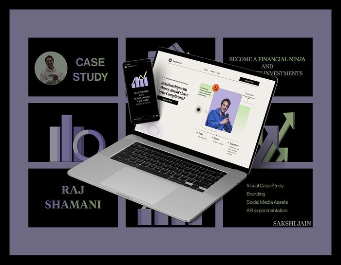
I designed a captivating Landing Page for Raj Shamani. The study delves into the design decisions made throughout the project, providing an in-depth analysis of each step.
Design Brief
Design a Landing Page for an upcoming event by the host of the Figuring Out with Raj Shamani podcast. Design a compelling webpage that promotes the event and entices attendees to register.

Background
Inspired by Raj’s podcast, I am designing a Landing Page for his upcoming event focused on helping younger audiences navigate investments.
The podcast host is known for in-depth discussions on investment strategies and financial planning, featuring successful industry guests who break down complex concepts and provide valuable insights to the audience.
Initial Brainstorming and Research
To better understand the target audience for the Landing Page, I began by exploring the mental model of people who might visit it. This involved researching questions such as
- What motivates them to visit the page and attend the event?
- What potential questions or concerns they might have that the page needs to address?
- How can the page establish trust and credibility with the audience?
As a regular listener of the podcast, I had a basic understanding of his content. However, I conducted further research to gain insights into his audience, their needs, and pain points to create a more effective and tailored Landing Page for the event.
I segmented the audience into two groups: new visitors unfamiliar with the podcast, and existing listeners.

UNDERSTANDING THE AUDIENCE

Validation
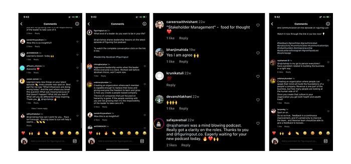
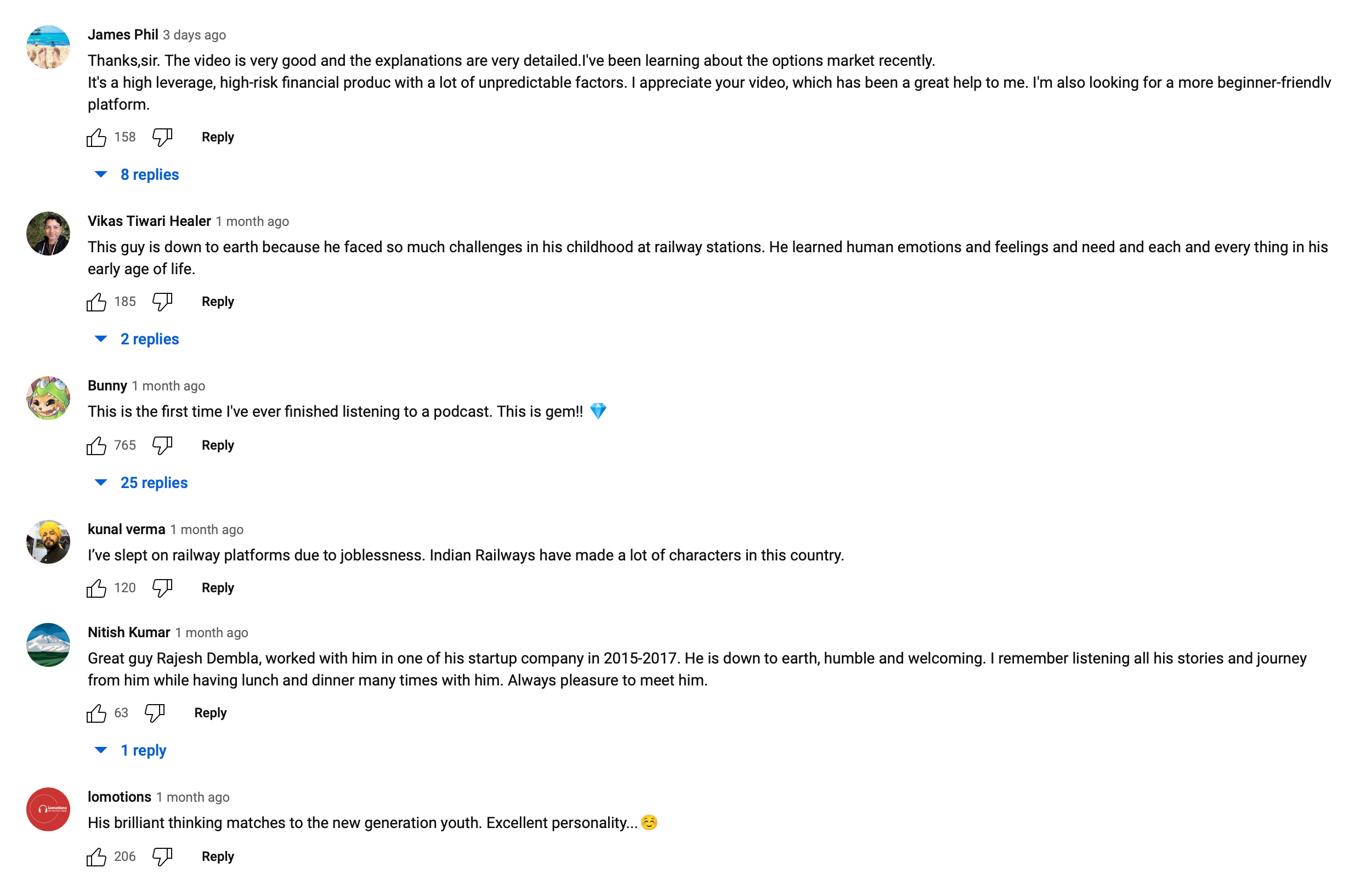
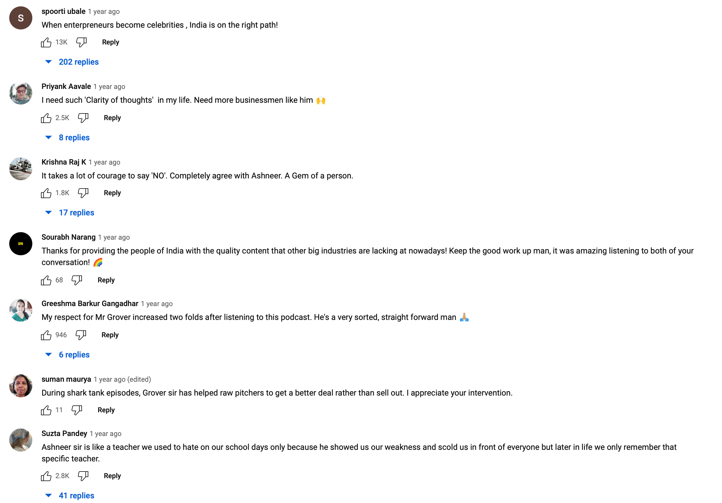
- Raj Shamani’s audience actively engages and responds to his content on YouTube and Instagram.
- They contribute valuable insights and express appreciation through comments and vocal feedback.
- Their engagement highlights the value they perceive in Raj Shamani’s content and their eagerness to learn and discuss investment topics
Why talk about investments?
- 🎙 Raj Shamani’s podcast features guest speakers such as founders, CEOs, and salespeople who provide valuable insights into breaking down investment strategies and understanding market dynamics.
- 📈 The primarily young audience of the podcast benefits from these discussions, gaining a deeper understanding of investment concepts and practical strategies.
- 👩🏫 The event enables young individuals to enhance their financial literacy, gain confidence in their investment endeavours, and receive guidance from Raj.
After understanding the target audience and their needs, concerns, and motivation, I used the MoSCoW method to prioritize the content of the landing page for both new and old listeners of the podcast.
- Must-haves: Identifying the essential information that both new and old listeners need to know about the event, such as the date, time, location, and how to register. Also, information about the speaker
- Should-haves: The benefits of attending the event in person, such as networking opportunities and staying updated on investment strategies and financial planning. FAQ Section, Social Proof and sponsors.
- Could-haves: Links to his Famous podcast related to the Event topic, social media following across platforms, his book, link to his March and quotes by Raj.
- Won’t-haves: New Podcast updates, any Initiatives that are not a priority for this time frame.
Competitive Analysis
🕵️♀️ After putting my research hat on, I delved into the world of competitive analysis to better understand the structure and visual composition of similar websites.
👩💻In my visual research, I analysed Raj Shamani’s website structure, colour palette, landing page sections, design elements, copywriting, and sticker usage to ensure a cohesive and engaging design.
🎙Being a listener of Raj’s podcast, I knew that good design is highly valued by Raj, so I took advantage of this opportunity to explore websites with trendy colour schemes that would best resonate with our target audience.


Information Architecture and Wire-framing
I came up with the Information Architecture for various flows.
Information Architecture is an important stage because now here I figure out what all content/information should be included in the actual screens.
During wire-framing, I attempt to give some visual structure to the information, so I tried a lot of different layouts for even similar screens to come up with the most suitable solutions.

Visual Direction
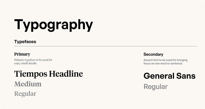
- I began by exploring colours from Raj’s existing website. However, I realized that the landing page needed to connect with a younger audience, as discussed by Raj in his podcast with Ranveer. In that podcast, he emphasized the importance of user experience, which is a by-product of understanding the product and the audience. With this in mind, I took a leap of faith and explored a trendy colour palette that would balance the importance of the content with visual appeal.
- I explored current UI trends such as gradient overlays, bold typography, and contrasting colours to create a modern and visually striking design that would capture the attention of the younger audience.


Branding
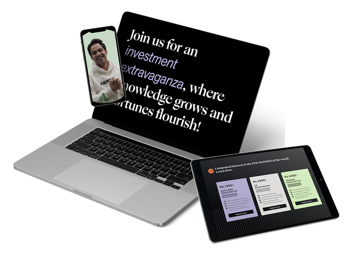
- In order to establish a strong brand presence on social media, it was important to create a cohesive visual language across all platforms.
- The designs for social media graphics were created with the goal of increasing engagement and driving traffic to the landing page. This was achieved by utilizing eye-catching visuals and incorporating key messaging from the landing page in a concise and compelling way.
- The goal was to create a seamless brand experience for both new and existing audiences.

Website Design
Get ready for a virtual tour! I’ll be your guide as we walk through each flow, step-by-step, and I’ll give you the inside scoop on all the design decisions I made.
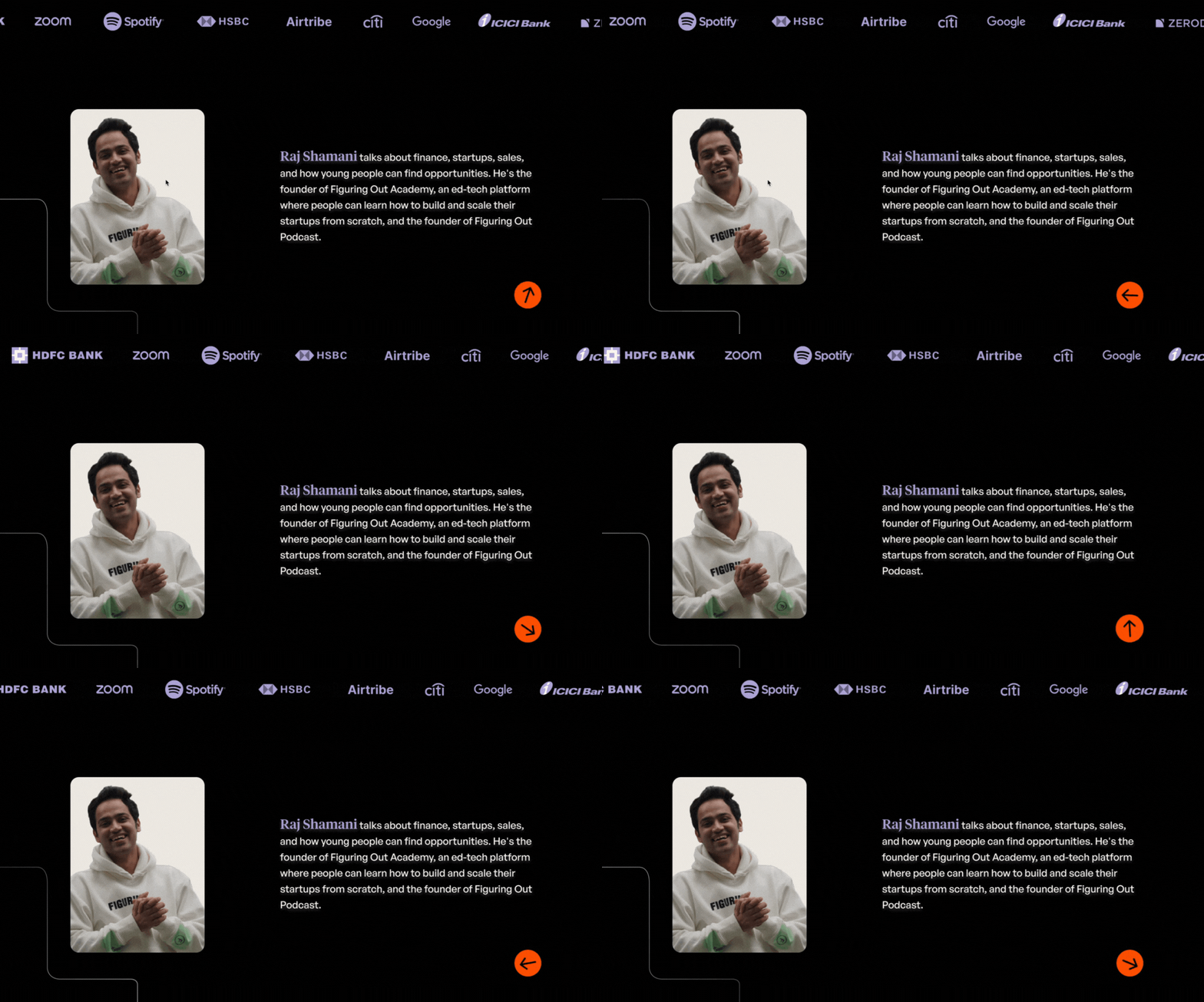
Goals with Hero Section
- Grab the attention of the visitor and make them interested in the event
- Communicate the topic of the event clearly and effectively
- Provide a clear call-to-action to encourage the visitor to buy the tickets
- Showcase the branding and visual direction of the event to establish a memorable impression on the visitor.


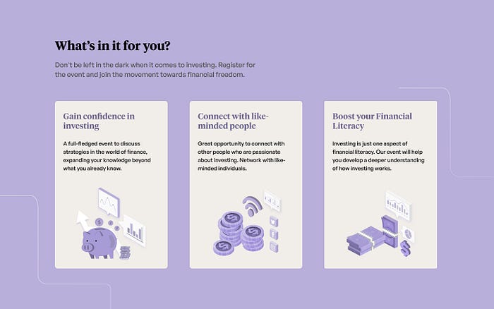
Objectives for the “What’s in it for you” section
- Increase excitement and interest in the talk show
- Provide clear and concise information about the benefits of attending
- Encourage attendees to take action and purchase tickets
Objectives for the “Ticket” section
The goal was to create a booking experience that was both informative and persuasive, and that made it easy for users to understand their options and make a confident purchase decision.
- Highlighted the price of the ticket, as this is often the most important consideration for potential buyers.
- Included the last booking date for the ticket, to create a sense of urgency and encourage users to act quickly.
- Highlighted the benefits of the particular ticket, to entice users and persuade them to make a purchase.
- Included a clear and prominent call-to-action (CTA) button.

Objectives for the “Social Proof” section
- It provides credibility to Raj’s expertise and experience as a speaker.
- Adding a QR code could potentially increase sales as customers are more likely to complete the purchase process without any roadblocks or distractions.
- QR codes can be easily shared on social media or other platforms, expanding the reach of the event and potentially bringing in more customers.
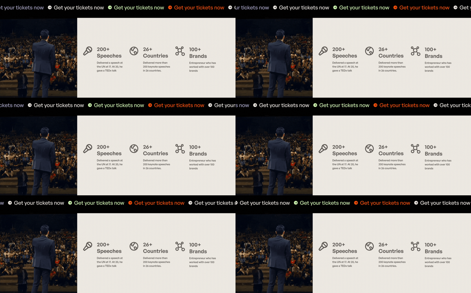


Please refer to this link for the Final Prototype
👾 AR Experimentations
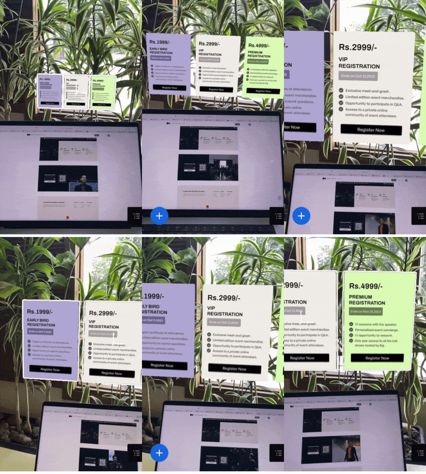
- I dived into the world of augmented reality (AR) using Adobe Aero to create an immersive ticketing experience.
- The idea is after scanning a QR code, users were transported to a captivating digital realm, showcasing the potential of AR technology in enhancing user engagement.
- Although the AR experiments conducted were at a basic level, driven by curiosity, they served as a stepping stone towards exploring innovative ways to enhance user engagement and create memorable experiences.
🔎 Reflection
- I started by understanding Raj’s target audience, their needs, and their motivations. Through user research and exploration, I gained valuable insights that guided design decisions.
- I prioritized content, created engaging sections, and focused on enhancing the user experience. Iterating and refining along the way, my aim was to create a landing page that resonates with both new and existing listeners.
- The goal was to connect Raj Shamani with his audience in a meaningful way.
👩🏫 Learnings
- Designing with a user-centric mindset is crucial for creating effective and engaging experiences.
- Through the process of multiple iterations and refinement, I realized the value of continuously gathering feedback, testing ideas, and making improvements.
- The AR experiments using Adobe Aero showcased the potential of new technologies and sparked creativity in pushing the boundaries of design.
✨ Gratitude
I am forever grateful to Abhinav Chhikara and Jayneil Dalal for their unwavering guidance, support, and belief in my abilities. They have played a pivotal role in moulding my journey, impacting both my personal and professional growth.
I also want to express my heartfelt thanks to Paritosh Kumra for encouraging me to enhance my visuals and to my amazing friends for their constant support.
👩💻 Behance
Please refer https://www.behance.net/gallery/172213625/Raj-Shamani-Event-Landing-Page for the Visuals.
You can reach out to me at ✉️ jain812sakshi@gmail.com for opportunities.
Twitter — https://twitter.com/doodlegrl090
Instagram — sakshi.art.design

