Case study: Put the end of funnels back on your website
Redesign of error 404 page is the subject of this case study. It is about the largest online marketplace in Iran with more than 600,000 users for event organizers, and also its ticketing system makes marketing and selling tickets easier for organizers. Let’s take a look at this case study.
It was just a few months that I joined the team. I found out that error pages were not efficient. There are many articles about designing error pages; this article provides a case study of the impact of an error page.
Problem:
In my periodic review of Google Analytics, when following the users flow funnel, I found that a significant number of users (15000 per month) churned from the wrong url. So I checked our error page, and DING!! It was a dead-end route.
Many times, the organizers changed the event name as well as the URL, resulting in error pages for users with previous urls. These users have no options on the error page, and their only choice is to leave the web page.
Goal:
Improve the design of error pages.
Metrics:
Metrics are variables that can be used to evaluate the success of a given task. For this Goal, we can measure:
- Decrease percentage of users that churn from website
- Increase the payments for tickets (users that came back to the to website from error page going to buy tickets)
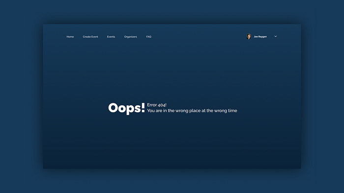
How was the design of the error 404 page?

Upon reviewing this page design, we found that users can continue their journey on the website. First, we should understand why users encountered this page:
- Users with incorrect URLs: such as typos in URLs.
- Users whose organizer changed the URL and are still using the previous URL.
- Users who follow all the rules but encounter this page.
Based on these topics, we should design a new error page.

How is the new design?
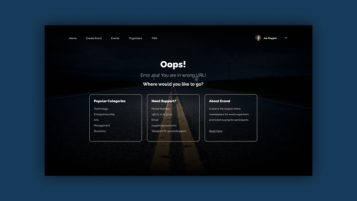
The new design contains these topics:
- Contains a title and text informing the user that the URL is incorrect.
- Displaying popular categories to users.
- Displaying support team contact information
- The About Company section is for those who don’t know the company and came from the external links.

Is there still anything left to do?
Yep! It is.
- Our research shows that the vast majority of users that reach the error page are coming from changed event URLs. Thus, it is important to add a feature for organizers to change the name/URL of their event, so that the previous URL redirects to the new one.
The Impact of this changes:
Let’s find out how significant the impact of this small change is.
- Before making these changes, we had about 15,000 users that reached the error page, but now it is only 5,799, while the number of our users has increased over the past two years.

- About 25 percent of users who encountered an error page used the buttons and returned to the site. Before launching this new page, these percentages were zero.

Next Step?
We display different error pages to different users according to the data they share with us while logged into the website.
This article was written with your interest in mind. Please let me know your thoughts if you have any.

