Proportional design systems with Proportio.app

It started with a design system request. Our design system team was asked to add a larger size option to our existing button component. After looking at the other sizes, we could extrapolate another size, but it got me curious… “how do all of the component sizes compare across our design system? Are there universal rules we should follow for sizing?”
Unfortunately, the answer was no. Some values were common, but nothing was consistent. There were no rules in place to help ensure cohesive sizing, spacing, and scale across our system.
Going back to basics
Great design is usually rooted in getting the fundamentals right. For many designers (like myself) typography is the most important fundamental element of design. We looked to our type scale to see how we could create proportional designs that scaled based on common ratios and methods.
Introducing Proportio
Proportio is a web application for designers to create the foundations of a proportional design system. You can explore typographic scales and how they can be applied to icons, sizing, spacing, and the composition of a component. With a proportional design system, component sizes and densities are a breeze.

Creating foundational systems
You start by defining your type scale, which will be used for much of the rest of your system. A base font size is used, along with a scale factor such as minor third (1:1.125). Every other font size is based on this ratio.

Icons are automatically sized based on the type scale, since typography and icon pairing is a common and important element in design systems.
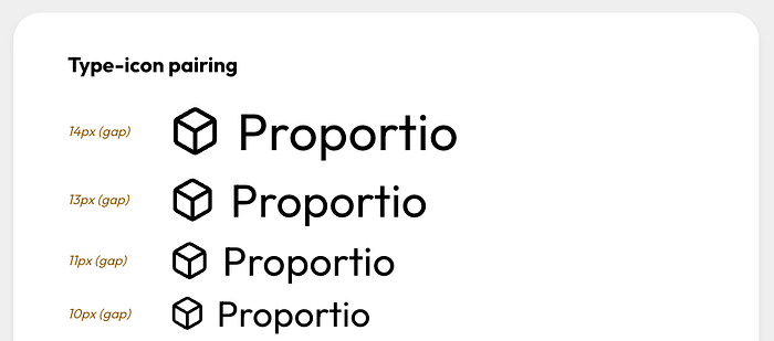
Text-to-icon spacing is proportional as well, based on the type scale. This ensures the spacing between them is relative and balanced. Similarly, you can create proportional sizing scales, radius scales, and even elevation (drop shadow) scales.

The component system
Here’s where things get really interesting.
Once you have our foundational systems, you can choose to use either our type scale or spacing scale to size our component padding and heights. The base (default) sized component uses your base type size (by default, 16px).
You can add smaller and larger sizes, which are generated in the UI based on increments in your selected scales.

You can also add more or less dense options as well. Density is like size, although it only affects the padding and height of the component — text and icon sizes remain the same. These are also generated based on the your scales, and you can modify the rate at which your densities grow or shrink.

You can toggle the component view to see how your component appears when there’s only text, only an icon, or both. You can also toggle a view to show the component’s specifications.

The container system
Just like the component system, Proportio allows you to create proportionally scaled containers.
For example, a popover could be a small container (small corner radius and padding). Larger containers like cards could have a larger corner radius and padding. Modal dialogs may be considered even larger containers and need the most padding and largest corner radius to look appropriate in an interface system.

Using the same proportional systems, you can create containers with scaled padding, scaled radius, and even elevation (if you need).
Exporting values
Once you’ve created a system you want to use, they can be exported as Design Tokens (W3C draft format) or as CSS variables. This makes it easier to hand off your system to engineers.

Currently, there’s no way to pull these values directly into Figma 😔. So in its current state, it is more useful as a prototype for defining what you’d like to use in your system, rather than a true “design tool”. But with that said, this feature could be added if you feel so inclined, because Proportio is an open source tool.
Open source
Proportio is an open-source project. I’m a big believer in giving-back to the design systems community to help share or provoke new ideas so we can all grow together.
The tool is still in its infancy, but there are additional features in the works to help you make the best use out of Proportio for design and development.

