Project differentiators: Typography
Finding high-quality, reliable fonts
The more design projects I work on, the better I get at identifying a set of constants, or practices I rely on. One of those practices is having a go-to library of fonts and a set of resources I can turn to when I want to confine my explorations. What do I mean by confining my explorations? Well, typography is one of those things I can spend hours, days, and weeks on. I could go soul-searching for the perfect font because the possibilities are endless. However, as a designer, an important skill I need to possess is knowing when to move on. In this article, I’ll share how you can create a library of high-quality, reliable fonts for your projects so you don’t get lost in the exploration phase.
All Good Things Begin With Research
The first step in finding high-quality fonts is to spend some time researching what’s out there. This goes beyond just doing a Google search. Here are some ideas:
- Browse Product Hunt
- Go on Twitter (a great community to be in as a designer)
- Ask other designers
- Look into your favorite design companies (some of them use fonts that are publicly accessible)
The list goes on. The best resources are found when you take an unconventional approach. Over the years, I’ve come across a few great typography initiatives from other designers on Twitter. I’ll bookmark these resources for later, knowing that they will likely serve a purpose one day.
If you need a boost, here are some of my favorites:
Let’s Talk About Quality
When designing, quality can sometimes take a back seat. If possible, we should always emphasize it, especially when it comes to typography. There are a few rules I like to keep in mind when choosing quality typefaces.
Rule #1: Use Google Fonts sparingly
Google Fonts is a great resource but it tends to get overused. That’s not to say you shouldn’t use Google Fonts at all. There are some great fonts on there and I would definitely recommended checking out the Notion doc above, especially because it can get difficult to sort through all of the options on the Google Fonts website.
Rule #2: Check out some type foundries
If you have the budget, I would recommend trying out some type foundries. Most of them have trial packs for personal projects or occasionally offer discounts. For example, I bought a pack of typefaces from the Atipo Foundry for just $20. Before I did so, I went through Atipo’s library to see if I liked what they had to offer. I ultimately determined that for $20, the pack was worth it. Each typeface came with several different weights and there was a good variety between sans-serif, serif, and display fonts. I particularly liked the Archia, Silka, Geomanist, and Basier typefaces.
There are a ton of great type foundries out there. Here’s a list to get you started:
- Atipo Foundry
- Colophon
- Good Type Foundry
- Grilli Type
- Klim Type Foundry
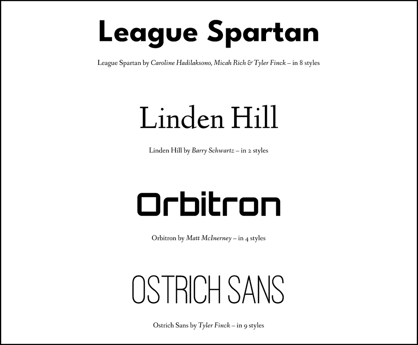
- The League of Moveable Type (open-source!)
- Lineto
- Pangram Pangram
And, here’s a cool Figma file with more font foundries:
Rule #3: Take some time to think about project needs
The last rule I have for choosing quality typefaces is to ask yourself some questions regarding the needs of the project.
Here are some that come to mind:
- What is the voice, tone, and mood you’re trying to establish?
- Do you need a typeface with several weights?
- What platform are you designing for? If designing for mobile, you’ll likely need fonts that are readable at small sizes. For web, you might prefer larger headline/display fonts.
To answer these questions, it helps to do some research on font origins and meanings. Most type foundries will have explanations behind their fonts and how they came to be. I know you’re probably rolling your eyes, but trust me when I say this helps!
Some typefaces also serve particular purposes. For example, according to the book Refactoring UI by Steve Schoger and Adam Wathan:
When someone designs a font family, they design it with a purpose in mind.
A family like Open Sans is designed to be highly legible even at small sizes, so the built-in letter-spacing is a lot wider than a family like Oswald which is designed for headlines.
Conclusion
All in all, when you take a thoughtful approach to choosing type, it really differentiates you from everyone else. Especially as an interface designer, I think it’s critical to emphasize quality (and to also think in systems — a topic for another article).
I hope you’ve found the tips above to be useful in increasing your typography skills. Before you know it, you’ll be a type snob!

