Case Study: Creating a photo sharing app for family & friends
by

Introduction
Our team of four elaborated on the following project on our first UX Design course.
The Problem
The problem is a missing family hub for organizing events and sharing memories related.
The Scope and Our Vision
The scope was to design a website optimized for smartphones while complying with the following requirements:

Our vision was a simple, very handy, intuitive homely web app with a strong focus on transparent privacy and high picture quality.
The Structure of the Project

It was a comprehensive, agile UX design project.
Péter Klein senior UX interaction designer acted as our Mentor in this program. Covid19 represented a specific challenge for us. The training program and the design project was held online, exclusively.
Research
We elaborated on a Research Plan to structure our work. Our target was to find out for whom and what to develop. We brainstormed on lifelike situations related to our problem to formulate the research questions.

We defined our tasks:
● reviewing similar apps to identifying best practices on the market,
● making interviews,
● processing outcomes in order to validate our hypothesis,
● finding common patterns in user behavior.
Then we had to create personas and user journeys with pain points.
As a timeframe, we had a couple of days for desk research, one week for interviews, and a couple of days for synthesis. We applied the relevant methodologies as follows.
First, we brainstormed to have a quick idea about our app and its functionality. We imagined lifelike situations like:
’Your mother asked you repeatedly during the week to send her your holiday pictures.’
We then accomplished a desk research#1. We reviewed similar apps for family photo sharing and organizing events. The aim was to analyze functions, flows, interactions, visual layouts to identify best practices. The challenge is that the desk research is to be performed in several rounds when one iterates in prototyping. As we got some ideas such as scheduled photo sharing, voting on events, diary, video chat, notifications about important family events, real-time geolocalization for family members with push notification, safe storage of key official family documents we double-checked those for best practices in similar apps, but also our idea of the priority of each function, screen sequence or icon content evolved as the project progressed.
The apps try to fulfill a lot of useful functions such as processing shopping lists, to-do-lists, built-in calendar, saving and sharing recipes, chat, password manager in a complicated way on dense screens while some key functions are sometimes either missing or not transparent. Apps are social media ‘heavy’.
We validated our hypotheses through interviews since the Desk Research does not show how good the applications are for the users. Sampling during Covid19 was a challenge. We interviewed our relatives and friends. We compiled an age and status proportionate sample.
We compiled an interview script since structured interviews ensure the comparability of the results. The challenge in interviewing for us was to keep stretched schedules, the necessity to adapt to the interviewees, to channel the conversation flow, to react flexibly to technical difficulties, and so on.
Some of our interview conclusions
● Hourly schedule with technical breaks
● Different scripts for adults/children
● Iterate: irrelevant answers require changing the script
● Let the interviewee in the ‘flow’ if relevant
● Pay attention to and be flexible with the technical tools
● Video record for emotions
● Input findings in specific software immediately
We focused on the pain points that we identified repeatedly and to be solved by our app:

We synthesized the ‘personas’ which was a challenge due to its novelty. Our personas continuously evolved as we found more patterns or fine-tuned those. We used empathy and affinity mapping first. In the beginning, patterns were eg. intensity of Facebook use, frequency of family and friends events. Although Excel was used as a control tool, to spare resources we suggest inputting the interview outcome in a specific application. In our case it was Userbit. At the end we crystallized the common patterns and settled three dimensions:
● how actively does she or he organize events (not at all-very active),
● what is her/his relation to photos (look only, share, prepare),
● and last but not least her/his digital affinity (weak, mature).
Our ‘3D’ — three-dimensional persona analysis

These described 3 personas: Penny Passive, Andrew Active, and Sylvie Scheduler. For the design, we have chosen Andrew Active. Although upload and sharing of photos was a priority for Sylvie Scheduler too, Andrew Active uses this feature the most often. He had other journeys too, which are useful for design.
Design
We already knew to whom, the design is about how? We raised ‘How Might We’s for Andrew Active.
● How might we create a better app for Andrew?
● How might we make the app more simple?
In fact, these turned out to be completely wrong, being too general, not specific enough. The proper ones were:
● How might we make photo sharing easier?
● How might we help to find specific photos easier?
● How might we provide better quality for photos stored?
● How might we ensure the feeling of safety on the visibility of the photos?
The challenge is to ask properly about the pain points and not on a specific solution.
Based on the HMW’s, the development needs of Andrew Active

The challenge was the complexity of our scope. We scaled back the scope canceling organizing events because the users are dissatisfied with such apps or functions and it would also exceed our resources. We kept managing photos as the priority user need. We found that small communities like friends etc. would also need such apps. There is no major difference among functions or flows for families or friends.
We identified 4 journeys for our persona Andrew Active. The reason is that we found that these are lifelike, including the main functions of the app, and yet differentiating with the scheduled sharing.

It was a challenge to choose among journeys for MVP. We voted for Journey#2 for prototype design as the best fit for our MVP approach including key needs of the personas being upload and settings.
Our context was a weekend birthday party at Lake Balaton. At the beginning of a summer week, Andrew Active receives a message from a friend that he is invited to Lake Balaton for the weekend to have a birthday party. Andrew Active goes, has fun, takes photos. At home, he wants to share his photos and wants to see those of the others.
This is the Journey Map of Andrew Active

The challenge in making a Journey Map is that it can be too fictive. Thus, we asked about it in the research interviews. How users made specific Journeys step-by-step on the last occasion, for instance. Back to Andrew Active, he did not feel comfortable at many points of his Journey. Reasons: 1) lack of information; 2) missing program organizer; 3) missing communication platform 4) lack of searchable, shared picture storage.
Prototyping
Optimally, a thorough planning process precedes the final prototype. The challenge was that ours was not optimal. Due to MVP and scarce resources, we focused on design principles and one ED element. We know that complex, longer horizon projects are different in this respect. We created the information architecture first. We used one design template made for Figma for the sake of simplicity.
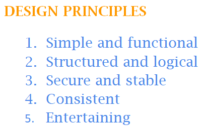
We formulated our Design Principles based on our knowledge of our personas and their user needs in relevant journeys. These principles were important for our personas and supported us in the design process including prioritizing among functions.
If our app is simple, functional, structured, and logical then the user flow is fast.
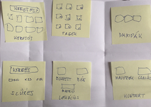
We elaborated a Master Flow from sticky notes in a Crazy6 session.
Storyboards helped us to visualize, sketch the agreed Master Flow in Miro.
The challenge was that we had various ideas on functions, interactions, and screen layouts. Thus, we accomplished a desk research#2 to review specific design solutions in photo-focused apps.
Our Value/Effort Matrix

Then we prioritized functions together in the value for the user/development effort matrix.
The first phone screen-like sketches were born in Miro

We made a mistake: the first full flow screen size was different from the final prototype’s which distorted available space for design. We then refined these to screen sizes identical to the final prototype.
Final screen versions in Miro

The challenge was that we had a disagreement on the sequence of screens. We let the test decide upon. We built a congratulations screen when the upload process was successful. After that, the final Miro screen versions were recreated in Figma.
Figma screen versions before final finetuning

The iterative evolution from paper sketches to Miro screens is necessary because it is more simple, thus faster to modify on an intermediate version than on a ready-made one.
Evolution of the prototype: 5 levels from sticky notes to low-mid fidelity Figma screens

Let us show the first, tested MVP version. Based on the tests we improved it and now please have a look at the Journey#2 of Andrew Active in our prototype.
Testing, Results and Next Steps
The challenge was to get reliable feedback on the proto. Thus, we acquired new testers, not involved in the research to receive unbiased and unfiltered views. We again recruited online among friends.
We accomplished cognitive walkthrough with them. We visualized the outcome matching the emotional reactions and content feedback to all screens. We were wondering about clumps, identical patterns.

The challenge in testing is to filter out distortion. We iterated the script due to its lengthy unfocused intro etc. We corrected the technical bugs in the proto after the first test. Despite the protocol provided prior to testing, we had technical breakdowns. Corporate IT systems required to create a ‘technical user’ in Figma. We separated the testers’ technical comments due to the prototype nature from their content ones.
Synthesis of test outcomes from User Journey#2: Pain points & emotions (Excerpt)

Failure: our image quality screens broke the flow and were complicated. The Privacy settings screen was in the right place. Congratulatory screen received very warm reactions since testers missed it in other applications. They also taught identically about the functions under the icons. Testers found the app differentiating due to its simplicity and transparent privacy. This is reflected in a 1-minute record walkthrough time and an average of 3 minutes, with small differences.
Based on test feedback, we made an Extended MVP proto. We added a group selection screen: family, close friends, coworkers. We canceled the quality screens. We intend to put those under General Settings later, while the main flow would only include default setting and storage visualization. We also planned personalization, an onboarding tutorial, and gamification to stimulate app usage.
As the closure of our training course at xLabs we compiled this case study and designed two high-fidelity screens: ‘My Gallery’ and ‘Single Image View’ since these were tested with feedback.
High-fidelity screens

The project was fictive since we are not working on a product to be marketed. However, it was lifelike, very intensive and practical yet a pleasant experience with a lot of lessons learned. Just one of those was the long-lasting effect of Covid19 on remote work in UX, in which we acquired the proper skills and gained valuable experience.
Appendix
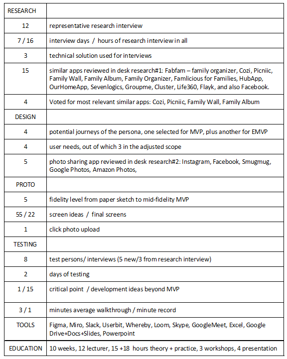
Project Summary in Figures
Visit us for more projects: Anna Árpás, Gábor Kiss, István Sebestyén

