Perception-based color palettes for customizable UI themes
Choosing the right color space to generate contrast-consistent palettes based on human color perception for user-adjusted UI themes.
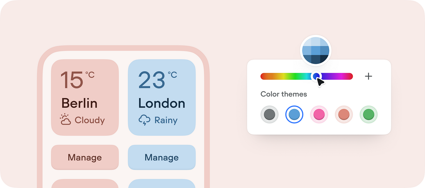
Android 12 has brought the Material You design language that provides users with UI color themes automatically adaptable to the wallpaper image or manually adjustable by developers. The Material team has introduced the HCT (hue, chroma, tone) color system based on CAM16 и CIELAB models.
To define a monochrome palette for a custom color, the algorithm uses Tone which is similar to Lightness in LAB-models. It describes the perceived brightness or lightness of a color. With L* equal to 0, the value corresponds to black, and 100 to white.
In my practice, it was a no-code chatbot builder represented by a mind-map-like canvas with content blocks and connector lines between them. Users asked for being able to color the blocks based on importance, logic group, and company brand colors.
A block on the canvas is a molecule-level object that consists of multiple items: controls, text content, background fills, borders, etc. All of them have to comply with a selected color theme.
In such cases, a designer requires the palette colors to be presented in a visually harmonious way. In other words, it means that similar shades of different monochrome palettes must match in contrast ratios or perceptional brightness despite any chroma defined by a user.
Choosing color spaces

Let’s take the conventional 10-shade palette from 50 to 900 as an example. After defining a key color, the system must automatically apply the palette to the UI elements based on their importance: labels could be 700, the background is 100, icons are 500, etc.
For the purpose of the palette algorithm, a designer needs to choose the right color system.
sRGB
RGB arranges colors based on how much red, green, and blue light combined is needed to display a given color.
For designers, sRGB has a big problem: it's optimized for monitors and printers, and human perception does not work like those machines. In particular, "distance" in sRGB does not correspond to what humans think of the distance between colors. Humans are more sensitive to certain colors than others, and sRGB is not designed to fully account for this. [1]

Even though these two colors are equidistant from white, they don’t look equally “bright” and cannot be used in the UI to guarantee a reliable contract ratio for different key colors.
HSL
HSL/B/V color systems have similar issues.
HSV (hue, saturation, value), also known as HSB (hue, saturation, brightness), is a more natural way to think about colors in terms of hue and saturation than in terms of additive or subtractive components. HSL (hue, saturation, lightness), also known as HSI (hue, saturation, intensity) or HSD (hue, saturation, darkness), is quite similar to HSV, with “lightness” replacing “brightness”.
The difference is that a perfectly light color in HSL is pure white, but a perfectly bright color in HSV is analogous to shining a white light on a colored object. I.e. shining a bright white light on a red object causes the object to still appear red, just brighter and more intense. Shining a dim light on a red object causes the object to appear darker and less bright.
The issue with both HSV and HSL is that these approaches do not effectively separate color into their three value components according to human perception of color. This can be seen when the saturation settings are altered — it is quite easy to notice the difference in perceptual lightness despite the “V” or “L” setting being fixed. [2]
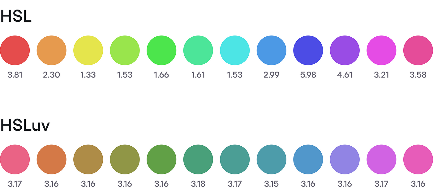
In the given example, if using these color systems, Hue would be adjustable by a user. If the designer decided to simply adjust the Lightness value for 10 palette colors, he/she would still face the same contrast and brightness issues for different chromas.
The palette algorithm requires a sophisticated approach to dynamically adjustable Saturation based on a provided Hue to make things better when using this color space.
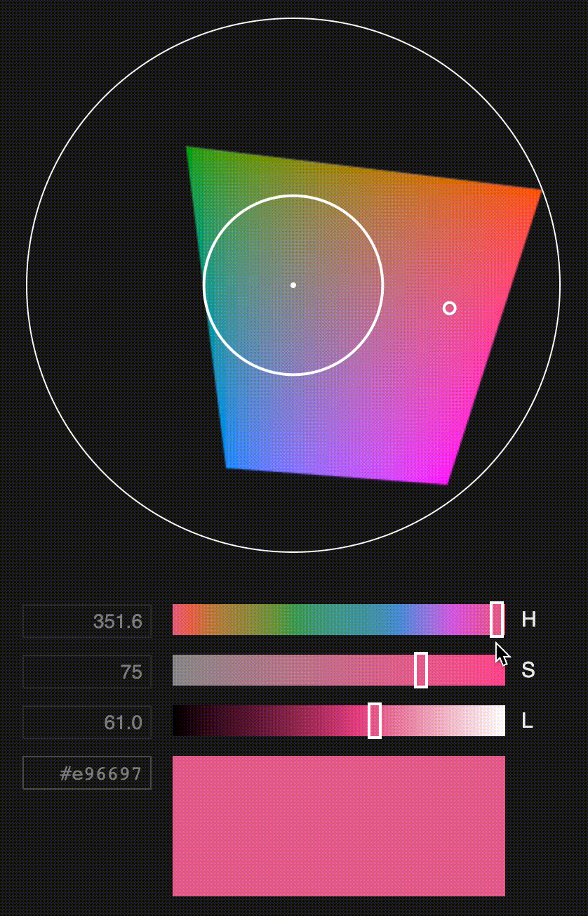
HSLuv
HSLuv is an extension of CIELUV color model.
The CIELUV space is useful for additive mixtures of lights, due to its linear addition properties (human hue perception does not respect light addition, however).[3]
Basically, HSLuv complements the CIELUV model with a new saturation component that allows spaning all the available chroma as a neat percentage. [4]

A designer might approach this space in order to achieve perceptual uniformity for custom UI color themes. Although, the hue range is less rich compared to the non-uniform color spaces.
To generate the palette, a designer needs to pick a preferred Saturation level and set up the Lightness values for the shades of a monochrome palette generated based on a customizable Hue.
CIELAB
LAB models express color as three values: L for perceptual lightness, A and B for the four unique colors of human vision: red, green, blue, and yellow:
- A — green to red;
- B — blue to yellow.
CIELAB was intended as a perceptually uniform space, where a given numerical change corresponds to a similar perceived change in color. While the LAB space is not truly perceptually uniform, it nevertheless is useful in industry for detecting small differences in color. [5]
In this model, a designer defines Lightness steps for the generated monochrome palettes so different chromas have the same perceived lightness and WCAG contrast ratio. In other words, the same blue and green with Lightness of 50 look consistent and have a similar contrast ratio against white, meeting WCAG requirement. [6]
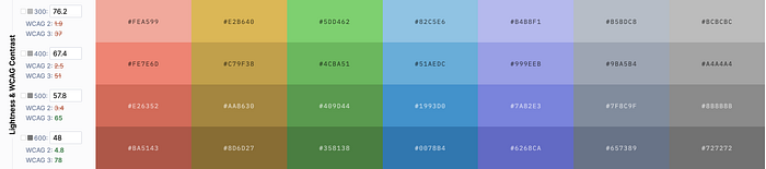
Eugene Fedorenko has implemented a great tool that generates perceptually harmonious palettes using the CIELAB and LCh color space. In this article, he explains the approach behind the tool.
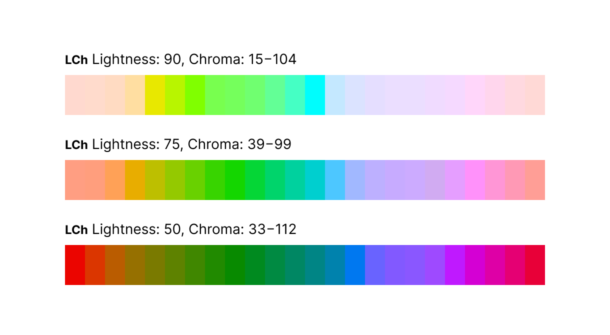
LCH
LCH (lightness, chroma, hue) is similar to CIELAB uniform color space. The difference is that LCH uses cylindrical coordinates instead of rectangular coordinates for LAB. The Lightness attribute can also be used to calculate the contrast ratio between shades when generating a monochromatic palette.

A huge advantage of the LCH space is that it’s becoming one of the web standards (CSS Color Level 4) and is already supported in Safari.
The hue angles don’t fully correspond to HSL’s hues. E.g. 0 is not red, but more of a magenta and 180 is not turquoise but more of a bluish-green, and is exactly complementary. Note how these colors, while wildly different in hue, perceptually have the same lightness.
In HSL, saturation is a neat 0–100 percentage, since it’s a simple transformation of RGB into polar coordinates. In LCH however, Chroma is theoretically unbounded. [9]
Conclusion
Uniform color spaces are built such that the same geometrical distance anywhere in the color space reflects the same amount of perceived color difference. [9]
If your product implies users being able to manually or automatically adjust the UI color theme based on custom colors, the efficient way is to consider uniform color spaces such as CIELAB, CIELUV (CIELCh), HSLuv. They ease the process of generating palettes with a similar contrast ratio for different chromas.
Links
- CIELab.io — a color tool based on human perception.
- Color spaces and their uses (Wiki)
- HSLuv — a human-friendly alternative to HSL.
- Color difference (Wiki)
- CIELAB color space (Wiki)
- Accessible palette — color systems with consistent lightness and contrast.
- LAB color space.
- CSS Color module level 4
- LCH colors in CSS: what, why, and how? by Lea Verou
- Accessible Palette: stop using HSL for color systems by Eugene Fedorenko

