Pepsi Unveils New Design System for a More Dynamic Brand Experience
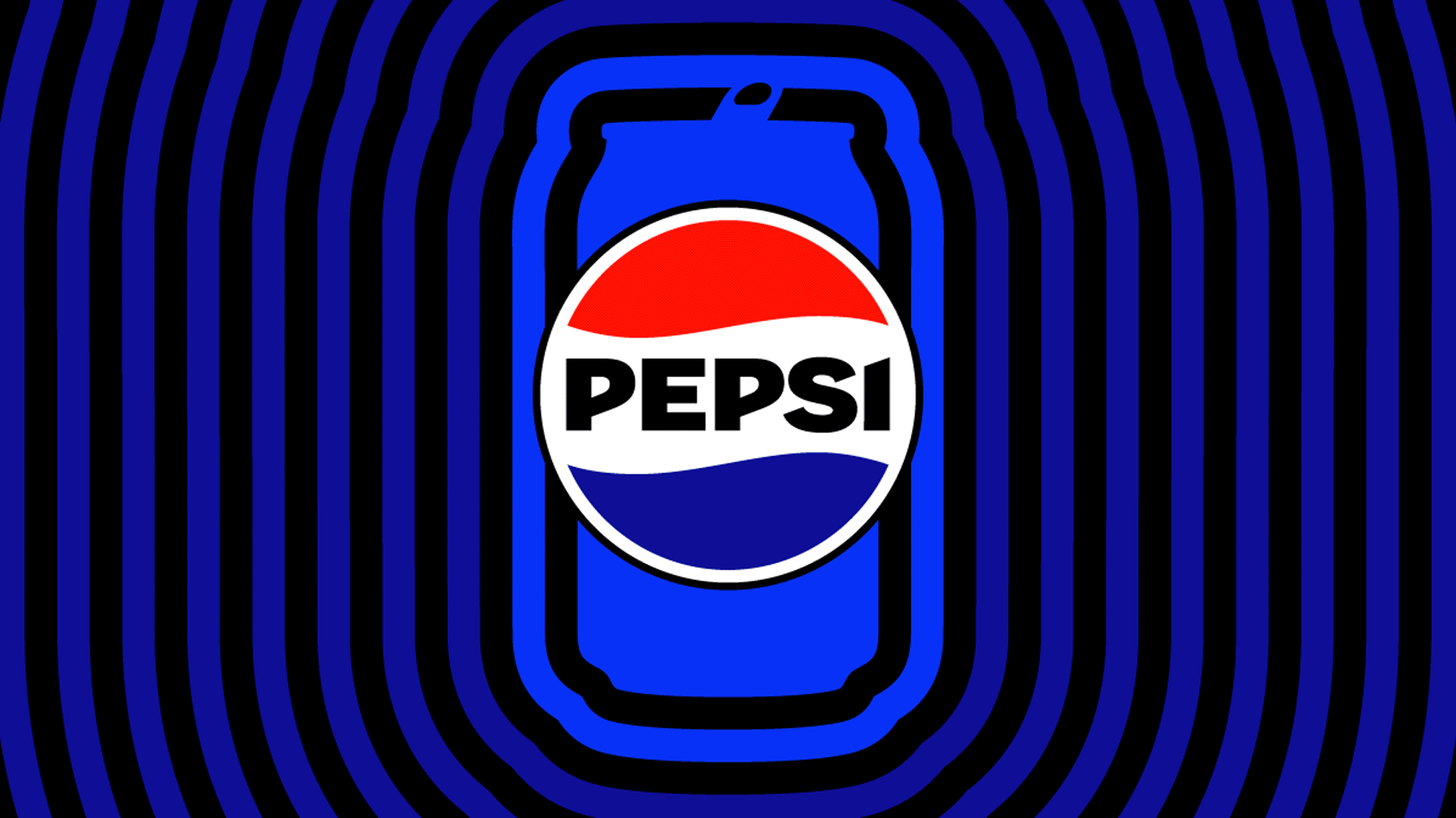
Pepsi, one of the most iconic and recognizable brands in the world, has just announced a new design system that promises to bring more energy, movement, and animation to its visual identity. The new design features a striking electric blue color and a silhouette of the brand’s iconic can, aimed at reflecting the increasingly blurred lines between physical and digital experiences. In this blog post, we’ll explore the key features of Pepsi’s new design system and what it means for the future of the brand.
The new Pepsi design system is all about creating a more dynamic brand experience for consumers in a rapidly changing world. As the physical and digital worlds continue to converge, Pepsi’s new design aims to bring more movement and animation to its visual identity, allowing the brand to tell more engaging and dynamic stories.
At the heart of the new design system is the striking electric blue color, which introduces a new energy and vitality to the brand’s visual identity. The color is designed to catch the eye and evoke a sense of excitement and vibrancy, reflecting the youthful and energetic spirit of the Pepsi brand.
Another key feature of the new design system is the silhouette of the iconic Pepsi can. This visual element not only serves as a powerful tool in the brand’s design arsenal but also reinforces Pepsi’s commitment to sustainability. By “heroing” the can in its visual system, Pepsi is emphasizing its efforts to reduce its environmental impact and create a more sustainable future.
The introduction of black into Pepsi’s logo and design system is another important element of the new design. The color not only adds a sharp and bold look to the brand’s visual identity but also serves to highlight one of Pepsi’s most important products, Pepsi Zero Sugar. With black as a key color in its visual system, Pepsi is signaling its commitment to growing this important product and attracting new customers to the brand.
Conclusion
Pepsi’s new design system is a bold and exciting step forward for the iconic brand. By introducing new colors, elements, and visual techniques, Pepsi is creating a more dynamic and engaging brand experience for consumers. As the physical and digital worlds continue to converge, Pepsi’s new design system is perfectly positioned to help the brand thrive in an increasingly “phygital” world. We can’t wait to see how this new design system will roll out and how consumers will respond to it in the coming months and years.
Feel free to reach out to me on LinkedIn if you need any more information on this topic or have any other questions related to UX design or product development.

