case_study/grubhub: Payment preferences for digital wallet
Math and ethics influence design decisions

Summary
A poorly designed payment preferences UI was resulting in accidental charges and left users at risk of repeat charges that could cause banks to lock their cards. In addition to addressing these pain points, we managed to maintain a level of possible customization unmatched by competitors.
Collaborators
Design Manager — Sloane Thomson
Product Managers — Wadie Abbas, Lee Orlandi
Current Pain Points
The previous design resulted in two main pain points.
- The steps required to load funds onto the app were both too easy and unclear.
- The ability to choose a reload amount and a balance threshold resulted in an edge case that would result in repeat charges.
Problem 1
Too easy to charge the user

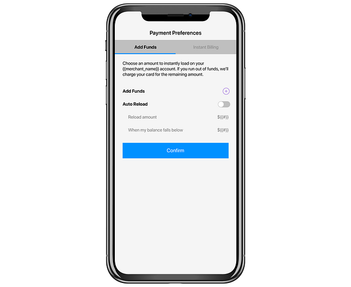
When we look at this design we immediately see the improper use of a tab bar. Rather than switching between views, this was acting as a switch. The user would confirm their selection by pressing the button while on a certain tab.
Also, if the user has auto-reload on, and presses confirm, they’re charged if their balance is below the threshold they had chosen. (For new users, this was almost always the case since they likely had a $0 balance.)

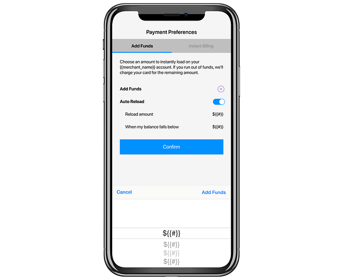
If the user tapped the + to add funds, a bottom sheet would appear where they could select how much they wanted to add. When looking at this screen, a user may be confused about whether the “Confirm” button or the “Add Funds” on the bottom sheet would actually complete the action. Additionally, if a user selected “Cancel” and then tapped “Confirm” but had auto-reload checked on, they would still be charged by the Auto-Reload function.

Many of the older designs fall into a “language trap.” As the team gets more comfortable with the internal language, sometimes it can end up in the designs. This language isn’t always obvious to users. In this design, we offer the options of “Instant Billing” and “Add Funds” as opposites. This presents a few problems:
- “Instant Billing” isn’t terminology that is immediately clear.
- “Add Funds” is an active task whereas confirming “Instant Billing” as a setting is passive.
- Perhaps most problematic of all, if a user runs out of funds, their card would be charged anyway – so technically, all users are using “Instant Billing” with some using their stored funds first.
Other opportunities on this UI were to:
- Clarify which settings were selected
- Show stored payment methods
Solutions to Problem 1
Eliminating the concept of “Instant Billing”

We realized that instant billing wasn’t a concept that we needed to call out. Users assumed that they would pay with a stored payment method. So instead of giving the users the ability to choose between “Add Funds” and “Instant Billing,” we ignore the concept of Instant Billing in the UI. The user can add preloaded funds as an additional option. This does a better job communicating that their card is charged when they run out of funds. (We also specifically call that out for the user, which I’ll show later).
Making it obvious

We wanted to make it obvious to the user when they were going to be charged. The new UI shows the user their current balance, a simple control in which they can select a value to load, and a primary button they can tap to add the funds. Additionally, the button text displays the selected value (“Add Funds ($50)”) to eliminate any remaining user confusion.
Charging the user’s card when their funds ran out

To add clarity to different situations, we added a dynamic line of subtext. In the above UI, the user has a card on file, has preloaded funds, but does NOT have auto-reload turned on. The right detail text in the table row shows the auto-reload settings. The subtext states, “When your balance runs out we’ll charge your default payment method.” This UI leaves no doubt about what happens when the user runs out of funds.
Problem 2
The “Repeat Charges” problem
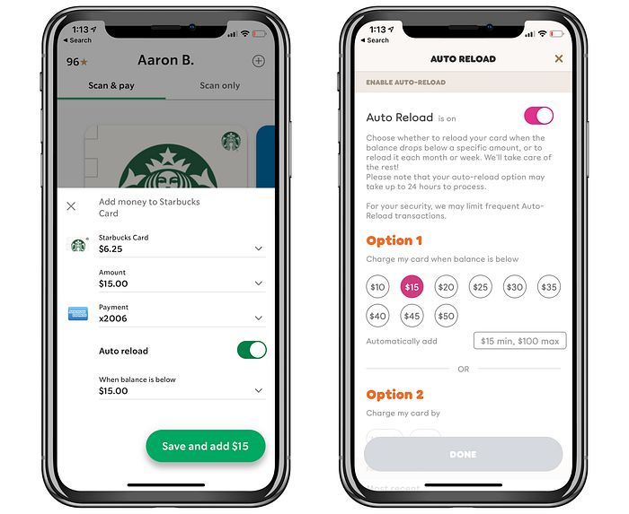
With auto-reload, a user can select to have the app reload a certain amount whenever their balance falls below a certain threshold. For example, “whenever my balance falls below $20, reload $20.” This functionality is used by apps like Starbucks, Dunkin’ Donuts, and others.

With Auto-Reload there is a potential problem if some basic logic isn’t considered.
If reload amount = X and threshold = Y, it is important that X≥Y.
The problem that arises when X<Y can is as follows:
“When my balance falls below $60 (Y), reload $10 (X).”
If a user has a balance of $70 and spends $50 in one transaction, what will happen?
Their balance will go from $70 to $20.
$20 is less than $60, reload $10.
$30 is less than $60, reload $10.
$40 is less than $60, reload $10.
$50 is less than $60, reload $10.
Allowing the user to select both options independently allows them to set themselves up for these repeat charges.
Starbucks
In the Starbucks model — they used to prevent this by forcing X=Y. Whatever you chose as a threshold was selected as your reload amount. But they recently updated to allow complete freedom. Although I haven’t been able to test it, my guess is that they either only check the balance once and reload appropriately:
Example: If the balance is less than $100, reload $10. Balance goes from $101 to $30. They check to see if it’s below $100 and reload $10 and STOP. This prevents repeat charges but also results in the possibility of the user spending less than $10 next time and being charged again in an attempt to work the balance back up to the threshold.
or
They know the risk and are less concerned because of the average item price. In order for this to be a problem, the threshold must be high and large purchases must be common.
As an agency, we don’t have the same control over assumptions like that. It’s more important to solve for as many cases as possible.
Dunkin’
Dunkin’ allows control over both X and Y but they give the user a minimum for X after the user selects Y.
Solutions to Problem 2
Separating auto-reload from adding funds
The original design allowed users to confirm auto-reload settings without loading a balance. Additionally, the designs stacked these concepts in a way that led to user confusion.
While designing the new UI, we concluded that users who would want to use auto-reload would be the same users who wanted to preload funds. The ability to add funds by setting up auto-reload with a balance of $0 is more confusing than helpful. Based on this, we decided to hide the auto-reload functionality until a user had added funds.

Here we have a user with a card on file but no preloaded funds.
Our research indicated that the existence of auto-reload did not play a factor in a user’s decision to add funds.
In interviews, 7/7 users said they would either use preloaded funds or add a card.
When asked if the existence of auto-reload would change their answer, 6 users said “no” and 1 said “maybe, but probably not.” We took this as an indication that it was safe to hide the feature until a user added funds.

Here the user has added funds, and so the “Manage auto-reload settings” table row shows.
Solving the X≥Y problem
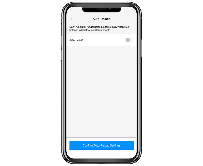
For the auto-reload feature, we changed up the UI. The user sees:

From this UI the user can go back or press the “Confirm…” button with the same result. If they turn on the switch, they see:

The user is now presented with two dropdowns. “When balance falls below” (Y), and “Automatically reload” (X). The selection in the first dropdown changes the available options in the second dropdown. For example, if the first dropdown is set to $30, the second dropdown’s options will begin at $30 and increase. By asking for the Y value first, we can populate the second dropdown with values ≥ Y. It is possible for the user to select their X value first but we default the Y value to a minimum which means their X values are already appropriate.
We chose to use dropdowns because it hides the “magic” more successfully. If we had chosen a selector that exposes the values, the user would have seen the numbers adjusting whenever they changed either value.
Continuing to clarify

Here the user has a balance and auto-reload turned on. We change the subtext to show their auto-reload settings. “When your balance falls below (Y) we’ll auto-reload (X) using your default payment method.” This allows the user to see their settings at a glance on this screen without showing a bunch of auto-reload information to the users who aren’t using the feature.
Conclusion
Redesigning this feature was full of challenges. The most exciting steps of the process often involve reframing the question. Here we had to challenge stakeholders to let go of how they had previously thought about this feature. The key breakthrough of realizing that “Instant Billing” wasn’t a setting that needed to be “confirmed” freed us up to design a strong solution that allows the user a lot of flexibility while protecting them from mistakes. As this feature is rolled out, we hope to see a drastic decrease in support calls related to this feature AND hope to see an increase in users loading cards and preloading funds.

