Own : A UX/UI redesign for a mortgage platform
Greetings!
I’m here once again with a new exciting project, which is the capstone project of Misk foundation’s UX immersive course.
Group project
Deadline: 3 weeks.
Before we dive in, The word Sakani is mentioned multiple times in this project, and it refers to سكني which is a real Estate Initiative from the Saudi government to support and enable Saudi citizens to own their first home.
What is Own — عون?

Own — عون is a mortgage platform designed to simplify the process of taking a mortgage, by matching the user with all his mortgage options from different banks based on his salary, past loans…etc.
The word Own (عون) itself means to help, aid or assist. The platform is designed to aid users in the journey to own their homes. I’m not sure if the pun is intended, but I thought it’s pretty cool :).
Why the redesign?
Although Own is already launched, the client informed us that they had little to no user research, and they’re facing a problem with the conversion rate, where users see their mortgage options but don’t pursue to book through the platform. Another thing the client showed his concerns toward was the trust element, as they did not know how to make their platform look trust-able.
Current design:


Understanding the business
As my Team (myself included) were clueless about mortgage, we decided to kick off the project with a business research to better understand the industry and be able to identify and spot the issues in Own better.
C&C analysis
We asked our client who do they they look up to when it comes to mortgage platforms, and they provided us with several platforms which we conducted our C&C on.
List of competitors included:
- Lower.com
- Better.com
- Huspy
- Deal app
- Done
Mortgage platforms are not as common in Saudi Arabia, in addition to the increasing number of internet scams happening lately, gaining the customer trust is crucial for Own to success. Therefore, we tried to focus on the trust element In this analysis.
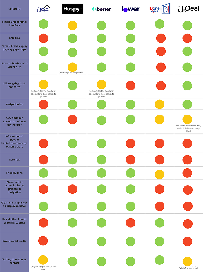
Key insights
Through this analysis, and other external researches, we were able to recognize certain practices that mortgage platforms use to gain the trust of their customers.
- Attentiveness and availability
We noticed that most competitors implemented this through linking their social media accounts and keeping them active or/and making a phone call action always visible at the navigation bar to give their customers a relief that there is a human they can always talk to if something goes wrong.
- Staying relevant
Customers need to know that the platform they’re using knows the industry inside out before putting their complete trust in it. We noticed in most mortgage businesses they would include a separate section dedicated to educating and providing customers with the information they need to know in a simple way(Learning center, help tips…).
- Include a human element
Customers find it difficult to trust a faceless corporation. We noticed how mortgage businesses humanize and personalize their services by adding information about the people behind the business and including reviews/stories from other customers.
- Transparency
We noticed how mortgage businesses make sure to allow customers to understand what the platform do, and how, by setting Clear value propositions/terms.
LEMEr’s Heuristic out of 5
Next, we moved to the heuristic evolution to measure the usability of the current UI design.
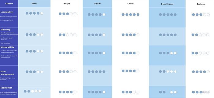
Through this we were able to define what aspects do mortgage platforms usually lack in, and what aspects should Own focus on in order to stand out in the market:
- Efficiency by providing shortcuts and clear language to reduce user hesitation
- Memorability by making the UI elements placed in conventional positions
- Provide better error management
- Make the platform visually appealing
Market positioning
We mainly did market positioning for us as a team, to better understand where does Own stand in the market as of now.
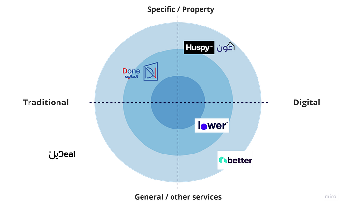
We defined the unique value of Own which is providing almost fully digitalized service specifically for mortgage property.
Understanding the users
Now that we have a somehow clear idea of the business and its industry, we moved on to the users. Who are they? what are their goals? What kind of pain points are they facing? and how’s their current journey like?
We recruited our users by using mystery shopping, screening surveys, and lastly interviews.
Mystery Shopping
Mystery shopping is a great way to measure the quality of the services provided and mirror the users’ experience.
We conducted it by having one of the team apply as a user, and here’s what we noticed:
- The employee asked about information that were already filled in the application, which indicates that he did not view it thoughtfully.
- Language used was not consistent, employee kept switching between English and Arabic, and surely not all users are expected to speak English.
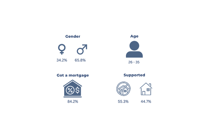
Screening survey
Screener surveys are surveys that are made up of a few questions, designed to recruit targeted users, which in our case are people interested in mortgage and employed.
Here’s what we were able to learn about targeted users:
Interviews
After the screener, we reached out to recruited users to start the interview. Our goals were to learn about their past experiences, motivations, concerns and pain point and how to gain their trust. This part was the most challenging part of the project, as we were on a very tight schedule, and the topic being sensitive, not a lot of people were ready to cooperate.
After the interviews, we created an affinity map, which a board used to categorize the similarities and common points we found among users.
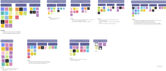
Key insights
- Most users only have basic knowledge about mortgages, brokerage, and Sakani.
- Users’ motivation for taking a mortgage differs, most of them take it with the motivation of owning their own property, while some for investment.
- Some users were interested in knowing the interest rates charged by banks.
- Few users find it challenging to find the right property.
- Most users would want to know detailed information about the conditions and policies for each bank. Especially that mortgages are paid over a long period of time.
- Some users would want to talk with a consultant before taking any steps.
- Most users would trust the platform if it has governmental proofs/licensed.
- Few users would trust the platform if its terms and conditions are provided.
- Few users trust the recommendations of people they know.
- Most users are tech-savvy, yet they never heard of the existing mortgage platforms.
Persona
Now that we have a clear idea of who our users are, we created something called a UX persona which is a fictional character that represents our target users.
Shall we meet Ghassan?
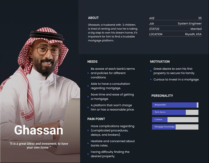
So, what exactly the problem Ghassan is facing?
Problem statement
Ghassan is a family man who’s looking to own his dream home. He requires a comprehensive and dependable platform that saves him time and simplifies the process of obtaining a mortgage by showing him his mortgage options from each bank along with the terms and policies for different conditions as well as helping him to find a suitable property in his region.
To sum it up, Ghassan was facing problems with:
- Trusting the platform
- Needing more information and details regarding the mortgage options and platform itself
How can we help him?
Solution statement
A web app that helps Ghassan learn more about mortgage, calculates his best mortgage options from different mortgage banks/institutions, shows him the terms and policies for different conditions in each institution and offers consultant services. Moreover, Ghassan has the option to use the web app to look for a property in his region.
Usability reviews
Before we go ahead with the redesign, we first made some users perform specific tasks on the platform, to find part of the it do they find frustrating, unclear or confusing.
Key insights
- Most users found some UI parts misleading
For example, they thought some parts were clickable but they actually are not, and vice versa.
- Most users found the platform overall confusing and difficult to trust
They thought the platform overall felt sketchy.
- Most users felt like they needed more information
They felt like they were not given enough details regarding the mortgage options.
- Some users had concerns regarding the used language
They language in the platform felt weak and inconsistent.
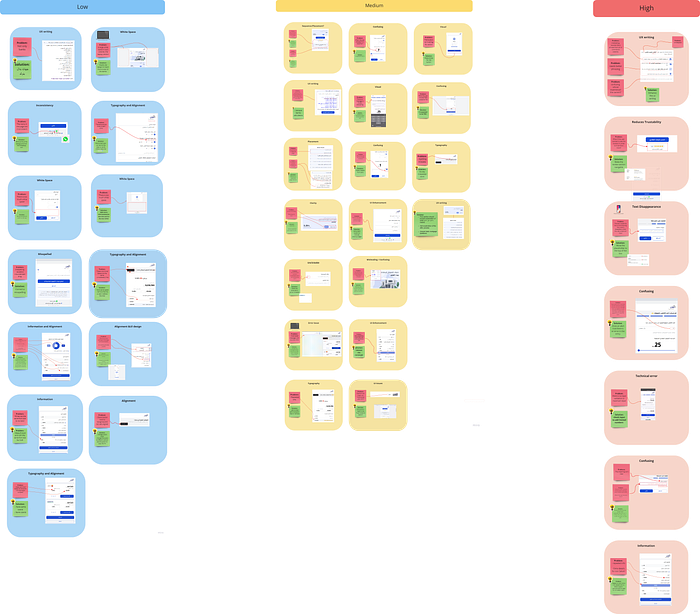
UX Audit
UX auditing is close to usability reviews, expect that it’s done by Uxers, in this case, us:). We went through the platform to spot what parts should be changed or enhanced.
As can be seen bellow, we categorized everything we spot into 3 categories based on its severity along with suggested solutions. Red: high, Yellow: Medium and Green: Low.
The Redesign process
We know the industry, we know our users and their needs, we know what parts should we enhance…it’s about time we start the redesign, don’t you think? :)
Ideation
We held an ideation session, and came up with the following ideas:
- Card for terms & policies
- Reviews Section
- About us
- Learning Center
- Consultation service
- Offers Feature
- Real estate List
- Support call
- Sakani Link
Features Prioritization
And because not all features can be implemented at once, we started prioritizing features based on their importance, and effort.
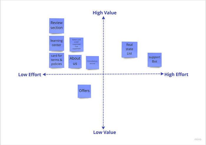
Finalized list of features:
- About us page
- Review section
- Learning center
- Sakani link to provide users with more information about it
- A card showing the terms and condition for every mortgage option
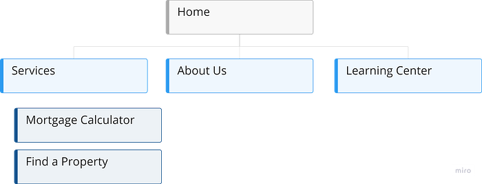
Sitemap
User flow

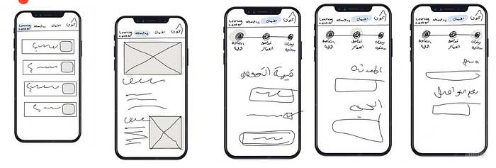
Sketches
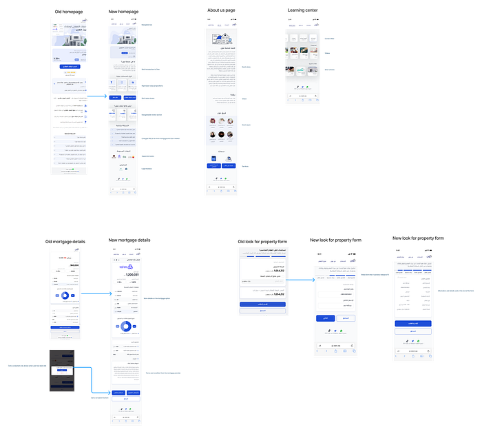
New design screen
Usability testing
During the usability testing, we asked users to perform the two main tasks of Own: Calculate your mortgage, and find a property.
We sat Clarity, trust-ability and ease of flow as our main criteria.
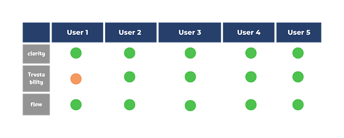
As can be seen from the table above, no changes needed to be done.
Final design
And we’re finally here! you can see the whole redesigned platform through the clickable prototype bellow
Or you can just watch this walkthrough demo :)
Next steps
As we were on a very tight schedule, there are certain things that we couldn’t do, but sure will be very beneficial on the long run. So what can Own do next?
- Talk with the developer team to see can be implemented.
- We did our best to enhance the written content, but it would still be better to discuss it with a professional copyright writer.
- Provide users with calls, or chatbots for technical support or consultation services.
- Conduct in depth usability testing.
At the end of this project, I would like to thank Own for giving me the change to experience how UX is done in real life, and my teammate who who I spent lots of VERY long nights with. Hopefully, I will be back soon with more projects soon:)

